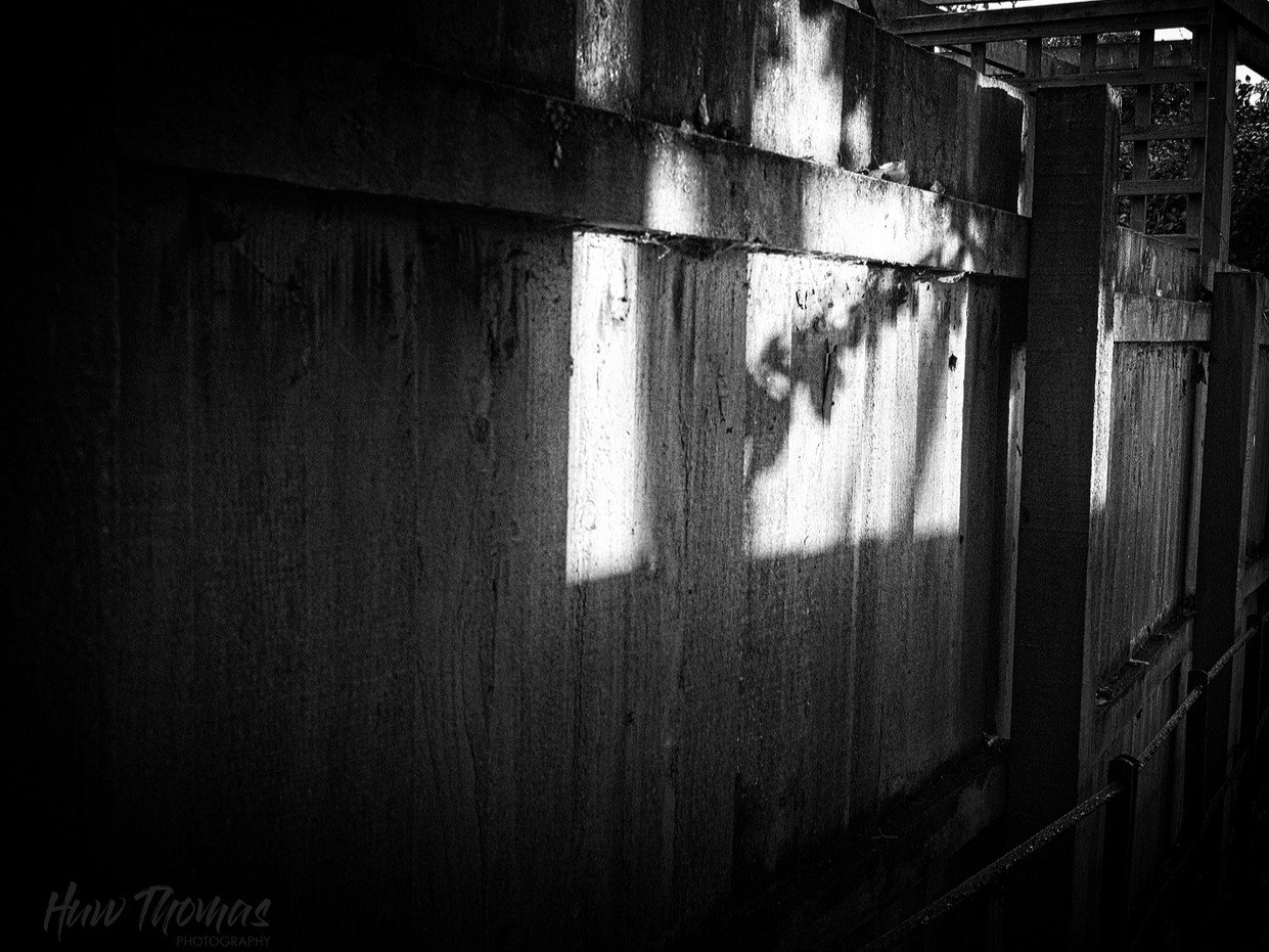
Please share your first response before reading the hidden notes below. The photographer is looking for an unbiased initial impression.
Feedback Focus: Artistic / Expressive
Questions for Viewers
The sky darkening,
The branch stands against the sun,
The storm is coming
A little more unusual vision for the Gesture of a branch - seen on my walk home.
Does it work as a composition. The storm was coming and light awful - but this one branch caught stray bit of sunlight , making a comment, a gesture to the storm - so it seemed a shame not to record it.
About This Image
poor light, high iso, dark overhead. Nice textures and an intentional bit of grain. Tried to keep some detail in the shadows.
Ethical statement: No trees or branches were damaged in the making of this image
I like this, Huw, though the storm doesn’t particularly come through from the image alone, but that doesn’t really matter. The pattern of leaves on the fence is what catches and holds my interest. From a composition point of view, I’d be tempted to take a bit off the left which feels like a bit too much empty space to my eye.
Great eye to see this. Sometimes we make a photograph when we are not even looking for opportunities.
I can see the logic of taking a tish off the left, but I also find the bright triangle in the top right a little distracting. Is it the source of the ligh? I don’t think so, but it has its own small branch.
So, if you play with crops, I would play with a slight crop off the right, maybe even a bigger one than off the left. I like scanning the frame from dark left to the details, light and shadow in the right. If you crop too much, it might feel more static. That could be a good thing if it’s peacefulness you want to capture.
Looking forward to other’s insights on this too,
ML
Visual Notes
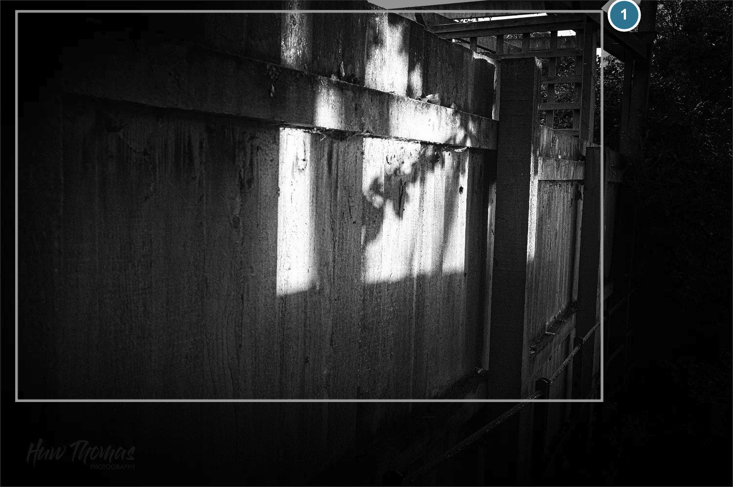
[1] Distracting light and shape
[Crop] removes the bright triangle and reduces the empty space to the left, but only marginally. Might be better to go taller to keep that dark area near the bottom
Huw, I agree with Marylynne about the light at the upper right. I don’t think I would crop it out I think I would darken that area so the main light is the fence with branch. I also wouldn’t crop the image because I like the way my eye travels along this dark path and then focuses on the light. (not sure this make sense)!! Great light and texture.
Thanks Alice. My thoughts on that area match yours. Am in the process of darkening it
Thanks everyone for your comments
No one noticed my attempt at Haiku?
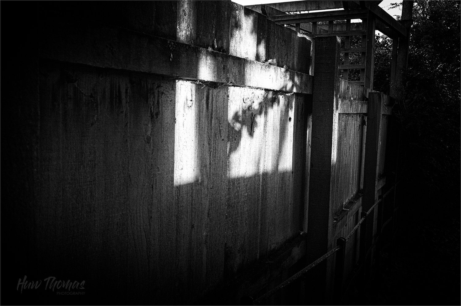
I love the raindrops on the rail and the branch shadow of course. The textures of the mono add to conjour up the feelings of the walk home through the darkness to a warm home. The light at the top did need darkening but the crops suggested altered the feel too much so went with the original
Huw
Your revision works well for me, and it makes me realize that the crop I suggested eliminates the darkness in the distance, and that darkness (along the right edge) is really important to the energy of the image.


 .