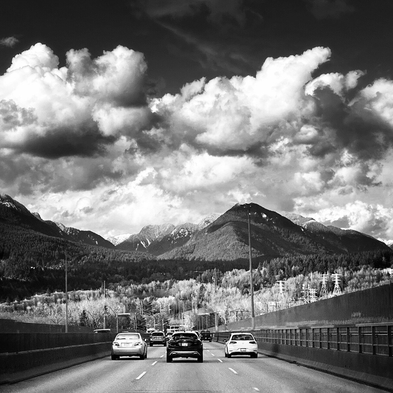
One of three bridges that connects central from North Vancouver. The view coming across can be spectacular at times . The mountain range known as the Pacific Range ( the southernmost subdivision of the Coast Mountain portion of the Pacific Cordillera located entirely within British Columbia) gives a feeling of how small and insignificant we really are .
Type of Critique Requested
Aesthetic: Feedback on the overall visual appeal of the image, including its color, lighting, cropping, and composition.
Conceptual: Feedback on the message and story conveyed by the image.
Emotional: Feedback on the emotional impact and artistic value of the image.
Technical: Feedback on the technical aspects of the image, such as exposure, color, focus and reproduction of colors and details, post-processing, and print quality.
Specific Feedback and Self-Critique
I tried to contrast the cars (whir black white) with light shadow contrast (shadow light shadow) of the mountain range. I also tried to contrast the cloud formations with the salt and paper mid ground. I like the way the B&W turned out to provide contrast. I was lucky that I didn’t blow the whites or blacks.
Duncan, this is a very impactful image! You have succeeded in giving viewers a glimpse of how impressive the mountains are on the horizon. Nothing like having nature shows us how insignificant we can be before such majesty.
The B&W treatment gave me a very nostalgic feeling about the scene. In fact, at first, my eyes saw the three cars as some oldies. I think that was in part because of the B&W edit. I really liked that. Those massive clouds also added to the overall size of the scene. As for the cars, you could not have asked for a better set with alternating colors and strong contrast. The image clearly has well-defined FG, mid-ground, and BG.
Your crop choice helps center the cars. However, I am just a little concerned that things do not appear centered. I see a slight imbalance in the overall composition. I would suggest experimenting with a tighter crop on the right side of the image while still maintaining the square crop. You can try to leave the same space from the car on the left and the space from the car on the right. That will, naturally, crop some of the mountains on the right side. With caution, you will find a section on the mountain slope going down instead of up. That will keep the eye at rest on the right side of the frame. Also, my eyes can’t help seeing those two lampposts on either side of the road. They add to the imbalance I keep seeing. Unfortunately, they are there. It’s either leaving them on erasing them. Naturally, it is your work and your vision.
This is a truly strong image showing how nature can overpower man-made elements. I find the image a very good capture. It’s also impressive you got that on a cell phone. Nature was on your side.
I really like the concept of white, black, white and using B&W as the genre ties it in nicely.
You also have that theme going on in the vertical as well, it’s light at the top, dark in the middle and light at the bottom.
I’d like to point out that there is a difference between B&W and Grayscale.
When you use a B&W conversion mask, you still have access to the colors to be able to adjust highlights and shadows to a degree and in many cases, those color adjustments in the B&W mode are enough.
However, when an image is converted to Grayscale, all the color information is discarded, then the only choices for adjusting highlights and shadows are through dodging and burning masks and curves. I use the exposure mask most of the time for dodging and burning but there are times when I use Levels or Brightness/Contrast, it just depends on the image.
I downloaded your image and discovered it was Grayscale so I had to use the exposure dodging and burning masks (some people call them Luminosity masks).
I felt that your image was leaning slightly to the left so I rotated it 0.5° to the right and cropped it in from the right (still a square crop but I cropped it to center the dark car) (I used the tires on the dark car as a reference point to level the image).
I also added some burning to the clouds and a little to the mountains because there was some good detail there but the brightness was covering those up a little too much.
I remember you stating that you don’t use Ps or Lr but I can’t remember what program that you do use.
I added an image with just a touch of very light orange just to demonstrate that B&W images can be warmed a little by adding tint.
I see what you mean Mervin. . The edit certainly bring out the mountains better. I use Darktable and GIMP (mostly because I have no cash!) I used Snapseed for this edit though. The rotation and centering improvedthe image for sure!
Great capture showcasing the wonders of nature and our connection to it with the nice arrangement of the vehicles. Their positioning and the light-dark-light contrasts work very well. To be honest though, I don’t really see a strong contrast connection or pattern that you describe up top - for sure though I don’t think there needs to be a connection. Just the composition and framing alone accomplish that.
B&W presentation works great and I really like Mervin’s sepia treatment which does indeed give it an old time, nostalgic look.
Sorry, but can’t help but comment… be safe out there! Hopefully you were the passenger!
The main thing I’ve noticed in your images is your sense of composition and your sense of theme, those two are tough for many people to grasp but you seem to have a knack for both.
I completely understand not being able to afford the tools you would like to have.
I would like to note that Ps and Lr are $10 a month for both (just in case you may have been thinking that they were much more expensive than that).
That said, I completely understand that even $10 a month can be too much so please forgive me if I made it sound trivial.
I watched a couple of videos on Darktable and I done some reading as well, I’ll have to say that Darktable is not very easy to use when compared to Lr because the most common tools are not easily accessible, although, any software is useable if you use it enough.
I’m sure you already have a list of tutorials on Darktable so I won’t link to any of what I just watched.
I would like to encourage you to add the settings used for each image in the “Technical Details” section of your posted image even if it was taken with your cell phone camera, there may be some settings that we could recommend that might produce even better results (if needed).
(No problems with this image at all in terms of shutter speed, aperture or ISO.)
Many phones have manual control of shutter speed, aperture and ISO, some even have exposure compensation. You can often set shutter speed and aperture under manual control and still have ISO in auto (for example).
Well done, your theme of light dark light was creative and well recieved
The clouds are spectacular and the interplay of shadow and light below is great as well. In fact, the richness of tonal value overall is excellent. The one suggestion for this image is that it had been a horizontal as all the main elements are horizontal. That would have allowed you to place the edges of the road at the corners and given the image even more perspective. But that’s after the fact and can’t be implemented on the current image.