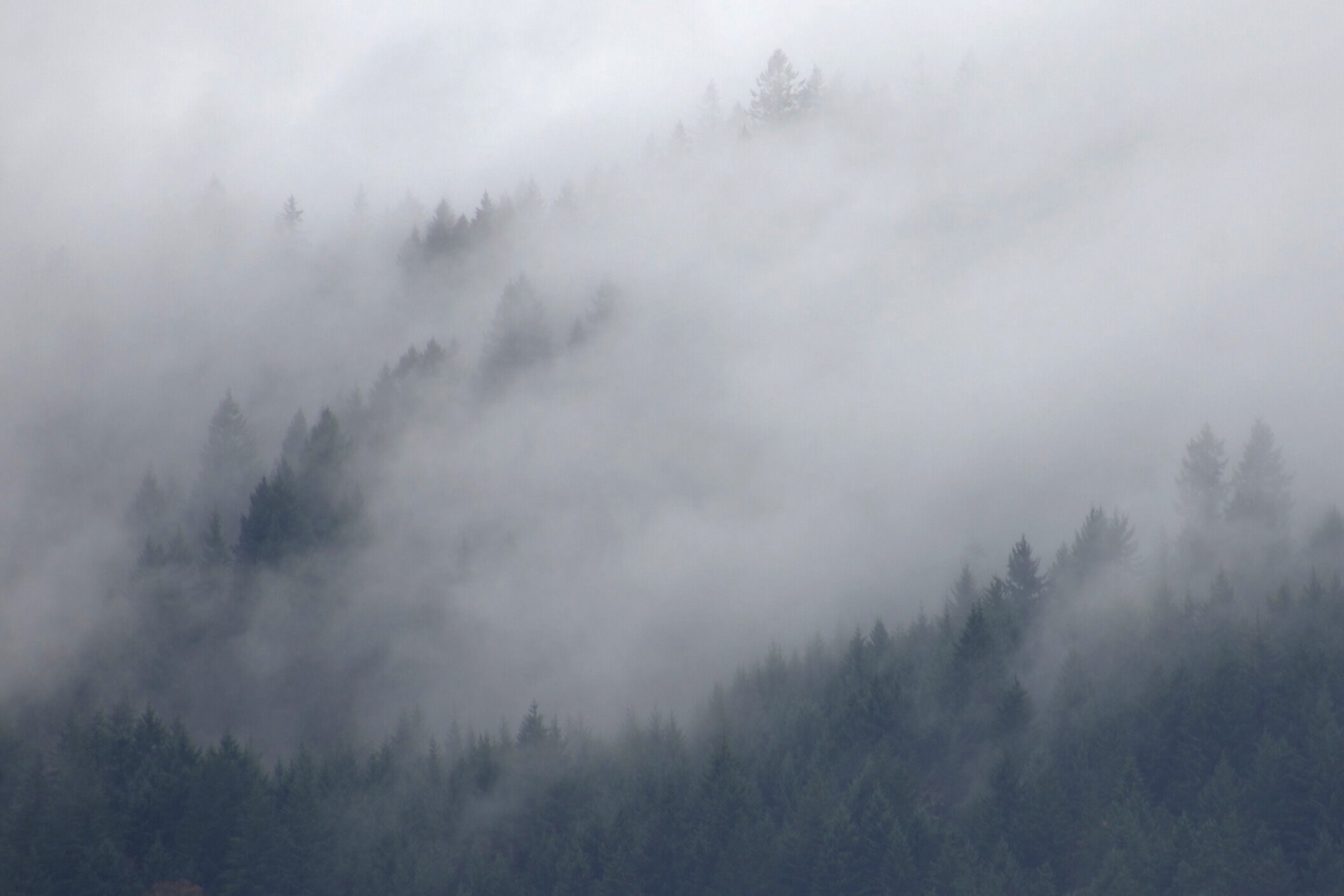
This time of year we get a lot of rain and cloudy days. But it’s neat when the clouds lift and move through the hills of pine trees.
Specific Feedback Requested
Is it too dark/ too much fog and clouds? Anything else/ I tried working with it to bring out the shapes of pines more. I have other shots too, but I tried to pick one that had the most balance between seeing the shapes but hidden too.
Technical Details
Is this a composite: No
Nikon D3400, 300mm, ISO 100, f/8, 1/320, adjusted exposure, contrast, also cropped a little as this was the way I wanted it if I could have gotten closer or zoom out more.
You have a lovely scene with the trees being silhouetted by the fog. I think the crop is OK but the fog is underexposed. Bringing up the lightest tones a bit more could reveal some interesting structure in the fog.
When we look at this sort of scene, our vision normalizes the exposure to some degree, and a photograph needs to do the same. It wouldn’t look right to take the fog as far as clipping whites, but brighter with more contrast will look more natural. Try using a Curves adjustment layer and move the UR corner straight in and see how you like it.
Your embedded profile is Display P3 – you should convert to sRGB.
Really good scene and mood. I experimented with brightening the fog. It nicely brings out more detail but it also greatly changes the mood and feel of the image. This feels kind of dark, gloomy and a bit eerie and brightening loses some of the that, but makes it “prettier”. You have lots of excellent options where to take this or just leaving it as is. All work great but are just different. I quite like it as is.
I like this! If you bring the whites up to brighten the fog I would target that to the middle of the image. The brightest part is currently right on the edge and if you brighten overall it’s just going to exaggerate that. If you decide to leave it in a darker moodier tone like it is I would consider decreasing the brightness along the top edge to better match the rest of the scene.
Definitely not to much fog and clouds for me and the crop looks perfect Vanessa. I too find the fog a little dark and would consider brightening it a little, although that is just my personal taste. When shooting a scene containing a lot of fog I will shot a couple of frames over exposing it by 1/3-2/3 stop and see which I like better on the computer. I hope you do not mind, but here is a rework with what I was thinking. The image is still dripping with mood. Bottom line is if you like it dark then go with what you like as it is your vision.
Vanessa, I think you have a good composition here, with a number of strong diagonal lines in the trees to add visual interest. I also think you struck a good balance between seeing/hiding the shapes of the trees within the fog. I also like you have a “base” of trees across the bottom to anchor the composition, it helps keep the viewers eye focused on the center of the image.
I agree with the consensus view that the image could be brighter. To me, fog is something that has to have some luminosity in order to have some life to it. There is an objective way to evaluate whether lighter toned things might be too dark. I downloaded your image to look at its histogram, and there is a lot of empty space to the right of the histogram data. When you see this type of histogram for bright stuff like fog, it says that you have room to lighten it, if you want.
Hi Vanessa, I have to agree with the others about adjusting the levels to brighten it up. I think that’s the only thing I would do, since the composition is awesome.
Thank you, so much, @Diane_Miller@David_Wallace@Ed_Lowe@Harley_Goldman@David_Bostock@Ed_McGuirk for all your feedback and inputs. It looks like a couple of you don’t mind the darkness. Maybe it’s more like passing storms instead of true fog. I did minor adjustments with curves and brought up exposure and brightness and midtown’s very slightly. Thanks for guidance because when I was trying to brighten it before but wasn’t liking it. Is it improved?….I think I still like it darker ….Oh and @Diane_Miller I’m not sure about the download, I always just convert to jpeg never heard of or even know how it ended up being P3?…
Thanks @Harley_Goldman I kind of like it the way it is too, as I feel like it most accurately is the way it was and usually is this time of year around here.
That’s a good idea @Ed_Lowe to take shots with different exposures. I did that but ended up deleting the brighter ones in camera. That’s a real downfall of mine. I need to just keep them all, even though I find it easier just to delete in my camera rather than the iPad, so I can see it on a bigger screen and probably try to work with that and maybe come out with a better end product that way.
You started with an underexposed image and when you tried to brighten it, the darker trees didn’t have enough tonal range. You would have been much better to start with an image “exposed to the right” – without clipping highlights – and then darken as desired in post. Then you can control the contrast with which it is darkened.
I would never delete an image in camera unless it was absolutely junk and I needed the space on the card. You can’t tell nearly enough by the screen on the back of the camera. Deleting in camera has also been known to trash a card and then you could lose all the images. That is rare but you should be concerned about it with your older generation camera.
When you export to JPEG for posting there should be an option to convert to sRGB and also a check box to embed the profile. (Do NOT “assign” sRGB – that will really mess up the colors.)