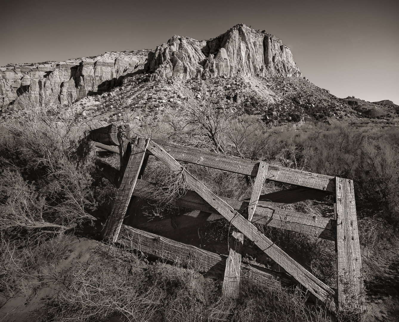
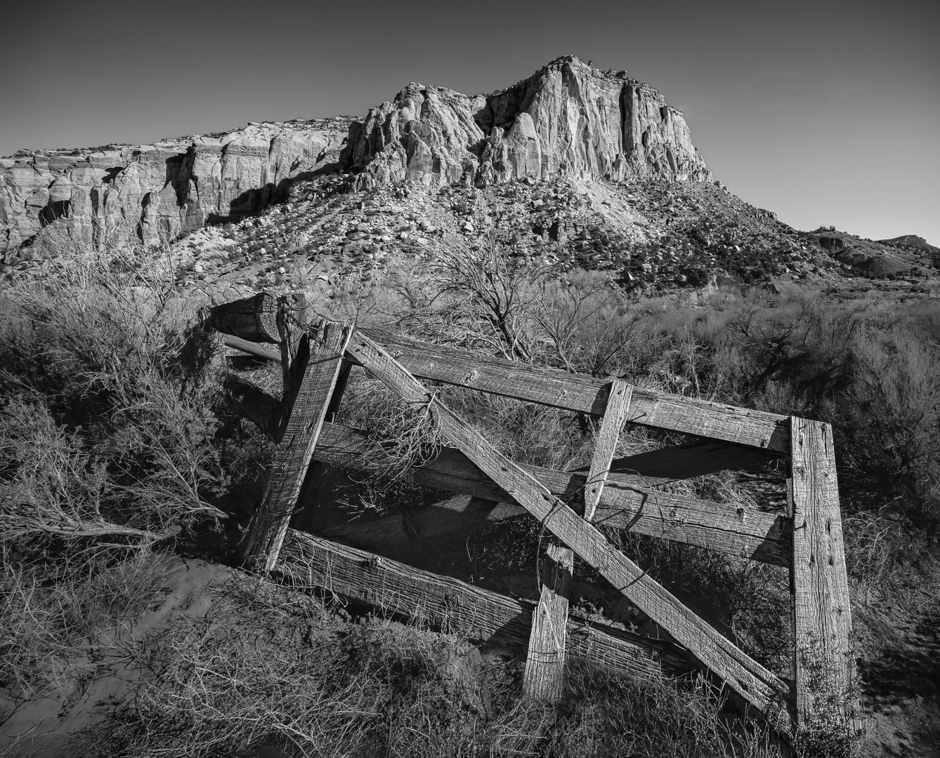
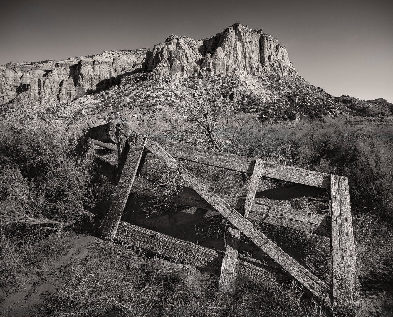
Added after receiving feedback from the community.
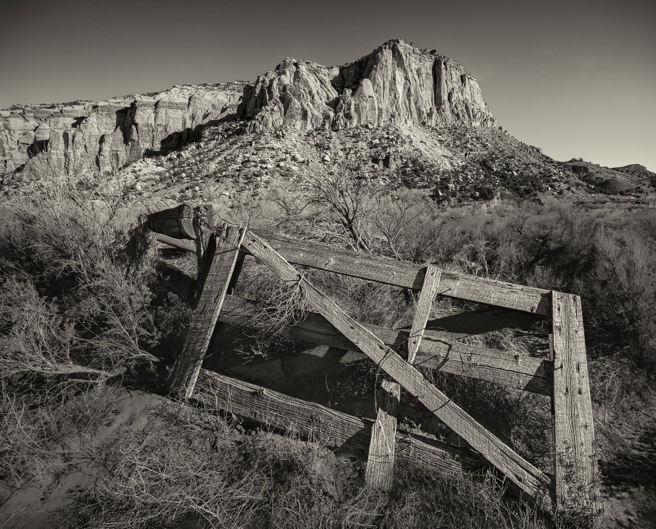
I completely redid this. I tried to incorporate everyone’s suggestions - I used the sepia, got rid of the contrail, and made sure I did not get the halo around the rock. All feedback greatly appreciated.
The photographer is looking for thoughtful feedback on the image as a whole, especially around the areas noted below.
Feedback Focus: Technical Help
About This Image
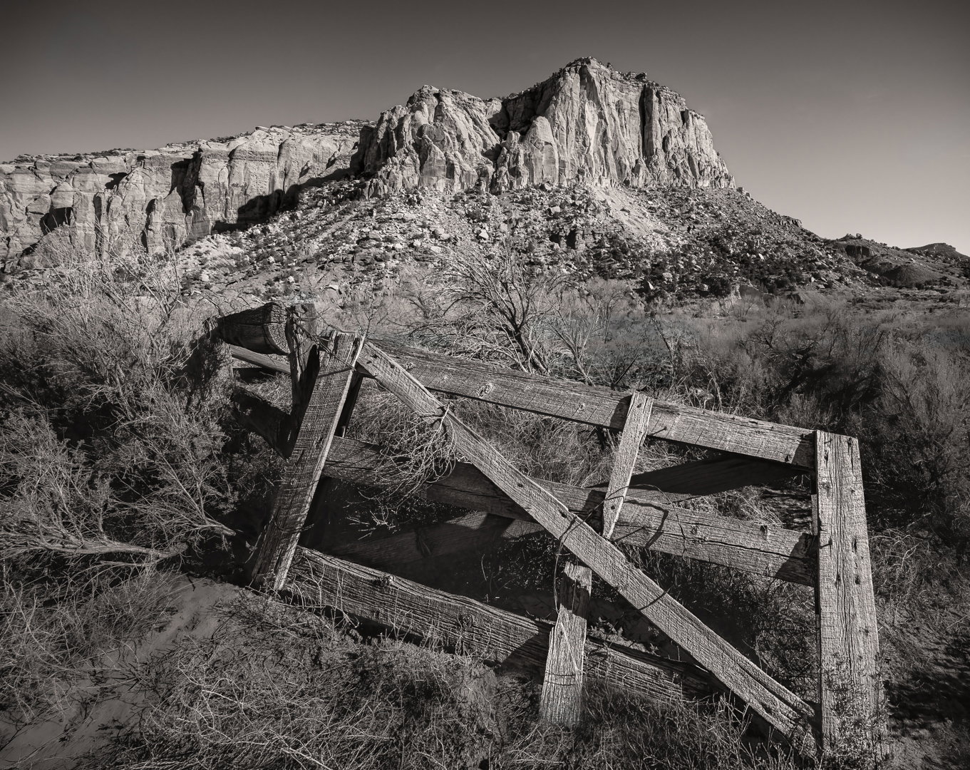
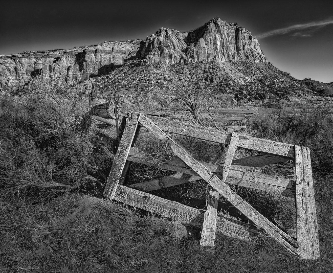
This was not taken under ideal lighting conditions, but it was when I was there. I have never really done black and white, but there was not a lot of color here anyhow and I thought in the mid day sun maybe the black and white would be better.
I could not get far enough back to actually have some room at the bottom of the gate, so the very bottom of the photo was done with generative expand in photoshop and some cloning, hopefully it looks realistic.
All feedback appreciated!
Feedback Requested
Particular interested in processing feedback.
Technical Details
Camera: NIKON Z 8
Lens: NIKKOR Z 14-30mm f/4 S
Focal length: 14mm
Shutter speed: 1/60s
Aperture: f/11
ISO: 100
Wonderful light here and I love what the wide-angle perspective has done to emphasize the derelict gate! Good job on adding the grass – I see just a small area of repeats in between the two vertical gate pieces to the right. I might cut back just a little on darkening the sky to reduce the halo around the BG. Other than that, I’d say excellent!!
I really like the mood of this image and it has a strong message to my eye about the impermanence of everything from the gate that seems to be gating nothing any more to the land forms in the background slowly subsiding into a heap of pebbles only tho be turned to sand and blown in the wind. I might remove the one streak of cloud as it doesn’t seem to add anything and I think the mood might be enhanced even more by a totally clear sky.
Excellent “old western” landscape. I do get a nostalgic sense. And even though the gate doesn’t look 19th century, I still get that vibe. In fact, one suggestion might be to give this a little sepia treatment to push that nostalgic look. Just a thought.
Good job on the foreground and giving the gate some space - including the open space on the right, which I think is compositionally important with this scene (ie. gives the viewer a chance to sneak around the gate to explore the rest of the scene.
I’m torn on the old contrail. It does occupy some empty space, but then again, it’s a contrail. A lot to clone out though.
Diane touches on this and I’m not sure how or what’s going on, but the sky is much lighter along the top of the rock formations, but seems too much for a simple halo. I would be curious to learn what may have been done to produce such a difference - OR for some reason there was a natural thing going on and the processing just enhanced it. In the end, it looks a bit out of place.
Overall this is a Great landscape and most certainly worth tweaking.
@Dennis_Plank Thank you for the feedback. I’m hoping to have a new version done in a few days and will include your suggestion of removing the cloud or contrail. Thank you!
The crop on the repost looks great, Elizabeth. To my eye, there’s been a slight tint added-maybe my imagination, and I find myself preferring the straight B&W. tonality. I do really like what you did to the sky.
Love the change to the sky. Interestingly, I think it is fine without the added grass below. Normally I’d worry more about that, but it doesn’t snag my eye much here.
I totally agree with @Lon_Overacker about the old western feel here, and can see the suggestion to tint; warmer pictures emphasize the “old” to my eye. I like to do that with Photoshop curves, because I can control how much magenta and how much yellow are added. I prefer a tint that is a bit more yellow, and only a tiny toward magenta. Here’s an example (obviously personal preference is the bottom line with this sort of thing).
The numbering on the revisions got a bit confusing, but I prefer the top two, and favor the sepia version of those. I now see in your original that the bottom right corner of the gate was cloned and I much prefer the newer version that lets the corner sort of fade out behind the plant instead of ending abruptly. Nice work on the contrail. The halo above the land in the original likely came from some tonal adjustment – several will do that and it’s usually below the level of noticing but can then be brought out more by a subsequent adjustment that increases contrast. The Shadows and Highlights sliders will often start the problem, then midtone contrast steps will make it noticeable.