Blueberry and Spruce with Clouds (+revised)

Revised Version

Revision 2 (latest)
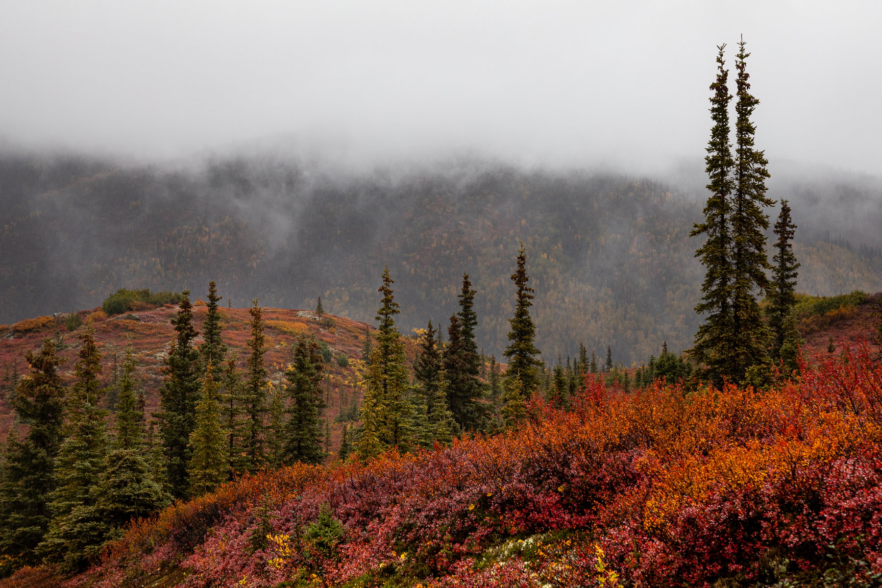
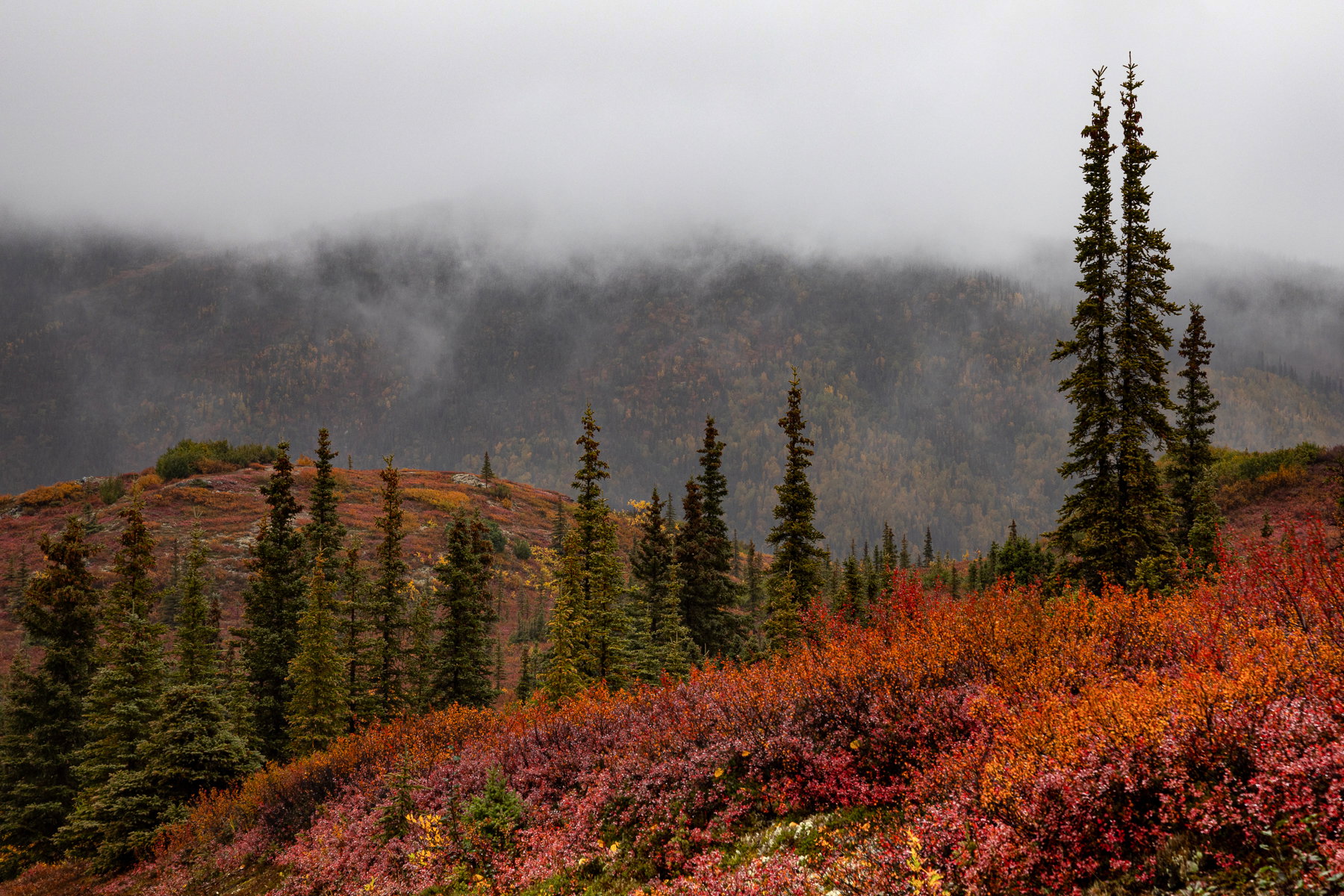
What changed: I enhanced the luminosity and saturation in the two foreground hills and did a slight dehaze in the background hillside. I left the cloud bank as it was.

Revision 1
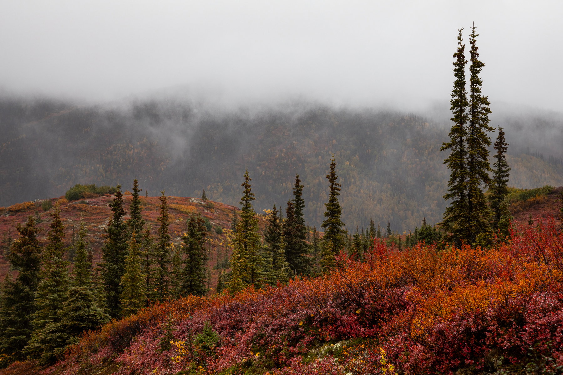
What changed: I increased saturation a tiny bit, cropped to remove the trees to the right, and removed a small tree from the left edge.

Added after receiving feedback from the community.


Original Version
Critique Style: Standard

The photographer is looking for thoughtful feedback on the image as a whole, especially around the areas noted below.

Feedback Focus: Artistic / Expressive

About This Image

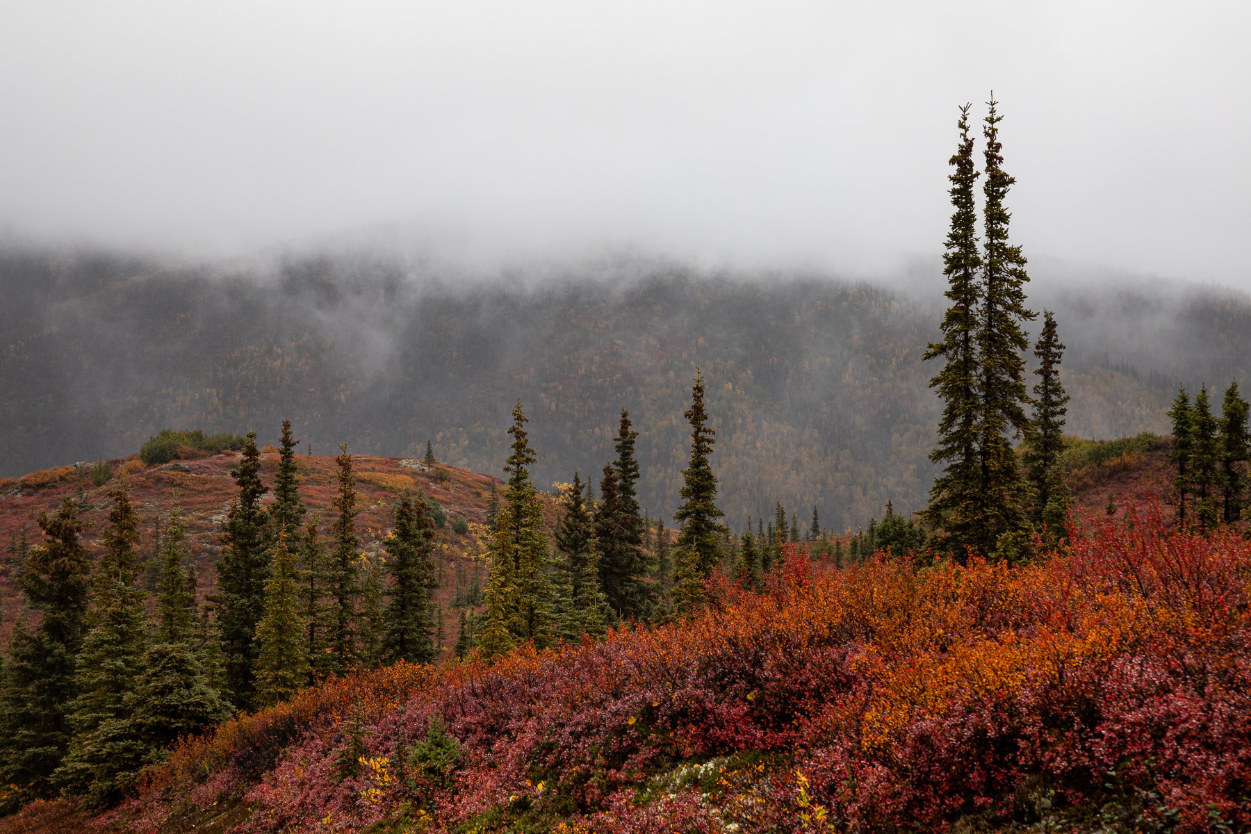
Most of my week in Alaska had conditions like this, except when it was an outright downpour! Nonetheless, the clouds did help to make the colors pop. This is a smaller scene from the area near Wonder Lake. I was attracted to the blueberry foliage and the spruce. If there had been snow, I would have expected to see Burl Ives on a sled gliding across those foreground hills.

Feedback Requested

I find myself struggling with traditional landscapes lately. It’s a combination of getting experimental with ICM and abstracts and also perhaps just being a little bit blocked emotionally and creatively. I see a beautiful scene, I can make a composition that works, but I’m not sure how to take it to the next level.

Part of it might be that I’m a little trigger happy: I’m in Alaska, on a workshop, I have my camera, conditions suck, but I better shoot something. I’m not always sure that what I am seeing is interesting TO others, and perhaps that impacts whether I can translate my attraction to a scene FOR others. I know I should be shooting for myself, but it’s hard not to imaging a viewer, especially when I get back to the computer and start processing.

As usual, any and all feedback is welcome. Feel free to suggest alternate crops, processing, etc.

Technical Details

Canon 5D4 with 24-105mm at 105mm
ISO 250, f/10, 1/60s
Slight crop, contrast boost, dodging clouds

1 Like

Exceptional fall colors. Moody image. Welcome composed with nice detail. could fit the weekly challenge.?

1 Like

It’s a lovely shot, Marylynne. The colors are vivid. I always enjoy seeing tall conifers.

As for creative uncertainty, I suspect that most of us feel that.

1 Like

What spectacular colors. I might crop a bit off the top, to make it more pano/expansive and reduce the amount of clouds, but that’s a nit.

I hear you on the traditional landscape thing. There’s that impulse to make a photo of the beautiful landscape in front of you, but the result is emotionally disappointing. It may be blasphemous, but I find making photos of the dramatic, grand landscape to be boring. I can make a few record shots (which I enjoy after the fact because it reminds me of the day), but it’s difficult to make the big landscape yours.

It’s hard to let go of the feeling that we need to make a photo that others will like. I think when we make photos that reflect what interests us, they will interest others, too - mostly (ha ha).

1 Like

I think this is a very pleasing, beautiful image. Not every shot can be the most creative or original thing we’ve ever done. We shoot what we’re presented with and try to make the best of it. And you’ve done exactly that.And most of the time, that’s enough. I like the processing and the composition with the tiny exception of the right side. I think I would add maybe 25 or 30 pixels of canvas to move those trees away from the edge. If you ever print it, the mat would probably partially cover some of them. JMHO

1 Like

I love the colors and the lines of the hills and spruces in this image, Marylynne. This kind of scene is very difficult to compose-what to include, what to exclude with all the similarity becomes a crap shoot. In this case, I’d probably shift the scene a tad to the left and eliminate those three trees along the right edge which feel a bit anticlimactic to me after the larger set to their left. It would be tempting to jazz up the colors, but that would ruin the foggy feel.

The original poster added a revised version of their image.

Thanks @David_Schoen @Don_Peters @Dennis_Plank @Dennis_Plank and @Bonnie_Lampley. I appreciate the feedback. I cropped a bit off the right and the sky and boosted the saturation a tiny bit.

Glad to know too that I’m not the only one who sometimes thinks, gee that’s a pretty picture, but…

ML

I think your crop following @Dennis_Plank’s suggestion is a lot better idea than mine of adding canvas,:+1:

I hadn’t done a good job of pre-visualizing that crop, so I’m glad you tried it, Maylynne. I think the visual flow is better. I also like the slight saturation boost.

Marylynne: Sorry to be so tardy to this but the advantage is that I’m seeing your revision which I think is excellent. My usual first impression reaction would be Too much sky, but the large trees on the right demand that much headroom and if you cropped some off the top of the trees I think it would be awkward.
I do have two suggestions, add some Dehaze to the BG hills and lighten the FG slope just a bit. Perhaps the conditions weren’t ideal but I think you made the most of them and your results are certainly not Me too of prior photographers. >=))>

Hi Marylynne,

These are the kind of conditions that I love; who needs the sun when you have atmospherics like this! Here again I am very much enjoying those rich lush autumn colors of the landscape. Your revision pretty much nailed it for me, but I have to say that I like the small tweaks from @Bill_Fach as well. I shoot for myself. If other folks like it that is great and if they don’t that is OK as well. I would drive myself crazy if I had to worry about how well an image would be received. Just be true to yourself. I hope to see some more images from your trip.

1 Like

Thanks everyone. I’m adding a revision above momentarily. I did a bit of dehaze and saturation boost in the direction of @Bill_Fach’s suggestion. I kept a little more haze as I didn’t want to diminish the sense of distance.

@Ed_Lowe : Yeah, I go in waves of “this is for me and damn the reception” and “I wonder if this is just another pretty picture.” The less experimental I am being, the more I become aware of tradition and other’s expectations. When I do stuff like my Thresholds Project, I just know most people won’t connect with it in any way as I do, but I just need to express it anyway.

Thanks for the feedback all. Revision above momentarily.
ML

The original poster added a revised version of their image.