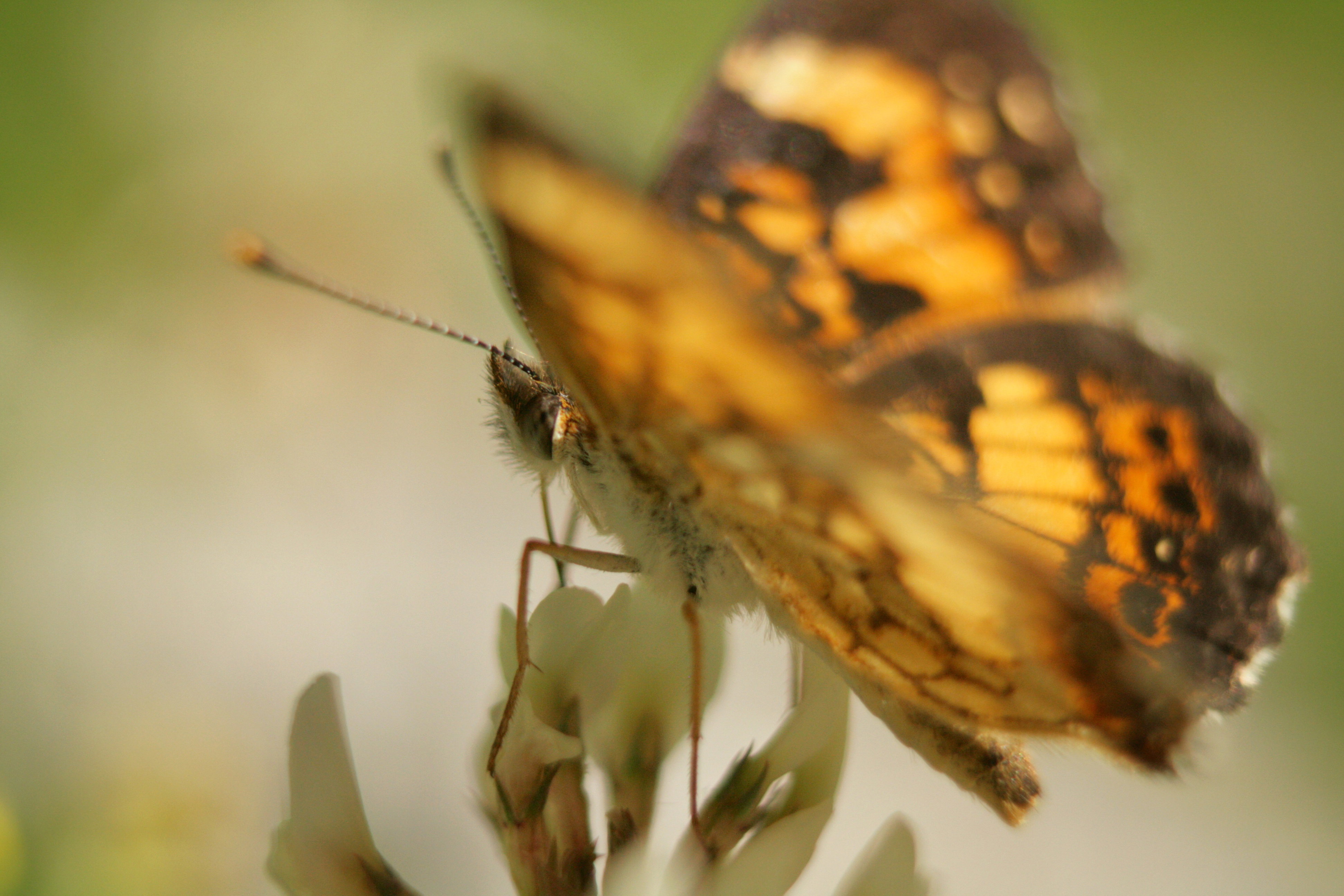
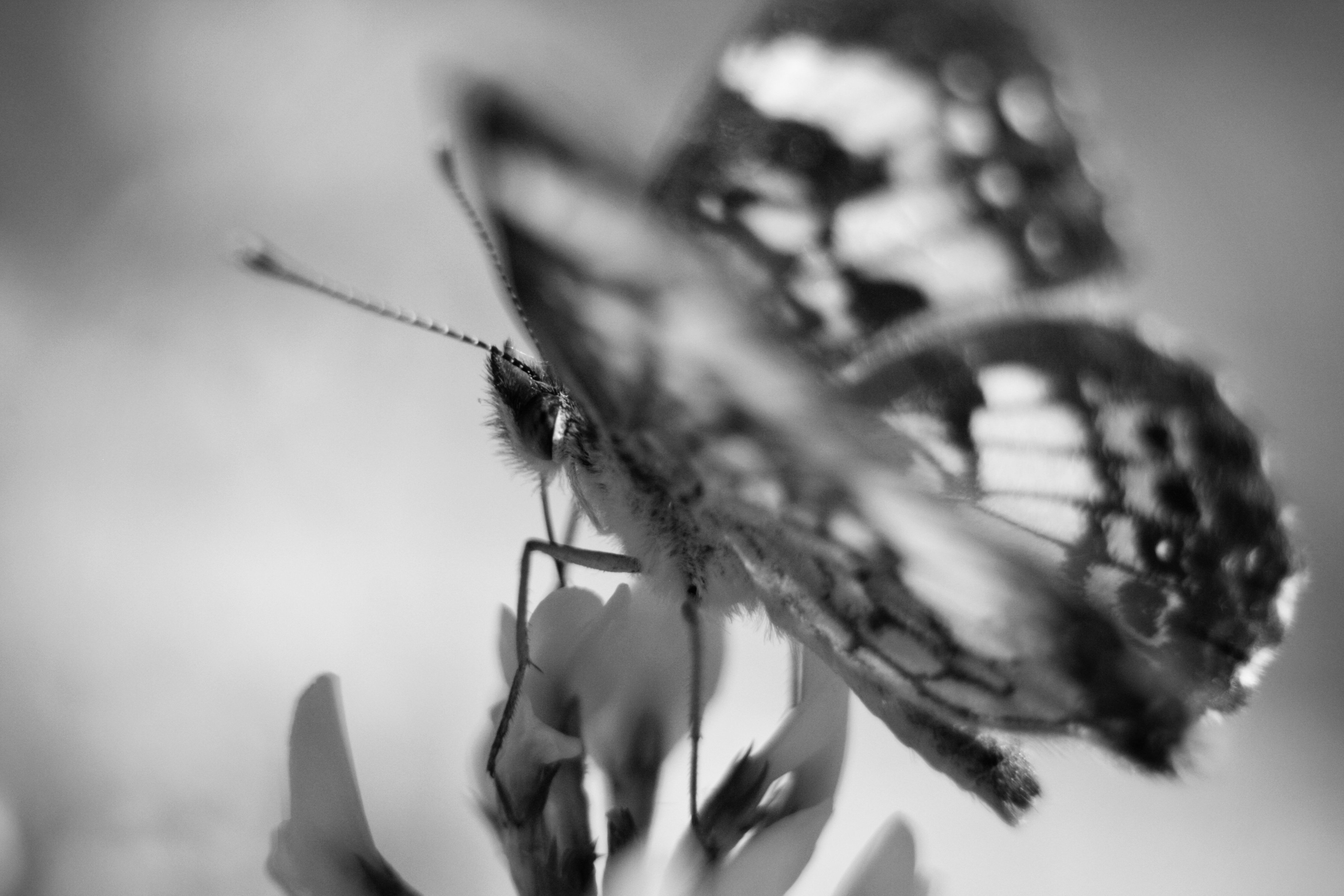
I look at this and see an expansive universe within the tiny world. I feel the cover of its wing tucking me into its point of view. I feel the warmth on my back. I just would like advice on how to share that feeling through my work when others see an “out-of-focus butterfly”.
Rachel: Welcome to NPN in general and to macro-close up in particular. I’m a fan of shallow DOF images so this does work for me. I prefer the B&W because the higher contrast makes the POF of the butterfly face more apparent whereas in the color rendition I can find it but it requires some hunting. Most of the time a clipped wing is considered a mistake but I think there is enough clipped on the top that it looks intentional and not accidental. Getting a sharp focus handheld at this magnification is no mean feat so kudos to you for that. It does help us offer more specific advice if you include the technicals of camera, lens, ISO, processing techniques, etc. One last point regarding posting; site guidelines do recommend sizing your images to 2000 pixels on the long side. Larger images, especially those submitted at greater than 3 MB, get treated harshly by downsizing algorithms on the site. Great to have you aboard and looking forward to more of your work and your comments on other member’s images. >=))>
And I’ll add my welcome, Rachel! I love both. The colors are gorgeous but maybe the B/W, being more abstract, is better for your hope that it will be perceived as something more than an OOF butterfly. (Something akin to more than a rock…) The strong closeup of the clipped wing adds to that for both versions. The face is sharp, which is a strong hint to the viewer of intent.
I wonder if slightly lower contrast on the B/W would give it a slightly more dreamy look? There is little we can do about viewers who perceive works literally. Follow your feelings and ignore the unwashed masses.
Welcome, Rachel. I can see what you’re aiming at here and I think it’s an interesting approach. Two things struck me before reading your dimmed out background discussion. The title Breathing, to me, would imply a bit more room for the butterfly-admittedly, that’s just my prejudice. The other was the in-focus/out of focus thing. You have enough in focus to do the trick and it shows up quite nicely in the B&W, but one thing to consider is people’s affinity for eyes. If you could get the angle to make the eye more obvious and in focus, the out of focus main body and wings would feel more intentional.
The light in this image really does a lot to get your message across. The overall soft light accented by the glow of the wings really works well.
Hi Rachel,
Welcome to NPN. I’m glad you found us. Honest and thoughtful critique are our stock in trade, so you’ll generally get more than “why is this out of focus” from us.
I too like this. I wanted to see the intention, so I cheated and looked at the hidden text. I knew there was a reason for the shallow DOF, and like Bill, I kind of like the black and white version because it is “cleaner” by which I just mean there is less distraction, making it feel easier to find a point of focus in the image. The colors combine with the shallow depth of field to give us a lot to look at but not much to zero in on. That too could be intentional, so I don’t mean it as a drawback.
Lots of other good feedback above, so I’ll just reiterate welcome and nice first post. I’m looking forward to seeing more of your work.
ML
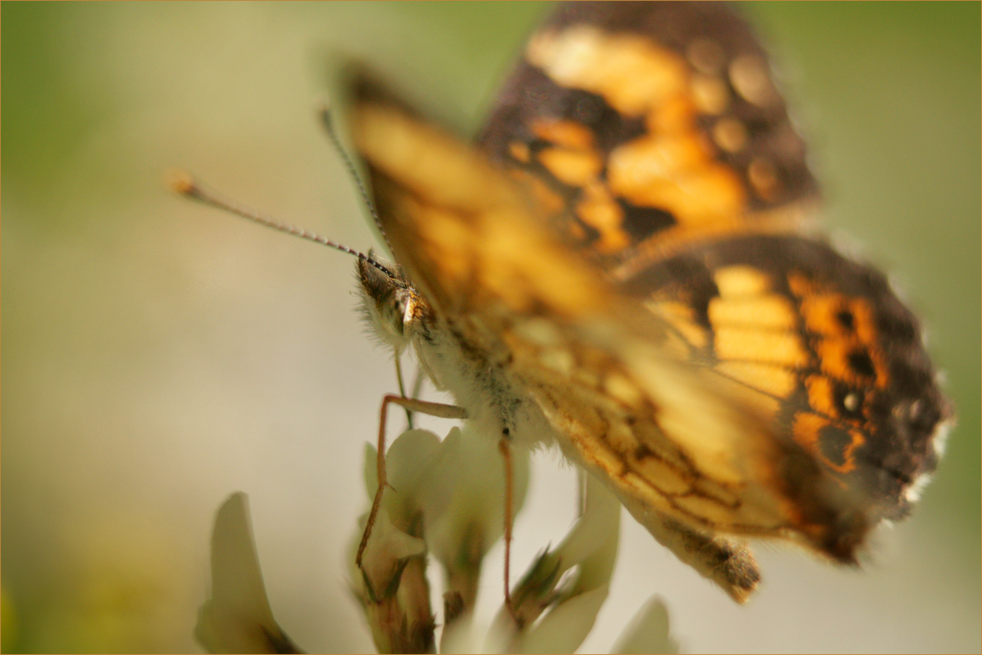
I love your vision - the very very colourful OOF wings and the minimal DOF on the eyes.
I wanted my eyes to go more to the BF eyes to be able to ignore a little of the bright wing colour whilst moving into the frame from the LLC along the leading line of the BF. - but the eye was being swamped by all that colour. The mono is a little better but for me the colour image is much stronger - its all about the masses of gorgeous colour…
So I zoomed in and brightened the eye.
I also created a linear gradient darkening mask up from the lower left corner up to the eye - darkening only the lower left corner so the brightened eye is locally more apparent , and added a bit of yellow and green to make it less white . I have not touched the glorious blurred wings with my processing.