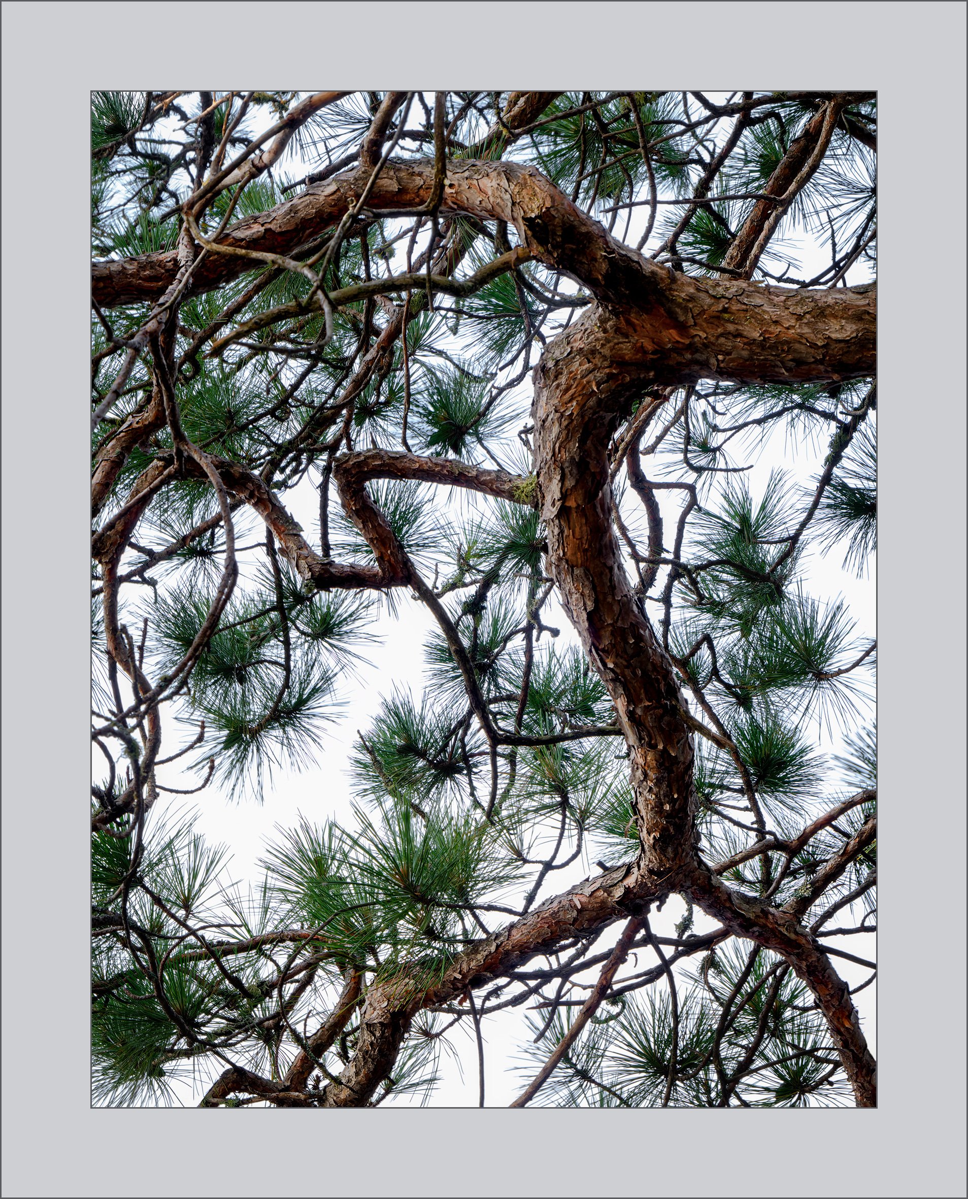
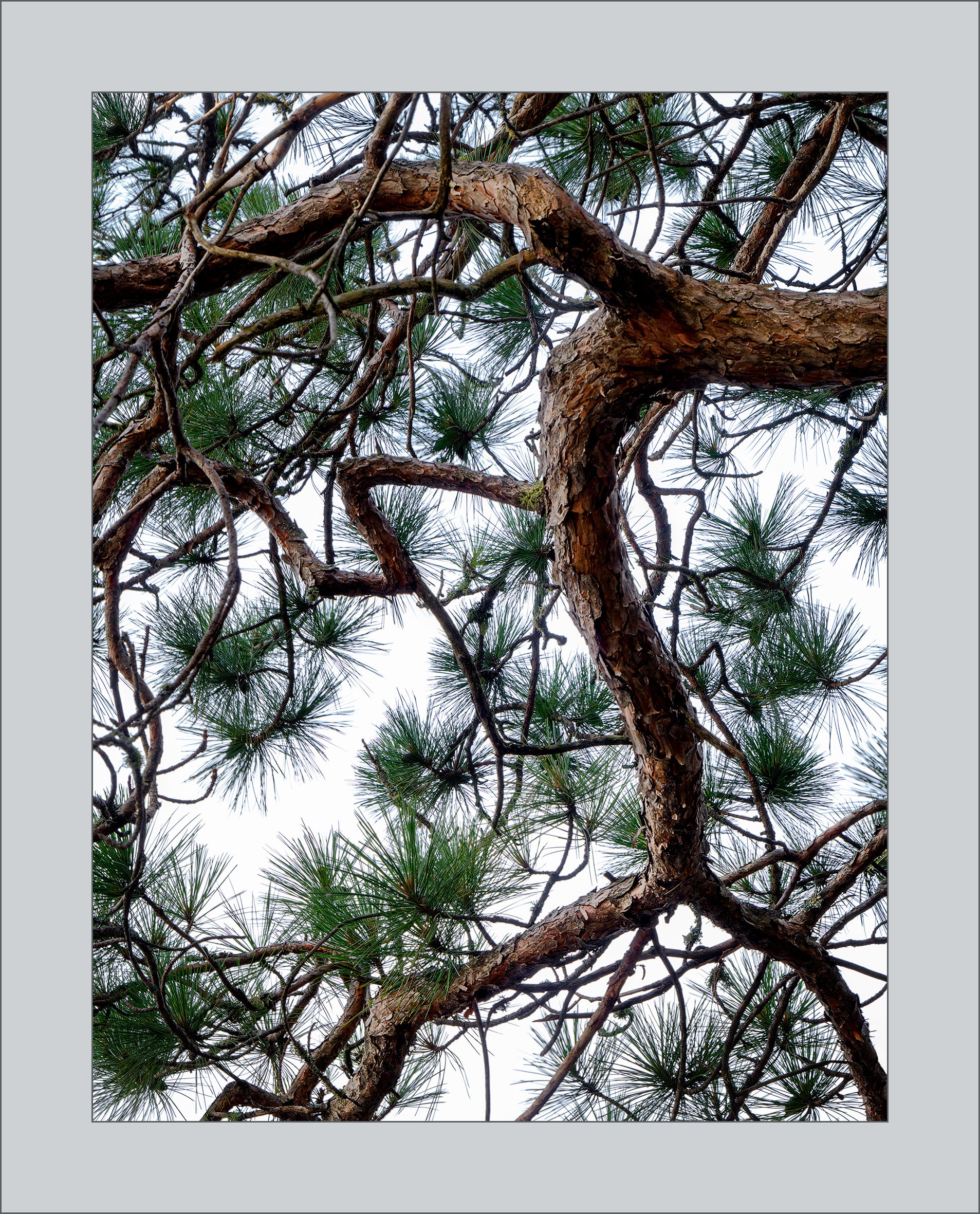
When I was going through my thumbnails in Lr, I came across a series of a dozen pictures of a tree on ledge by a lake. I was so disappointed because looking at the thumbnails it was obvious that the picture I should have taken was of the branch of that tree that leaned crazily out over the ledge – not the tree. Apparently, after taking those pictures I wandered off and took others but came back because down the row of thumbnails I discovered another dozen shots just of the branch. And I thought, I guess I’m getting the hang of this photography thing after all.
I found this picture, both taking it and working with it in post, challenging because it is hard to find balance when there isn’t even a lick of symmetry. I did a pretty good job of framing this in camera because aside from changing the aspect ratio I didn’t crop much at all. My gut tells me that overall, it feels balanced. Your feelings on that? What about colour – does the red/yellow of the bark work with the slight blue cast of sky and needles? With regards to that, I have posted two versions of the picture – one with the blue cast around the needles and one where the blue has been removed. The difference is subtle, but I’m torn and would appreciate feedback on that as well.
In addition, I would love to hear of any other thoughts or feelings that come up for you.
Hi Kerry, personally I prefer the one with the blue removed. The first one sorta feels like purple fringing and I think it takes away from the beauty of the tree limb against the sky. Just my personal preference though.
Regarding the image itself, I think there’s a nice balance to the composition. The limbs meander around, but where they leave or enter the frame, it feels planned and balanced. I can see myself laying on the ground underneath the tree and gazing up at nature’s wonder. Well done.
I have to say that I love this composition. That, to me, is what makes this picture. I suppose I like the bluish tinge to the first one because color does contribute some to this image. I suspect this would not look as well in b&w. But the overall design is excellent. Good eye to see this arrangement of lines and circles.
The color of the second one feels more natural to me. I find both of them to be really bright, and I’m not sure that’s bad or good, just immediately caught my attention in that way. The way the composition forces the eye out of the right bottom corner is a distraction for me, but that is me. Conversely the small needles on the upper left and bottom left are much more pleasing in terms of holding me into the frame. Hope that helps!
@David_Bostock , @Igor_Doncov - thank you both for taking the time to take a look. I don’t do this sort of thing very often so I appreciate the support. Igor, I too prefer the blue I think because blue is the complement to the red/orange that is predominant in the bark. @Matt_Payne - thanks Matt, your thoughts were helpful. Usually, before posting I double check my histogram but this time I forgot. And indeed, your eye did not deceive you - there was a bit of clipping in the highlights. I have amended that though I’m not sure if the relatively slight amount is what you had in mind. As to the other issue, I wondered if there might be some way to address the way one’s eye is pulled in the lower right corner. It occurred to me that there is a lot of visual mass down there because of the extent to which that lower limb is in deep shadow. If you scroll up, you’ll see a rework where I’ve tried to pull up the shadow and I think it does grab the eye less without losing the rhythm of the composition. Do you think this improves the image’s balance and helps to hold the eye in the frame more?
I’ve often looked at scenes like this, but have never thought I could make it work so confined myself to looking. I prefer the non-blue version only because I don’t think I’d see any blue if I was seeing it for real. The trailing branch on the far left frames the rest and in some ways adds balance despite a more chaotic note. The slightly lifted shadows are a nice touch that improves the overall feel even if the blue is still there.
Thanks @Kris_Smith . I decided to stick with the slight blue cast because it literally (on the colour wheel) compliments the orange/red in the tree bark. You know how it is with colour anyway - the camera offers us a colour palette that we may not see otherwise and even though it may not be exactly as it was (though we all see differently anyway) sometimes what the camera sees just feels more in tune with what I felt.
Your composition is what grabbed me here. The blue cast doesn’t bother me either way. In fact the differences are subtle. Very graphic and attention grabbing.