What technical feedback would you like if any? Sky–Too much Cyan?
What artistic feedback would you like if any? How do you like the scene?
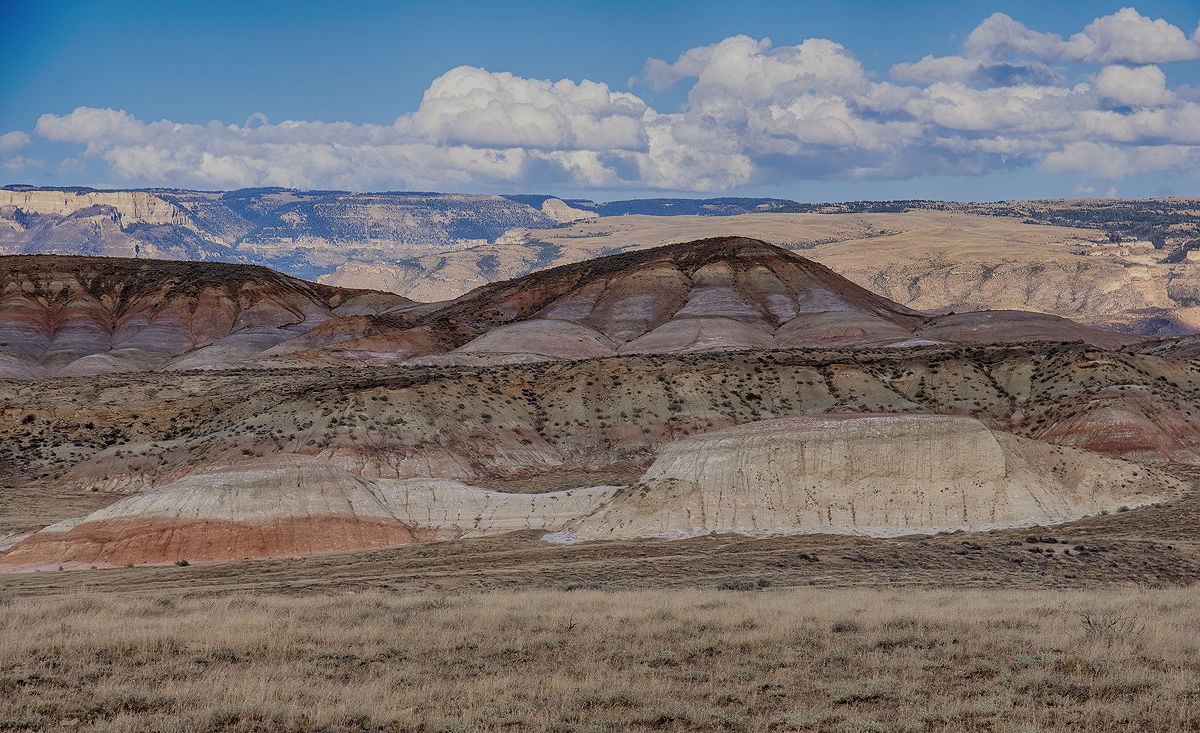
Pertinent technical details or techniques: D500 16-80mm f2.8-4.0 (1/250 sec at f7.1, Iso 200, 80mm) Levels, Luminosity masks on midtones, brights after shadows & Highlights, Layer of 85% Opacity with HDR Efex preset applied, Briughtness & Contrast, Slight crop from the bottom. Initially, I tried to reduce saturation of cyans in the sky with Hue & Saturation. This scene is from Dinosaur Tracks National Monument and yes, dinosaur’s presence can be found in the variety of tracks left in once muddy creek beds. I had to do a lot with this scene due to the shadow produced by the clouds. The sky was very light and am not happy with the result of my post processing. Please let me know what you think…Jim
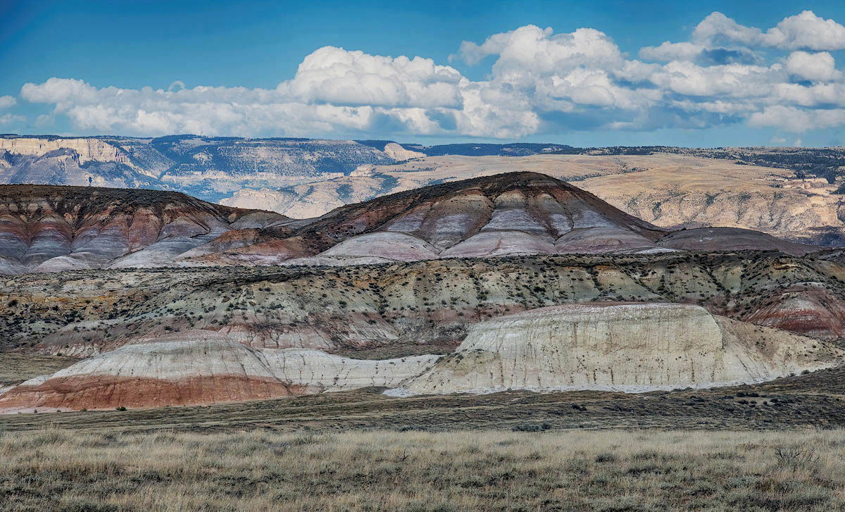
ps.: Thank you all for the hints and techniques for improving this image. Believe it or not, I applied a little bit from everyone’s suggestions to the reposted image below. Lon’s Lab Color suggestion was used to bump up the contrast and the Selective Color adjustment layer warmed up the rocks. The sky is pretty close to what it looked like on that late September afternoon. I also used some tone mapping in HDR Efex to darken the sky slightly to finish it up. Once again–Thank you…Jim
(If this is a composite, etc. please be honest with your techniques to help others learn)
If you would like your image to be eligible for a feature on the NPN Instagram (@NaturePhotoNet), add the tag ‘ig’ and leave your Instagram username below.
Its a great composition of a place I have always wanted to see Jim. I did download you photo image and tried a few things in Photoshop (lightroom classic would have worked too)
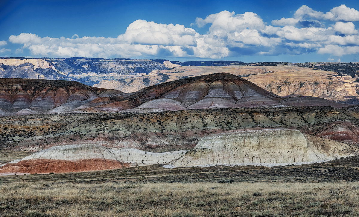
I created a adjust hue and saturation layer. Clicked on the sky and held down the ctrl key to adjust the hue of the cyan +10. Next I created a curves adjustment layer and click 2 spots one on the brighter landscape in the back and middle of the closer mountains. Then clicked on the lower point and moved the down arrow key (holding shift moves it more) Then clicked on the higer point to move it up a little. So this darken the foreground mountains more but added the contrast I was trying for. So I selected the middle area and created a curves adjustment layer. Then clicked on a midtone area and moved the point up.
You are right about the clouds and shadows, that makes it pretty hard to work with but actually it looks very good with what you did, maybe me adding contrast I did was all that was needed and the sky part. I love the contrast of the bad land like landscape.
This looks like it would be a cool place to visit, Jim. Were you able to spot any dinosaur tracks while you were there? I think @Dean_Salman’s tweaks have taken the image in the direction you were seeking. I only have one suggestion and that would be to even out the darker areas of blue in the sky; particularly the ULC; a little bit. This image also has some very nice layering to it. Nicely done.
Thank you. Yes, the BLM has a parking area with a boardwalk to an exposed creek bed that contains lots of tracks. The scenery is spectacular and it was desolate.
Jim, I like the composition. Reversing the foreground/background lighting would be superb. Unfortunately, I’m not skilled enough in post-processing to do that.
I googled Dinosaur Tracks National Monument. The only match found was in Namibia.
Could this possibly be Prehistoric Trackways National Monument in New Mexico?
We have the Picketwire Trackway on the Purgatorie River in southeastern Colorado. It’s HUGE, remote and very interesting. I highly recommend it, but the surrounding landscape is not as photogenic as your site.
Try Red Gulch Dinosaur Track Site. Wyoming. It is a BLM national landmark. Nobody visits this place and we found it by accident. Beautiful rock formations, short grass prairie, and of course several species of dinosaur tracks.
Jim, I love the layered composition, and the soft, gentle colors in the landscape. And the icing on the cake are those clouds. This is a really neat looking image. I think using less saturated colors helps to reveal all the interesting textures and subtle colors in the landscape.
I have a few suggestions to tweak this a bit. The saturation of the sky looks fine, but to my taste the sky is too cyan, and i would shift it slightly towards blue (personal taste I admit). I also think some subtle dodging and burning of the landscape would help balance the tonality of the scene.
Here is a rework reflecting my comments.
Jim, I feel the sky should be somewhere between yours and Dean’s. I tried playing with it but couldn’t get it right. I also like @Ed_McGuirk’s dodging and burning.
I would agree with others the cyan is a little over, in fact the warmer tones in the image in general, not just the sky, also seem toward the cooler side. I think your point above is right on. I think each of us have had images where piling one tweak on top of another eventually leads issues.
The good news is that I like your base image; someone mentioned layers, you’ve got a complimentary sky an there’s depth to the landscape as well.
Here’s my stab at it. Well, scratch that. Looks like I overwrote my psd file and now I can’t refer to the changes I made, and therefore have no confidence the jpg I have shows any changes. I do recall a few things:
Ed McGuirk’s processing trick for white balance. Basically open an empty unadjusted curves layer, go to options of the layer and make the below changes. Change opacity to suit. Now, I’ve found this works differently on each image - of course no image has the same color balances, hues, etc. But for the most part it’s pretty helpful in detecting and correcting color balance
Another layer I added was a simple “Selective Color” layer and tweaked the neutrals, bumping the yellow a little, dropping the cyan. Played with magenta/green but don’t remember where I settled. If needed you could do the same for the whites. This technique is more about look and feel rather than numbers. Gut feel on whether or not you’ve altered the color balance, enough, or too much
I’ve been using the LAB COLOR technique for a while and found the options and results to very effective. I wrote about this some time back and it’s in the Post Processing Discussion. What’s neat is that once you bring that Color LAB layer back in to your stack (it get’s converted back of course to your working space,) but you can use various blending modes and opacities for effect. Actually, at 100% the results look like crap, but at 20%, effective. I use Normal, soft light, overlay, Multiply, Color/Sat, The effect is very similar to the results if you add a blank Curves/Level Layer, don’t make any adjustments, but change the blending more to Soft Light. A good contrast enhancer.
Anyway, I’m really bummed I didn’t save the work, and sorry too late and tired to rework. But maybe I will
I really enjoy the layers you caught here Jim. I also agree that the image is too cyan; I could see it moving towards red, but slightly less yellow than magenta. I don’t find they help with some scenes, but shooting a gray card can sometimes be very helpful to stay grounded in proper color.