The photographer is looking for thoughtful feedback on the image as a whole, especially around the areas noted below.
Feedback Focus: Artistic / Expressive
About This Image
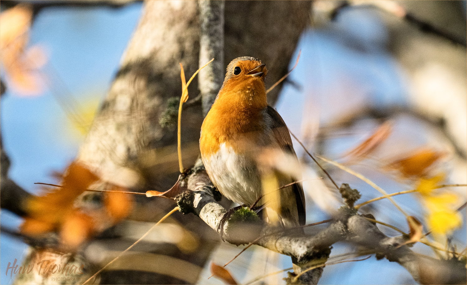
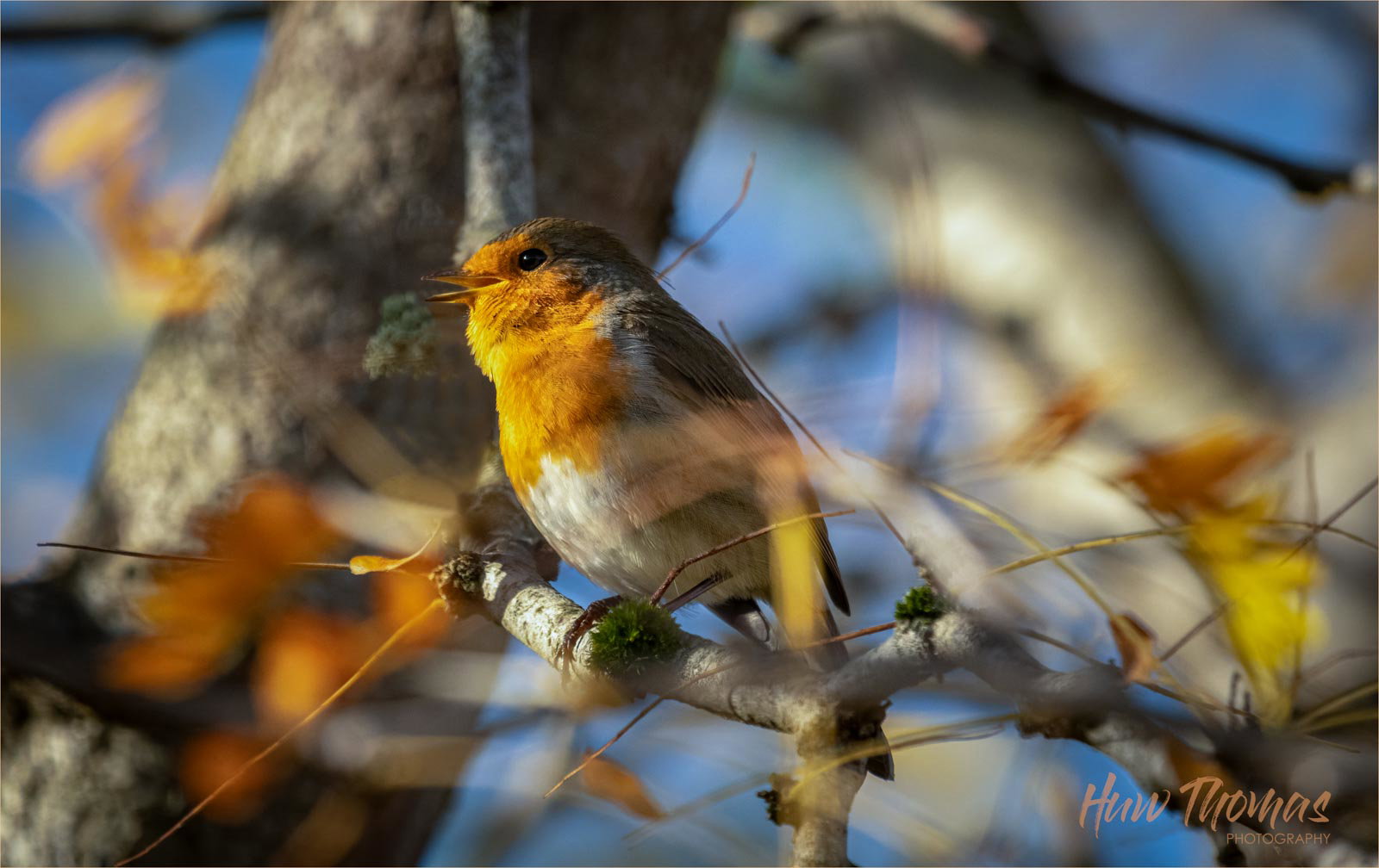
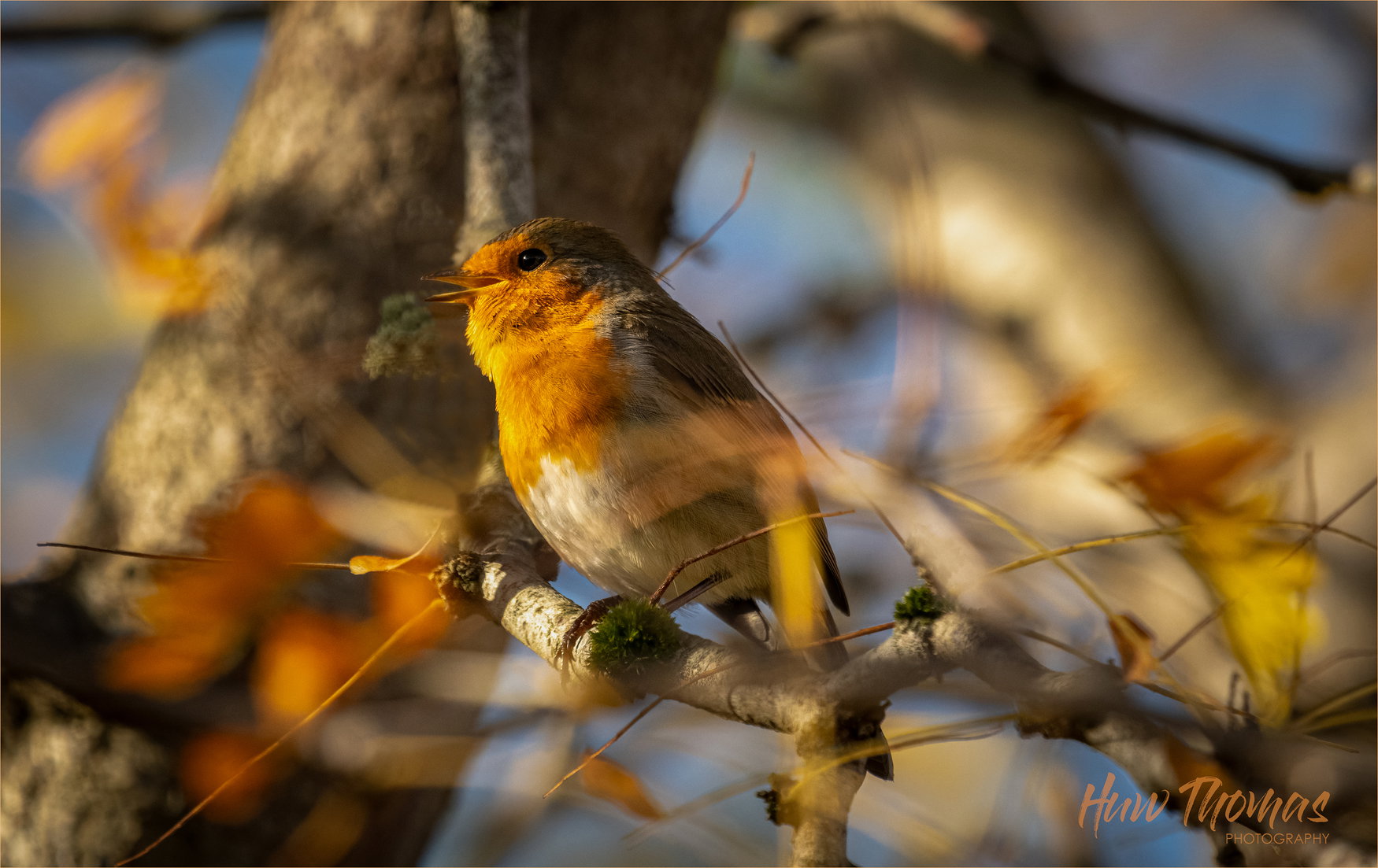
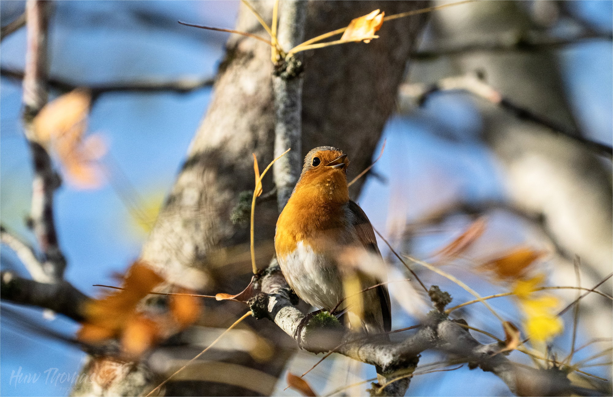
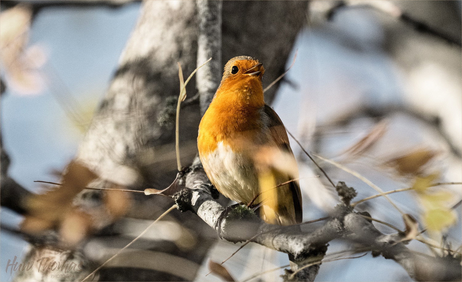
Enjoying a colourful false acacia tree - the colours just seemed to match up in a lovely way.
Intentionally narrow DOF and blur.
Feedback Requested
Wanted a nice composition - it was the colours that made it (to me) a bit special
Pretty much framed as in camera - reduced the highlights a fraction and needed very little denoise - masked so only affected the bird. Just love the red/ oranges and flashes of yellow
Of the two, I prefer the second, Huw. In the first, the background is so warm that the bird tends to get lost in it, particularly the beak. The bird pops very nicely in the second and the splashes of color from the leaves stand out more against the cooler background. The personality of the robin also comes through much more in the second image.
Of the two, I prefer the second, Huw. In the first, the background is so warm that the bird tends to get lost in it, particularly the beak. The bird pops very nicely in the second and the splashes of color from the leaves stand out more against the cooler background. The personality of the robin also comes through much more in the second image.
Thanks @Dennis_Plank This surprises me a little, compositionally and colour wise the original was all about the colour, I have now tweaked the WB of the first to cool it down a little, but I still prefer it artistically because of the colour harmonies between the red/orange and yellow leaves are mirrored in the sunlight hitting the robin’s chest. The blue comes through as a nice pop (complementary colours) and I can see that the harmonies are much more subtle in the second with the brighter blues.
I would imagine as a bird photographer prefers not to be distracted by arty colour matching but I like the camouflage in the first.
I may be missing the point but if you have any more explanation and direction I would appreciate it.
I’m less birder and more arty photographer but eager to understand and see both sides
Hi Huw. I think it’s all in what the viewer thinks the photograph is about. Coming from the last fifteen years as primarily a bird photographer, I tend to focus on the bird itself more than how it works with the overall colors in the image. In the bird photography world, there is a tendency to focus on separating the bird from the background so that it can be distinctly seen and appreciated without regard to that background and we are constantly talking about distracting elements, overlapping birds, etc, etc, ad nauseam. Most of us start out trying to make the bird fill the frame as much as possible, and I know old pros who still preach that mantra for all wildlife photography and carry it on for other genres as “make the subject fill the frame”. Most of us, as we practice the art longer, tend to move toward looser composition and including more of the environment in the image and away from the dreaded “just another bird on a stick” summary. However, there remains a tendency in most genres I’ve seen, (wildlife, macro, birds, flora, etc) where there’s a central subject, to de-emphasize the background.
In the temperate world, bird photographers at least have the excuse that many of the species we are trying to photograph are cryptically colored and making them stand out from the background can be a bit of a challenge.
As in everything in art, that’s neither good nor bad, it’s just the way most people are doing it currently.
Hi Huw. My favorite is revision 1. I like the pose of the bird with the open beak and the background tree looks more natural and doesn’t seem to be competing with the bird. The color of the leaves work well to complement the robin’s colors and I like the warm/cool contrast of the image. To speak to Dennis’s comment, I think it depends on the situation you find the bird in, but when possible, my goal is to put the bird in a pleasing setting, that by itself would make a nice image. Of course, the birds rarely cooperate. But , I too, have taken enough documentary shots that I’m now looking for something more.
Useful summary - thanks
I like pushing the boundaries - although I love animal and bird images - doing amazing things, my creative journey is definitely about sharpness,artistic blur and colour harmonies and mixes
Thanks @Allen_Brooks
I appreciate @Dennis_Plank 's comments and am learning loads - but your summary above definitely echos my current position and direction.
Revision 1 is my favourite too. I like the warmer original - but can see it was a bit OTT and the blues contribute more to a nice autologous colour theme
The Robins are interesting, but the background seems to take over the photograph. You could maybe look at making the background into B&W, reducing the saturation on the Robins.
For me I like the way the red and oranges of the robin are echoed in the Autumn colours of the Acacia.
I understand completely on a forum like this representing the. birds faithfully against a neutral background is the way to go, but I love the overall composition - a symphony in reds and yellows.
I have recently studied Whistler and he named his portraits as musical pieces, Symphonies and nocturnes - the colours were is dominant reason for painting - with the portraits just producing an income.
I would like the Robin to take a major part of the image - but enjoy the way the background and bird harmonise with each other. I do appreciate your suggestions - I have played with your ideas but I current feel that the division no1 is my preferred version
Many thanks for taking the time to comment - very much appreciated