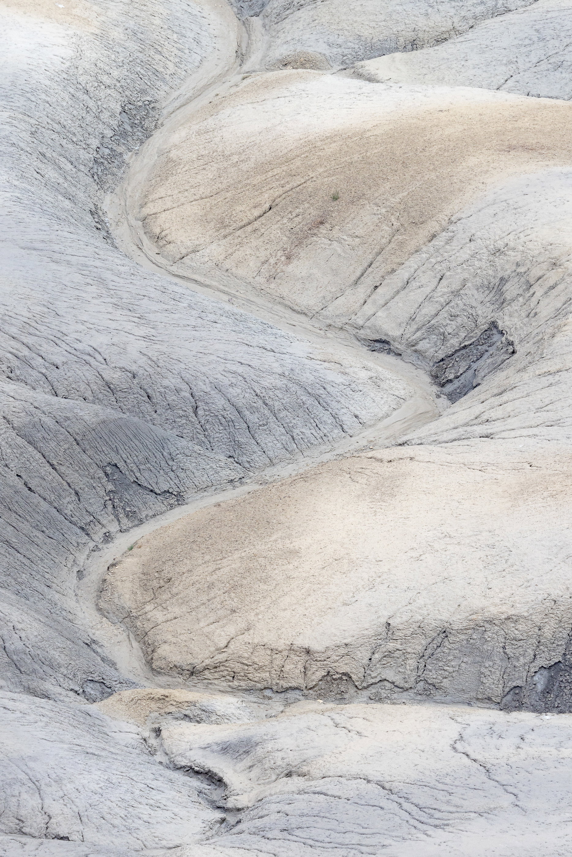
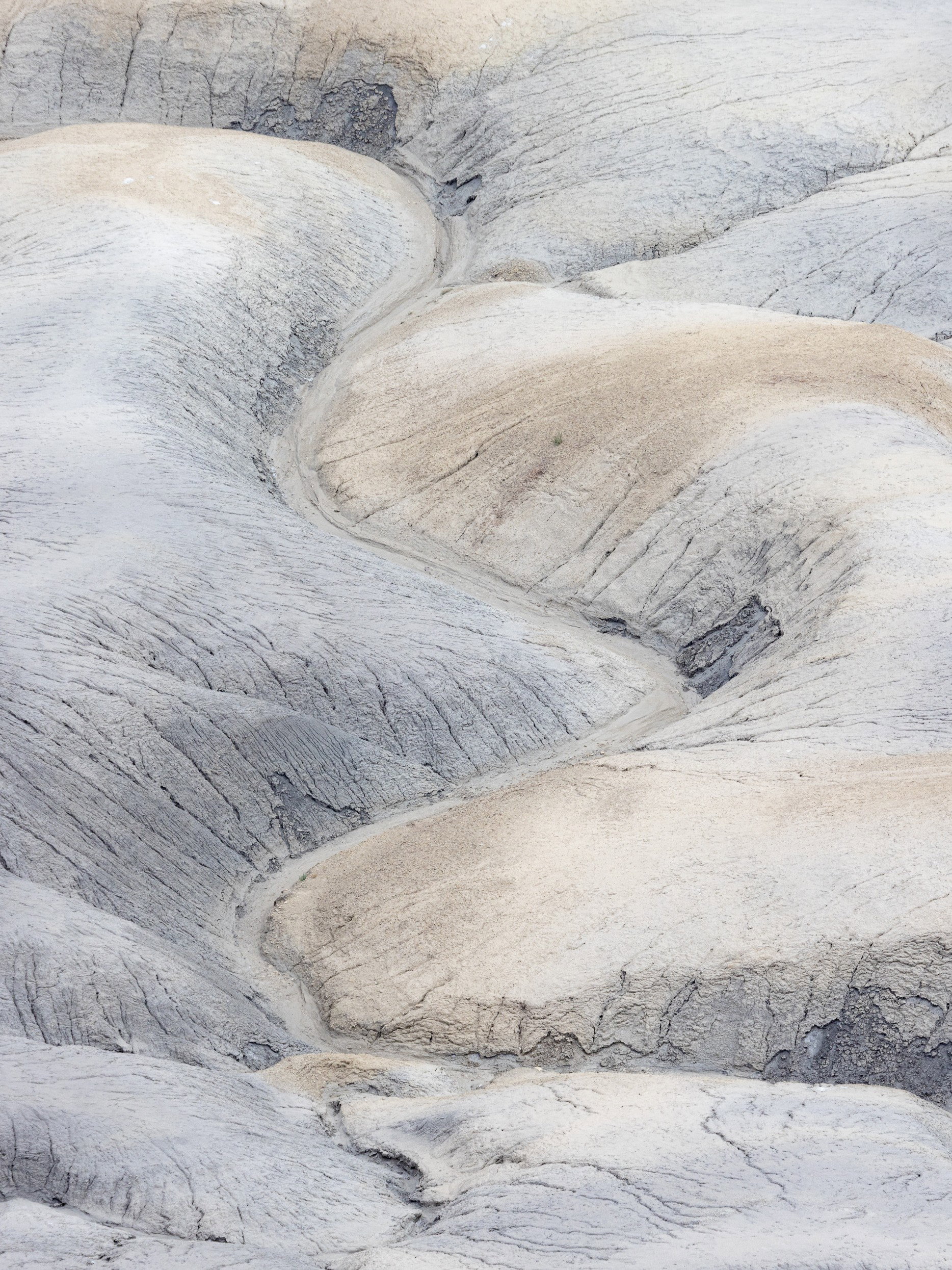
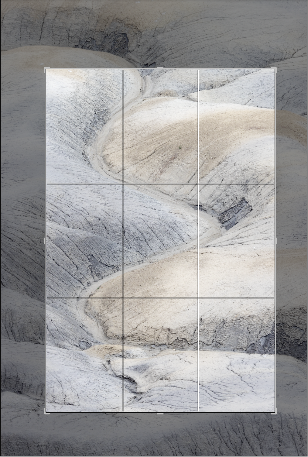
What changed: Went with what I thought was a more pleasing crop to include more of the sweeping S curves in the image, just brightened the light areas a tad with a mask and brush, bumping the whites.
Added after receiving feedback from the community.
The photographer is looking for thoughtful feedback on the image as a whole, especially around the areas noted below.
Feedback Focus: Artistic / Expressive
About This Image
I was shooting the Moonscape Overlook area outside Hanksville Utah and was focused on more of the “Grand” compositions and then looked down at the badlands in the foreground and the curves and softness of this scene caught my eye.
Feedback Requested
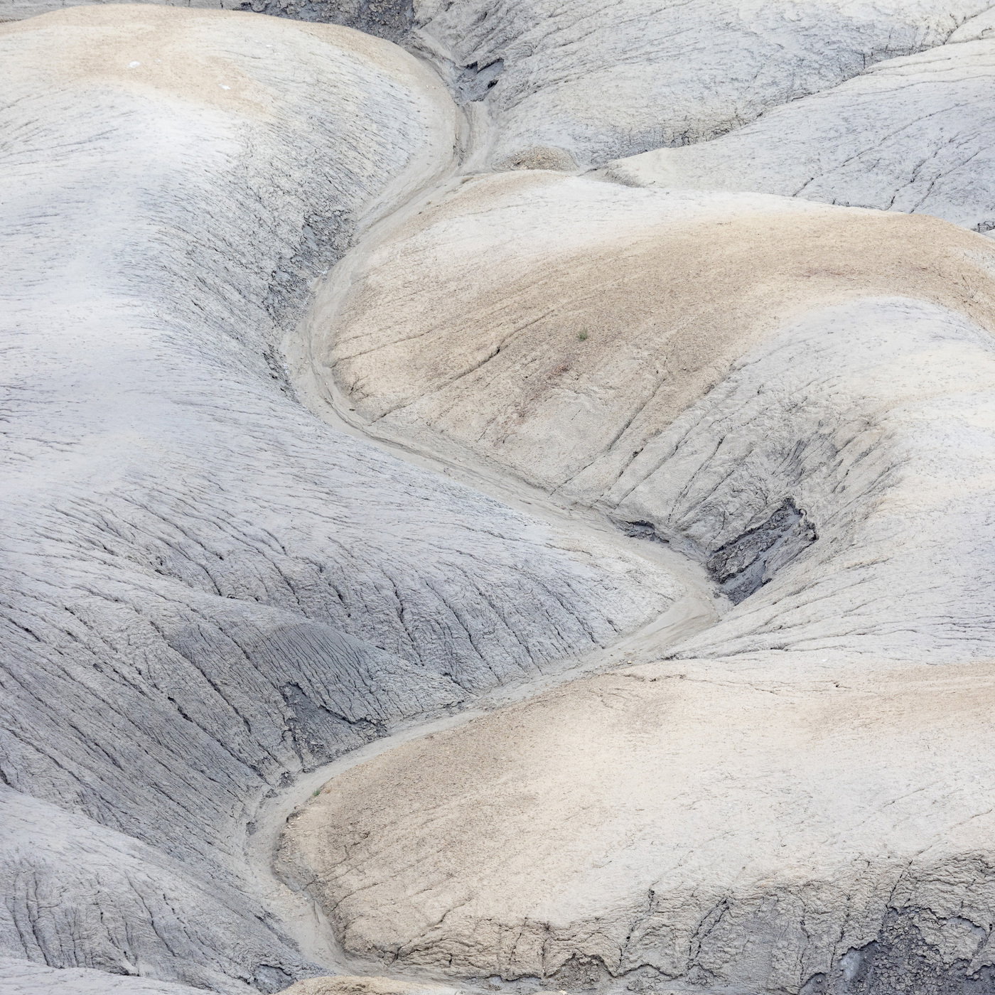
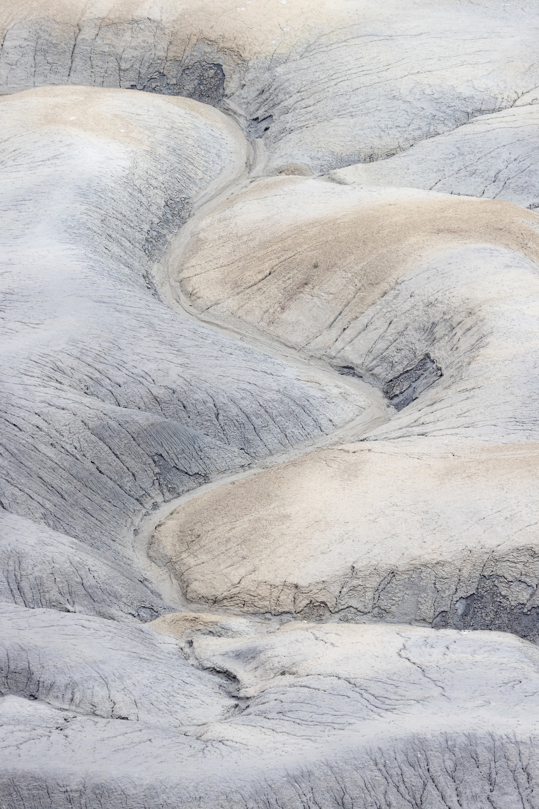
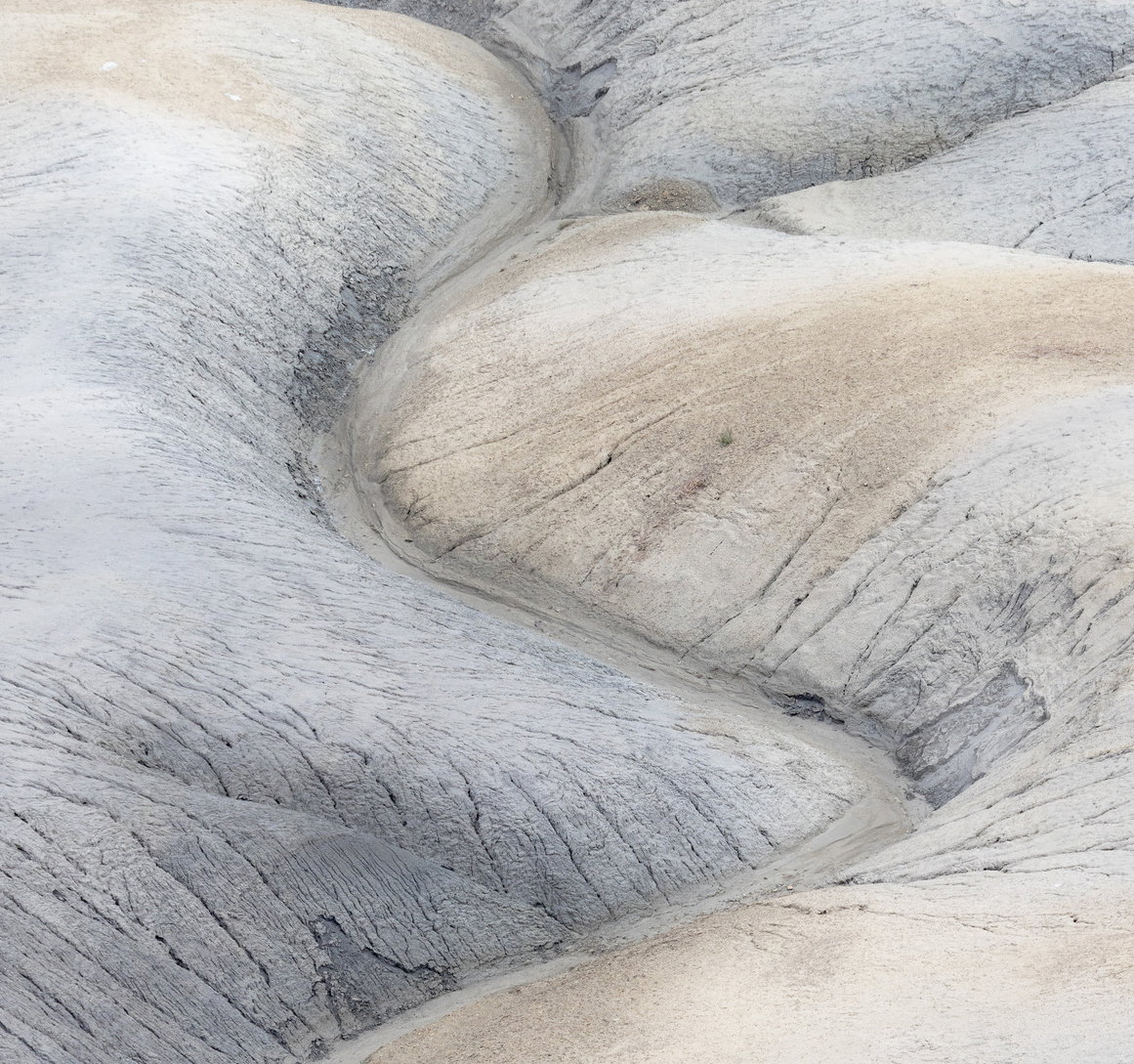
I am leaning towards less is more with the 1:1 crop. What do you think original or cropped?
Technical Details
First choice cropped
Camera: Canon EOS R5
Lens: RF100-500mm F4.5-7.1 L IS USM
Focal length: 270mm
Shutter speed: 1/320s
Aperture: f/9
ISO: 800
Original
Camera: Canon EOS R5
Lens: RF100-500mm F4.5-7.1 L IS USM
Focal length: 270mm
Shutter speed: 1/320s
Aperture: f/9
ISO: 800
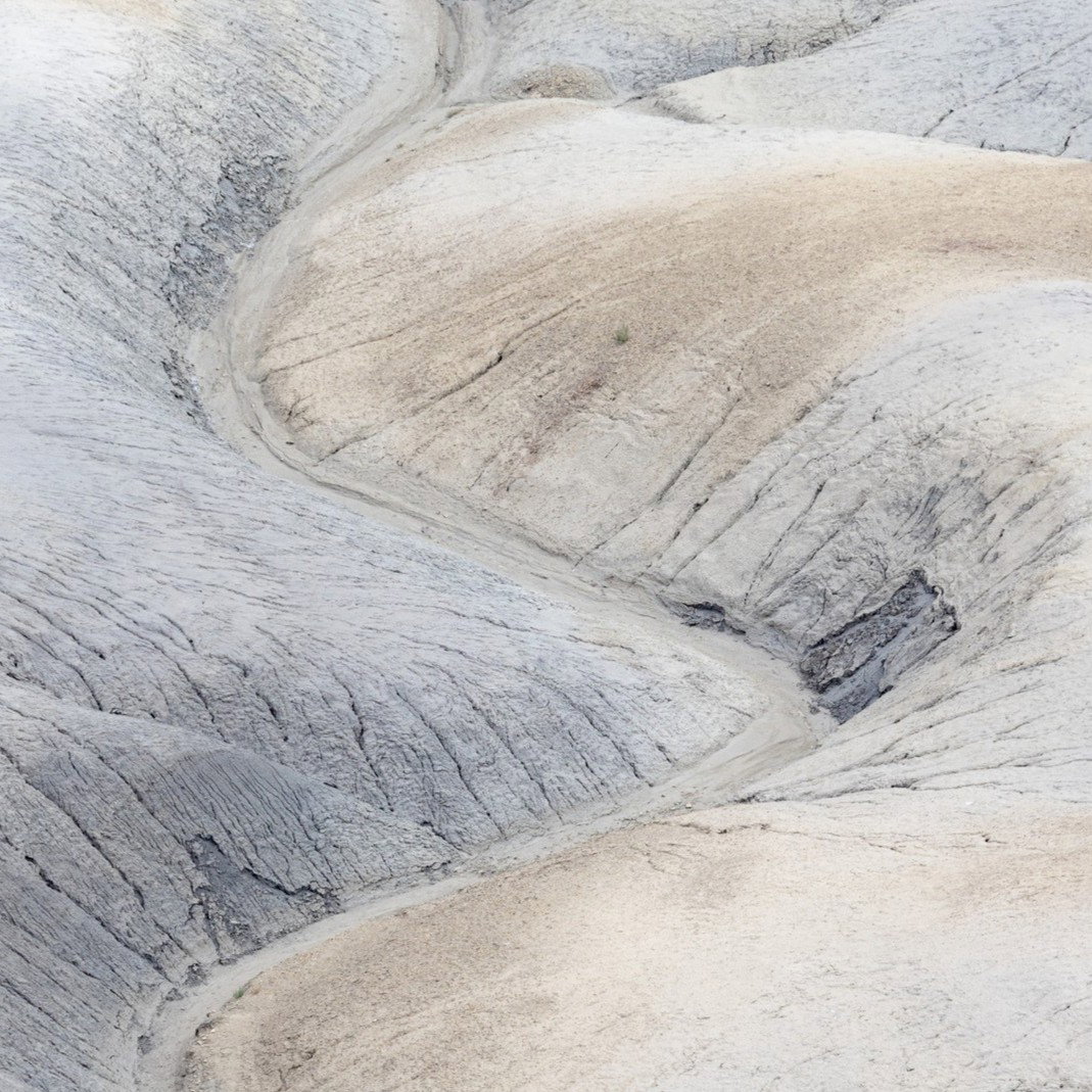
Both are lovely!! I love the high key but still very rugged look, and the absence of a sense of scale. I could go for a third version where your original is just cropped from the bottom as in the top image but still has the extra room on the top from the original. Great finds often have several crop choices.
I can see why this caught your eye as both images look great and are winners IMO. The pastels and the slight high key effect are quite lovely and I like the way the ravine snakes it’s way through the scene. My only real suggestion would be to include more of or crop that darker area toward the ULC;in the first version; as it catches my eye a little. Beautifully done.
Keith, I think this looks great! I really like both versions, actually, and it’s hard to pick a favourite. If I had to choose, though, I’d lean very slightly toward the second, rectangular version. I think that’s mainly because, in general, I find square images can feel a little more static and have slightly less energy to them.
Keith, I too like both versions. The cropped version flows very well up and down, with the small side drainages adding interest. Either a touch more or less at the top would work well, letting the full curve in the upper left show or leaving it off altogather. I do think that the original showing the “lead in” at the bottom adds a lot to the story, although there I could see losing the bottom most slope. The somewhat high key and subtle colors look great.
Both are nice - but definitely the orginal as there is more variation and more of a flow -
looks to me like a part-finished pencil and gauche artwork . Love the darker detail in the 2 bits which are on the edge of the tighter crop
I like both crops but prefer the square version. it homes in the details and the nice sight path through the scene. I also like the way you processed it. The high key look works nicely.
Hi Keith,
Both are quite nice. I like the subdued contrast and the serpentine line through the frame. I was curious about what others might say on cropping. My instinct with both was to crop each a tish more. I don’t really have a preference for the square or the vertical, but for each, I can imagine a slight trim, especially off the bottom.
For me, the distraction in the square one is both the slight “slough off” in the top and the small shelf at the bottom. Those two features divide my attention graphically as I move through the frame. I’m just thinking, does it add to my appreciation? If not, let it go. So, for that one, simplifying (I probably did too much here), might be worth playing with. If that removes your favorite part of the image, ignore me entirely.
For the vertical one, it’s the edges at the top and the shelf at the bottom, but I like the full breadth, so for this composition, I can see going with a slightly shorter, wider vertical composition.
As always, it’s quite possible that what I find distracting is of zero consequence for others. Just some variations to consider. I know that once I settle on a crop, I rarely think about it again; however, as soon as someone identifies another possibility, I end up preferring that. Personally, I tend to be too conservative with my own crops and merciless with other people’s images. So please, take with a grain of salt if any of this strikes you as “hell to the no.”
I can see why you went with the crop, Keith, as it eliminates that bar at the bottom that does tend to interrupt the flow of the image, but at the same time, the image is largely about the flow and as such, I tend to prefer a vertical rectangular presentation that accentuates the flow. For minimizing the effect of the berm at the bottom, the second crop @Marylynne_Diggs presented works very well while still maintaining the longer flow.
THANK YOU @Marylynne_Diggs@Mark_Seaver@Ed_Lowe@Dennis_Plank@Preston_Birdwell@Huw_Thomas@Tom_Nevesely@Diane_Miller for all your takes on what I thought was a simple composition and subject. But I find these “simple landscapes” to be some of the most interesting for the very reasons all of you have pointed out! The rework I posted is after some reflection and input from you all, this is my current favorable iteration. I was drawn back to what drew me to this scene and that was the curving valley between the mounds of ancient sea bottom.
The square format seemed simple and more intimate than the original and I still like it for it’s simplicity but after sitting on the image for a bit and thinking about all your comments and suggestions, I now favor the rework which is back to the 2:3 format. It really is fascinating posting an image on NPN and then seeing it through others eyes, what then comes to your own mind. I guess this is partly how one grows as a photographer and I appreciate all of you taking the time to provide feedback!
Keith - Late to the party here but thought I’d weigh in on the side of less is more, along with @Marylynne_Diggs . It’s a beautiful image of lovely hues and tones and shapes. I like it very much. I’d be tempted to cut out all the gulches around the top and bottom and make the story about the lovely S-curve. I think the other bits could distract from the story about the beautiful curve, which maybe is why you selected this compostion in the first place …? I’ve given it a try, and added some masking and tone curve adjustments to try to make the gulch more apparent, and tone down the black box in the centre, hopefully bringing the viewer’s eye to follow up and down the curve without too much interruption.
Anyways, this is all just my opinion. in any event, i think the desaturated, high-key processing is very nice. A lovely image no matter what the final crop, imho.
Thank you @Doug_Wilson for this version! I do like it a lot and does as you say, emphasizes the S curve and I also like how you toned down the darker areas to carry the overall soft feel of the scene!
Nice job on “looking down,” something that is easy to miss when the original target is grand.
Of the three you posted, I definitely prefer your revision. The square crop feels overly tight, and the bottom ridge in the original breaks the flow moving into the picture to the wonderful serpentine channeling. I also really like @Marylynne_Diggs 's vertical, because I like that final bend to the left.
Keith, Revision 1 is spot on to my eye. There is an exceptional graphic quality to your image for me, I enjoy to perceive it as an abstract. Thanks for sharing.