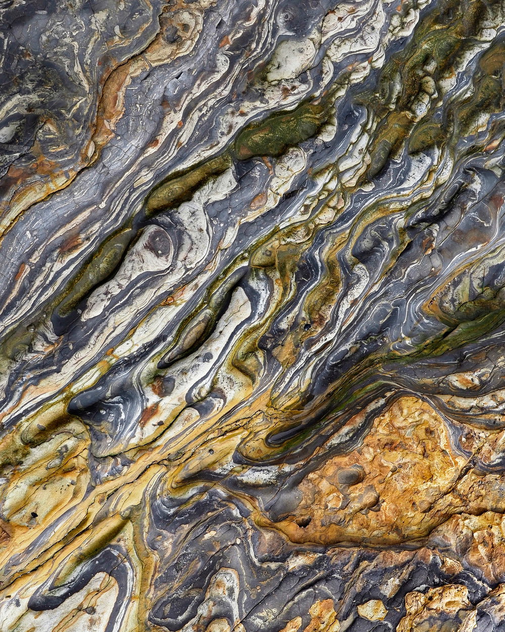
The photographer is looking for thoughtful feedback on the image as a whole, especially around the areas noted below.
Feedback Focus: Artistic / Expressive
About This Image
My favorite location for this kind of photography – aside from Utah – is Point Lobos State Park, south of Carmel, CA. Wind and waves have carved the crazy sedimentary rocks into a photographer’s smorgasbord of abstracts. The rock compositions are often decorated with colored pebbles as well.
I want to add something which many of us may relate to – I was first inspired to shoot these kinds of images by the Sierra Club Book “On the Loose,” published in 1967. I still have my copy, a gift from my sister. On page 69 is a photo of rippled, pale red rocks with trapezoid joints like picture frames. The caption: “So you went to the Louvre; what did you see?”
Feedback Requested
The challenge here for me was how tight to crop. This is only about 1/4 of the original image. Probably the size of a print would help answer this. Sometimes these kinds of compositions can have too much going on. Certainly there is no point of interest; the whole image (I hope) is a point of interest.
James: Reminds me of my prescription scribnature, er, signature . What a delightful scene that one can enjoy for a very long time. Wonderful find and an even more wonderful result. >=))>
James, wow, you’ve got a frame full of highly distorted and colorful rocks. This is a nicely abstract view, even as every bit is real. If the rest of the frame shows this much distortion and color it would probably make a fine abstract as well. In many abstract the best part is when the viewer’s eye continually roam the entire frame, with only a few, slight resting places. (In this case, that’s the big orange blob near the upper left and the “zebra” type angled stripes through the middle.)
Point Lobos has some serious history as a photographic subject; I only wish that I will be able to make images there sometime. This photo I think captures the essence of subjects like this; I would like to see the entire frame, since you mentioned it, but think this crop does well. My own preference would be to have more consistency in the pattern across the entire frame (e.g., excluding the orange area), but that’s merely a matter of opinion.
A lovely find!! The patterns are amazingly fluid and the colors delightful! Although there could be a huge number of compositions here, I do like this one with the inclusion of the different area. I think you did a good job of framing its inclusion – not always easy with a scene like this.
Wonderful, outstanding! The patterns in nature are so often just amazing. Pt. Lobos is not exception for having a wealth of these gems.
Excellent framing and the processing is spot on. I have no nits really. I do have a suggestion for an alternate, which of course is just a perfonal preference. I guess one advantage of not being there, I don’t have the reference of what the original orientation was. For all I know, you’ve already rotated, flipped or whatever. Of course with scenes like this, it really only matters to the photographer who was standing there. So with that, you may or may not like my alternate. I rotated and flipped to put that orange conglomerate in the LRC. Not sure why, other than it feels better weighted - if that makes sense. YMMV. And no matter how you slice and dice, this is a wonderful capture of nature’s abstracts.
A gorgeous image, James. I don’t see anything I’d change in this. @Lon_Overacker has an interesting alternative, but when I look at yours, my eye keeps moving around in the image, more or less in circles, whereas in the rotated and flipped version, it feels like there’s a lot stronger directionality from lower left to upper right that tends to move my eye through and out of the image.
Many thanks Dennis and all who commented — I have made some 11x14” metal prints of similar abstracts from this area but decided they are probably too small. Or should be framed matted. And lit.
Might be a rule that if we take closeups of geologic mosaics and swirls to imitate dazzling abstract paintings, the only print that will deliver the desired impact is a large one. The rocks certainly seem to deserve a shot at being captured as great art.
I’m still wondering what to do with some delightfully rippled closeups of the multicolored pebbles in the stream beds of Glacier NP !
The patterns are incredible and the warm yellow browns against the darker blue gray swirls work very well in your comp. As abstractions go, this one generates a lot of interest for the eyes. The implied diagonals in the frame provide pathways for the viewers’ eyes. Very nice…Jim
Much appreciated Jim. I need to schedule another few days there for geologic abstracts. Trouble is, the bird and seascape photography is often so good that I forget to look down at the rocks I’m standing on. A good problem to have.
What’s your thinking on how large these kinds of images should be printed?
This is beautiful - I’d describe it as very tactile; it appears almost three-dimensional. I’d attach it to a ceiling and stare at it for ages, changing my orientation from time to time.
I would go bigger than an 11x14 print for sure if you have the pixels for it. The subject matter is too complex for small print sizes. Although, this one printed at 11x14 with a wide non-textured white mat and very simple thin, dark frame would be wonderful as well…Jim
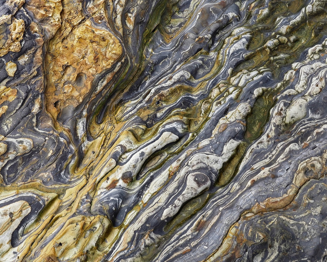
 . What a delightful scene that one can enjoy for a very long time. Wonderful find and an even more wonderful result. >=))>