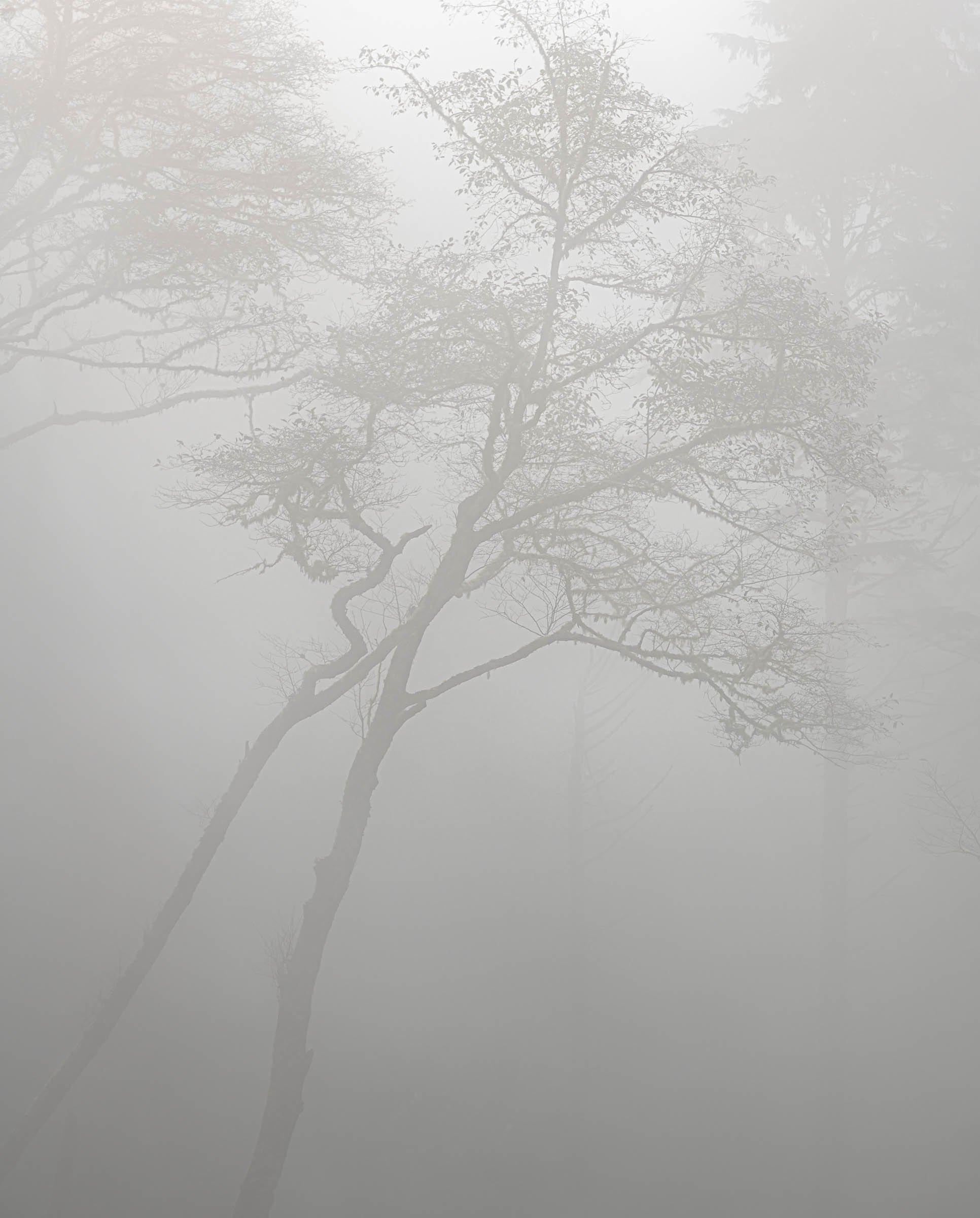
I made changes in LR based on comments, plus I played a little. This is from @Igor_Doncov’s suggestion of lowering the contrast a bit. I like how it brought out more detail as well as lightening the fog a bit.
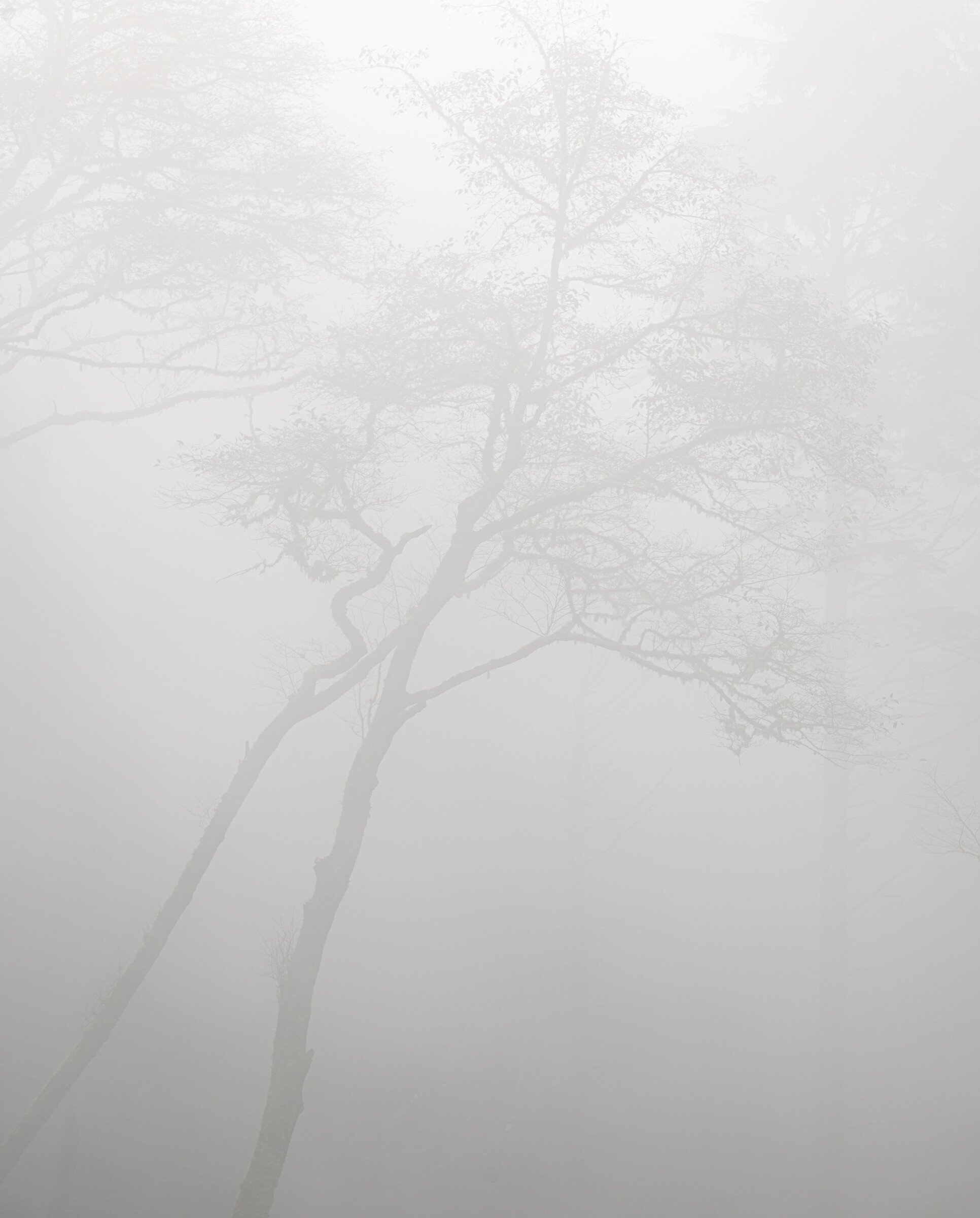
Now for @Lon_Overacker’s suggestion to move it a bit more towards Hi-Key. I went a bit over the top here but what the heck! It certainly made it more ghostly.
In October, @John_Williams and I took a trip down the Oregon coast. We drove through the Otter Crest Loop road in the fog (that’s kinda redundant since the whole trip was in the fog!). This is my take on the twisted trees we spotted. John’s version is here. He shot from a different angle and brought out more detail. I wanted to emphasize the fog more so mine is a bit more ghostly.
Type of Critique Requested
Aesthetic: Feedback on the overall visual appeal of the image, including its color, lighting, cropping, and composition.
Technical: Feedback on the technical aspects of the image, such as exposure, color, focus and reproduction of colors and details, post-processing, and print quality.
Specific Feedback and Self-Critique
I’m not sure this image works as presented. I’ve thought about darkening it a bit and cropping to focus more on the twisted shapes. What do you think?
Technical Details
Nikon D850, 70-200 at 102mm, ISO 64, f8, 1/250 second
If I hadn’t been there, I would have thought this was a toned black and white; the subtle color is fascinating and I like the warmth it adds. (My memory is that we were here late morning, and that the sun was a little up and to the left trying to break through the heavy fog.)
The diagonal lines leading in from the corner work well for me, and the touches of the trees on the upper left and on the right are nicely framing those two guys. I think your choice to leave the lower contrast works; it really does give a ghostly feel.
Very interesting to see the two versions as they are so completely different. Personally, I prefer yours because of the semi-abstract nature of it. It is very moody and dream-like or better, as @John_Williams put it, ghostly. Me, I wouldn’t fuss with it too much more. What gives this image its power is the ambiguity of it - I wasn’t sure, for example, if I was looking down at the trees (a reflection) or up at them. Recently, when Eric Bennet was doing a guest critique, I asked him about originality and what he said stuck with me. He said, “If I was there with you, would I have seen the same thing that you did?” In the case of this image, clearly not.
The beauty is subtle here and it takes a bit of looking to recognize it. For example, I like the tonal gradient that comes from the lower left quadrant. I played with it and found that by lowering the contrast the shapes seem to come out more. By a very tiny bit.
Thanks @John_Williams! I also remember it as late morning. The light changed quite a bit while we were there. I took this shot at least 3 different times. This was taken when we first arrived and the fog was heavier.
Thank you @Igor_Doncov! I like your subtle adjustment. I had not tried reducing the contrast and I think that’s what I was looking for.
Just wonderful, fantastic! The fog of course makes for almost a mysterious mood and atmosphere. What is unique here in my mind - and works beautifully btw, is the composition and how the canopy is pushed towards the top and the two trunks eminating from the negative space at the bottom.
It’s hard to see the color, although I imagine gone purely greyscale some of the mood would be lost. The only suggestion I can think of would be to push this even further towards hi-key. But that would also change the mood.
Thanks @Lon_Overacker! I think I will try pushing more towards hi-key. It may make the trees fade into near nothing but somewhere in between might be pretty cool. At least it will be a fun experiment.
Interesting to see the variations Steve. I think, especially given the push of your title, I still prefer the original. The contrast to zero is a close second.
Hi Steven, super lines and minimalism here. I love your original best, though. To me that brings out the foggy circumstances and the mysterious mood more. Whichever version you decide to go for, I like them all.
Best, Ingrid.