The photographer is looking for thoughtful feedback on the image as a whole, especially around the areas noted below.
Feedback Focus: Artistic + Technical
About This Image
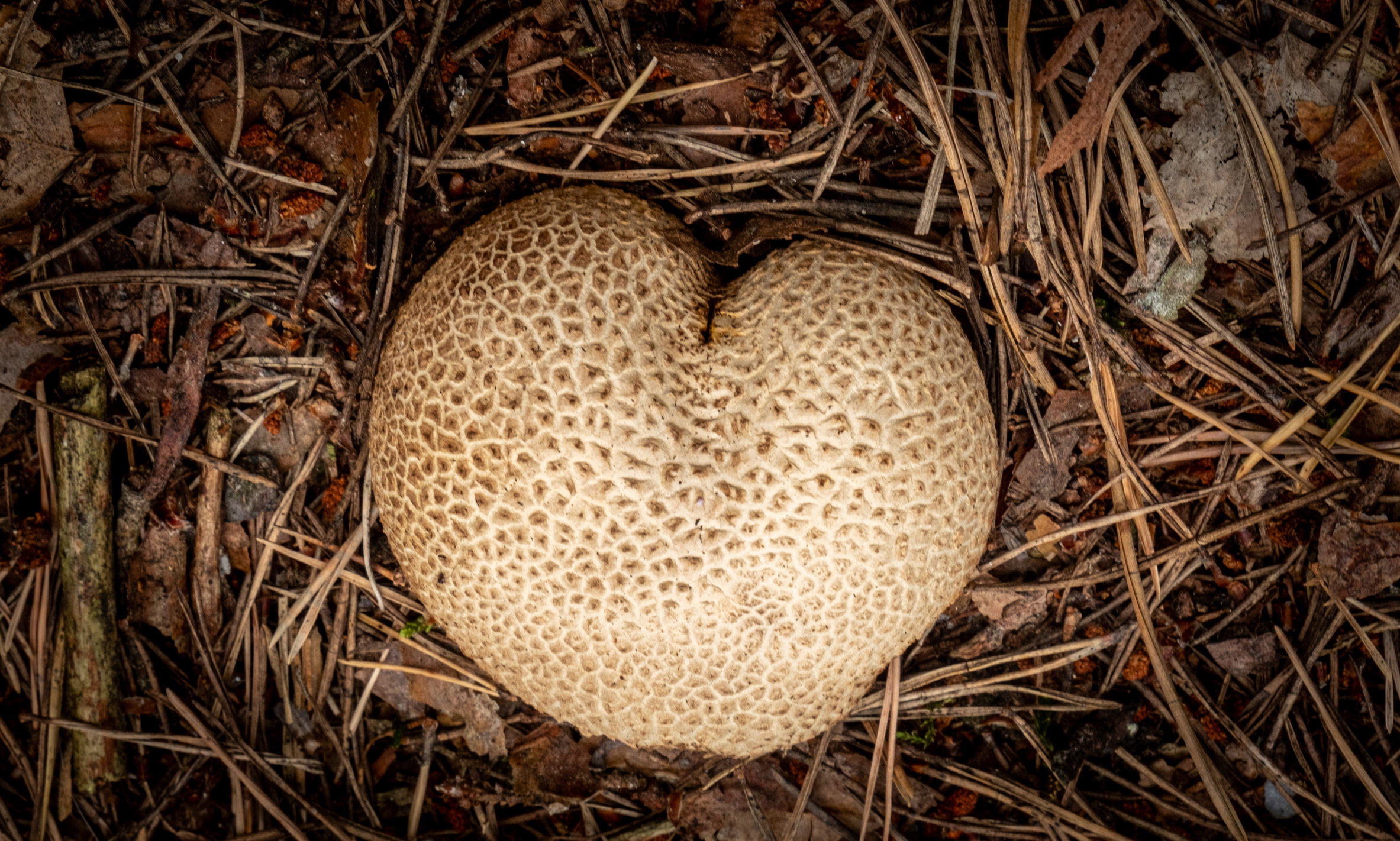
I found this puffball on the forest floor and was immediately drawn to its almost heart-shaped form and the fine pattern of its surface. For me, the contrast between the pale mushroom and the rather chaotic texture of needles and leaves around it is what makes the scene.
Feedback Requested
I’d be interested to hear whether the surrounding forest floor adds enough context or feels too busy, and whether you would have framed the mushroom differently (this image is cropped). I’m also curious about the vignette – does it work for you, or is it too strong or too subtle? And would you prefer the forest floor somewhat softer or blurred, to separate the mushroom more from its surroundings?
Horst, the heart shaped Puffball look great. Its shape, brightness and textures set it off very well from the forest floor. Personally, I’d avoid the vignette but crop to a square, or 4x5, around the Puffball. I like the details in the forest floor. They are what you see there, which is important in putting the Puffball into context.
Horst: Great find and a solid capture. I’m with Mark on cropping this a bit tighter, (I would favor the 4x5) but I like the vignette, perhaps just a smidgeon lighter. Good eye, good shot. >=))>
The debris looks fine to me since that’s where these guys fruit, but I feel that the overall effect of the debris works better when the stuff is basically all the same size. The bigger bits on the left drew my eye too much and so my crop. The textures are so crispy and I can feel how dry it seems to be. Vignettes are funny, I use them sometimes, but honestly didn’t notice one here so for me it looks just fine. Blurring would throw this off for me since the subject and the surroundings are in such proximity. Nicely seen.
Visual Notes
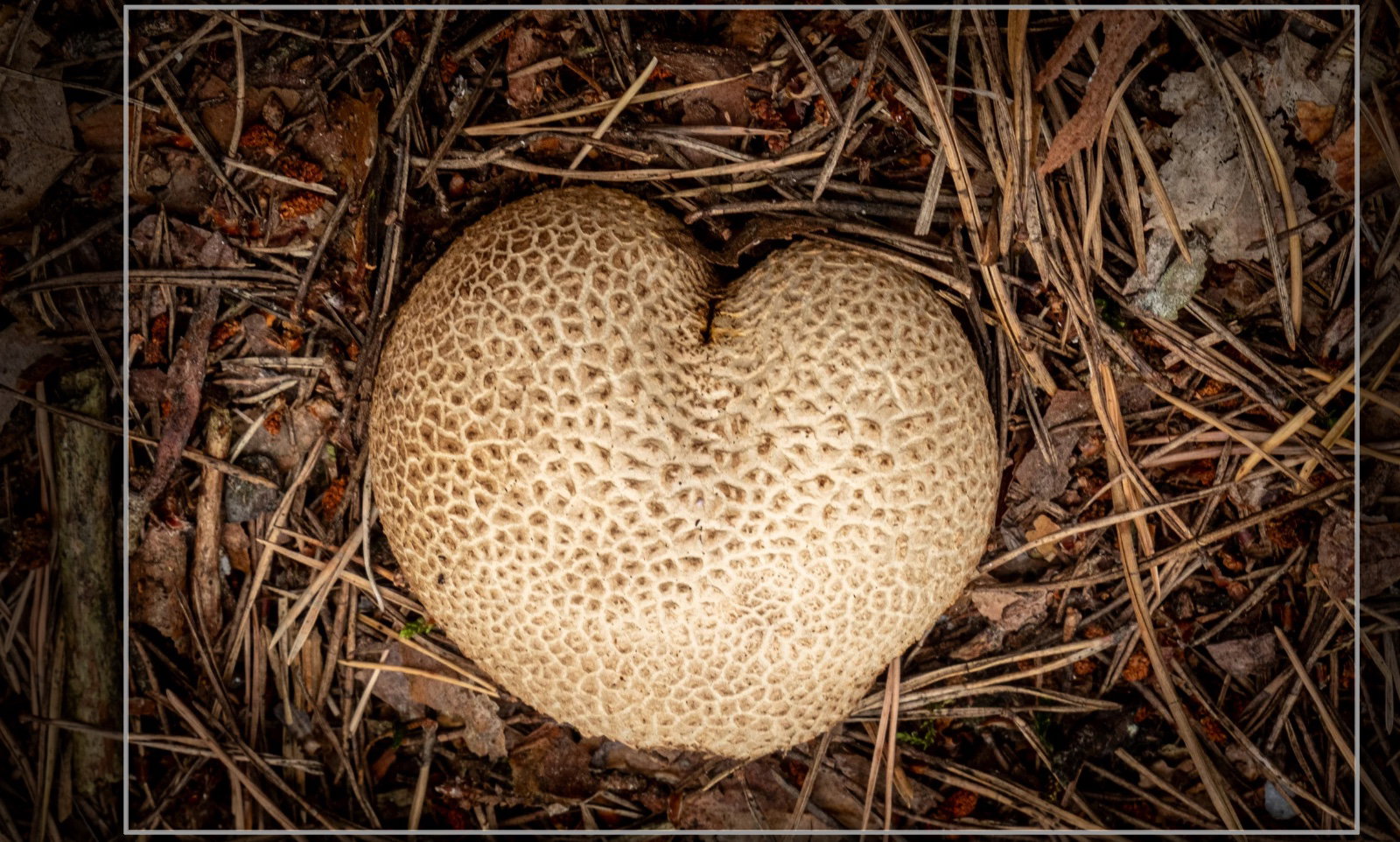
[Crop] eliminates large stick on left, while still maintaining a lot of the surroundings
Hi Horst,
I like this a lot, and I like the amount of detail in the needles/background. To me, the separation of the subject is a natural/organic result of the shape and texture, so blurring the background is unnecessary. The other thing I like about the needles, especially with the vignette, is how they resemble a bird nest.
The result, to me, is a kind of analogy (two analogies in one, really): a heart and a heart in a bird’s nest. I’m sure someone with more understanding of mushroom ecology could take this even further, but I’ll make a crude and ham-handed effort: it’s a heart-shaped life emerging from the decay of a decomposing life, and it is tucked safely in a nest, expressing love, care, or at least reluctance to leave the home that grew it.
Yeah, I have a tendency to let my mind go with images like this. All of which is to say, I like it a lot, and I like Kristen’s crop and the vignette (applied again after that crop).
A beautiful find, Horst. I do like that alternate crop that @Kris_Smith shows, though I liked the original as well. This looks like forest floors I’m used to and I expect a wild jumble of debris, so it fits. To me, the vignette is a bit heavy, but then I rarely use them and then pretty gently. The spotlight effect just feels a bit too much for my taste.