The photographer is looking for thoughtful feedback on the image as a whole, especially around the areas noted below.
Feedback Focus: Artistic / Expressive
About This Image
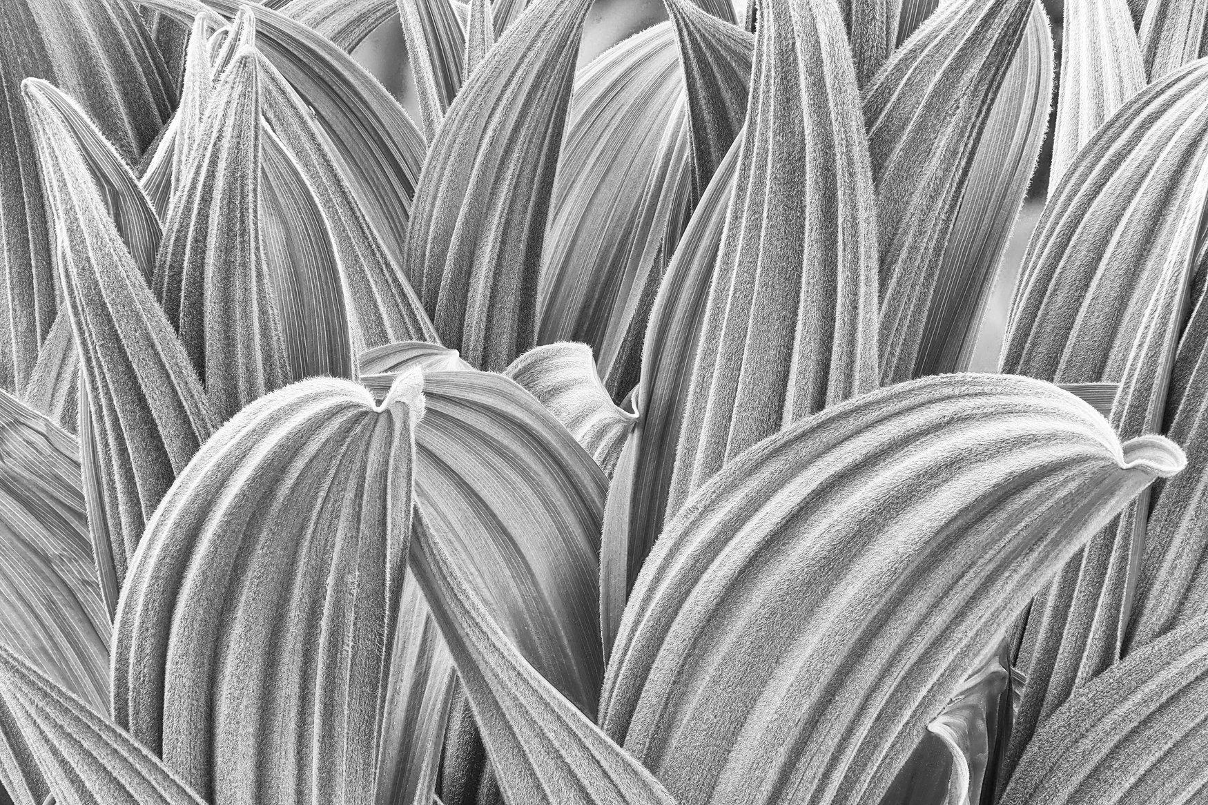
False Hellebore, common in the mountains of Washington and Oregon at middle elevations, present an elegant form, beginning with the early-season , impetuous shoots.
We have these in the Sierra, usually at higher elevations in somewhat moist meadows. We call the Corn Lilies.
I really like the high key presentation here, and composition is especially nice.
Not saying you should do this, but this type of subject lends itself nicely to adjustments in contrast. It might be fun to experiment a bit with this one.
Preston, Thank you. Yes, I’ve seen these in the high Sierras too. Actually, I like these plants so much that I have a 6-frame series beginning with these early shoots, up thru several very elegant forms, and on to late-summer decline with the fungi and insects taking their toll–but with the hellebore still holding an elegant form even in such decline.
Delton: Hellebore leaves are great subjects and you’ve fille the frame nicely with them. The textures and lines are compelling and a joy to savor. Nicely done. >=))>
Man, Huw, I was looking for that thing! You freaked me out. I think it’s upper left corner. We do that a lot here. I think it comes from portraiture, and talking about the subject’s right eye (when it’s our left, their right). Not a complaint. Just wanted to save other’s some time . Exit stage left!
I love this, Delton. Like Preston, I can imagine changes to the contrast here: Much higher key? Or less micro contrast? But really, it’s lovely as is. Needs nothing.
Ah, False Hellebore. Such an incredible plant to photograph! I love the detail, as their story is so much about the repeating, curving lines. The mood this evoked for me is a sense of Fellows Hanging out. A cacophony of kinship. Delightful Delton.
Delton, this is a dramatic, frame filling view of these False Hellebore. The details are outstanding, expecially the little fly! Keeping things high key works very well.
The composition is nice. I think you nailed that. Perhaps it’s a personal preference but for me much of the beauty in b&w are in the smooth gradual tone gradations. By increasing the contrast you have eliminated that and it’s starting to look more like a lithograph than a photo. It might be helpful to see what you had to work with before you went down this pathway. It’s a personal choice of course but for my taste it looks too gritty for the subject matter.
Thanks to all who commented on my image, “Hellebore 1.” I have enjoyed tracking down these elegant plants in the mountains for years. I actually have a series of 5 or 6 images, “The Rise and Fall of False Hellebore” and will send that series along when we have a call for such series.
 . Exit stage left!