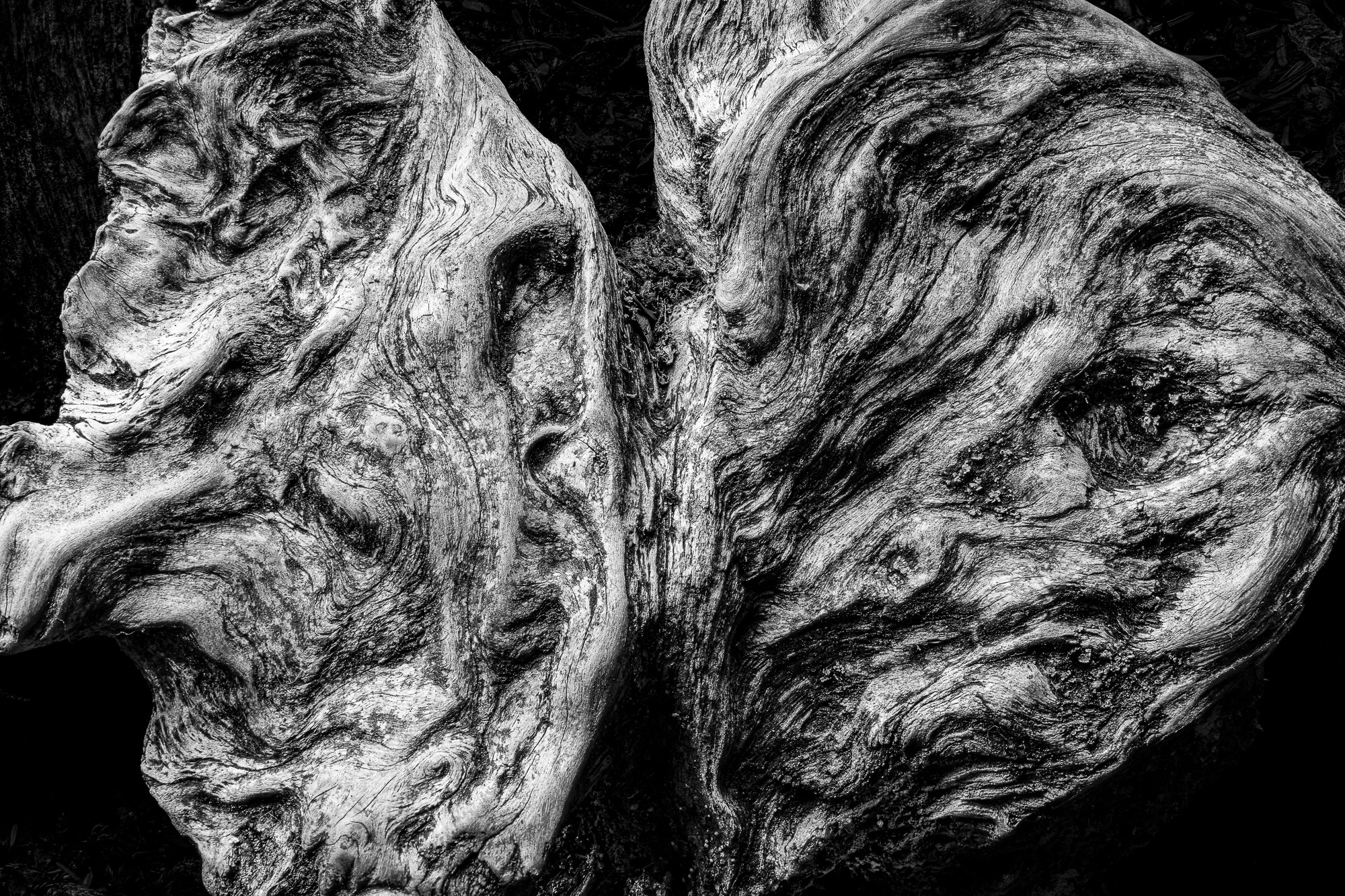
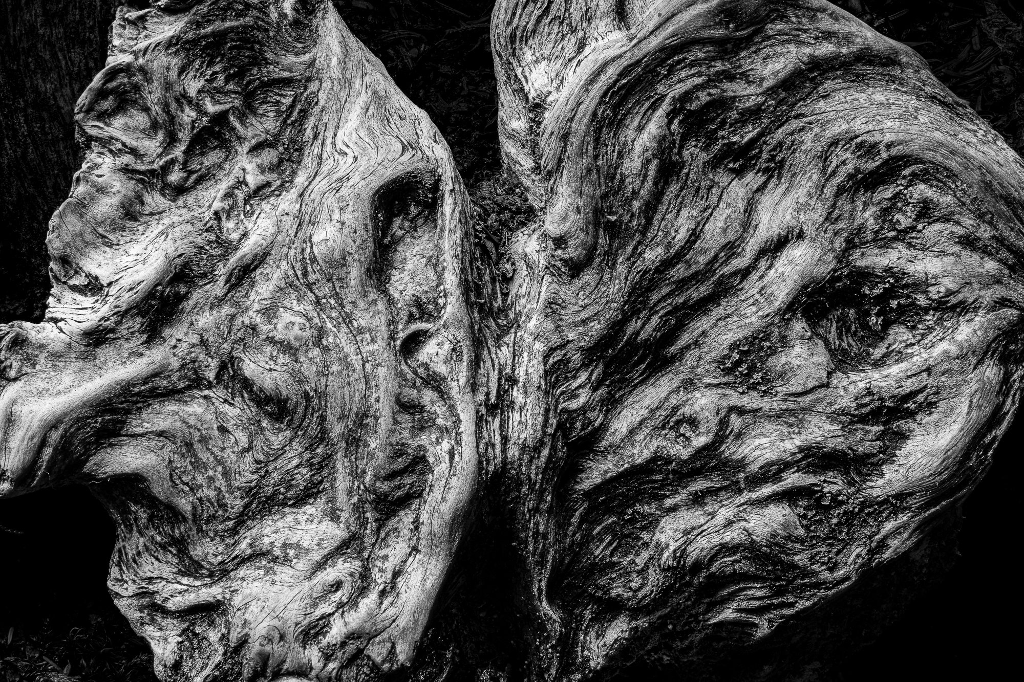
What changed: Thank you all for the feedback. As always, it was helpful. I ended up lifting the black, and it reveals more of the texture that initially drew me to the scene. I also darkened the LLC, and I think it helps the subject stand out as a whole. Thank you again for the helpful advice.
Added after receiving feedback from the community.
The photographer is looking for thoughtful feedback on the image as a whole, especially around the areas noted below.
Feedback Focus: Artistic + Technical
About This Image
This is a small section of the root system of an upturned tree. The rough wood, along with the smooth, worn portions, caught my attention. The texture and the fact that there are two distinct sections reminded me of a creature from a
Guillermo del Toro movie.
Feedback Requested
Does the Black and white help with the “creature” feel of this image? Are the blacks too black?
Technical Details
Camera: Canon EOS R5
Lens: RF24-105mm F4 L IS USM
Focal length: 70mm
Shutter speed: 1/3s
Aperture: f/11
ISO: 100
I’m afraid the movie reference went over my head, Todd. Not my genre at all (I looked him up). While I don’t particularly get a creature feel from this, I am a natural wood junkie and I really love the curves and textures in this image. Your processing with the deep blacks really brought out the texture in wood and it doesn’t feel overdone to me. A great find and well photographed and processed.
I think mono works really well for these textures . My preference would be to have some texture detail in the deepest blacks. they are a bit blocky at the moment IMHO.
Todd: I love all the textures and curves and think the luminosity is fine. My only tiny <1¢ nit is the LLC with those tiny slightly bright spots on the edge. The subdued textures in the other corners are complementary and not a distraction. Nice find and presentation. > =))>