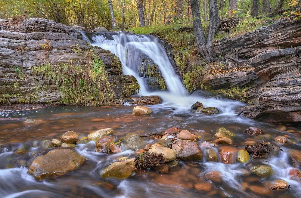
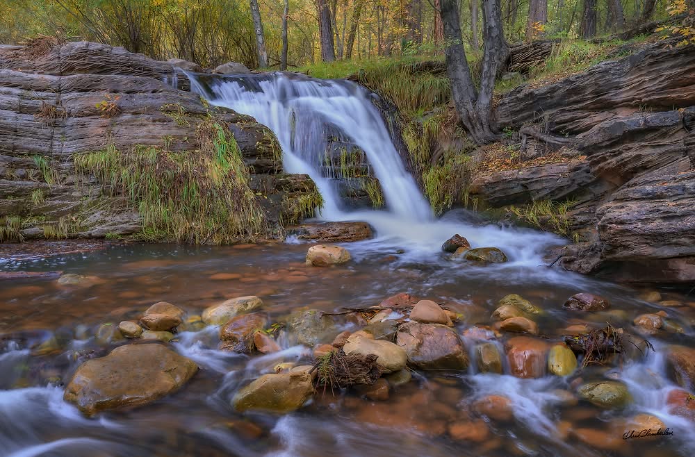
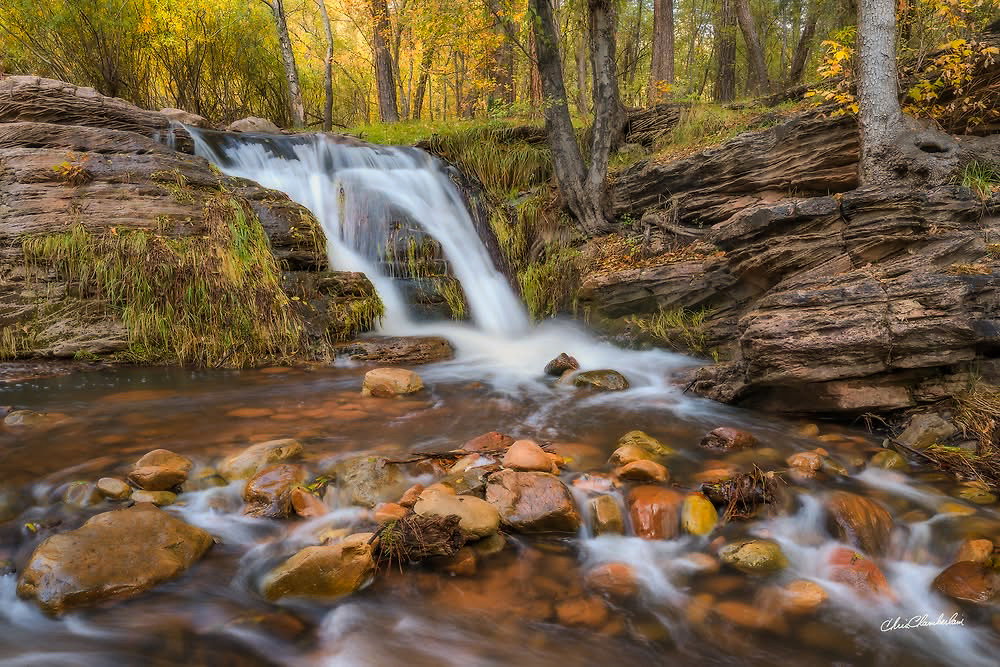
What changed: Ok. Here is a slightly adjusted exposure “increased” to match the brightness of the original closer. The top area with light in the background was kept burned down a bit. Adjustments were made to the magenta/blue colors in the white water. The water looks pretty white to me. Looking at this file at 30x45 on my monitor, I can’t see any issues. What do you think now> Thanks!
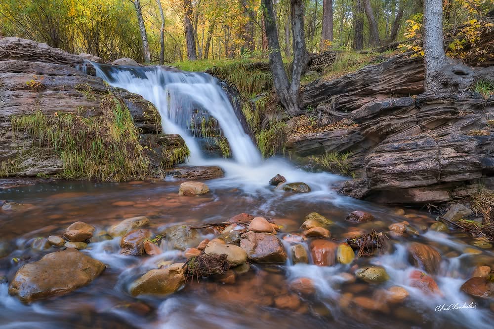
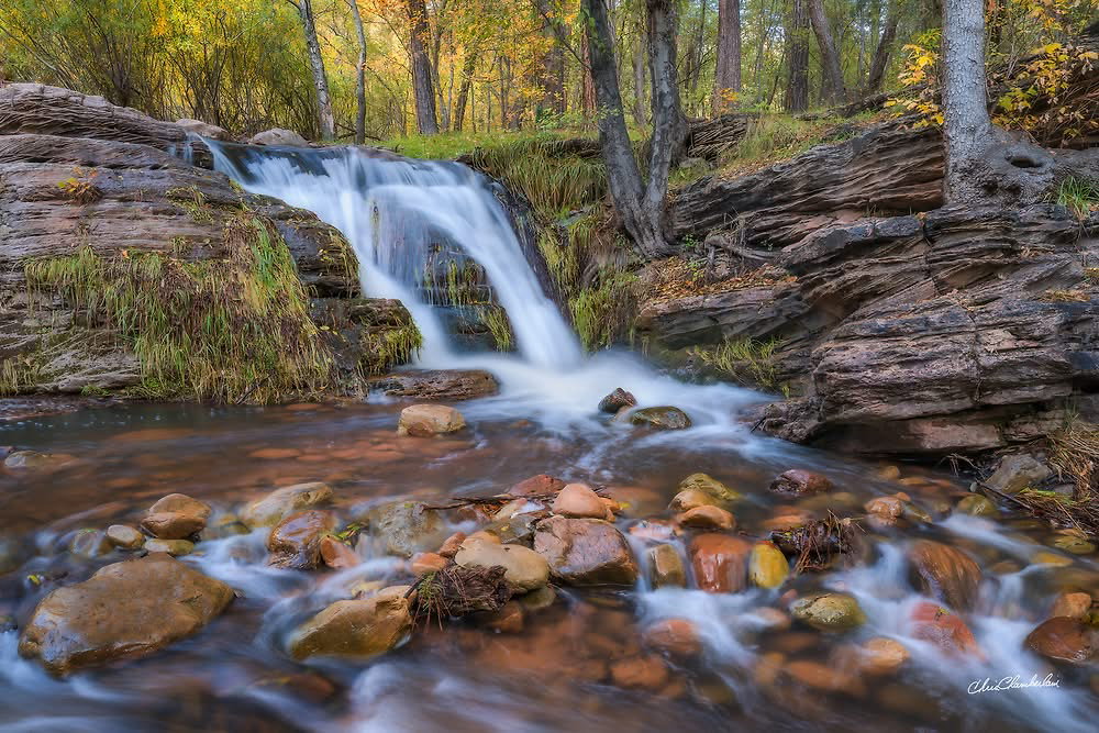
What changed: Here is a different file, with slightly different perspective/composition. I think this addresses all of the suggestions but one. The background forest is burned down more to even out the brightness there. This image has a either a 1/3 or 1/2 second exposure vs. 1 second in the original post. There is more texture and detail in the cascade. I add a bit of soft glow to my images. I brushed it off the waterfall in this version. No vertical or panned up version to show more forest up top. Thanks!
Added after receiving feedback from the community.
The photographer is looking for thoughtful feedback on the image as a whole, especially around the areas noted below.
Feedback Focus: Artistic + Technical
About This Image
I found this little cascade while hiking up Horton Creek, below the Mogollon Rim. As always, the thing that I try to communicate most in my imagery is just gratitude. Gratitude for being able to be there and enjoy what’s out there. I try to compose and present a scene in a way that gives it justice. And helps the viewer get a sense of a place. And feel as if they were standing there.
Feedback Requested
Interested in first impressions? Then if the image holds your attention? If you enjoy the composition or not?
Technical Details
Camera: NIKON Z 8
Lens: NIKKOR Z 24-70mm f/2.8 S
Focal length: 28mm
Shutter speed: 1s
Aperture: f/11
ISO: 64
I really like moving water images like this Chris. What works well with me is the light on the foreground rocks, leading my eye up to the water fall. I think we the shutter speed is perfect for this image, not too cotton candy like. The layered rocks add some course ruggedness to an otherwise tranquil scene.
I do like the sense of what is beyond and in the forest background by having it framed the way it is. Part of me wonders on a vertical composition with more forest but then it could take away from the focal point of the water fall. Just thinking out loud.
I think the composition works really well. It’s hard to compose a scene like this: where do you cut off to avoid having half a rock at the edge or where do you crop the trees at the top. I can imagine a tiny (millimeter) crop off the top to eliminate the one little bit of sky coming in next to the primary trunk up/back there, but really, that’s not necessary. There is something about light blinking through that feels nature.
This is a lovely scene: the golden light in the forest above, the grasses, the layered rock on the right, the river rock and water flow.
I really like this scene, Chris, with the creek leading to the falls and that lovely forest above it. The one thing I noticed is that the patch of bright forest above the falls seems to get brighter toward the top of the frame and for me, it leads my eye out of the image. I took the liberty of downloading your image and doing a bit of gentle burning along the top, particularly in that area. See what you think. Your image makes me want to be there!
I have a couple of vertical comps that I have not taken a good look at yet. The sun was encroaching, and verticals showing more background forest, got up into that brighter light. I’ll have to see how it renders after an edit.
I have a few frames with 1/2 and 1/3 second exposures. I’ll take a look and see if the texture in the water is better in those. I tend to like as little more pillowy water in falls and rapids. But this one is pushing it for me too.
What a gorgeous scene! I do get the feeling I’m standing right there, and don’t want to leave! I’ll save some clumsy typing and ditto the positive comments above! I would have no problem in layering different SSs and masking in the areas that might offer a look you preferred more. No problem in going from a 9.999/10 to an 11.
I think this new comp is better overall. It is tighter up top though. And while I like the extra space for flow in the bottom left corner. I’m not sure that I prefer the lower right corner. I do prefer noy having that tree trunk in the upper right though.
I can see that the repost is not quite as bright as the original as well. I’d probably adjust that too.
Nice RP, but the water is getting a bit blue. I don’t mind the tree but you could probably darken it in the original composition. A slight bump in contrast in the RP would match the OP better, I think. Both version are lovely!
Lovely scene and I quite like your composition and choice of framing. The white balance though, oh boy. Purple/blue water? Not natural to my eye. A quick adjustment in ACR with an auto white balance (using the eye dropper in the white part of the water) gave me this which looks so much more realistic to me. Also lowered the exposure somewhat, brought the shadows down and added a teeny bit of contrast. YMMV, but it’s just an idea of what you could do with this most excellent little fall if you wanted.
This is a very nice scene and I like how you simplified the scene with the revised image. Maybe it’s my crappy monitor but me I like the colours in the original version more though.
Well, color casts, and identifying them has been one of my biggest challenges. I honestly did not notice the purple/blue color in the white water, prior to you pointing it out. But I can definitely see the difference in the example you adjusted. And I can see the differences between the original, and my revision. I did not edit the revision exactly like the original. I should have had them side by side on my monitor so that I could get the brightness and tonality the same. The water here looks much better to me. I have will post a second revision. Hopefully the issue is corrected. I cannot see any cast in the white water now. I also took a bit of blue from the blacks and shadow areas under the falls. I’m quite happy with the balance of light in the second revision. At least as it appears on my monitor at home before posting it anywhere else.