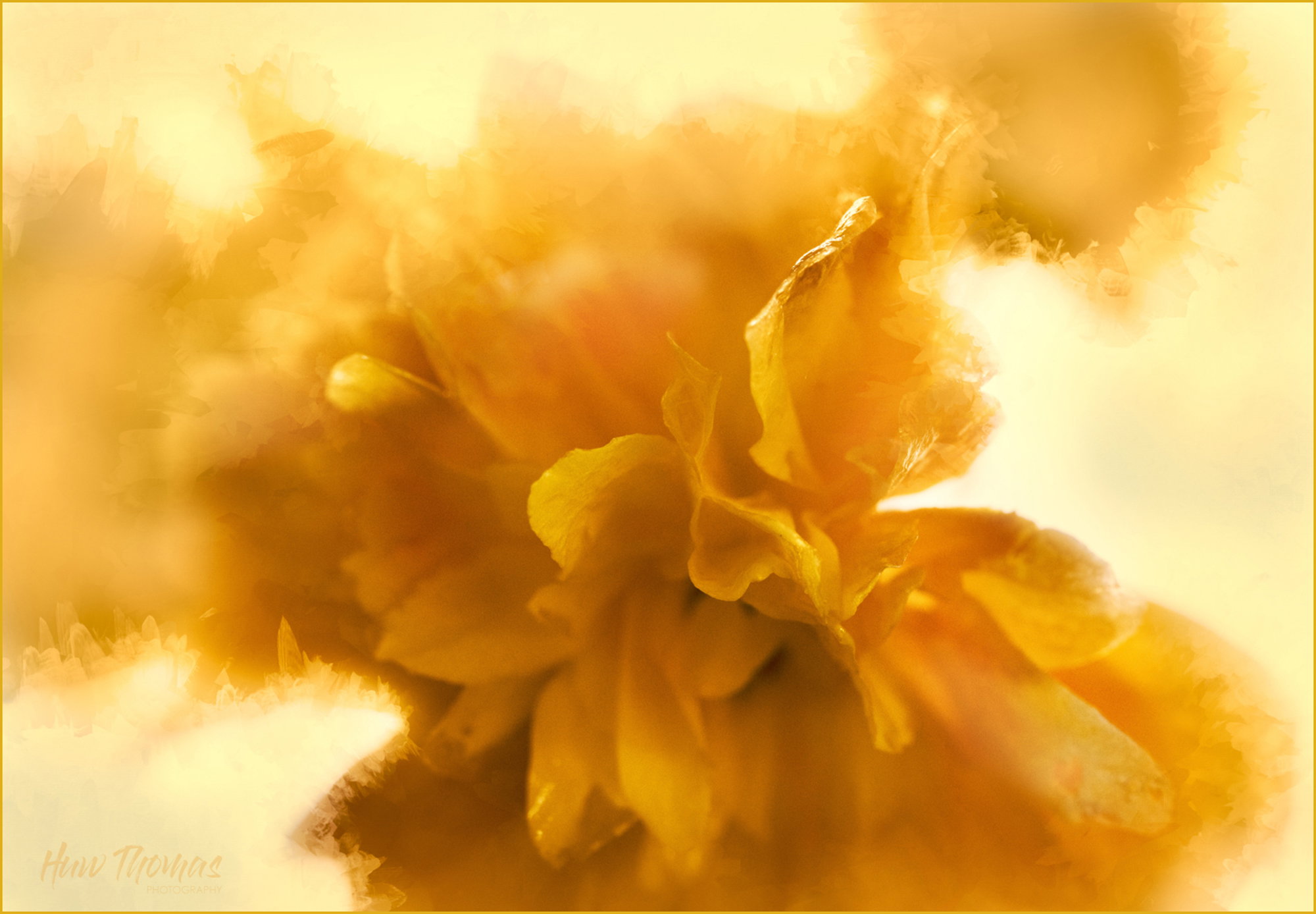
Well done on the abstract and great job handling the exposure. Here, I think the bright areas are an asset and don’t really register for me that they’re “hot” (although I bet close on the histogram.) The light and shallow dof field are working very well together.
The main drawback I have is that there doesn’t seem to be a central place for the eye to rest or land on. There is one fairly sharp curl that does draw the eye, but also many petal edges just out of focus (which is fine), but all different shapes, going in different directions, etc. My eye just isn’t settling on any one thing. Which takes me back to the light and the shallow dof that is the atrraction for me. Make it make sense.
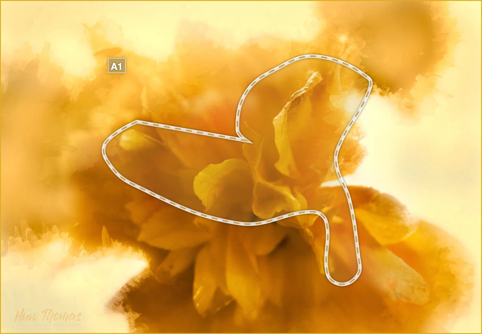
This is really an experiment - its not really about the flower - I visualised it as shapes tones and textures - Concentric circles, the ice round the outside, the warm darker yellows as the next layer and then the crisp sharper areas (area A1) in the centre.
It is really about light and texture abstract.
I suspect it doesn’t really come through as that … but that was my intention
Thanks for the comments. Any tweaks to further facilitate my creative message via this image very much appreciated. Regards
Huw, this grabbed my eye. I don’t have the problem Lon has. My eye is drawn to the few sharply focused petals. But it’s really the fuzzy context that makes the shot. I think it works.
I think the crop should be a little tighter on the left and top. The darker tones might be a little brighter. But all that’s in the category of nits.
I like this one as posted, Huw. My eye is drawn to the relatively small in-focus area in the center first, but I don’t mind that it roves around as I really enjoy the hints of ice crystals around the outside and wouldn’t want to lose any of them.
Huw the single color works very well here. Surrounding the infocus bits with the softer parts keeps interest on the center as the subtle color and brightness variations invite eye movement throughout the frame. Have you tried dodging slightly the brightest bits, especially the two areas in the upper right? That might or might not be an improvement.
Huw: Count me in with the bunch who likes this as presented. My first irreverent thought was that if this was B&W it would make a great Rorschach. >=))>