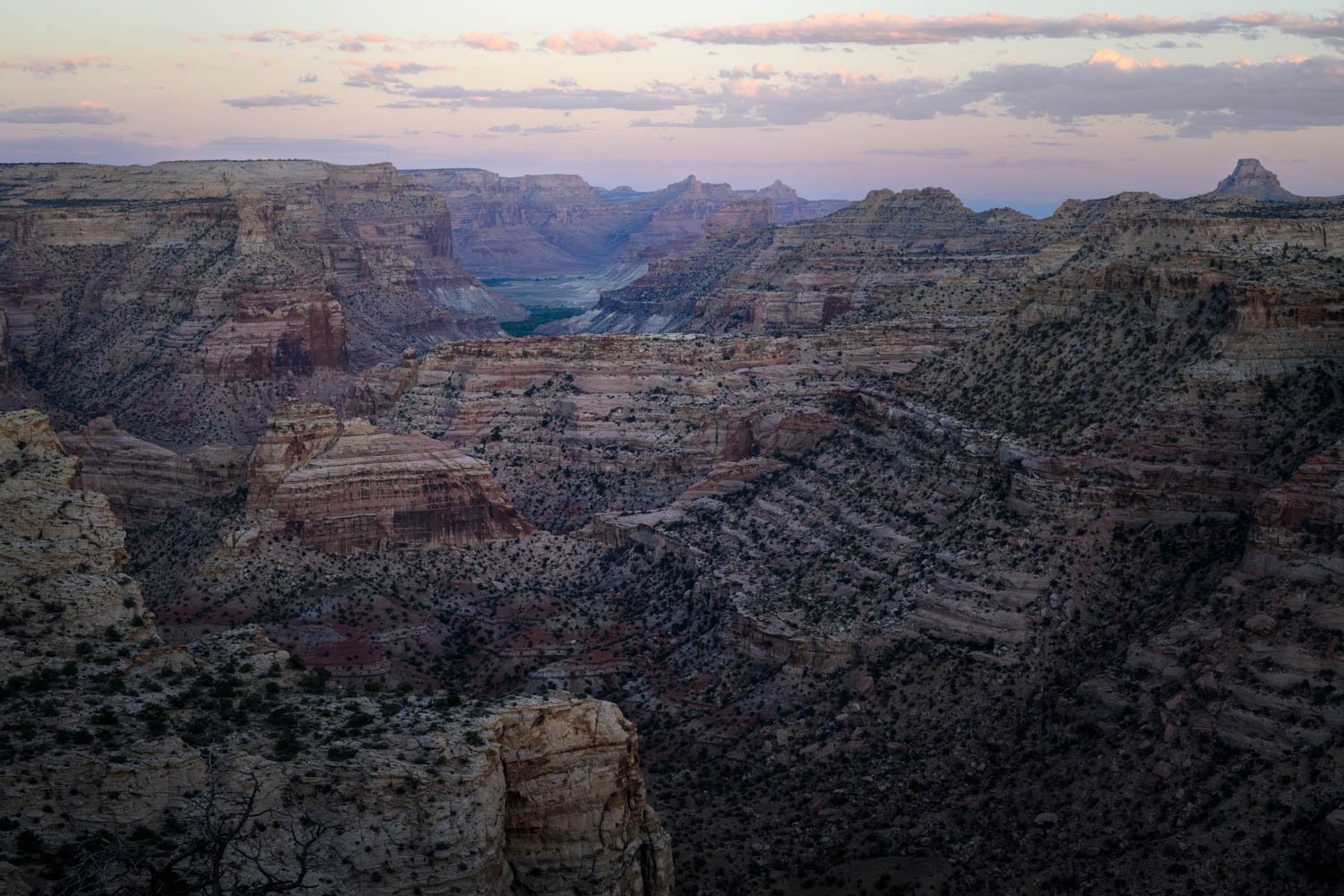
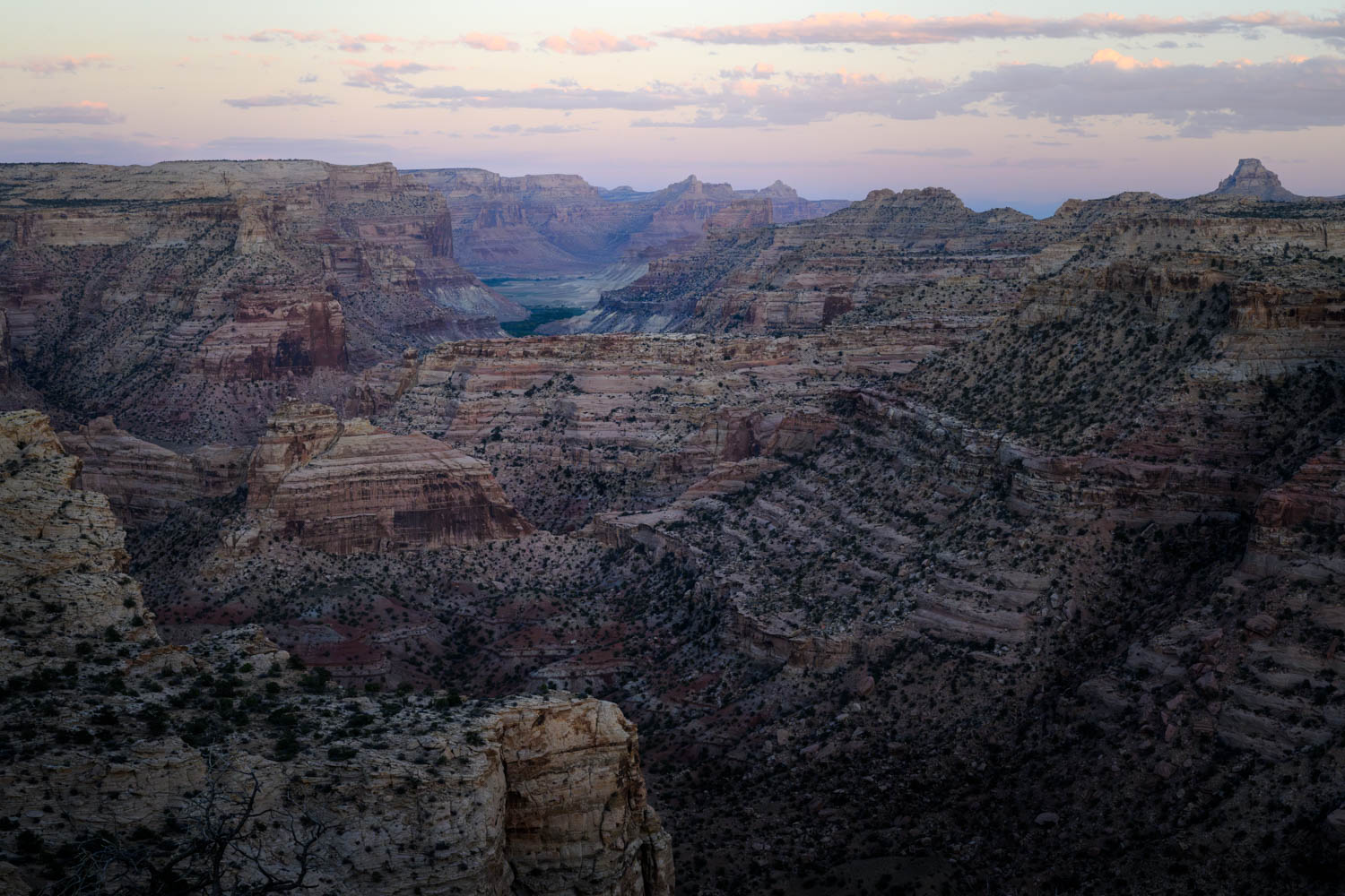
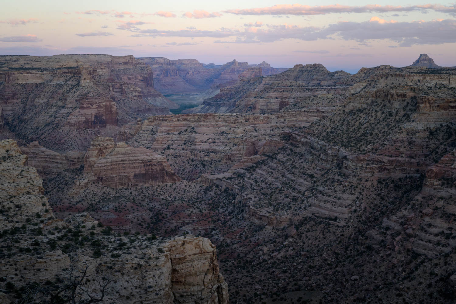
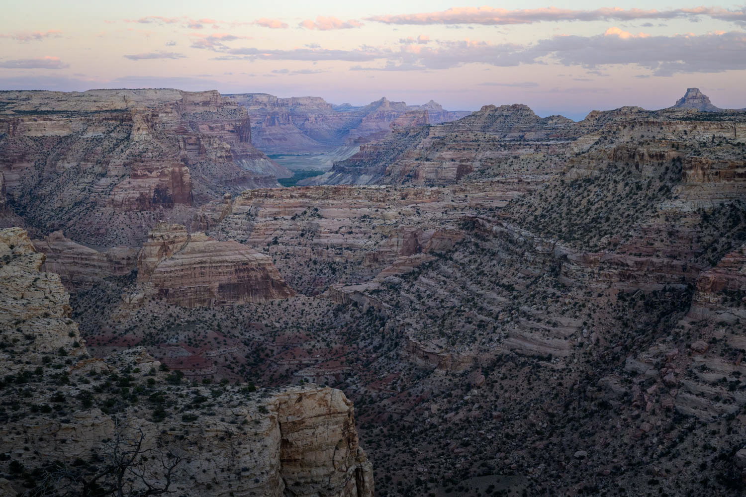
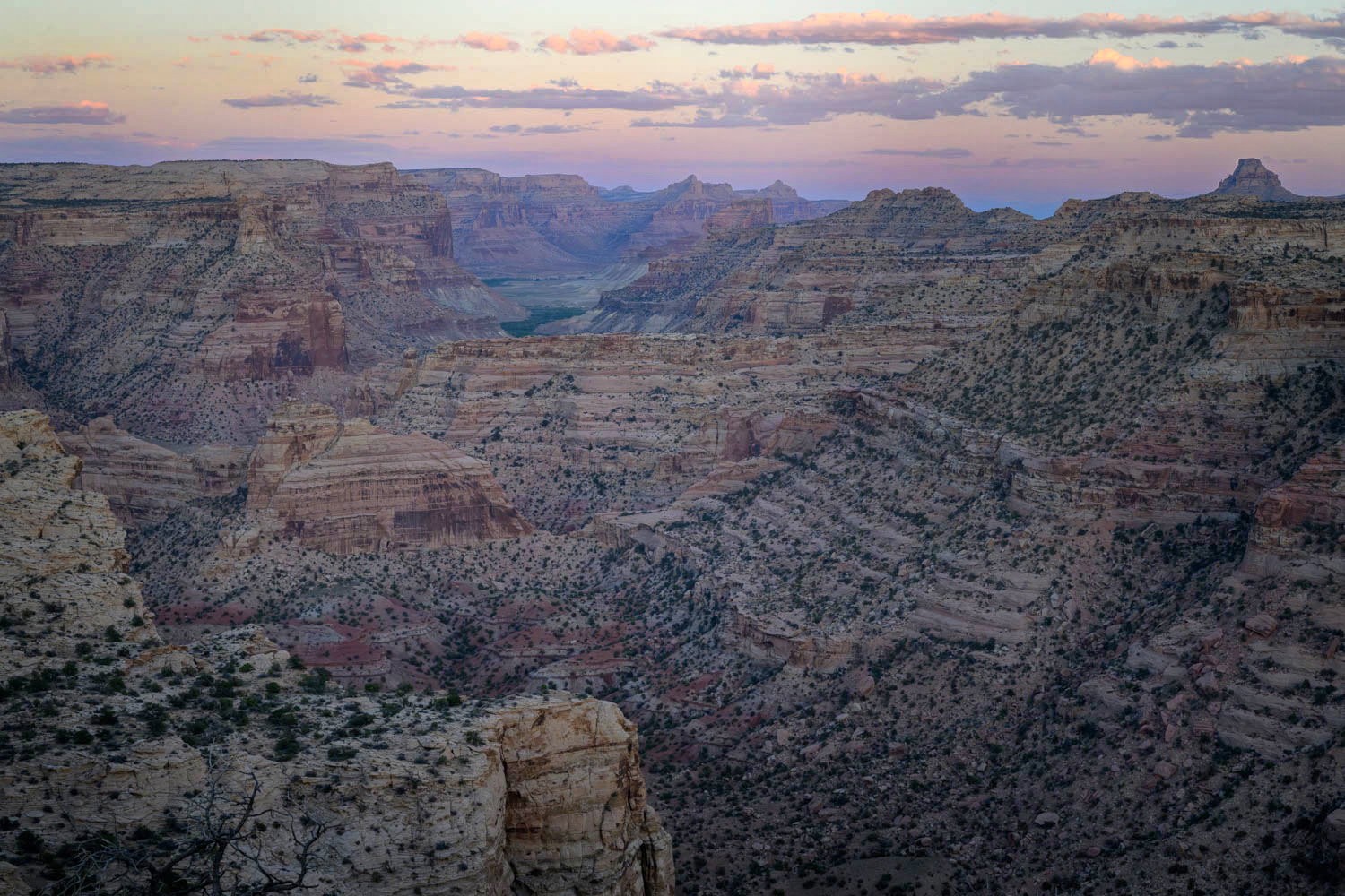
What changed: i used the suggestions for a bit more clarity/contrast in the sky and the terracing. Pretty subtle changes, so please let me know if it is effective or not. I also opened up the shadows a bit on the LRC but still looks dark on the thumbnail here, while it looks ok IRL. Thank you!
Added after receiving feedback from the community.
The photographer is looking for thoughtful feedback on the image as a whole, especially around the areas noted below.
Feedback Focus: Artistic + Technical
About This Image
I keep coming back to this image. I loved the moment when there were no hard shadows left, it was just so pretty. What I loved was the light, the pinkness, the hazey feel, but yet how far I could see. I am not sure that it has a clear subject, though, and I’ve worked on the contrast to bring out the shapes of the canyon better.
I’m just not sure. The top version has darker shadows, just a tiny curves adjustment from the bottom version.
Feedback Requested
I’m wondering whether the processing supports the mood or feeling I was aiming for, or if there just isn’t enough of a composition here.
I think the subject is the scene itself in this case, Julie. While I like the even light, I’m also intrigued by all the terracing and I think it could be pulled out a bit. I did some tinkering in LR by selecting the landscape, intersecting with a linear gradient from the top and raising exposure, texture, clarity, contrast and dehaze just a bit-nothing drastic in the adjustments there. Then that lower right corner was actually looking a bit dark, so i did a linear gradient at a diagonal from the lower left to about the center and raised the exposure a trifle there as well.
Just food for thought. The basic image certainly is worth pursuing in my (non-landscape photographer) opinion.
Thank you, Dennis! I like your suggestion, it’s more micro contrast rather than trying to emphasize a leading line that has dissapeared into the hour. I will putter around with your suggestions when i am next at my computer.
I like this and I like how this makes me feel - so calm and so at ease. I can just image standing there in silence, enjoying this view that seems to go on forever.
I think that the sky could could use a bit more punch to help balance it out against the visually strong, textured landscape. I took your image into Photoshop and tried adding a bit more oomph to it. Just something to consider.
Thank you for the feedback!
I thought about punching the sky a little bit, but I liked how the soft sky helped the hazy distant feeling, so I left it more or less as it was SOC, but your version has some nice clarity, so perhaps I’ll continue playing with it a bit more.