The photographer is looking for thoughtful feedback on the image as a whole, especially around the areas noted below.
Feedback Focus: Artistic / Expressive
About This Image
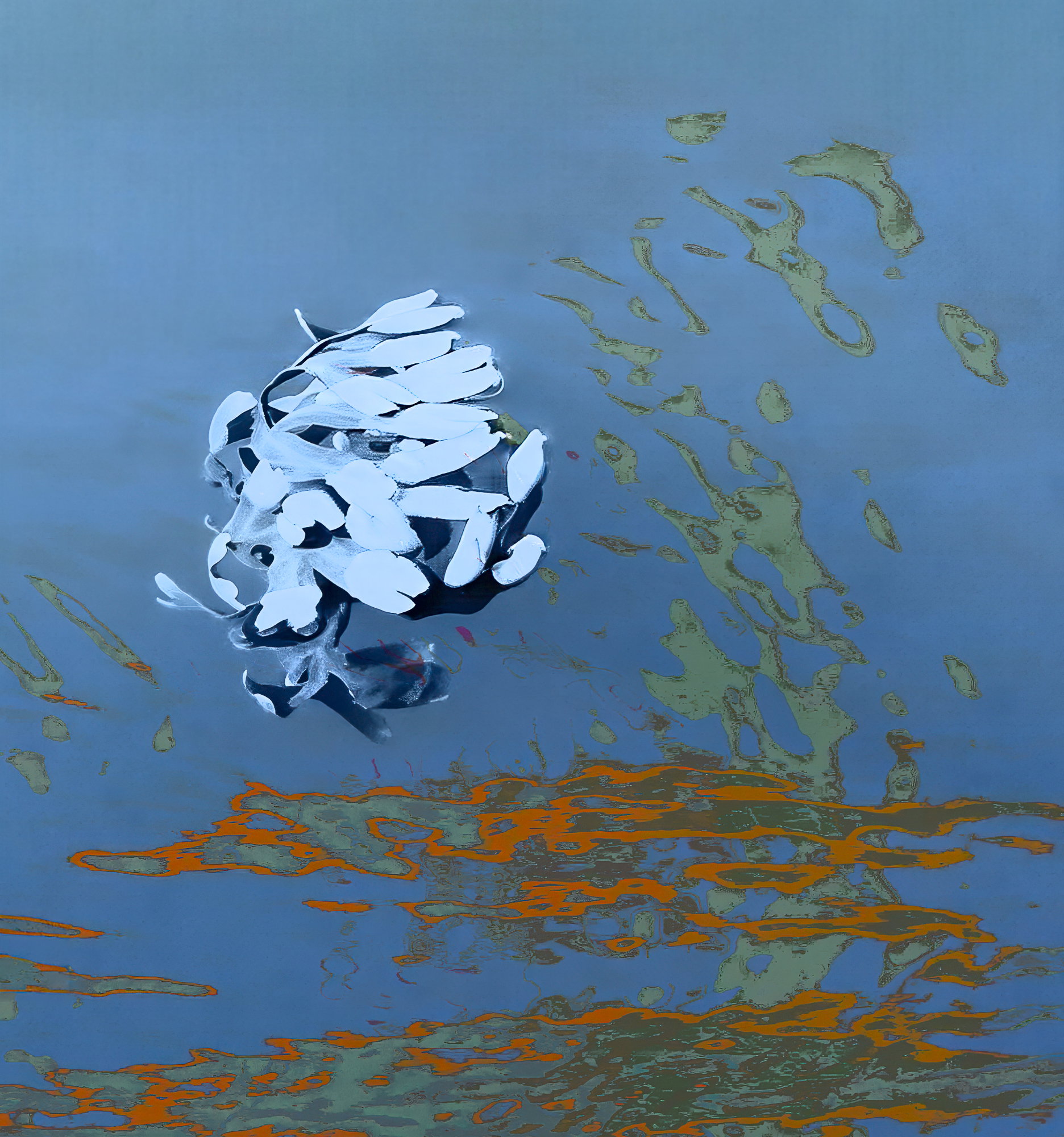
This is a composite of two images taken on the dock in Nanaimo BC. One image is of floating algae and the other image was of orange and green reflections in the water.
Oooh what a cool arrangement of strange things. The way you’ve put the two photos together works really well with the dynamic shapes and saturated colors. I’ve just now tried to suggest a crop, but the tool is such a pain I gave up. Basically to maybe go to 4:5 or square to eliminate the space at the top which to me isn’t doing much considering the tension in the composition. So intriguing.
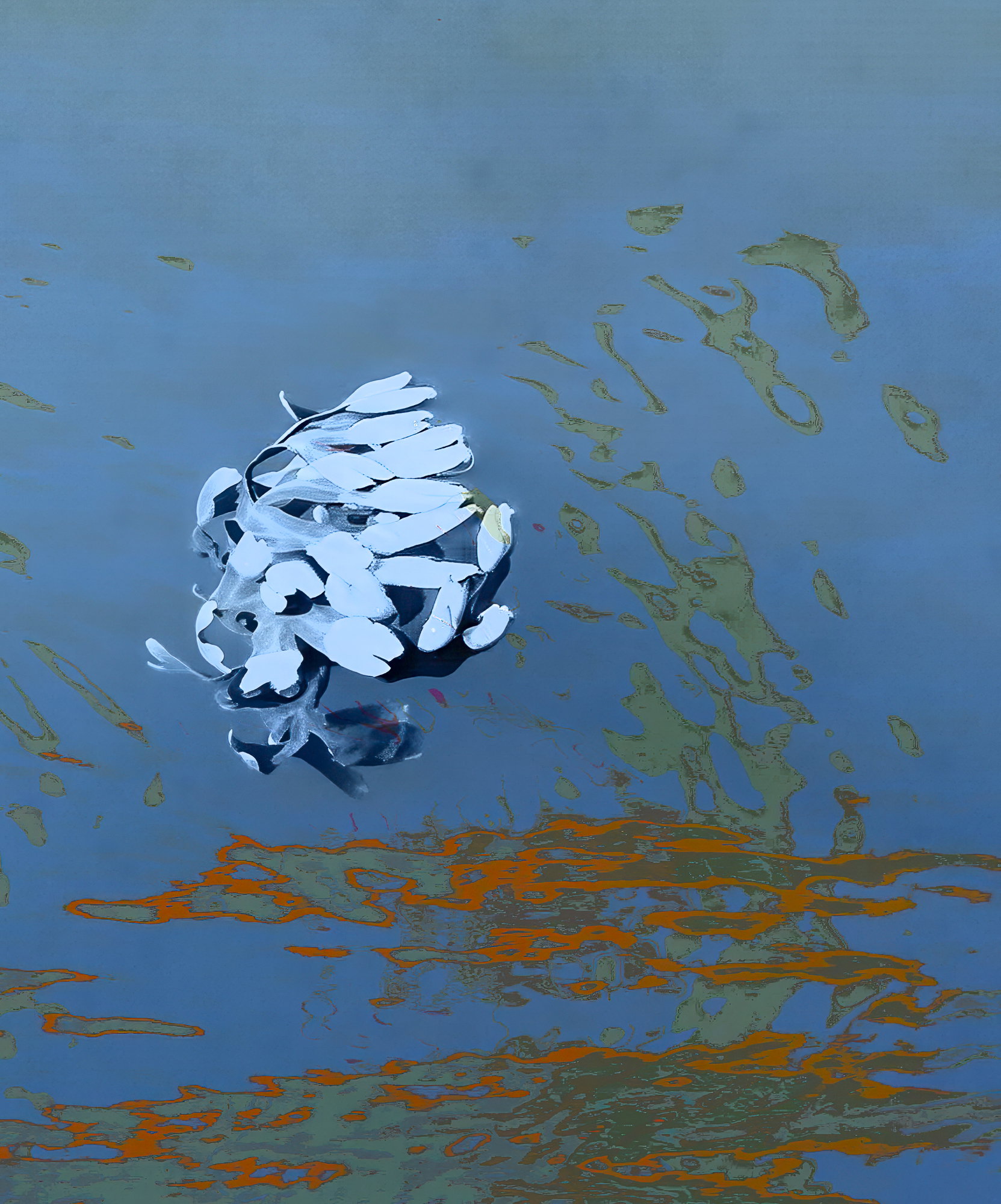
Hi Kristen, I tried your suggestion of a square crop and I like it better than the original. I think it’s a bit more dynamic. Thank you for the feedback.
Alice
Crop looks good to me. One thing that occurs to me is to play with the luminosity slider for the orange channel and see if that adds some zip. Right now all the colors are saturated, but not bright. That may not suit your goals, but might be worth playing with.
A very interesting combination of images that I wouldn’t think to put together, Alice. I do like the square crop a lot more than the original. For some reason, the algae clump looked a bit out of place in the original and it fits much better in the square crop. I think the luminosity of the algae made it a bit too dominant in the looser composition.
Kristen, I don’t know if you can tell but in the last revision I added a little luminosity to the orange and the green. It’s subtle but I didn’t want to go to far with it. I also cleaned up the edges from the square crop.
Good suggestions all around.
Thank you
Alice
Bravo Alice. What an amazing image. To me it looks like paint. I especially like the rich white brush strokes on a dark blue background. Very compelling abstract. I like both versions equally. Perhaps I wouldn’t have removed quite so much in the crop.
Wow Alice, this is a mind bender! From further away, I never would have guess algae and reflections in the water. It’s not until one starts pixel peeping that I can recognize a bit of plant structure in the algae and the reflections on the water’s surface become more clear.
What a combo! I didn’t think of it, but I really like Igor’s reference to a painting; especially the brush strokes in oil of the algae blob. This is just really cool
I love the revision as presented. Can’t think of any other nits or suggestions. Well done!
I’m late to the party on this one, but I wanted to stop by to say wow! I really like the revision, the stronger oranges, the cleaner upper left half of the water. Really wonderful to explore.
ML