Thanks for all the great comments and suggestions. Here’s a repost. I am inspired to go beyond basic processing by the folks on NPN, but the challenge is not to go too far, keep it subtle.
I do most of my processing in Capture One and only minor work in Photoshop these days. For this repost, I took the ideas below and worked them in C1. I adjusted the sky a bit using a color mask. I then used several adjustment brushes to add detail to the wave, a touch of warmth to the wave (minimal), burned in the highlights on the foreground rock and did some selective contrast brushing as well…hopefully it improves the image without making too over the top.
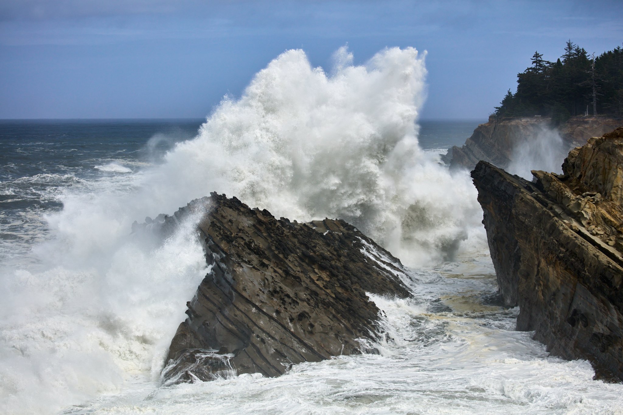
We were on a weeklong trip down (or up) the Oregon coast and stopped at Shore Acres. Had no idea that a King Tide was going to give us a show. Hard to tell perspective but the cliff in the upper right has a fenced lookout for folks to watch the show.
Specific Feedback Requested
Any comments appreciated.
Technical Details
Is this a composite: No
Canon 5DsR, EF 100-400 @ 100MM, 1/2500 sec @ f/4.5, ISO 400.
This is a tremendously energetic wave. Your exposure and speed seem just right to capture its energy. I wondered if the wave’s energy would stand out more if the sky were not so bluebird placid, so I tried to desaturate and darken it a bit, adding contrast also. Burned some of the rocky faces and some of the darker parts of the water. Idea was to emphasize the energy of the wave.
Opinions are like, well you know and everybody has one…I like the image as presented but like Dick, I find it a bit insipid…it’s ok but not strong as the wave should be. I didn’t leave the sky alone but also didn’t do much to it as I don’t think it plays enough of a role to be a dominating factor. The wave and the rocks, however, should rock us right out of our chairs. I did three things: one, isolated the wave and rocks from the sky and UR trees, gave them a color balance adjustment, then gave them a High Pass filter treatment/soft light at 85% and lastly, did a SEP2 layer and set the blend mode to Luminosity. I was careful on how I brushed in the High Pass so as to allow some foamy softness as well as some hard drama. As with any critique, my edits are only o show another POV and not to degrade your original image. Actually, I did four things by adjusting the color and detail on the trees in the URC.
Thanks all for the comments and suggestions. @Dick_Knudson and @Chris_Calohan, I appreciate both of your suggestions and reworks. I am working on a repost based on your suggestions…just having some trouble with the sky color at this point…need my wife’s expert eyes to help me there…Will repost shortly.
I like the darkness of the cliffs and rocks of the original post. I think it goes well with the theme of crashing waves. I would not try to ‘cheer it up’ with added light or color saturation.
Dave, you also have the foundation for a fairly striking monochrome rendition. In the attached, I started with your version, increased sky contrast, and applied noise reduction to the somewhat grainy resulting sky. Played with the BW Layer sliders. and used a blue filter.
I really like how you brought out more detail in the crashing wave. Great composition. You should clone in a person on the cliff for a sense of scale. Just kidding. I also think @Dick_Knudson 's treatment is great.
I like the rework done by @Dick_Knudson, the stronger contrast and darker sky elevates the moodiness of this scene substantially. To me, Dick’s darkening of the sky makes the wave pop more. But in his rework the two upper corners get too dark, probably a function of some vignetting in the original post. If the sky were this dark but more uniform in tonality I think it would work better.


 Just kidding. I also think