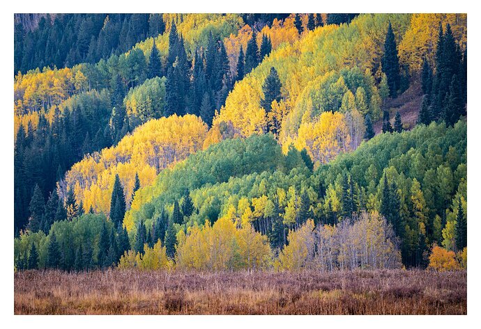
Like others it seems this is the time to go through older images. I initially did not process this image…for what ever reason but gave it a shot. To me it is about the diverse geometry of shapes and layers with the color palette.
Specific Feedback Requested
Is this too chaotic? How about the composition in general? SHould this be cropped to simplify? Any and all comments welcome.
Technical Details
Is this a composite: No
200mm f/10 1.3sec iso 150
A great look at the contrasting diagonals in this Mario. Everything from bright green, haven’t started to turn colors yet, to fully peaking yellows and everything in between. Nice variety of trees as well. I also like that you included some vegetation in the foreground giving this image a nice base to sit on. I do find that the left side of the image has more going on and could be cropped into a portrait but I also really like that little orange tree in the LRC. Otherwise, the composition looks fine to me. I do notice a heavy magenta cast to the image. The aspen trees all have purple/magenta trunks so I took this into LR only and did a few small tweaks to it. I used the WB selector tool pointed at the trunks of the aspen and this is pretty much what the color picker gave for tint and temperature. Tint -31, Temp +12, and then I made some other tweaks…Highlights -18, Exp -.53, Dehaze +21, In the Hue/Sat/Lum section I tweaked the Hue…Orange -7, yellow -3 and in the Saturation section I pulled both the magenta and purple to -100. Hope you don’t mind me playing with this one. It may not be at all what you envisioned so there’s that. LOL
Thank you @David_Haynes for the comments and the rework. I like it. I many times add +5-10 of magenta/tint to images like this but overdid it as I can see now. I especially like the use of dehaze as it really subtlety sharpens the image.
The composition seems very exciting to me, with the horizontal base colors, and the repeating waving layers of the trees.
The light seems to be cloudy/flat, so luminosity contrast is quite muted. I deepened some of the darker areas with History brush/Multiply. Also wondered if some additional green and yellow hues could be found, so applied a LAB curve to try that. The result might be too strongly colored for the mood you wish to convey, but forwarded for your consideration. (Seemed to pick up a lot of orange and bluish foliage color upon jpeg conversion.)
Dick thank you for the time and comments in making the rework. A little strong on sat and blue for my taste. It was taken at 9 am hence the flatness of original.
Yes I know it was too strong, but just for illustration …


