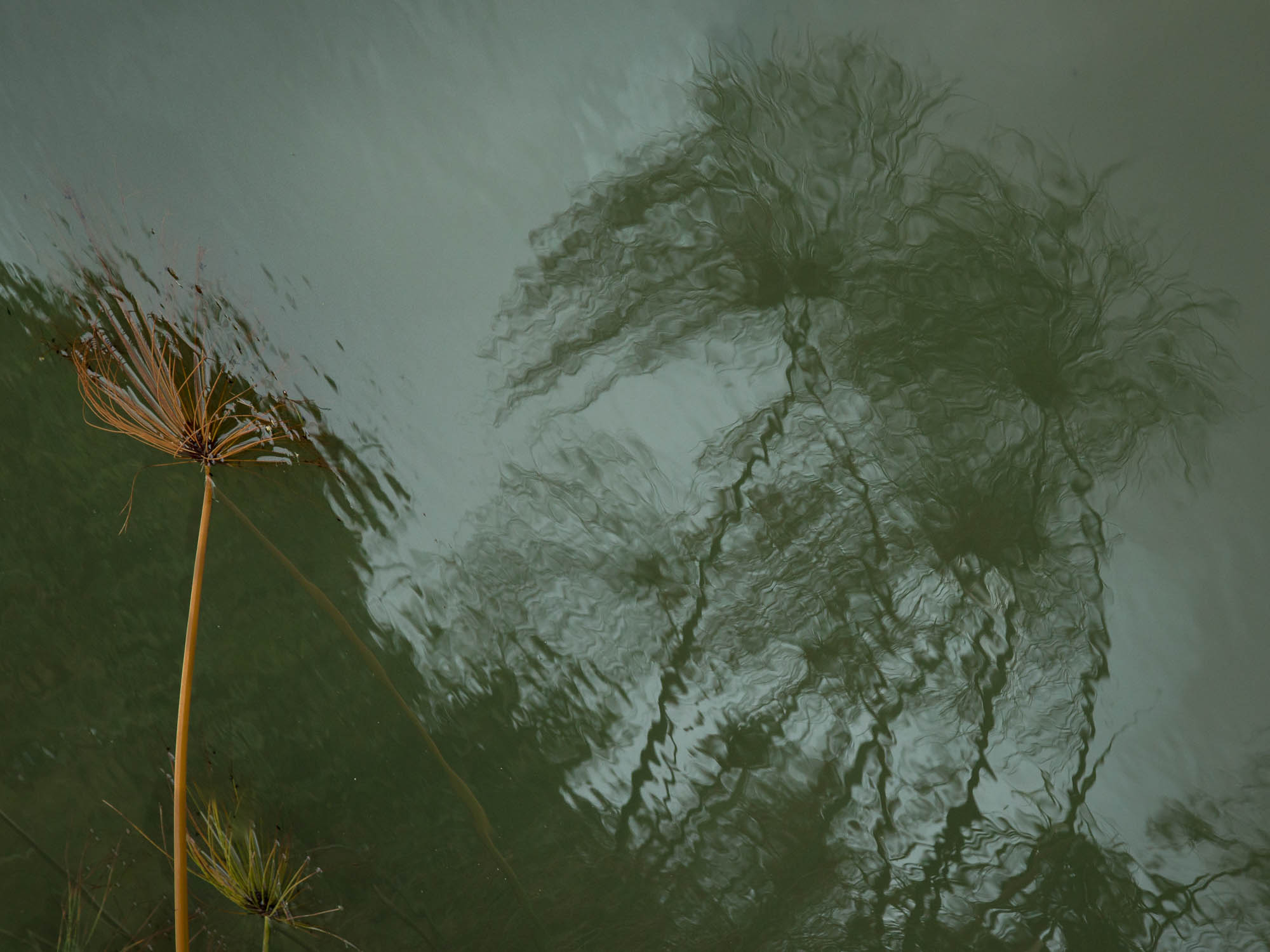
I was entranced by the reflections of these plants in the green water. and took many images. For a long time, I’ve been trying to sense why I was entranced, and how to convey that. The attached image seems to be a conversation between the reflections of the healthy papyrus and the drowned and drowning prior generation. I have also attached the full frame.
What technical feedback would you like if any?
A lot of options are available for relative lighting of elements of the scene. Your thoughts on what I’ve chosen, and anything else are appreciated.
What artistic feedback would you like if any?
Same request for the composition options.
This is the full frame (one of many)
It does appear as though they are conversing. Framing it so the plants are pointing up in the frame was a good choice.
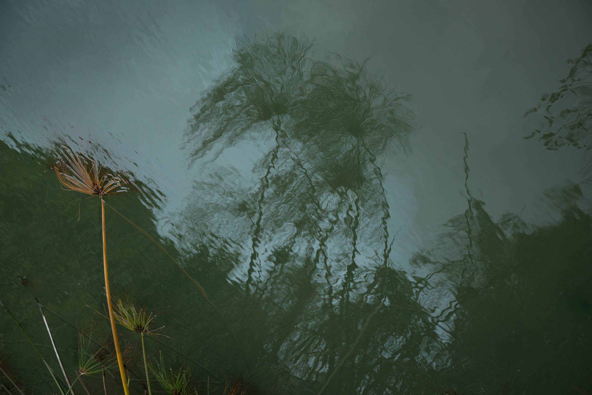
The one thing that strikes me is that it feels muddy because of the low contrast. You didn’t say if you were trying to convey a subdued mood - if so, the low contrast is perfect. I was wondering what it would look like if the contrast were increased, so I brought it into ACR and raised the highlights & lights, then did some dodging/burning in PS. I tried to bring out those fingers reaching out from the reflected plant. Oh, and I cloned out one diagonal stem in the LLC, where it intersected the frame edge.
Anyway, I just love little vignettes like this, and this one was well seen, for sure.
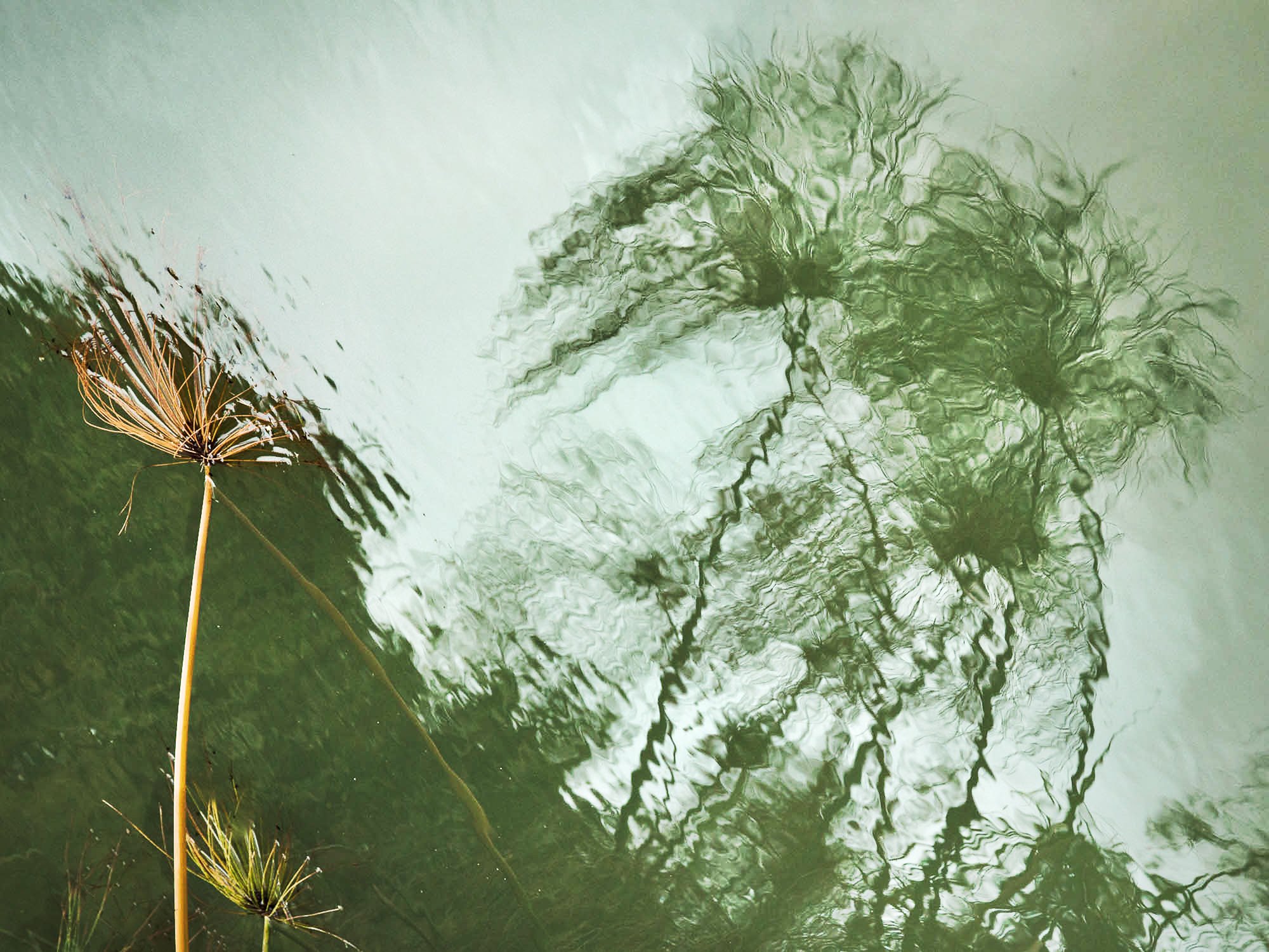
I enjoy youraccentuation of fingers reaching out. I wish I had a version of this image taken with a polarizer, so that the submerged fingers would be more evident. The revision is an attempt at that. I stayed with the subdued tone, in particular because the brightness between the 2 kept them apart. Yep, I cloned out that gray stick, too.
1 Like
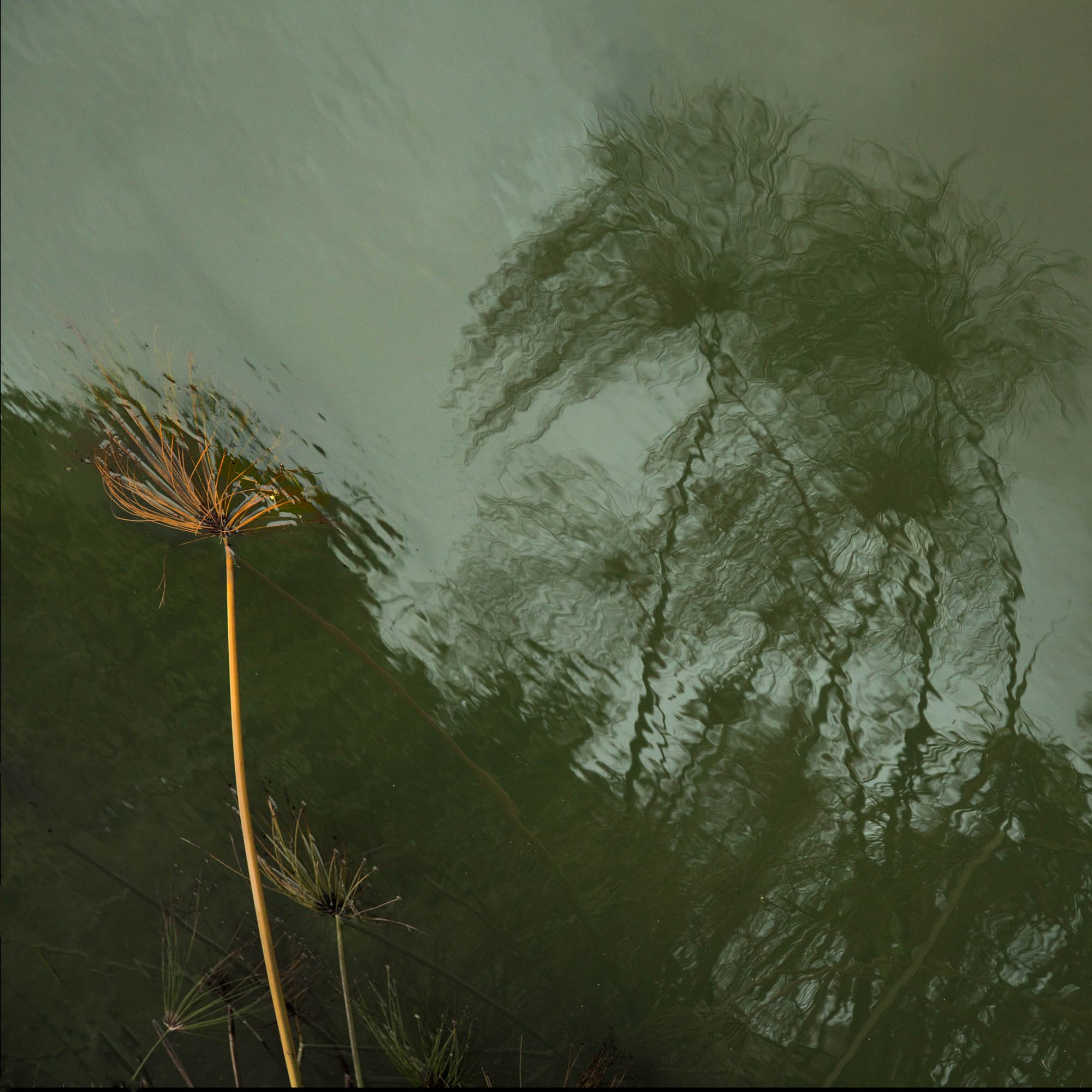
I like where you’re going with this. It definitely is unique. The last one is my favorite. It just needs a bit of cleaning up of bottom twigs rising from the frame. You could read a lot of symbolism into this image.
Thank you for the encouragement, my friend
This is a very interesting and unique image. The reflection looks like a water color painting, it’s so soft and delicate. Then you get the juxtaposition with the yellow papyrus. For me, the two element contrast nicely, and work well together. I think the muted colors of the reflection create a very calm and gentle feeling. So for me this image works well as presented.
I also think what @Bonnie_Lampley has done with her rework is an interesting alternative, by 'turning up the volume" the reflection creates an entirely more aggressive feeling. With Bonnies rework, i might consider cropping the left half of the image away, and making it all about the reflection. I especially like the green tones of the reflection in her rework.
@Ed_McGuirk You are right about the right side being quite interesting on its own. This is a BW exposure from a different tripod position, although I like this its algae-green monochrome version better than this BW.
I was trying to channel Brett Weston Leaves and Lava on this trip to Kauai.
FYI @Igor_Doncov
I know this isn’t the one you are featuring in this post but, man, I love the black and white. It clears away what can sometimes be the distraction of colour and gets to graphic heart of picture. It really, really works for me.