The photographer is looking for thoughtful feedback on the image as a whole, especially around the areas noted below.
Feedback Focus: Artistic / Expressive
About This Image
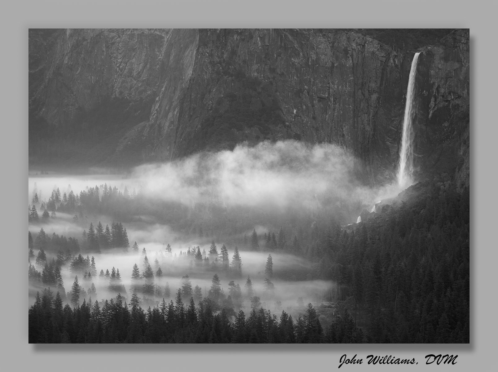
Last month I upgraded to a new computer, and as part of that I realized I was overdue to “weed the garden” and delete images that didn’t make the grade. This is one that I had in the “probably delete” folder from the Yosemite trip in May (I preferred Peaceful Valley, taken the same morning from the same spot, but sometimes it’s just hard to let go. I decided to toss it up for critique to see what others think.
Feedback Requested
What I’ve struggled with is the granite walls dominate a bit, but I have to include them to show the waterfall. (I would have loved some higher clouds/fog in the distance.) What do you think, keep it? As always, all suggestions are most welcome.
Technical Details
Camera: NIKON Z 7_2
Lens: NIKKOR Z 28-400mm f/4-8 VR
Focal length: 140mm
Shutter speed: 1/13s
Aperture: f/8
ISO: 64
@John_Williams For me , compositionally I prefer this image to Peaceful valley one, - the light and tones and drama really flow to the viewer and the waterfall appears to be filling up the valley.
I’m seeing this valley for the first time and I think the granite walls have been rendered tonally very well. The “smoke” dominates for me - nature is real power!
This is fantastic, John. I’m so glad you didn’t delete it. It always amazes me to see what we sort into the keeper v. probably delete columns. Sometimes it’s because we were really into a particular approach or level of abstract, and something else feels too traditional, or or just comparing two pictures, feel like we have to “pick one” and as a result, a really wonderful image gets set aside because we like something else better. It’s the scarcity model applied to a shoot. Of course, you can keep as many images as you want from one morning. Yeah, one might be your favorite, but your third or fourth has a right to exist as well, right?
As for this one, I also find it more interesting than the Peaceful Valley image. In part, it’s because Peaceful Valley could be anywhere. You know it’s Yosemite, but without context, it could be any number of places. This image, in contrast, is clearly of a place. The framing and set of conditions are truly original.
I think that dominance of the granite wall could be mitigated by a slight crop, but really, especially considering this week’s Weekly Challenge, there is something about that length of wall and valley that adds to the scale and the majesty.
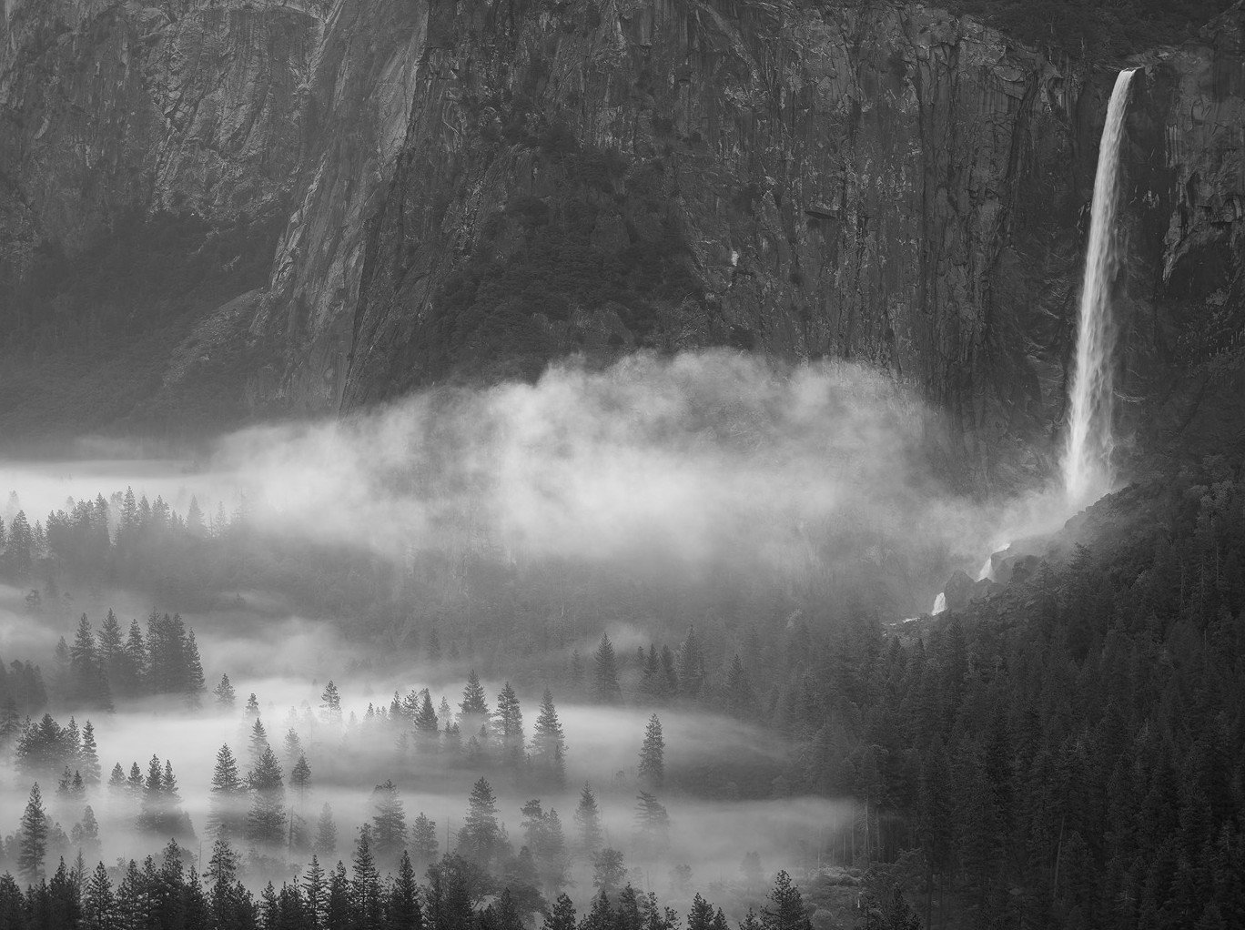
Here’s the crop I played with. I like yours better, but in case this gives you something new to play with, I offer it as an example.
You certainly had a productive time in Yosemite! I love the softer contrast due to abundant mist and fog and especially the billow just left of Bridalveil. The softer contrast of the granite walls helps accentuate the waterfall and the mists.
For me the wall has presence, as it will at this scale, but because of the relative uniformity and the great contrast and interest in the rest of the scene, it doesn’t dominate. Instead it provides context and a backdrop for the drama of the falls and the misty trees below. The relative low contrast feels ancient to me and adds to the gravitas of the scene. Fabulous work.
I like this a lot, John, and I most certainly wouldn’t get rid of it. The wall doesn’t bother me as it does add context. However, it does get some haze in front of it as you move from right to left and it would be pretty easy to accent that with a little negative dehaze if it suits the mood you’re trying to evoke.
I took the liberty of downloading and playing with this a bit in LR to increase the haze on the wall and brightened the haze in the valley a bit using a luminosity mask to draw the eye more to the haze than the back wall. Just some food for thought.
Huw, you’ll have to visit some day. This was my first time to photograph it, and it’s a rich environment for sure.
Thanks for the crop alternative Marylynne. I’ll be playing with this one a bit more eventually, and will fiddle with that. I hear you about the “pick one” dilemma.
I agree Preston, Yosemite was an amazing place to visit as a photographer, quite the candy store!
Dennis, thanks for the thoughts and the edit. When I am able to go back and work on this image, I’ll play with those ideas.
You had such great conditions that day John, I too prefer the other image you mentioned, but this is quite nice too. I like all the elements in the image, but it seems a little off compositionally, with the waterfall so far to the right. I almost immediately thought of cropping out the waterfall and just featuring the cliffs rising above the trees and the fog. I know, kind of heresy… I do like Marylynne’s crop suggestion as well.