I have to admit that it took several looks to appreciate this one. I could not understand what you were after. This is an image to not ‘understand’ but to absorb visually. I don’t know how to explain myself. If you are just let go and look without analysis then you get it. I don’t know how you even saw this to be something worth taking because as a viewer it takes time to even get what you saw in this. I’ll say this. It/s not an image for everyone.
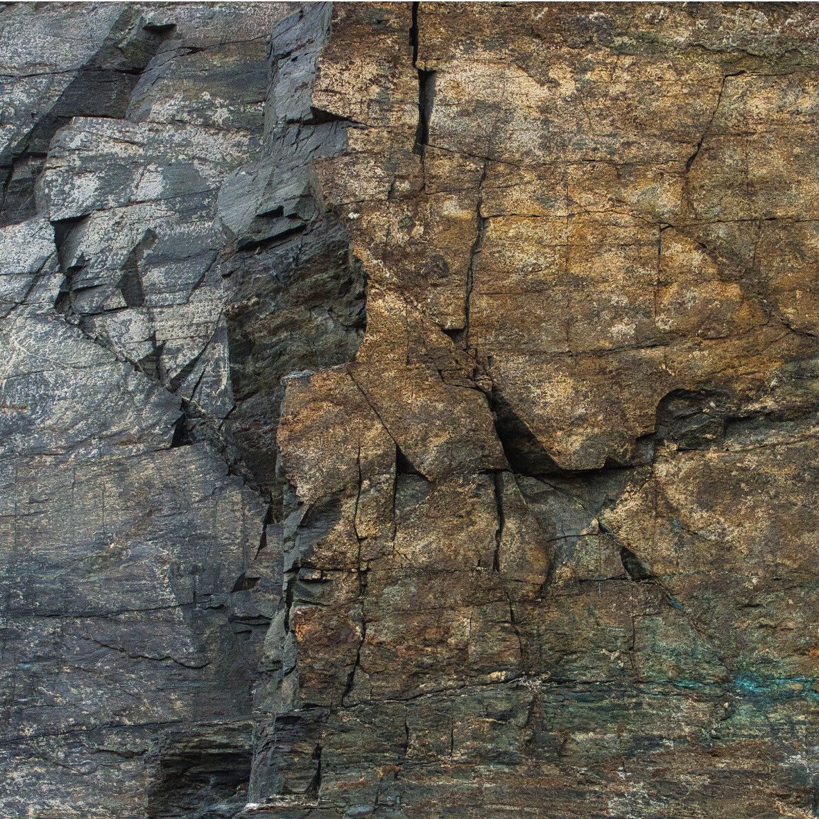
I like the contrast in warm vs. cool, and that it is an image that conveys a sense of depth and three dimensions. I love the twisty shape of the rock in the ULC. I think the image also works as a study in contrasts.
My only suggestion would be a crop from the bottom to eliminate the dark gap in the bottom center. Or maybe a clone of it way perhaps.
@Ed_McGuirk, @Mario_Cornacchione, @Igor_Doncov, @joaoquintela and @DeanRoyer thanks for your comments and thinking on the image. What caught my eye was the contrast between the cold and the warm parts, then I also liked that the rock surface had some depth. Some mixed comments on the ULC. It was not possible to keep that part fully out of the image, then I decided to include a lot of it to add to the depth. I agree that clone out the dark part bottom center is a good idea. Or in fact, I marked that area and brigthened the shadows and reduced the contrast, see rework at the top.
@Ola_Jovall
I like the image. You have both a warm/cool contrast of colors and a hue contrast of gold and silver/grey. I photograph a lot of geologic structure and really identify with this.
The composition is almost 50/50 and feels awkward to me. Johannes Itten wrote "Elements of Color. In it he talks about the many types of contrasts. One of them is the contrast of extension, where a divided frame may seem balanced, but has no visual weight on side or another.
Dividing the frame quite unevenly is one way to attempt to achieve visual balance. It creates visual weight for the smaller side.
By applying the principal to your image we get this:
@Guy_Manning thanks for taking your time to look more closely into my image, and thanks for the composition advice. I like a lot your take on the image. Once again, thanks.
I agree with Guy’s analysis. It’s pretty much what I suggested for David Wallace’s image of rock wall and pebbles. It also addresses the issue with the lower left quadrant, a weak section of the image. However, you can also purposely compose an image with two dominant sides and expect the viewer to look from side to side. There are no strict rules in art in my opinion.
@Ola_Jovall
I am glad you liked the change. There are few times when a 50/50 split visually works on an image. You also don’t have to do a square, you could take the entire right portion and include it, though you then have to worry about it becoming to much of one and not the other. Itten, a Swiss, was part of the Weimar Bauhaus. The Bauhaus was the most influential “school” of its time, stressing that all art should be utilitarian (something usable and easy to duplicate).
@Igor_Doncov
“There are no strict rules in art in my opinion”.
This is true, the problem with this comment is that the great majority don’t understand that there are in fact no rules. The ideas have become misidentified as rules, usually because the people lack background. The ideas discussed are instead tools we have been provided over the centuries by those who came before us. These tools are what others have found worked in the production of their art and some artists have codified them for posterity. Tools are used as needed and are not mandatory, though I don’t believe anyone can make a successful work of art without use of them. Use them as appropriate. The wholesale rejection of these tools, as seems to be common these days, is at the creators peril.
If you want to build a house you need certain tools: hammer, square, saw, etc. If you reject all tools, you can’t build the house.