The photographer is looking for thoughtful feedback on the image as a whole, especially around the areas noted below.
Feedback Focus: Artistic / Expressive
About This Image
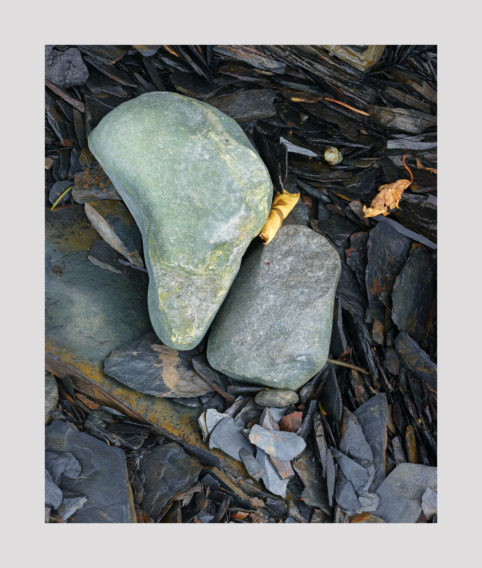
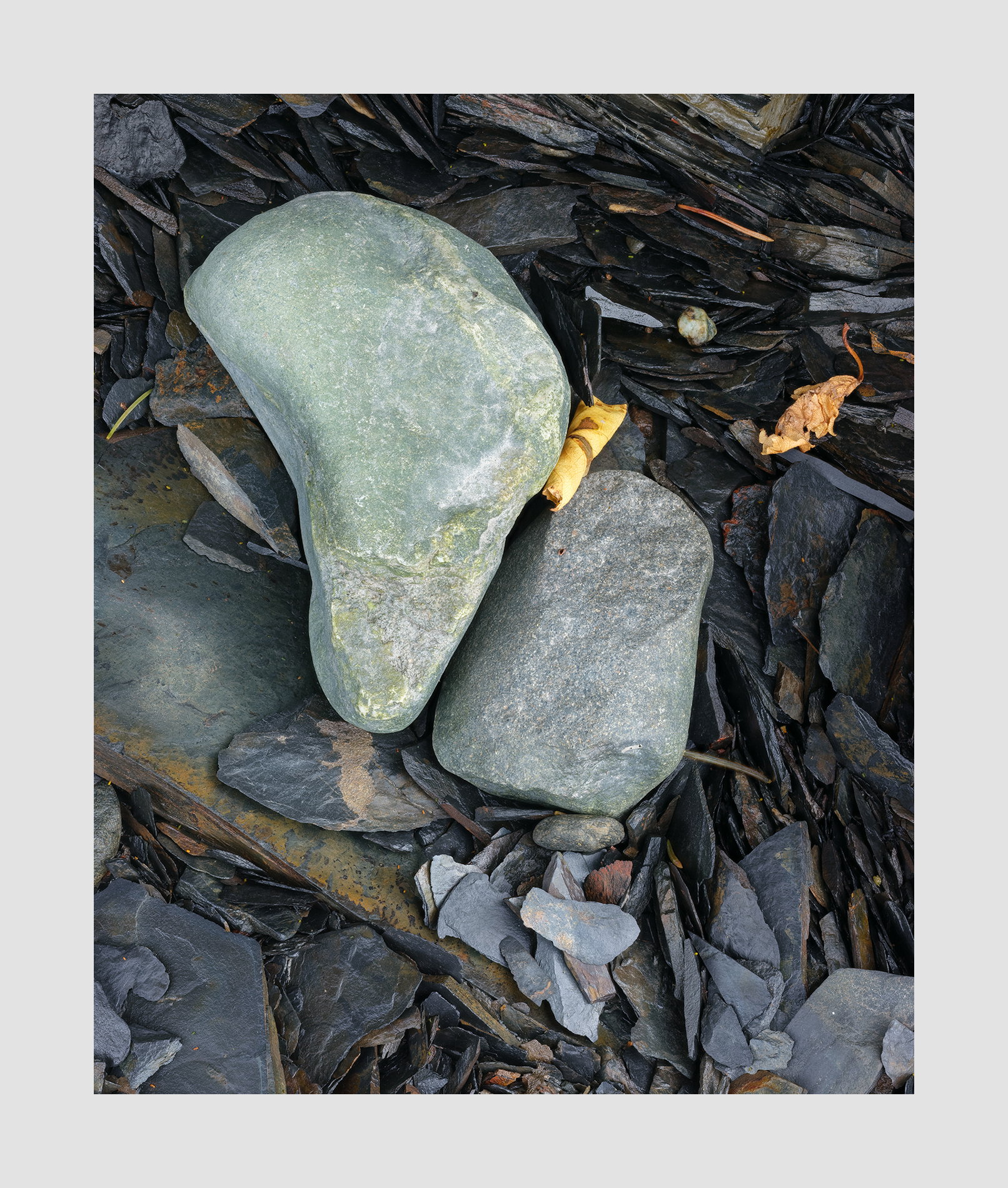
I’ve just come back from Alaska where I did all my work within 1/2 mile and most of it within 50 feet. Much of it will look very similar. They’re variations on an idea, idea being rocks and leaves in a variety combinations and arrangements (natural arrangements). In this image I tried to contrast the smooth curves against the jagged ones and scattered leaves. I thought of this as a still life when I shot it but now I see it as a sort of portrait.
Feedback Requested
I’d appreciate feedback on the composition — whether the balance, framing, or spacing is working.
I could saturate this more and make it more colorful. Would you suggest that? I tried that and rather liked it but wasn’t sure whether it started to look ‘showy’.
I find myself really liking this image, Igor. Interestingly, my eyes only spend a minimal amount of time on the central stones, but the dwell for a long time on the surrounding features going around the central features time and again. I’m not sure if that means the central features could stand to be smaller relative to the outside or not.
I’d have to see a more saturated version to know if I preferred it, but at this point , I think not. One of the things I really appreciate about this image is that you didn’t do the “border patrol” thing on it as I don’t find any of those little edge anomalies to be at all distracting.
Hi Igor,
Welcome back from Alaska. I was there a few weeks ago also.
I really like this photograph. It’s understated, and I think that works well. I wouldn’t mind seeing the more saturated version for comparison, but in this version, I like the gradations of tone and texture in the rocks, their alignment, and in particular, the one curled colorful leaf, just kind of finding its way into the middle of things and hanging out there. No nits from me. Feel free to share your more saturated version for comparison.
ML
My eyes always settle on your images, Igor. They are quiet and unassuming and gentle.
You have the art of turning sticks and stones into something special. The sharp shards against the smoother rocks is intriguing.
The composition is lovely and I wouldn’t mind seeing a more saturated version, but this one really works for me.
This image definitely has a distinct style: as soon as I saw the thumbnail, I knew it was yours.
I really like the image - its rich colors and shapes. The eye gets lost endlessly in its myriad details.
Strangely, nothing seems out of place - which is rare in an image of this kind.
Very good.
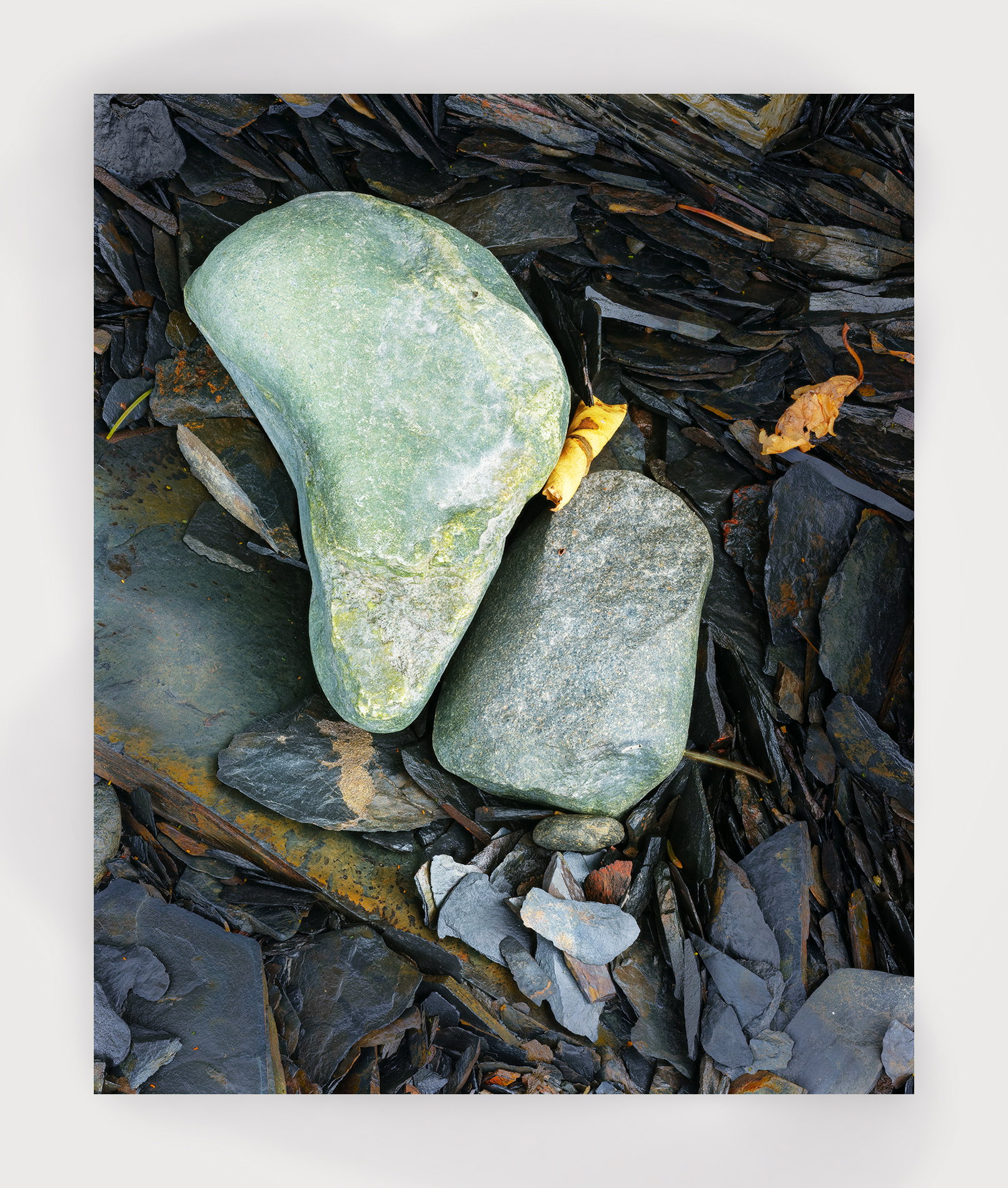
I added a slightly more saturated version next to the original. When I started to saturate the image I found the leaves to start to look to garish. The saturation helped with everything but the leaves. So I masked out the leaves during saturation. What do you think? To me there seems to be a shift of emphasis. The leaves seem to play a less prominent role. Perhaps that’s as it should be. I’ll print this and fiddle some more with it. I don’t think I want to have this be understated since the colors are really quite beautiful.
Igor, this is a great view of this collection of rocks and yes it shows your “characteristic” view and processing. The many sizes and shapes around the two big one keep the rest of the frame interesting. The scattered leaves add some extra interest with their shapes and colors. The diagonal of somewhat lighter rocks works well. I’ve switched bank and froth between the two versions and can’t see any differences.
Hi Igor,
Your adjustments seem very subtle, and I notice them mostly in the rock on the left, which feels more green and is a nice complement to the gold leaf curled next to it.
I think you’re right that even with those complementary colors, the leaves feel like less of a focus in the saturated version. But it’s subtle. If you like the rocks having more presence, it worked!
FWIW, the leaves make the picture for me. Maybe it’s because they are organic and I identify with their need for protection?
I know you will hit the right balance, and both of these work wonderfully for me.
The slight increase in saturation does have a nice effect on most of the rocks, Igor, and I tend to like it’s effect on the rusty browns. The greens (algae?) on the upper large stone seems a tad out of place to my eye, so I’d probably mask it out as well. However, given the subtle changes from screen to print, I think you’d be wise to do a bunch of test prints to make the final decisions on minor changes like this.
As the image appears to be a" mis en place" the assumption is it’s part of the story. If it’s a foreign object that needs an explanation or appears a distraction then def remove it
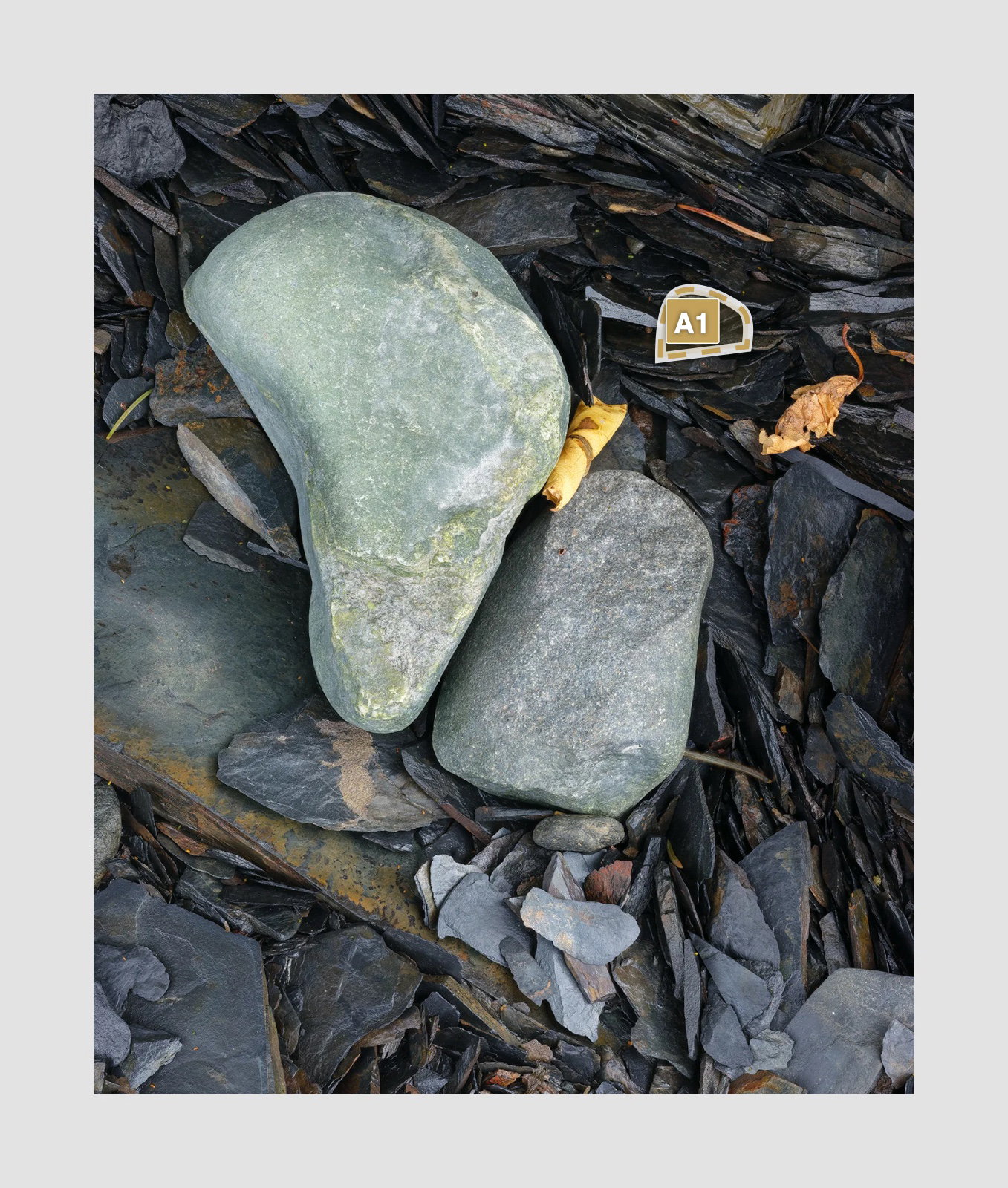
Superb composition, Igor, as always. The contrast between the rounded rocks and the canvas of shards of shale(?) make for a very compelling image. and the leaves add an additional texture to the story. The subtle bump in saturation works quite well too. I think I would remove that round little object/pebble that you circled as it does seem incongruous with those sharp shards, and conflicts with the solitary presence of the two large rounded rocks. Wonderful image that must be stunning as a 16x20 print.
This has your usual flair for a well thought out intimate scene that most of us would never notice and walk on by. All of the rock shapes fit nicely within the scene and form a cohesive image and I like the inclusion of the two leaves as they make a nice counterpoint to the hard shapes of the rocks. To answer your question about that small stone; yes I would remove it. I toggled back and forth several times between the two images and I am not picking up on a bump in saturation so I would be curious to see one. It sounds as though you thoroughly worked that area. Nicely done.
I found myself very much drawn to this image. So many elements of art, light, colour, composition, form, line, contrast and harmony are well utilised. The small white item you circled in the second image I think you should leave there- it creates a triangle of three with the leaves beneath, with the two light but contrasting in shape, size and energy stones anchoring them. The diagonals in the background, directing the eye, conveying energy, are also anchored by the smooth but interesting central stones. The smooth light central stone and bright warm yellow catches the eye, conveys calm and the more textured, detailed background draws ues in, line and colour directing our visual journey. They invite us to share a gentle moment of fascination, a glimmer, that sooth the soul, and awaken curiosity and connection with the world around us.
I am fascinated by the large rock - it immediately reminded me of the map of Africa. But as everyone points out, all the other objects form a cohesive portrait. I am glad, though that you added saturation to “Africa”, it’s such a gorgeous color.
Yes!!! I call it my Out of Africa rock. But now I’m being silly.
I’m fond of the color as well. I could have said ‘I like the color’ but you see I currently watching Pride and Prejudice and they all spoke in that manner back then.