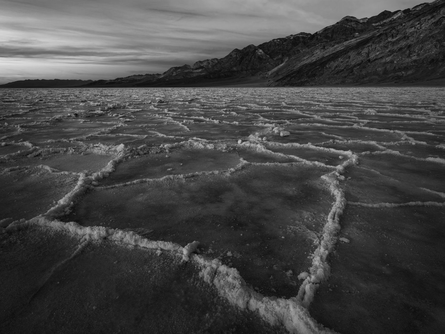
Death Valley is surely a favorite place this time of the year… this one is from a visit a few weeks ago. Not a new composition by any means but it’s hard not to take a shot like this when you are there. As always, I always look forward to your feedback!
I think the polygon idea works pretty well compositionally, that is the design. The sharp angles in the salt pan complement those of the sky and mountain thus adding form to the composition.
Yeah, I can see why this is hard to pass up, even if it is from a well known location. The graphic nature of your composition was just made for B&W. And the texture in the clouds also translates nicely to B&W. I like that you left more space to the right of the big polygon, it leaves room for the image to flow better.
While I like the luminosity of the sky, I wish the lighter tones in the salt flats and the mountain had just a slight increase in luminosity. I recognize this is a matter of personal taste, but I think a slight bump in contrast in the landscape can tease out some interesting textures.
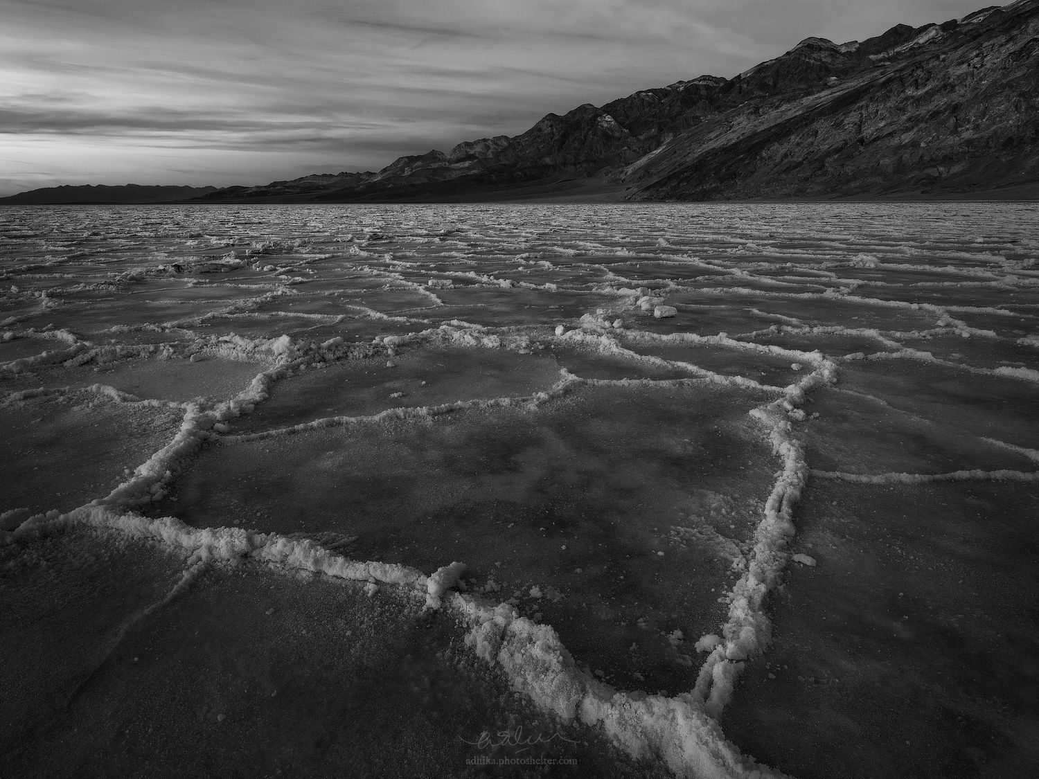
Thanks, @Igor_Doncov and @Ed_McGuirk! As soon as I posted it, I started thinking about more contrast to bring out some details in the polygon. Your feedback confirms it for me, Ed. I have posted a version with a little more contrast overall. Having a little more contrast to the sky seems to make sense, too (FG cannot be brighter than the sky?).
I like the rework a lot, it’s a nice improvement that draws out more texture in the landscape. And I’m 100% on board with your change to the sky, totally agree the sky should be brighter than the highlights in the salt polygons.
I know what you mean Adhika. I have been there multiple times hoping to get polygons this tall. Never have. I love the the shape of the polygon pointing towards the sun where all the action is. But it is something about the land mass that keeps my eye drifting out of the right to left line. If that is the intent then great. I haven’t done much B&W work but if it was color I would always try to bring out the luminosity and colors of the sky and mid ground gradually leading to the background. Your repost just popped up. I like it better. I still might pull down the whites in the hillside just a touch to shift more of the viewing to the left side. Or crop out some of the right side? Maybe it doesn’t seemed balanced? Other than that I can’t put my finger on what is nagging at me. Regardless it is a super shot with some nice polygons and a definite keeper.
Put me down for the rework. The contrast in the repost ups this a few notches for me, adding a lot of depth and interest. A fine take on that iconic location!
Thanks, @Alan_Kreyger! I am very happy with the rework, too, but I think @Greg_Stokesbury brought up a valid point. This is the final image where I added a slight vignette to the upper right corner masked only on the highlights. I think the change is very very subtle but I think it’s quite effective.
Sorry for the late response Adhika…I think this works well. The reworks have incrementally improved the image…yet there remains a lower key feel to it overall and I anticipate this is intentional.
The visual weight of the hillside on the right balances the power of the general direction and energy from R lower to L upper corner. I do think @Greg_Stokesbury is on to something about a tension that exists that is somewhat hard to specify, but to my eye, I’ve concluded it is the balance and energy of the elements listed above that explain this adequately. Very well done.
Adhika,
Even if I had prior visits to DV I would not have passed up this lovely image either. I love the subtle changes in the reposts as it makes an outstanding image even better. This has a wonderful depth to it with the graphic shapes of the salt leading the viewer into the scene toward the horizon and the mountains. Gorgeous work; no suggestions from me.