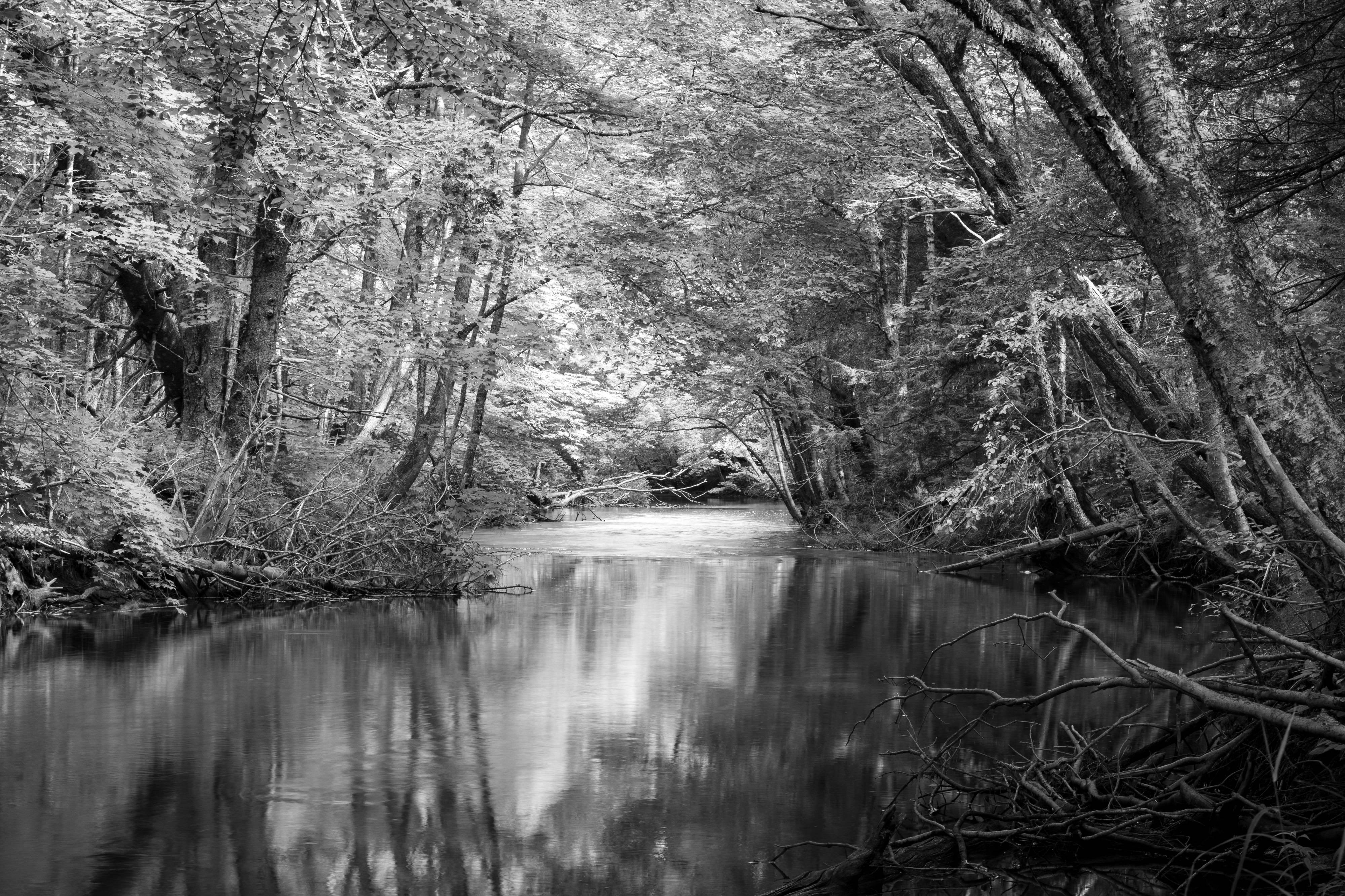
I’ve been working my way along a nearby trail a short drive from my house, finding various small scenes of interest. The trail runs alongside a quiet river through the woodlands behind farmers’ fields. Its quite pleasant and except for a couple of people fly fishing, I’ve had the trail to myself.
There are many downed trees along the river and in the woodland which I suspect may be the result of Post Tropical Storm Dorian which hit PEI in 2019 and did a real number on the trees here. That said, I have very little to compare this to so perhaps the many downed trees are a common occurrence in this kind of setting.
This particular shot was taken from the bank of the river.
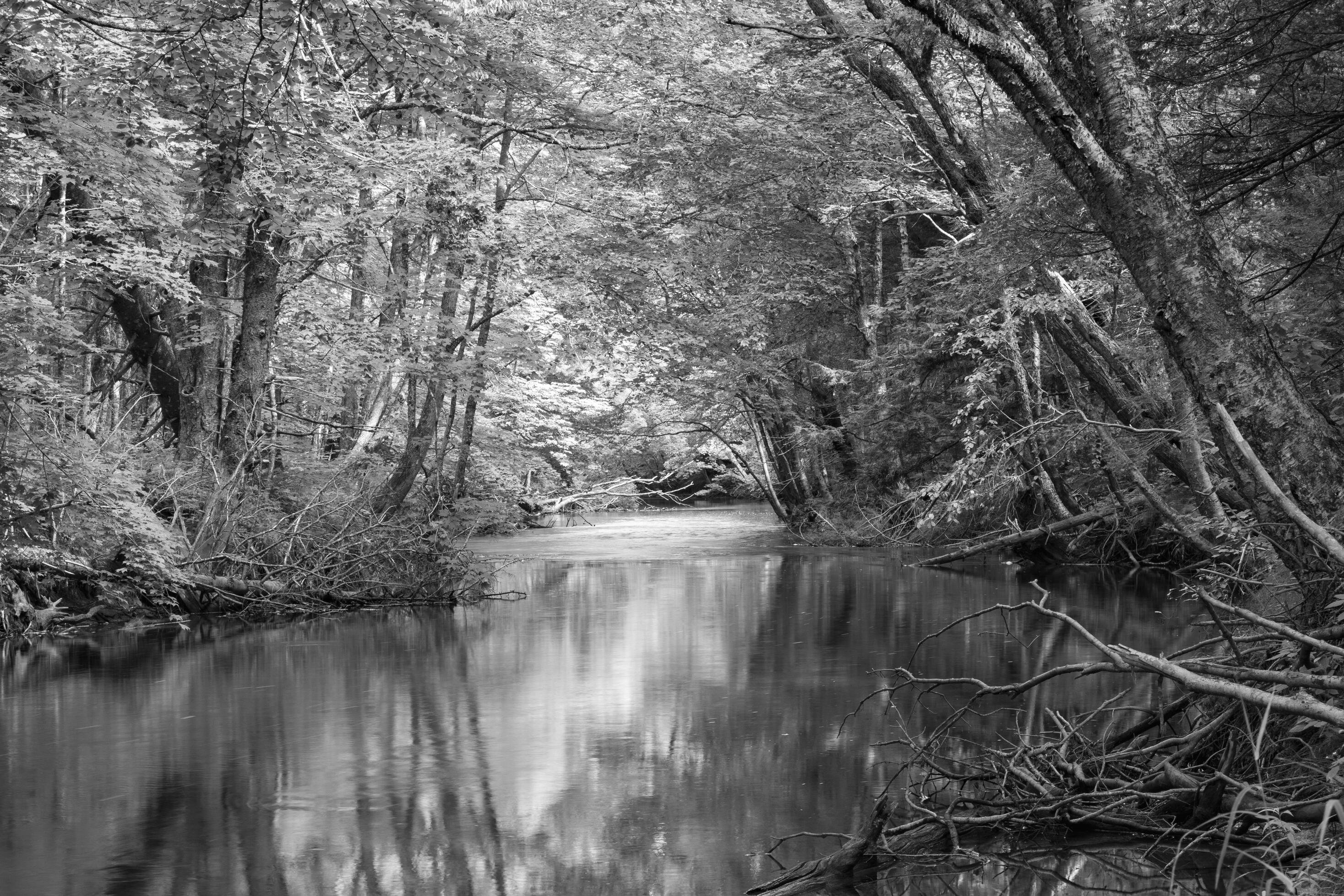
Here is the original shot in color, with some of the white blotches in the water cloned out:
Do you think this holds up as a black and white image or do you think it works better in color?
I believe the unattractive white blotches and streaks in the water are from the beige foam which was floating all along the river. Would you clone this out or leave it be? I’ve cloned out some of it in the color version of the photo but the amateur documentarian in me is questioning my motives.
Technical Details
Shot on a tripod with a Canon EOS 80D / EF-S55-250mm f/4-5.6 IS STM.
ISO 100, 55 mm, 0.8 sec, f/11
Minor edits in Lightroom to improve the range of tones. Color version has a number of water blotches/streaks cloned out.
I love green trees overhanging peaceful streams, so I surprise myself by preferring the B/W here. Not that there’s anything wrong with the color, but the B/W just has an interest I can’t put into words. I could sit there a long time.
The reflection is lovely but I’m not crazy about the branches in the LR. Maybe darken the brighter one? Looking up the river, it feels like it needs some CW rotation.
The B&W image wins hands down for me. It’s peaceful an d interesing.
I will echo Diane’s comment on the CW rotation. Once that is done, I think the resulting crop from the bottom is also more appealing. I might be tempted to add quite a dark linear gradient from the bottom edge.
While I like the monochrome, the color has more appeal because I have long loved and photographed scenes like this - small rivers with little to no development on the banks. They meander and flow with whatever nature throws at them, including big storms and wind events. If you want to strictly document a location, I would guess cloning isn’t going to work, but if you want to nudge the shots to a more inviting and beautiful state, a little can help. In this case I think it does. I do the same with my Prairie River project - leave it mostly as I found it, but do some judicial clean up.
That said, I think you could at least tone down the presence of the woodpile. It has a lot of visual weight, especially in the B&W version. You could also sculpt the light with some luminosity masking combined with dodging and burning through masks as stencils. If you work entirely in Lightroom you can do some of this with the new luminosity and color mask tones to refine brushes, radial and linear gradients.
Thanks @Diane_Miller, @glennie and @Kris_Smith for your comments and suggestions, they were very helpful and I really appreciate them! I’ve posted an update which takes them into account.
Looks good!! Just as the creek fades into the distance there is a dark area that is at a slight angle – hard to know if it is really on a level surface. The FG angle looks good – maybe a clone touchup to remove or correct that detail would be good?
I like the changes you’ve done, but would probably go a little further.
I may have gone a wee bit overboard with the gradient? It’s such a lovely scene and well worth the effort to tweak.
I turned CW a tad more, which lowered the sticks on the right and added the heavy gradient from the bottom. I’ve also increased the Shadows on some of the darker trees.
Thanks @Diane_Miller & @glennie, I really appreciate your comments and encouragement to go further.
I agree a bit more CW rotation looks better – I’m finding it tricky to clone out that dark black shadow in the water between the bright patch and the deep background.
I’ve gone further with the dodging and burning, deepened the bottom linear gradient and added a mild tonal-S curve.
First, thank you for working the image based on some excellent feedback. I must say when I viewed this when you first posted my easy preference was the color version. I do think still for this kind of scene I just appreciate and enjoy the color and the glow. The original b&w and why it didn’t grab me so much was because of something that many b&w suffer from - and that is it’s very different to separate colors in a b&w scene - we only have tones of white to black and 90% grey in between. Much of the detail and enjoyment is lost because the tonal values are so close together, the b&w, IMHO loses any staying power - ie. I lose interest quickly.
Now, having said all that - your repost with the b&w is excellent! A couple of steps above your original post. Great job incorporating the feedback! Such a big difference IMHO - there is much greater tonal separation and this last version keeps my attention much longer and better. Well done!
Thank you for your comments Lon! This exercise in particular has helped me get a better sense of things to look out for and work on.
I’m so grateful for this wonderful, friendly community. I’ve only been here a short while but seeing the work and comments of others and receiving feedback on my own work has been immensely valuable and encouraging.
I really appreciate hearing that, thanks @glennie!
Also, thank you for pointing out the reflection along the bottom right edge. I’ve done another pass and darkened that reflection and a number of other highlights. I also took the exposure down a tad and softened the water.