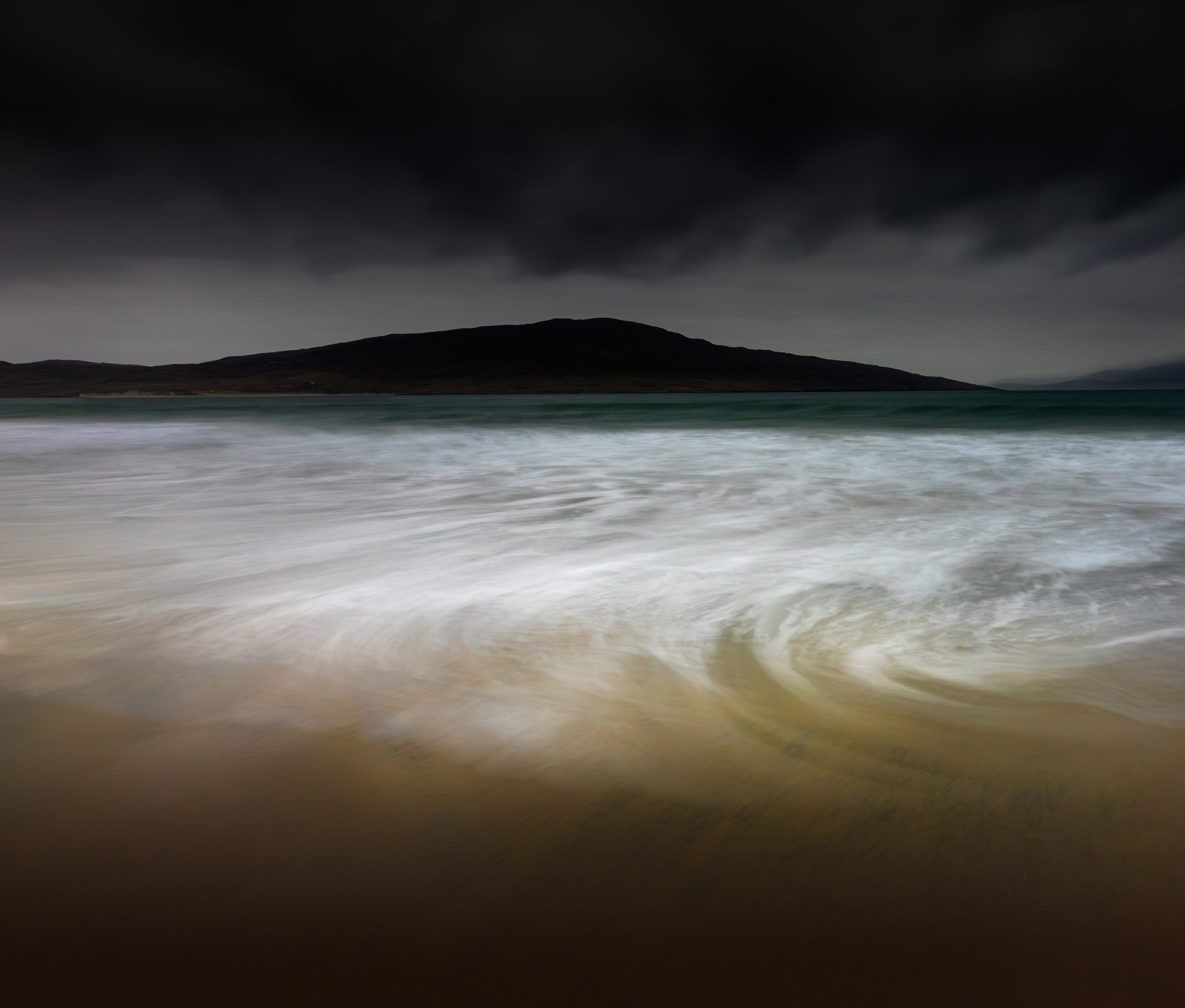
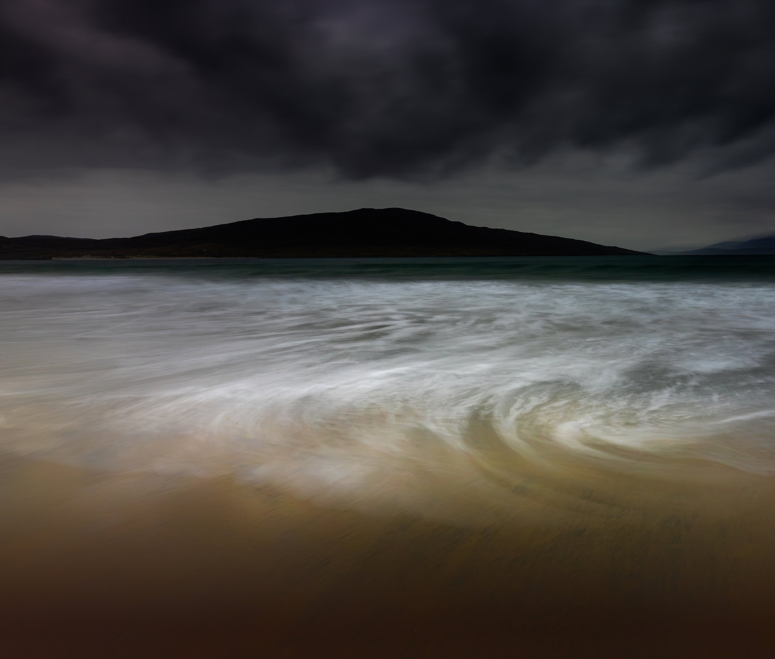
What changed: What changed: Many thanks to all the contributors to this critique - very helpful! I have tried a few changes and am getting closer to what i want - cropped out the right fuzzy mtn and made the focus the highest point - reduced contrast in the cloud to diminish focus there and keep it on the swirl and mtn - added contrast in the lower portion of the swirl - raised tones of the far left edge of mtn to balance the right I’m going to set it aside for a few days and try again with fresh eyes! Thx ag
Added after receiving feedback from the community.
The photographer is looking for deeper feedback connected to their intent, creative direction, and specific questions.
Feedback Focus: Artistic + Technical
About This Image
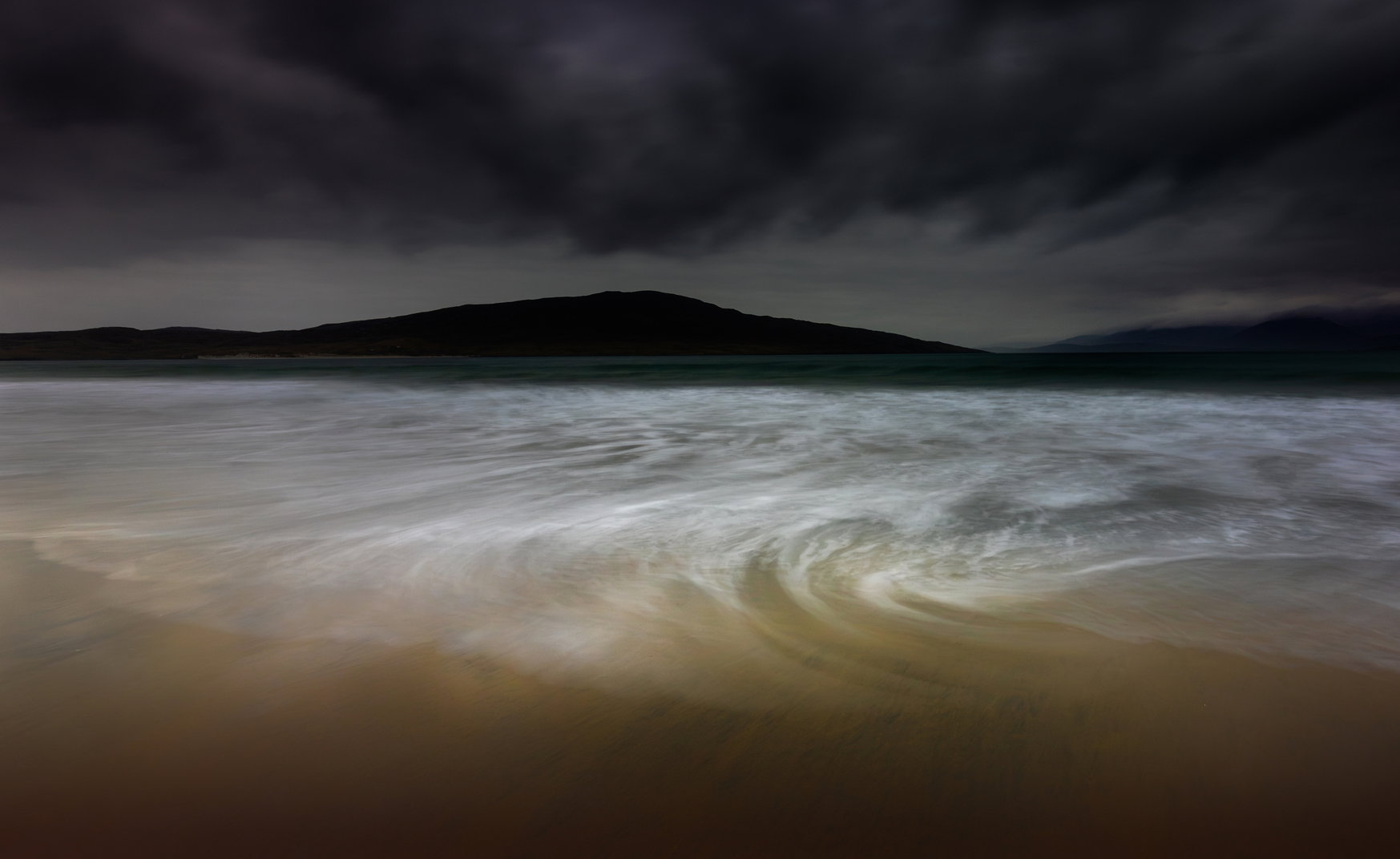
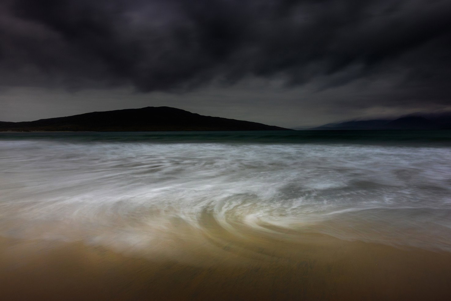
This is one of a number I made on Luskentyre beach on the Isle of Harris this spring. I really want to love it - I like the colours and the mood and the motion - but wonder if there are too many faults that can’t be overcome by further editing. Could it ever be a top-tier image with processing improvements?
Where Feedback Would Help Most
I’ve done a lot of masking to the image, trying to push and pull, but wonder if
a. those have been successful
b. there are compositional faults which probably can’t be overcome
Technical Details
Camera: Canon EOS R5
Lens: EF16-35mm f/4L IS USM
Focal length: 17mm
Shutter speed: 5s
Aperture: f/11
ISO: 640
Processing software: Lightroom
Major adjustments: lots of gradients on sky and foreground; lots of brushing in the water
Blending/stacking:
Other notes:
I didn’t pixel peep, so I’m not sure what kind of processing concerns you have. To me, it’s an engaging photograph, with interesting complementary colors, wonderful drama in the sky and in the water motion.
You mention compositional flaws. Can I ask what specifically you see as a compositional flaw in this? To me it feels a little right heavy, but that’s easy to address with a crop off the left side. I do like the scallops of water there, but I don’t think they make or break the image.
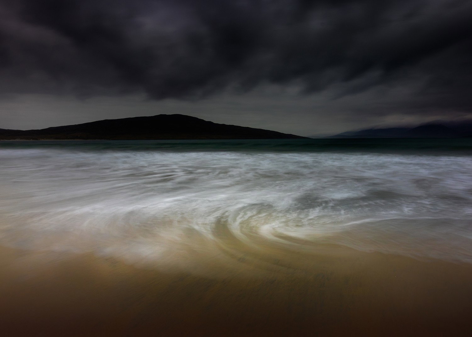
I played with a couple of narrower crops, which I offer as possibilities if you are unhappy with one side or another of the image. I tried a flatter wider, and I liked the taller narrower better.
I’m eager to see what others think as well. I’m not sure exactly what top tier looks like. I know my own top tier has shifted as I improve. I can say that I think this is an interesting photograph and one I would be proud to have made.
ML
Ultimately beauty is in the eyes of the beholder! I do think the crop ( 5x7 especially ) . DTLE are a challenge. I like the swirls in the water and lightening the darks in the upper 1/3 is probably a good idea
I very much like this, as you do. I find it hard to give a critique technically since it goes into the abstract somewhat.
I personally have attention on the darkness at the bottom. I would like to have that lightened up. But perhaps there is not enough data in the shot for that. I would be interested in how you got the shot.
It is certainly unique and as we sometimes say, “I would hang this on my wall.”
I like this.
I really like the composition and the way the swirl draws the eye to the mountain in the background and continues (like an inverted S) to follow the clouds and the sky.
I like the creative choice to make the mountain very dark, and I particularly like the “brushing” technique used on the water.
@Marylynne_Diggs@Steve_Buffington@Karl_Zuzarte@joaoquintela Thank you all for your comments and suggested crops. I wasn’t specific on the flaws because I wanted to see if they were apparent to others or mostly in my own sometimes overly self-critical assessment. The flaws I see are
the misalignment between swirl and mountain. I had envisioned an image with them both aligned but that’s not going to happen… but maybe it doesn’t need to
the contrast between the sharp relief of the central mountain and the fuzzy, misty mountains at right. They’re not consistent and that draws my eye. I’ve played around trying to equalize the tones of the central mountain and the fuzzy rights, but haven’t got that to work yet. i think it’s the sharp/fuzzy aspect rather than the tonal differences that are the problem.
the wave is not square on to the beach while the distant lanscape is, so there’s a slight wedge going on with the water area - ie wider at right than left
But your cropping ideas got me thinking and i’m thinking I can try cutting out the fuzzy mntns at right - to do away with the contrast issue - and lightening the tones of the swirl at left to get more balance, per my new version.
Doug, you’ve got a lot of drama here. As I view this, I’m wondering about what you’re trying to show. It’s quite dark, except for the swirl in the lower middle ground. The sky shows dramatic clouds and the yellowish tones at the bottom are a strong change-of-pace from the rest of the view, which is largely black and white. Cropping off the dark cloud on the right horizon has merit, but that reduces the value of the swirl… I would brighten the bottom 1/4th to let the color there play more of a role, but that has to be done carefully, since it looks clearly like you don’t want it to be a major player in the view. I suggest bringing up the middle darks in the clouds (looking for a bit more drama there). If you can get some tonal separation between the land on the right and the cloud, that gives a way to keep the view as frames. Those are lots of suggestions, that you, may or may not want to try. It’s your view, and your story, the key is how do get a viewer to see what you were seeing?
I really like your revised version, Doug, as that fuzzy mountain was bugging me in the original post. I like the dark, slightly ominous, mood you’ve created with this image. Unfortunately, I don’t have any real suggestions for what you might do further as I think the revised version works very well.
As an administrative item, there’s a button at the top of your post that you can click to add a revised version and it will automatically put it at the top where it’s easy for people to toggle back and forth between it and the original post. It also has a space for you to explain what you’ve changed and why.
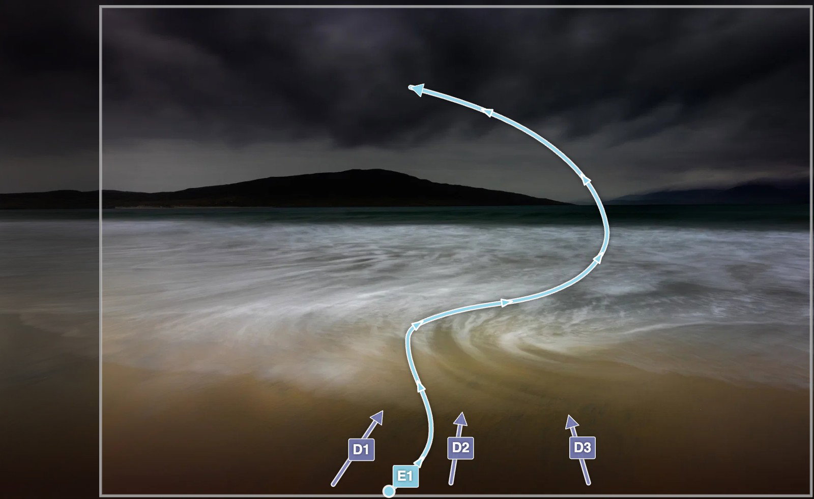
[E1] My eye is drawn through the image starting in the foreground with the dark striations pointing straight out to the gap in the mountains. My eye is further pulled through the curving and swirling wave and again, out towards the gap in the mountains. The heavy clouds are where my eye finishes.
[Crop] I think the left hand side of the image is the weakest part of the image and this crop better balances the two mountains, the main water swirl and the heaviest cloud in the upper left. I also think that the clouds are basically pointing to the taller mountain peak and the water swirl is pointing towards the smaller mountain maintaining balance.
[D1] I like these darker striations in the foreground and I think they should be centered
[D2] More dark striations
[D3] Again, more dark striations
[Crop] Crop] I think the left hand side of the image is the weakest part of the image and this crop better balances the two mountains, the main water swirl and the heaviest cloud in the upper left. I also think that the clouds are basically pointing to the taller mountain peak and the water swirl is pointing towards the smaller mountain maintaining balance.
This is clearly a heavily processed image and you had real intent with your edits. You have brought major drama to this scene with the darkening of the clouds which I like but I would consider dodging them just a bit to bring back some brightness. Not a lot but they feel a little too heavy for me.
I personally don’t mind the OOF mountain on the right side of the image. It’s farther away than the larger left mountain and there are lower hanging clouds/fog over there so it appears natural to me that those hills are more OOF than the more prominent mountain. I actually love that its soft.
The colors are personal choice and I like the purple clouds and the tan foreground. It works for me.
There has been some discussion as far as dodging the foreground sand along the bottom. I think it plays nicely with the moody darker processing you’ve chosen for your image and I’d leave it alone. I like it.
Your questions and self critique really got me thinking about this and I’ve been working on it for almost an hour. I really had to sit and think about how this could possibly be made into a better image since it is a banger to start with. Thanks for forcing me to think critically.
Great, moody image Doug! I like everything you have done with the revised image. Darkening the clouds brings focus more to the water and brightening the water just below the mountain does the same thing. I like the crop as it simplifies the image . I love the tones throughout and the sense of movement you get with the “soft” water. Excellent work!
Wonderful expression of a vision you had. Personally I prefer the 5x7 and 4x6 crops suggested over the 4x5 due to the fact that this is primarily a horizontal composition.
I love this! The super dark sky, the colours throughout the image, the white swirling lines of the water, and that dark foreground that keeps everything nicely contained.
I don’t normally like square crops that much because they usually feel too static but I’ll admit that it works perfectly here. Really nice work!
Nice work on the revision, Doug. Personally, I’m with David Haynes on the crop. I’m not sure why the lack of clarity in the right-most hill doesn’t bother me. Maybe it’s the storminess, and it just makes me feel like the rain arrived there first. To me, the swirl need to be more central, and it works better for me with the left cropped.
Of course, it needs to fit your vision and what you like about it now, after taking the image. Nobody likes having an image in their collection that they immediately associate with what they don’t like about it . I have one of those on my bathroom wall and get reminded multiple times daily.
This is a keeper though, so keep tinkering until it makes your heart sing.
 . I have one of those on my bathroom wall and get reminded multiple times daily.