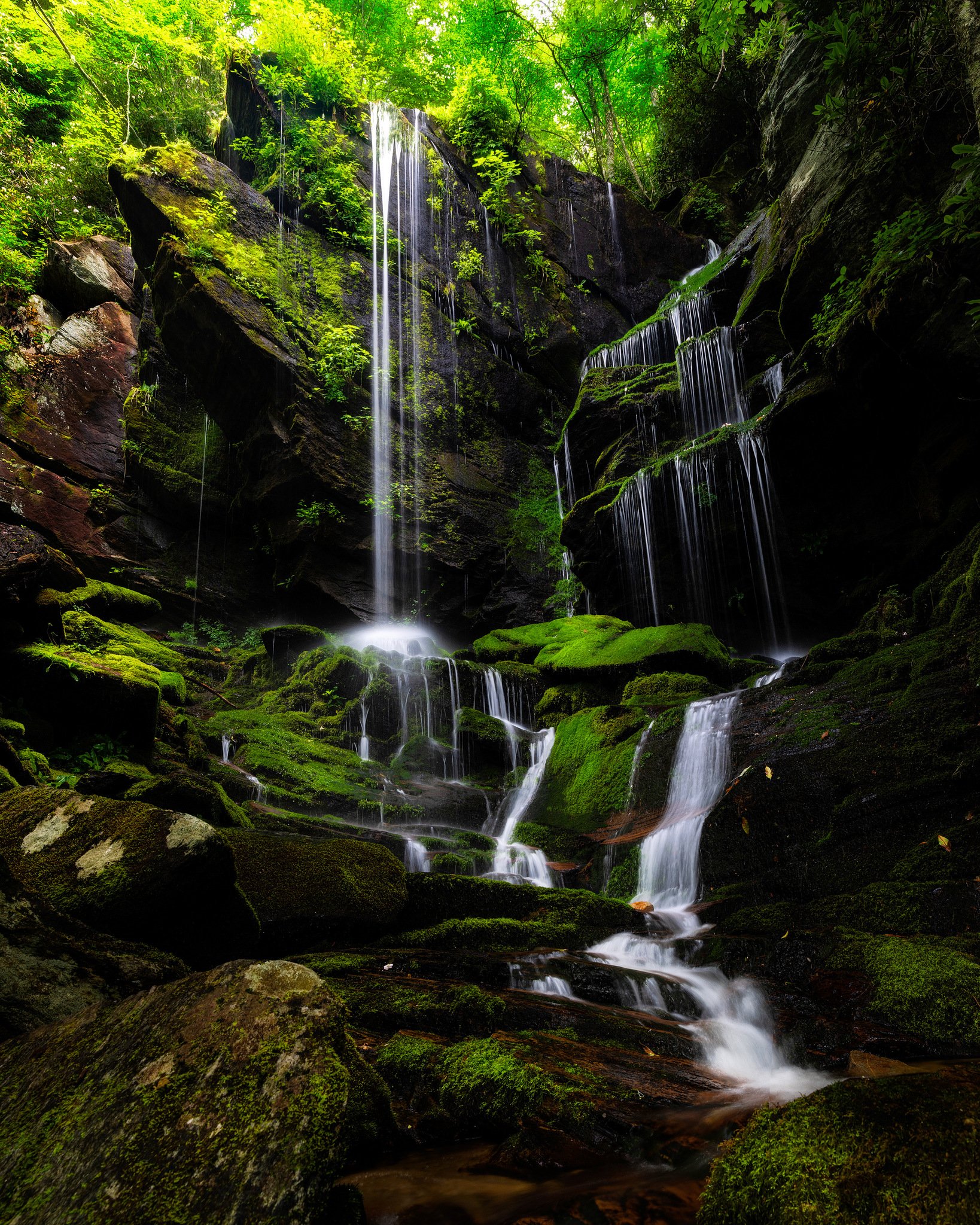
One of the tougher waterfalls to get to right off the Blueridge Parkway in NC, there’s just something surreal about sitting there. Maybe it’s that most of the time you have it all to yourself or maybe it’s getting lost in the green moss you can find all the way to the top of those jagged rocks. Either way this one’s my favorite in NC.
Specific Feedback Requested
I only had my 24-70, I needed a winder angle lens so I chose to focus stack in order to get the whole Falls in the shot. There isn’t a lot of room to back up and shoot it. I’d love any critique on composition/ burning and dodging or anything else I might be able to do different and make it better.
Hi Justin. I’m also a relative newbie here. This a really nice shot. I like the exposure length and the smoothness of the water. I also think you’ve composed the shot well with falls itself as my eye follows it through the frame into the background. If I would toy with anything it would maybe be the upper left corner? The tone of that section is brighter than the rest of the image and draws me away from the subject.
Thank you Cameron! I Definitely see that upper left corner like you said. It was one area that bothered me the most but didn’t want to do too much so thank you very much!
Hi Justin and welcome to NPN. A fine look at the falls. Looks like they were a little dry, but I think the perspective holds up well. When you say focus stack, do you mean you did a panorama stitch? I think a couple things might make the most of this photo - to bring down the green saturation and to even the light transition from the very bright left side to the very dark right side. The exposure on the water looks pretty good and the shutter speed left some detail there, but I’d do some work to make sure our eyes stay there and not all over the super intense greens or looking for detail in that darkness. You didn’t talk about your camera settings or development tools/process so this might not apply, but many of us work in Photoshop with the TK8 Plug In to create luminosity and other masks that help control light with a precision that’s pretty fantastic. I can have a go at your image if you’d like to see what I mean, or maybe give it a try yourself. All part of the learning and sharing we do here. Nice opening salvo to your time here on NPN which I hope will be a valuable part of your photographic journey.
Thank you Kristen! Yes pano stitch, I think in my mind at the time there was a little bit of focus change from the foreground to the top of the Falls but not much so that’s a much better explanation of the process.
As far as post processing, I used Lumenzia, still fairly new to using luminosity masks to their full potential so I would absolutely love for you to give the image a go.
Thank you for the feedback, i was Definitely a little nervous to post in here but it seems like the feedback I’ve read on others has been super helpful so I appreciate learning this space more and more and I’ll be more detailed about the settings/development in the future.
~Justin
Luminosity masking has a steep learning curve for sure, but if you take it in pieces and learn a bit at a time, you’ll be surprised how much you’ll come to know.
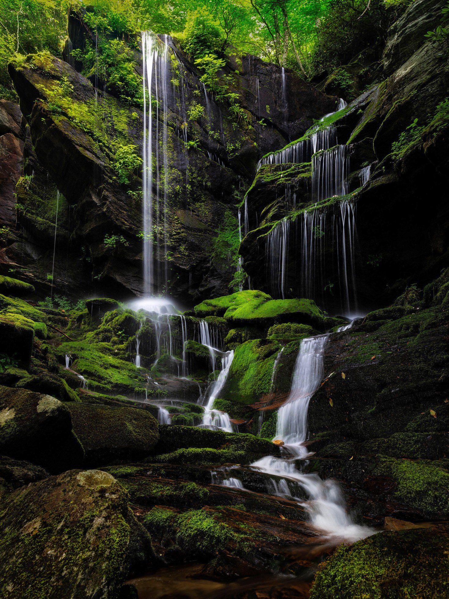
Here’s what I came up with in a few minutes in Photoshop with the TK8 panel -
And a little crop of the bottom and right at the end.
This is just my idea of how I would like this to look if it were mine. I could have played with it a bit more, but you get the idea. If I can explain anything more than just the layer labels, let me know. I generally use low opacity brushes and build the adjustments up slowly. I also usually leave the layers the way TK8 panel creates them - burn layers are overlay, dodge are soft light, levels & hue/sat are normal and clarity actions get a soft light layer as well. All are at 100% opacity.
Oh sorry, that’s just a duplicate of the background layer where I used the healing brush to remove some bright spots. Nothing super fancy, just didn’t explain.
Glad you like it. It was a fun image to work with.
Welcome, Justin! This is a lovely first post to introduce yourself here! I’m fairly new myself and have found this to be a fantastic place to hang out!
This waterfall is a place I could spend days, just sitting and soaking it in! You have framed a composition that is powerful but with a strong sense of tranquility, and I think you’ve done a wonderful job with composition and processing. @Kris_Smith has given you some great ideas and I can’t add more in that regard.
One thing I try to do with scenes like this is to correct the perspective distortion from looking up at the falls by stretching out the upper right corner. The only place it’s really obvious here is in the falls to the right, which ideally would be vertical. I’m guessing that’s why you wanted a wider lens, so you could correct it in post. You could gain a little width by shooting 2-3 frames with the camera oriented in landscape format and stitching, which could combine well with focus stacking.
That’s a beautiful waterfall and you capture it very well, but I would try to crop out the entire green vegetation on the top, even if that means to cut the central fall. As I see it, that would focus viewer attention on the water path.
Ohhh gotcha. Thought that was some cool little feature TK had but that makes sense. Really love what you did and how you did it from the layered work. Do you have any recommendations on where to learn more on the techniques or is that just a learn as you go thing? I feel like I’ve learned quite a bit of the basics on layers but not the techniques on applying that to the image.
Thank you! I debated on the horizontal orientation vs vertical. I was really kicking myself for not bringing the wider lens. I’ve only dabbled in stretching out the image a little bit but more to get things out of frame. I love that idea to fix the distortion though. I will absolutely give that a try!
Thank you very much for that and I look forward to seeing your images in the future!
Since you’re using Lumenzia as a plug in, I’d go right to Greg Benz’s You Tube channel to watch his tutorials. That’s what I’ve done with the TK8 plug in. I think once you’ve mastered the way the Lumenzia panel works, you could watch other luminosity masking plug in videos and just cross over to the way your panel is laid out and the different actions it has compared to other plug ins. Does that make sense? Here’s Greg’s channel link -
Thank you! I hadn’t really thought about cropping it that much. I think that’s something my brain wouldn’t let me think about since I love that upper drop. Thank you for making me look at the image in a different way!
Welcome to NPN! A wonderful first post. The clean cascades surrounded by the lushness of the Smokies is a wonderful combination. The composition is wonderful and the vegetation up top really allows this vertical comp to work because you’re not dealing with an unforgiving sky - instead the top is framed nicely with the vibrant and backlit vegetation.
Difficulty here of course is the dynamic range - the full range from deep black to bits and pieces of blown highlights (very few, so that’s good!) The resulting high contrast is the toughest to deal with. Can’t tell from the jpg, but not sure if even the RAW has any detail in the shadows? Which leads to the old axiom, you can’t create detail from pure black…
Anyway, I’ve employed another cool tool from the TK8 panel and that is Tony’s tried and true “Triple Play”. It’s just a tool in the bag that I occasionally use to pull up some shadow detail. In this case elevate the darks just a bit and subsequently reducing the contrast a little. Not sure if this fits your preferences, but yet another alternative approach. With that, I also toned down the brightness/saturation of the yellows/greens up top.
Lastly, I think you nailed the answer to your own question. At least for me. I’m not even close to being an expert in processing, but how I’ve learned is pretty much by one thing at a time. You learn a simple technique, then build it in to your workflow. Some times things stick, other times they get replaced by new techiques. But I think the point is that most folks are going to get overwhelmed trying to dunk yourself and immerse in to learning everything there is about LR, PS, masking, etc. etc. Slow and steady wins the race… and “learn as you go” seems to work best. At least for me.
Welcome aboard. Looking forward to more images and for your participation!
That’s a lovely waterfall. Sounds like a challenging shoot without the wide-angle, and I do think the image would be improved if the water on the right was falling straighter. Some stitching programs can compensate for perspective, but if that’s not an option you could use Puppet Warp to help. I’ll post a quick and dirty thought below; it’s far from perfect since I did it quick, but it will give the idea. I also agree that the brightness at the top/left distracts from the falls and would cut that back as noted above. I like Lon’s suggestion on the blacks, and would go back to the originals to see if more detail is available. I would only bring up the deepest black areas though, if the rest of the image gets too bright it robs from the falls. Anyway, this is a lovely scene with just some technical stuff to really make it sing.
Nice to see you here Justin!
For me the highlights are slightly too bright and the upper part of the frame is blown out slightly… not sure if you had some way of reducing that…
I also think the blacks are pushed a bit too far on the canyon walls but that could be personal taste!
Welcome Justin: I think the scene is wonderful. Living in the desert southwest, when I see green like this, I want to stay there for hours!!
Processing is a matter of taste, but it is also an art. There isn’t a singular right answer, but here’s one answer I came up with. Several luminosity and saturation masks, quite a bit of selective dodging to create more light where it felt like it would be beneficial. I pushed the exposure of the dark tones up a good bit as it was just too contrasty for my tastes.