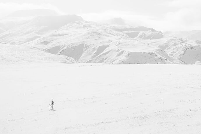
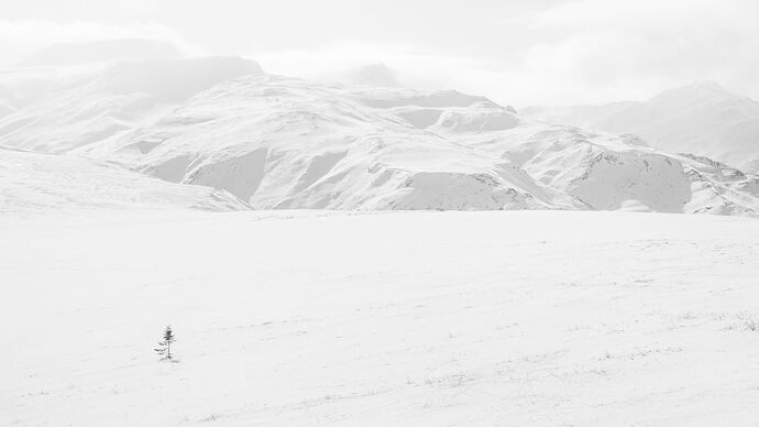
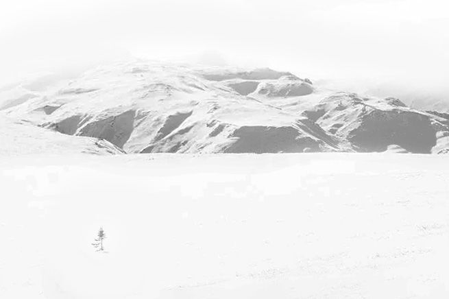
Second Set of Re-posts: I apparently uploaded two 16:9s last time, so this time I got both aspect ratios and I straightened further. I’m pretty certain the ground sloped up to the left here as we climbed this hill, but it’s like a curving lake shore. It’s gonna look better horizontal.
Thanks again all!
4X6 (for real this time) Straightened more
16:9 Straightened More
REPOSTS:
Thanks, everyone, for the feedback. I like the lower contrast and moving the tree. Originally, I think I cropped to remove some other vegetation, and that brought the tree close to the edge. This time I moved the tree a bit and “snowed over” some of the little sticks and such in the foreground. I rotated a bit, but not as much as Don had, as I think the ground was rising there as we went up to the pass.
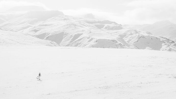
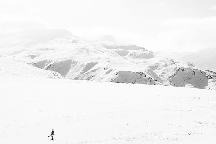
I also reduced both the contrast and the exposure to give the sky a little something. I raised the blacks (lightened them) to keep that tree from becoming so dark. I’m sharing here two crops with this new tonality approach–one the original 4x6 and another a 16:9 that I thought might community expanse, but I’m not sure it does as it brings in another ridgeline and perhaps detracts from the focus on the tree.
As always, let me know your preferences.
4x6
16:9
Original Post
Critique Style Requested: Standard
The photographer is looking for generalized feedback about the aesthetic and technical qualities of their image.
Description
After watching Stefan Gerrits’ webinar on high key photography, I went back to some of the photographs from my trip to Northern Alaska in 2023. We took the highway north out of Wiseman toward Prudhoe Bay up to the pass (a north/south continental divide), and on the way, we saw what was described to me as the northernmost tree in North American. This tiny little white spruce tree (maybe 3-4 feet tall and who knows how old) is the last heading north in north America.
I had not been able to do anything with the image as it all felt somewhat underwhelming as a composition. Tiny tree in a field with mountains behind it, some tundra vegetation poking through snow here and there. But high key seemed like it could breathe new life into the frame, and this tree struck me as a fitting subject.
Specific Feedback
I’m always eager for whatever feedback you want to throw at me, from technical stuff to gee that’s oof, to this is fine but it’s not interesting.
In particular, I’m curious about this:
- What is the first impression you get. Does the tree seem to have importance? Does it feel sufficiently alone and unique?
- As I play with high key in images not necessarily shot with that intention, do you feel like this has
a) an aesthetically appealing high key quality?
b) intentionality in the high key treatment?
c) too much brightness in the sky?
Technical Details
Canon 5d3 with 24-105mm at 60mm
ISO 160, f/16, 1/640s
Critique Template
Use of the template is optional, but it can help spark ideas.
Vision and Purpose:
Conceptual:
Emotional Impact and Mood:
Composition:
Balance and Visual Weight:
Depth and Dimension:
Color:
Lighting:
Processing:
Technical:
