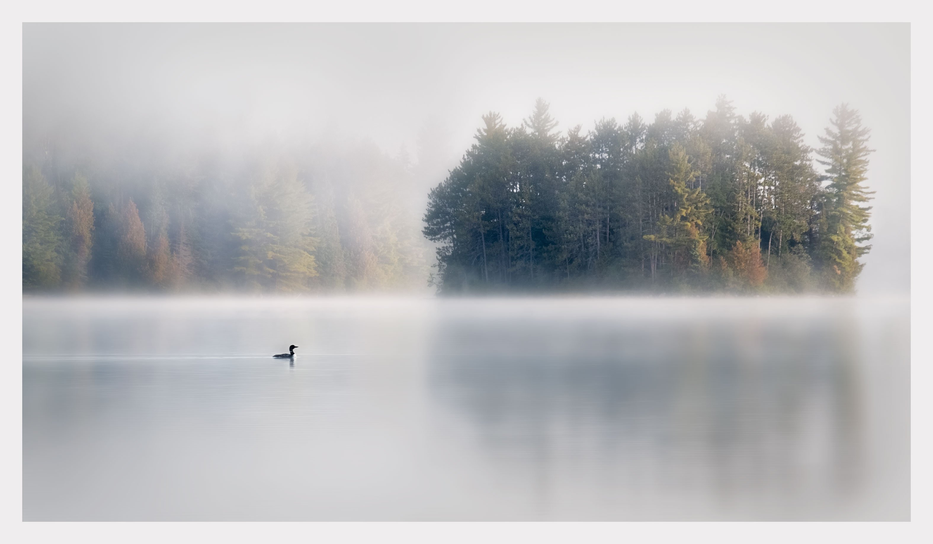
I posted a version of this image six or seven months ago in black and white. Given the magic inherent in this picture for me – the loon gliding into view just as I was about to tear down my set-up and call it a morning – I was never satisfied with the results. The first time around, as I came to work on it in post, I really didn’t have a clear idea of what I wanted the picture to be about and the result was a kind of dog’s breakfast – throwing a bunch of ingredients onto a table and hoping to end up with a banquet. Maybe I was just intimidated by the pressure of my own expectations at the time. Anyway, because this image is so special to me, I decided to do something I’ve never done before – go back and start again from scratch. This time I wanted to keep it simple and see if I couldn’t capture the magical, dream-like quality of the moment, more or less as I experienced it. I have been working on two versions simultaneously – colour and black and white. I like them both in their strengths. The danger with colour is that it can be used to hide an image’s weaknesses with the result being that the colour distracts from rather than enhancing the picture’s essence. I don’t think that is the case with this one. I feel that the colour adds another layer of complexity to the image – the sense of time. It is the colour that reveals the season and, I think a certain bitter-sweet sense of transition. The autumn comes early in canoe country and, despite the beauty, I always feel a slight melancholy at having to say goodbye for another year. Does any of this come through in this picture?
Kerry,
I do not know what the B&W version looks like, but I think the color is flat out gorgeous! The mood with the fog is truly magical as the BG trees fade away with an air of mystery. The loon is perfectly placed in the scene and is the icing on the cake for me. I have always loved their call the few times I have had the good fortune to listen to them while in Maine. I was going to suggest a crop from the bottom to move the horizon from the middle, but then decided that I like the reflections of the trees on the island and I would not want to lose them. The large version is a real treat. I think this would make a beautiful print.
Kerry, I’m glad that you started from scratch on this image, the result here was certainly worth the effort, it’s now become a a very powerful image with a lot of mood and emotion.
Some photographers rely on color (especially autumn color), as a crutch to add interest to an otherwise not so interesting image. They rely on fall color (and saturation) for impact, rather than making their image about composition, shapes, light etc. In this image, the use of fall colors is very subtle, the colors are lower saturation and they occupy only a small percentage of the overall scene. This “lower volume” use of fall color is harmonious with the soft and tranquil feeling of the rest of the image.
I couldn’t have said this any better myself. These feelings and emotions about the autumn season can tell very powerful stories in images, and you have succeeded doing that here. The autumn color is telling the loon it’s time to fly south to the ocean for the winter.
This is excellent, Kerry! The image has a great dreamy look and feel and great elements. I think you could get away with boosting the yellow/red saturation a bit and not lose any mood, yet furthering the feel of the changing season. But that is personal taste and minor. I think leaving it in color was a good choice. B&W would not convey the feel of the summer exit and the coming winter. I really like this one.
Absolutely fantastic image, Kerry! I really like the crop, mood the fog adds and subtle colors in the trees. The composition is outstanding as well. Congratulations, I am stumped as to making any changes.
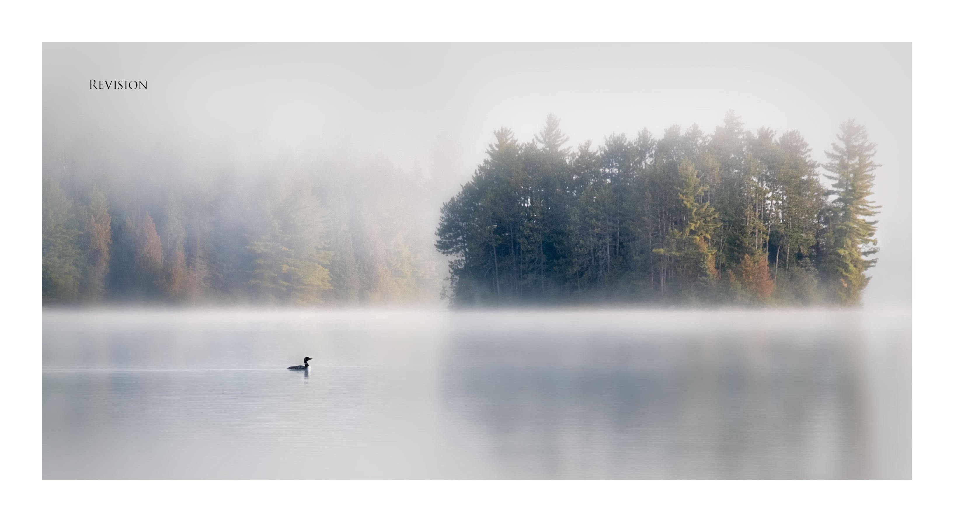
This is a superb image, Kerry. I think color is an obvious choice for this image with the autumn color and warm light. You have the warm coloration contrasting with fog; that’s wonderful. This image exudes tranquility and quiet. Not quietness from nature’s sound but from man-made noise. My only nit is, for me, there’s a wee bit too much negative space at the bottom. I downloaded and re-cropped a bit to bring the Loons presence downward a bit to help balance it’s position a little more.
It’s interesting that you mentioned you’ve never gone back and started from scratch again. I do that quite often. especially with images I processed 10-15 years ago when the tools we enjoy today weren’t available. Sometimes it works wonders, sometimes not, but I think it’s well worth doing.
Anyway, here’s my take on your image:
Original:
Revision:
Simply a fantastic image Kerry. For me, this defines, “capturing moments in time.”
I had a similar thought to Bill’s suggested crop. the original is fantastic - Bill’s crop feels just a little bit better. For me, it’s more about the presence of the loon, the foggy mist and the island - and less so about the island’s reflection - which I think you wanted to include given the crop. Minor aesthetic point though.
Beautiful moment.
Lon
I love the surrealist mood to this image. To me there is something very Canadian about this scene.
The sense of depth you’ve created is great with the Loon, island and background woods all on different planes.
@Ed_Lowe, @Harley_Goldman, @Keith_Flood, @Ed_McGuirk, @Nathan_Klein . Thanks so much for your kind words and support. This image, as originally post processed, has been a burr under my saddle for lo these many months and I’m delighted that the return trip has worked out so well. I did take your advice, Harley, and pushed the vibrance/saturation in the colour just a touch more, being careful not to get too far from the ethereal feel overall. @Bill_Chambers, @Lon_Overacker. Thank you both as well, particularly you, Bill, for taking the time to do the crop. However, I’m struggling with your suggestion. On the one hand I absolutely see your point from the point of view of balance. But I have a real problem with using “random” aspect ratios. It really messes up showing work together if everything is cropped all over the place. For example, I’m hoping this one will be part of a series and so far they are mostly all 16:9 with a couple at 2:3. As a single print, it doesn’t much matter what the aspect ratio is so long as it works for the image but in a book, for example, which is how I most like to collect and show my work, it can get a bit out of control. To what extent are standardized aspect ratios a concern for you in your work in terms of presentation?
I understand your concerns about aspect ratios in a series context for sure. I very rarely do series so aspect ratio basically means nothing to me. In fact, that I can remember, I believe I’ve only done maybe 1 or 2 series ever. I would love to see this image in a series - would be magnificent.