This is an old image that I revisited and tweaked a bit. I wonder if y’all think it has any merit.
1 Like
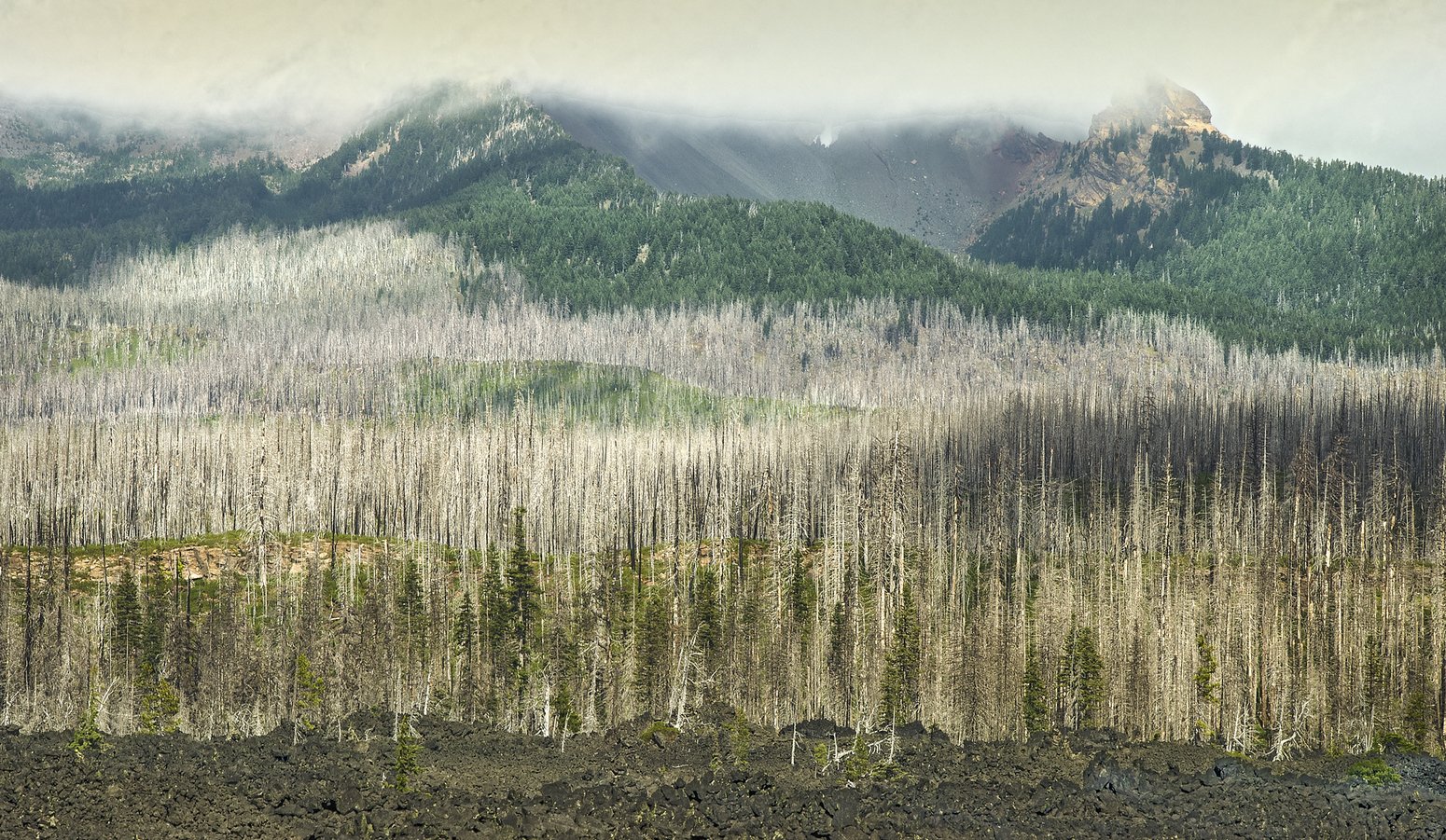
Hi Larry. This image contains a handful of contrasts: lava and trees, flats and mountains, live and dead, sky and earth. It also has some sweeping lines. So I think it has a lot of promise. South central Oregon Cascades? Cool country!
Rather than “has it merit” (YES) another question would be “does it convey the feelings about why I captured this and why I found it interesting to process”. That answer is not clear to me.
What are your feelings about this? What about the image stirs those? What can you do to stimulate or convey those to the viewer?
From the file name, I gather that this is an HDR image. The things about HDR processing are that it reduces shadows and takes liberties (under your control) with color. Both of those make this an odd image to view. I would like more shadows to define the trees and terrain. HDR did not do much to help your sky, which is a bit pebbly and has a tough line as it hits into terrain between the two peaks. Did you really need HDR? Could you recover some of the sky’s subtlety in a single raw file using ACR or LR by moving the Whites slider, and then avoid HDR processing?


I had fun playing with the image.
In one attached image, I decided I wanted to convey the textures of the scene, and added contrast in places that the HDR processing removed contrast. In the second image, I decided that the lines of trees and terrain in the left 2/3 were intriguing to me, and I accentuated them in the cropped version; also vignetted; the crop lets the sky and the lava form roughly equal top and bottom layers.
Dick, Thanks for your reply and rework. Your questions are the central ones we all need to ask about all images. Unfortunately, I did not think about communication in 2013 when I took this. I also agree about your HDR point. I have been laying really low on HDR in the last couple of years as well. Thanks for your comprehensive comments.
One thing you might look at is the color cast. Both the original and the rework have an overall greenish tint. I would correct that. You can do that in LAB mode by adjusting the A channel in the curve adjustment.
Thanks, Igor. I should not have even posted this image. I will try adjusting the color cast in LAB mode. I recently got the Dan Margulis book on LAB mode, but haven’t gotten through much of it. Thanks.
Hi @Larry_Greenbaum, really good shot.
Layers in composition works very well in my opinion, i personally don’t like how you managed the sky lights, i would decrease luminosity in a different way, like a more soft graduated filter.
It’s also my opinion, the image works well as is, thanks for sharing.
@masdamb, the more I look at this image, the less I like it as well. I chalk it up to learning. The best I can do with it now is either nothing or delete it. Thanks for your comment.