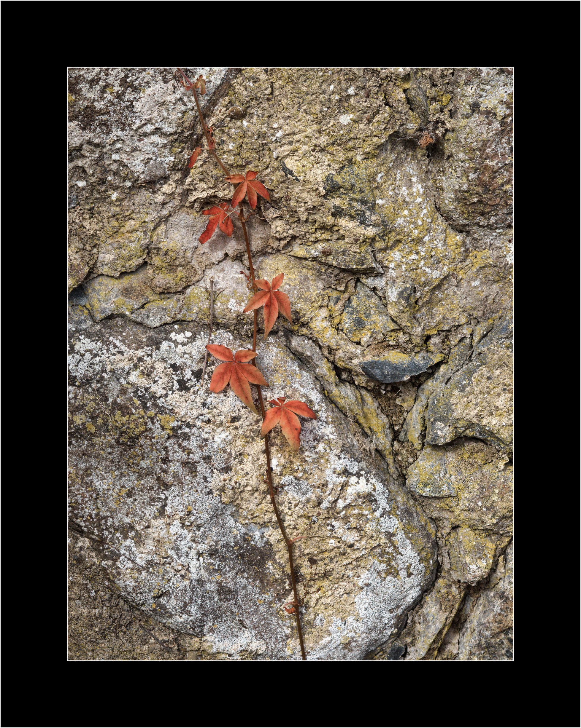
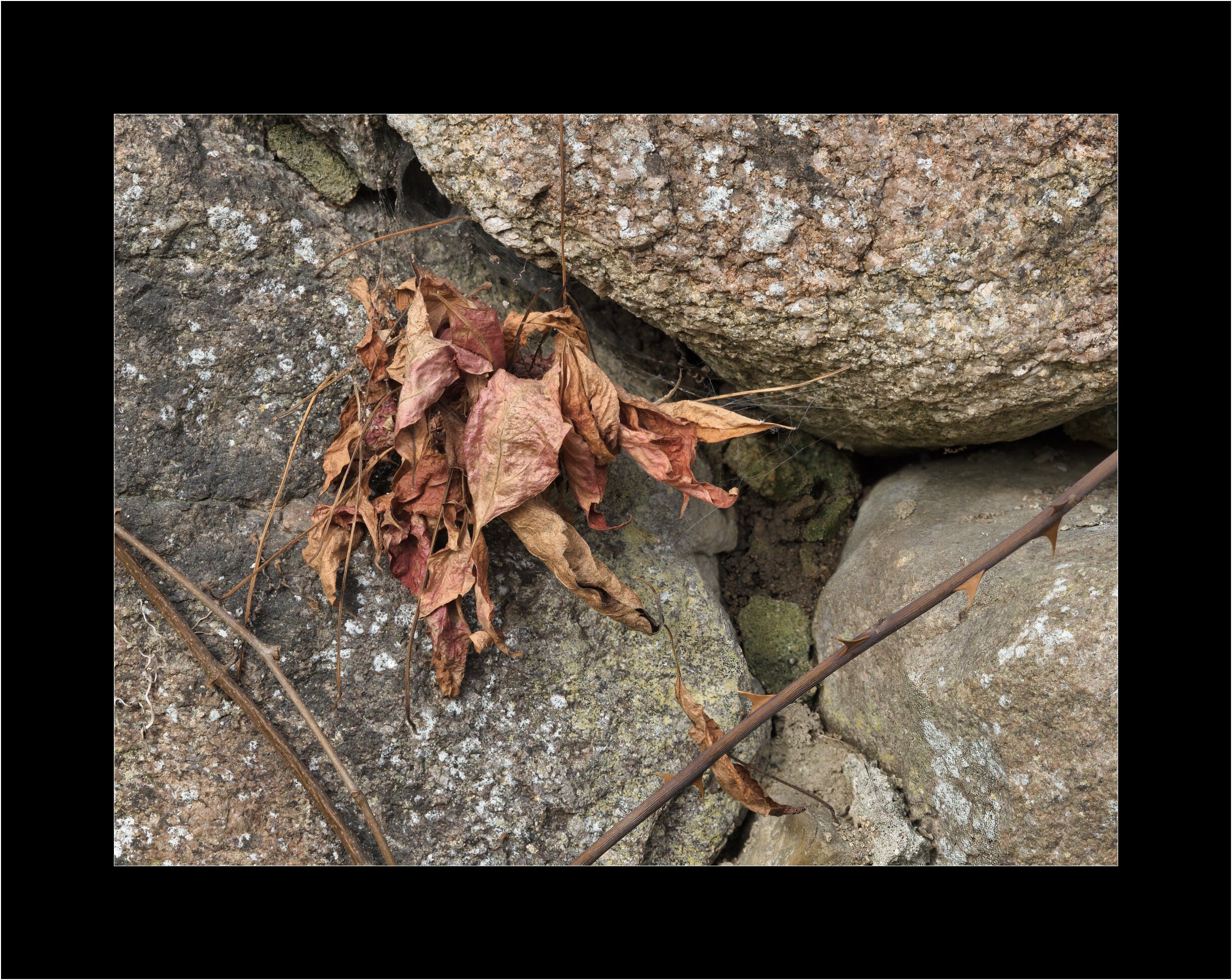
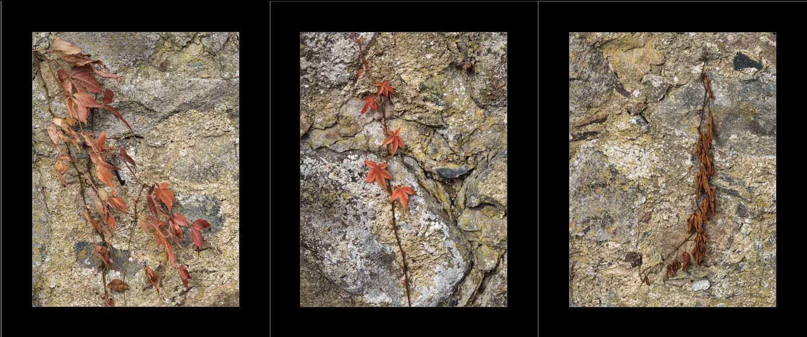
A while ago I visited the Svaneholm castle, and the very nive walk around the Svaneholm lake. When coming back to the parking lot I captured these images of the wall defining the parking lot.
Specific Feedback Requested
Any comments are welcome!
Technical Details
Is this a composite: No
f/5.6, 1/2000, ISO 800, Olympus lens 75 mm, travel camera Olympus PEN E-P7, handheld - windy conditions
Marvellous. Really. Although I might say that I like the first one best, I think that is beside the point. They are a series and the three tell a story that no single one can tell as well. I’d call them “tenacity and texture” because that’s my experience of them. Beautifully seen and presented.
I’ll go on a limb and say the 2nd one is the best composition. I think viewers are turned off by the decaying subject matter. I think it goes well with the background.
I actually like the first and second one equally well. But I agree with Diane that if the goal is to present the three images as a collection/series (triptych would be a great way), then having a third vertical makes a lot of sense. Hopefully you have another comp that would complete a series of three verticals…
The other aspect of this that makes the third image too different is that in the first two images the rocks are more of a background canvas that lets the plants stand out. In the third image, the curved line of the rock has a lot more visual weight, which competes with the vegetation.