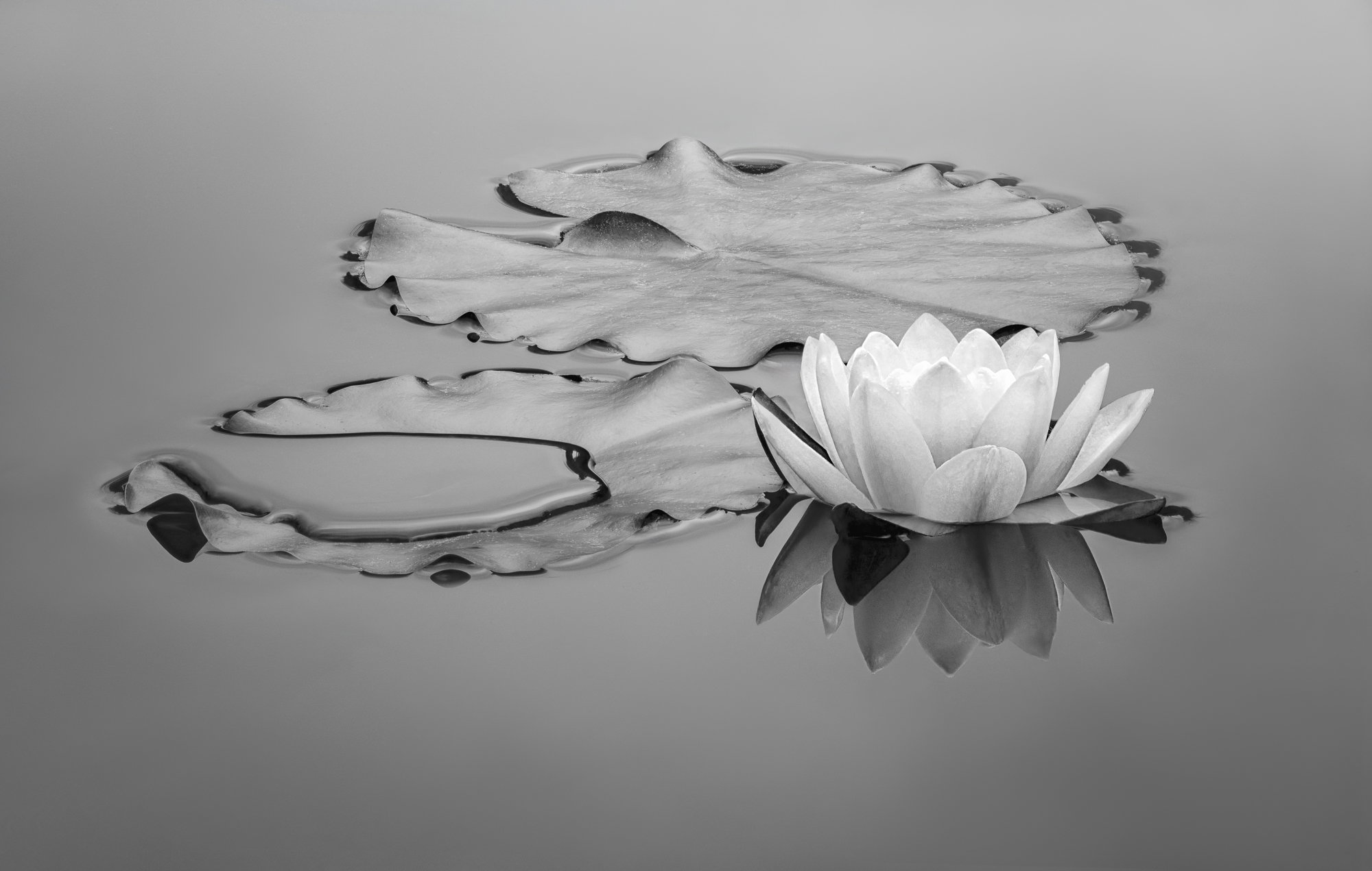
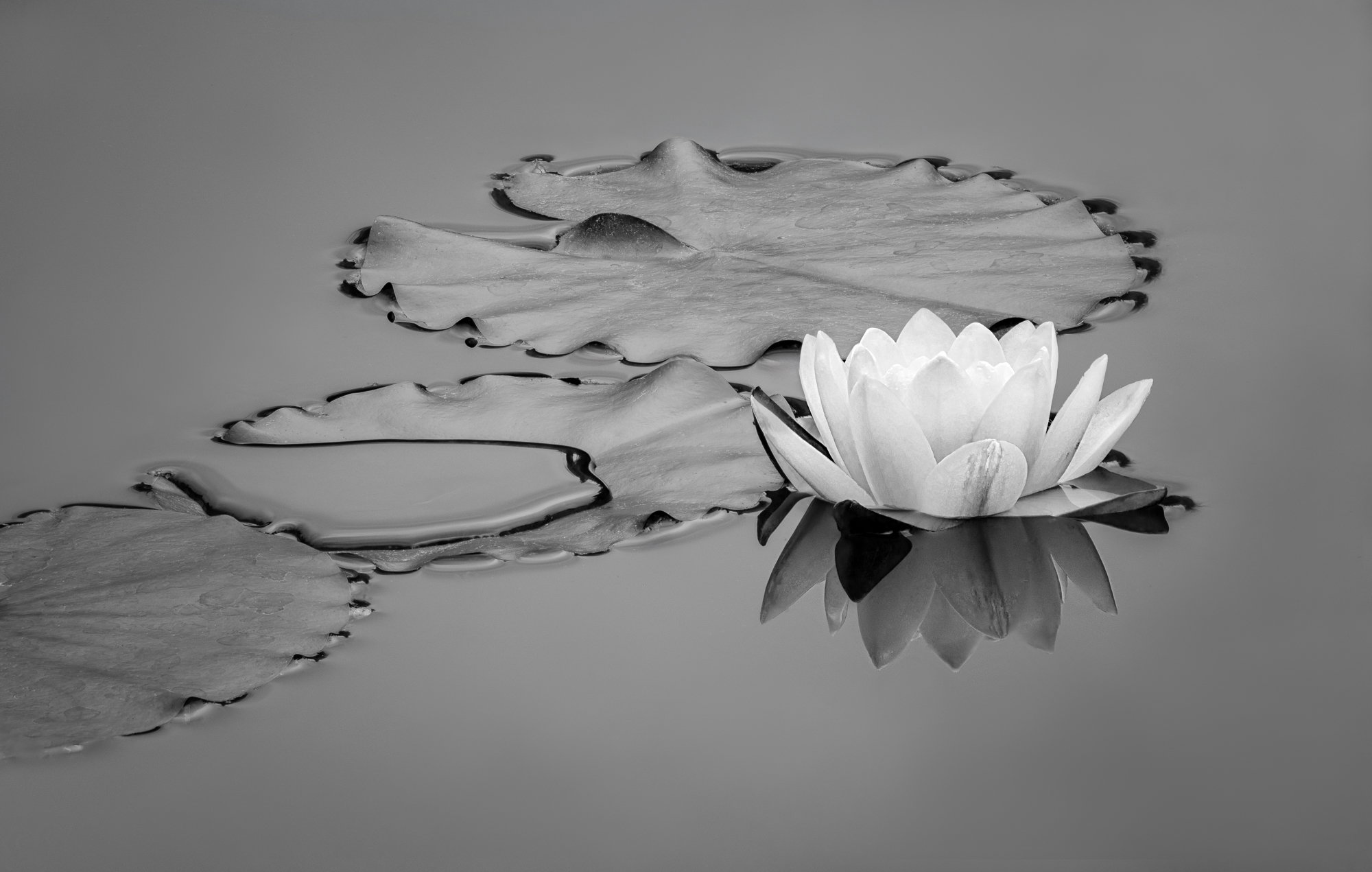
What changed: Some small cloning tweaks and a bit of rotation as the puddle felt awkward. Added a gradient for the water for a bit of dimensionality. I hope this is the last tweak!
The photographer is looking for thoughtful feedback on the image as a whole, especially around the areas noted below.
Feedback Focus: Artistic / Expressive
About This Image
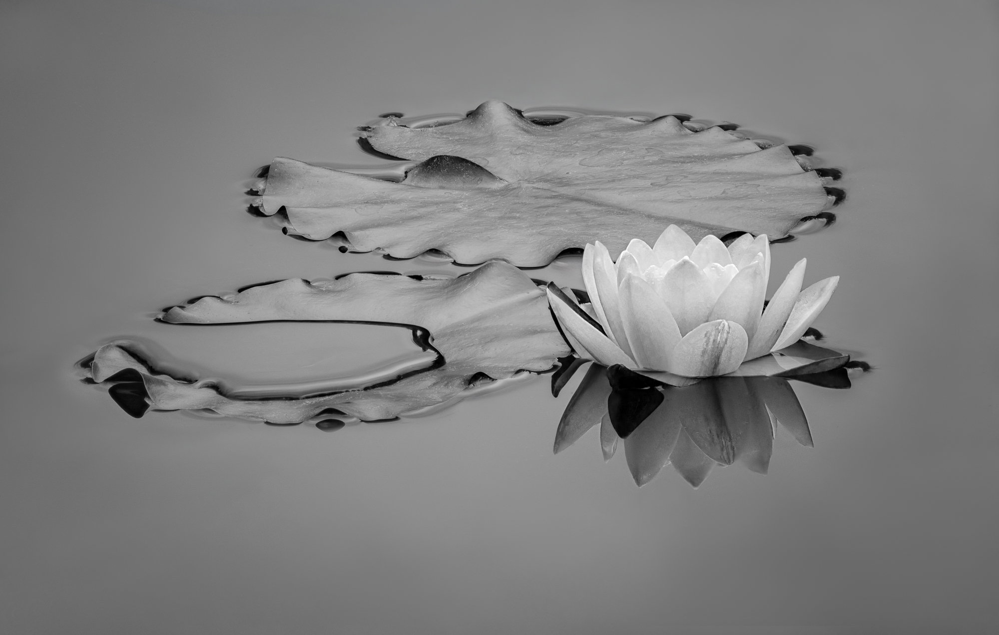
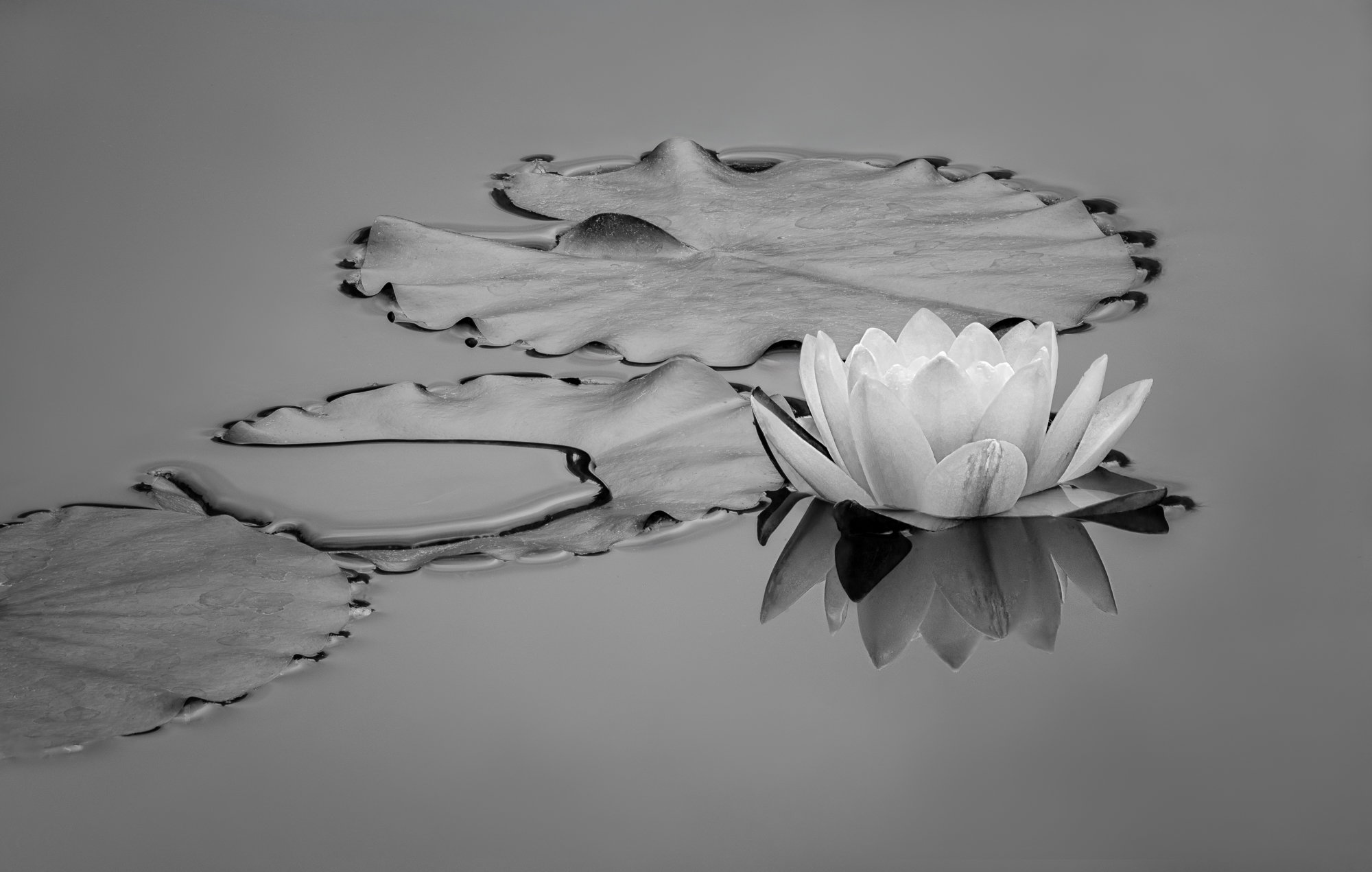
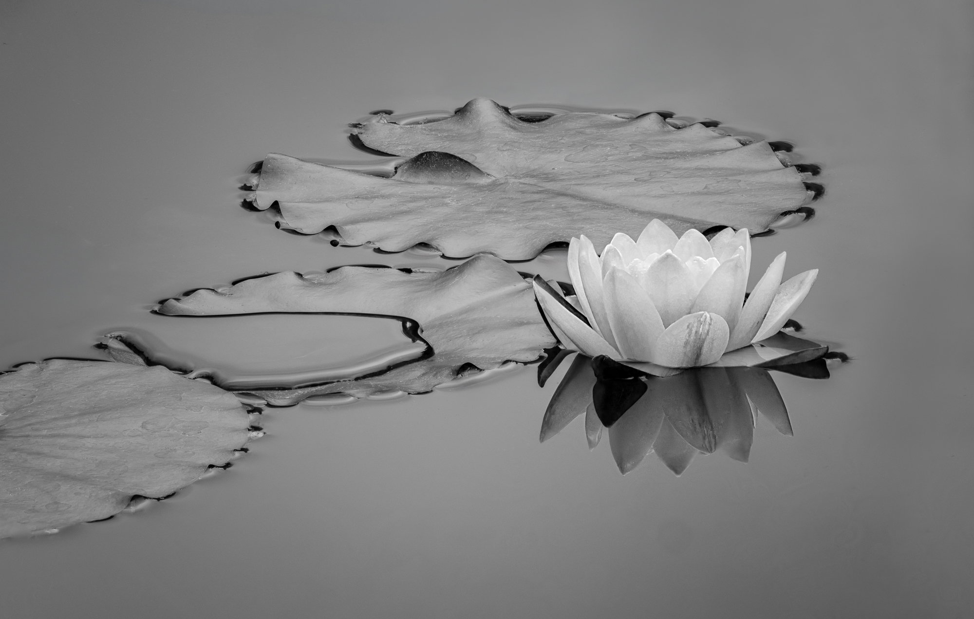
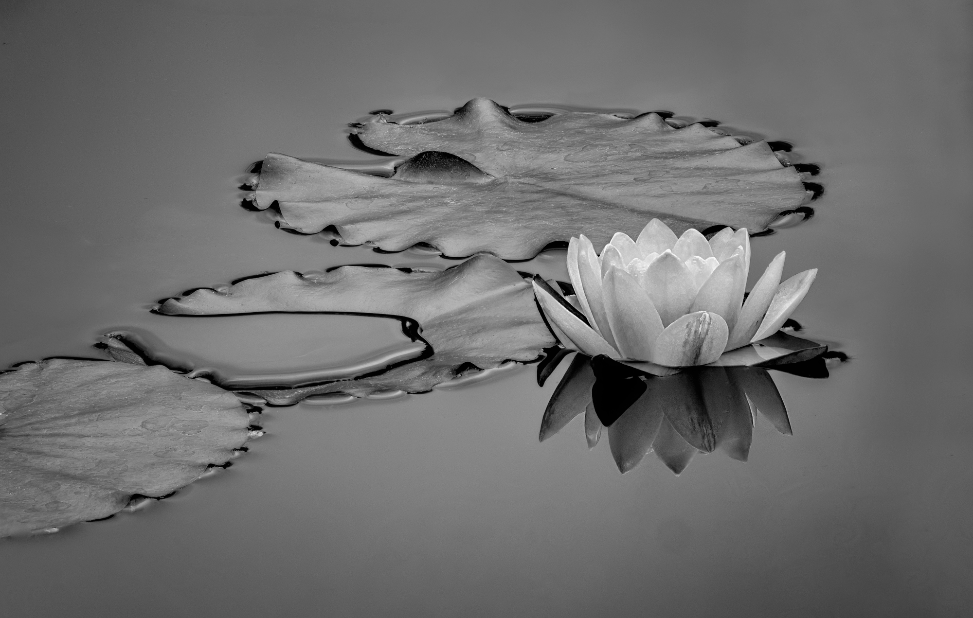
Morning fog has been clearing early lately, but last Thursday it lingered long enough for me to race down to Sonoma Botanical Garden. And calm air that let me capture this scene with a stack, although there is some flow through the pond. There was very little color so I went with B/W, and always love playing with the color sliders.
Feedback Requested
All comments welcome!
Technical Details
Camera: Canon EOS R5
Lens: RF100-500mm F4.5-7.1 L IS USM + EXTENDER RF2x
Focal length: 600mm
Shutter speed: 1/125s
Aperture: f/11
ISO: 500
Tripod, focus stack, minimal corrections in LR and into Zerene to stack. Then to PS for some simplifying at edges and B/W conversion.
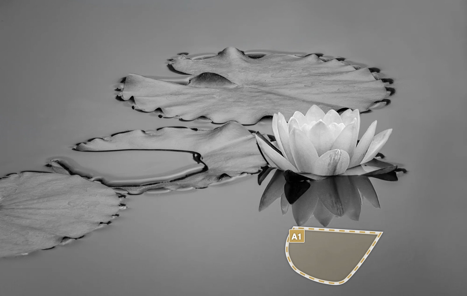
Wow, Diane, a great idea to put a water lily shot into B and W. I love the softness of the light here, and the reflection of the flower. The shadows under the leaf edges really enhance the outlines. The large blob of water on the leaf is stunning. Allow me to suggest an alternative composition. If you cloned out the leftmost large leaf, you would get a simpler composition, maybe cropping off a bit along the bottom of the photo. The cloning might be tricky because of the part adjoining the “blob leaf”, but I’m sure it’s not beyond your powers. You’d lose the leading line from left up towards the right corner, but to my eye that wouldn’t matter too much. Just my taste. (Yep, I love playing with the B and W sliders too!)
Hi Diane
If you are going mono I started trying to play with the lighting and contrast and the textures to make the image sing a bit more.
I have left the crop as is because I can’t see one better - I think the flooded leaf needs the one in the LLC to stop it being too much of a story but the circle of the water balances the circle of the flower compositionally very nicely .
Thanks, @Mike_Friel and @Huw_Thomas ! I cleaned up the dust spot (thanks, Huw – it was on the back of the TC) and tried darkening that leaf. I agree it needs something but not sure if this did any good. The raw file was striking due to its low contrast from reflections and I tried to stay with that but did bring it up just a tad in the OP.
There is now some posterization from the conversion to 8-bit JPEG.
I think I’ll try removing that leaf, but it will be tricky.
Diane: Wonderful subject and a fine comp and capture. My only suggestion is to brighten the lily just a bit. As it is it looks a little dull and even in B&W I think these flowers should command real attention. I bumped the flower a half stop which may be a bit too much but back to you for your consideration. >=))>
Thanks, @Bill_Fach – the histogram shows you are right! Fixed in the revision above, in which I also managed to remove the leaf. (Stole the material from a leaf I had cloned out at the top of the original capture.) I have the feeling it needs a slight CW rotation for the puddle, but left it alone here for a good comparison of before and after.
Didn’t think I would be able to do a decent job with the leaf, but surprised myself. Years ago in a high school art class, we were assigned to copy some piece, and afterwards the instructor told me I should consider a career as a forger.
Others have already voiced thougts similar to mine, so I’ll just piggyback off them. I agree with @Mike_Friel about the composition and crop and @Bill_Fach about brightening the flower. B&W looks great. Lovely work.
Your revision 2 is stunning, Diane, and the initial post was excellent to start with. Nothing really to add to what others have said, except that I really like the direction this image took.
Wow! Who knew that removing that leaf would give it more pop!? I liked the original and would have merely suggested a little more mid-tone contrast, but I like your second revision a lot. Nicely done.
ML
A bit late to the party, but OH MY this is gorgeous! I’m pretty sure I would say that if you only had the original. And I’m thuroughly impressed with the results of revision 2. Outstanding editing!
What’s now interesting to me is that I envision the color version as it might be more documentary, whereas the tonality, luminosity and even the contrast really make this one sing.
The latest revision is jaw-dropping in its simplicity and we all know that is the hardest thing to achieve. The arrangement of the (now) three elements is so balanced and the water spilled into the lower leaf is sublime in the way it tells the story of the watery world. However you achieved the grayscale tonalities is fantastic. I never thought a version with this much gray could work so well. We’re so hung up on contrast and “pop” with black and white that I think we’ve stopped appreciating the softness and subtlety of all that is in between. Gray reveals, but also conceals in the sense that we can gloss right over it if we aren’t careful. I bet this would make a stunning metal print. Can you say ‘Fine art gallery’? Fabulous.
Thanks, @Lon_Overacker and @Kris_Smith ! This is one that just sort of sat there on my screen and told me what to do. The original was very low contrast which got me onto the right path. It was quite unlike others I had shot within about a half hour within maybe 50 ft along the shoreline.
Yeah – next print is probably in the works. Time to move some older things into the guest bedroom.
 Remind me if you go to the Yosemite gathering in November not to let my checkbook get out of my sight around you
 >=))>
 I agree with