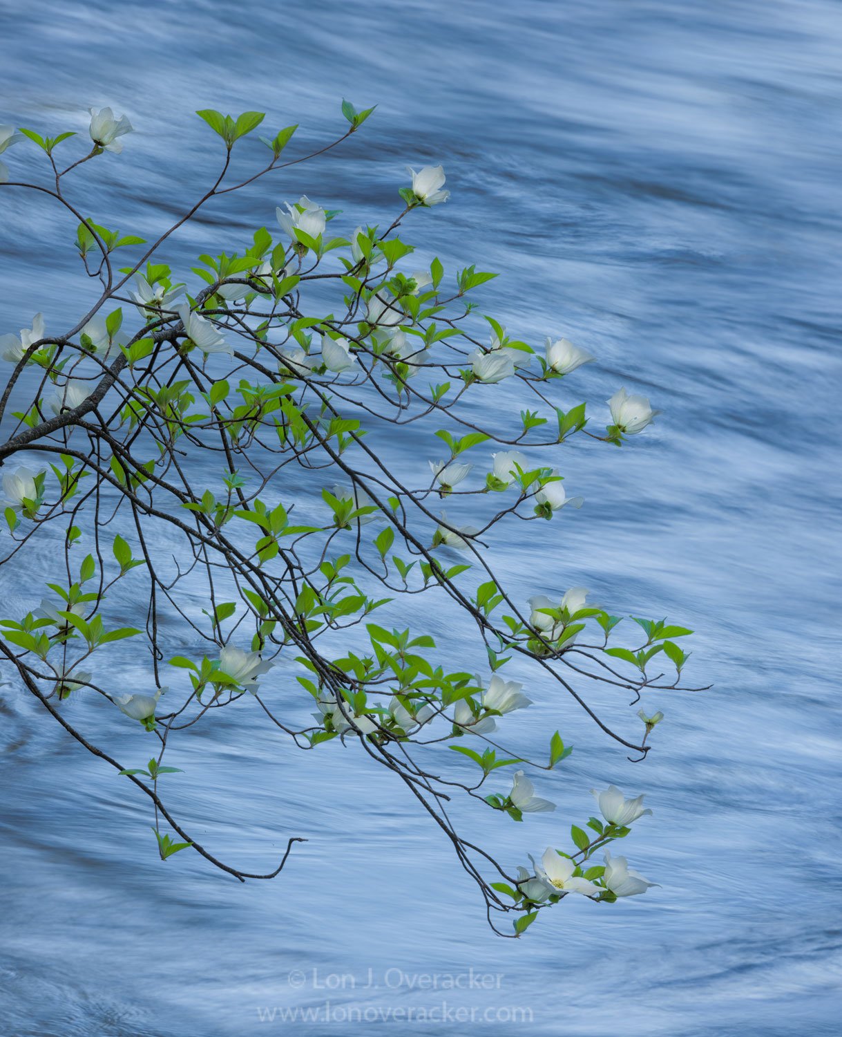
Here’s a couple more; a closer look at the lower branch of the same tree of my last post. These were captured about 12 hours earlier in the day. Early morning usually makes for little to no wind, other than what is being created by the river itself.
It’s amazing, but not surprising how the light can change in Yosemite (or anywhere for that matter) in just a matter of a few minutes. This first image was taken just 39 minutes after the first. At this point, the sun had risen high enough to illuminate the canyon walls and many of the trees allowing more yellows/golds/greens to be reflected upon the Merced. Just 30 minutes earlier, the only thing reflecting on the river was the blue sky.
I have my preference and issues, but would like to hear your thoughts, critiques and suggestions. Both are cropped from full frame.
I hear you about fleeting light, Lon. Unfortunately I just cannot get along with that blue background, Lon. I think the first image is perfect. The color harmony, the background, and the way you have timed the water and everything are just miles better than the second one.
I much prefer the warm image. I kinda wish the reflected light completely filled the background, rather than having the white water, but you get what you get most of the time. Still prefer it though.
Lon, I also definitely prefer the richer looking warmer image. Maybe this is an illusion? But I do prefer the narrower framing and amount of water on the blue bg version slightly better than the warm version.
Both are quite beautiful!
I think it’s the dappled gold sunlight on the water that makes that image stand out. The combination of tones of various intensities makes that a really fine background.
Lon, it’s notable that they are essentially the same branches and same vantage point with such dramatic differences. Of course the sun on the walls makes a huge difference. I’d mentioned in my recent comment that the more predominant greens from your earlier works there were appealing to me, and I see the later frame is similar to those. Think I see at least one the issues you may have. In the lower version there’s one bloom that hides part of a branch near top left, giving the illusion that the branch is broken. And, just for my personal taste, I think the water in the first is a little “busy”, not as nicely soft and simple as the other.
My vote’s for the blue. It has a delicacy I like. I prefer the smoother water in that one. Most of us chase the gold; the blue is a less common background.
Either way, you might play with making the tree and flowers stand out from the background a little more:
Lon, I prefer the warmer version, it just feels more inviting to me. Its interesting, because even though the bluer version has more separation of the dogwood tree from the water, the cool toned water is not as appealing to me. I’m not sure how much of it is due to color contrast, and how much of it is due to luminosity of the blue water being brighter, vs. the yellow/green water in the first image having a luminosity that is very close to that of the tree.
Just for fun I downloaded the warmer version, and tried to get more separation of the tree from the water by increasing the luminosity of the yellows and greens. It was a good chance to test drive the TK Actions V7 new yellow/green color range selection. I did a yellow/green selection and pulled up on a curves adjustment layer. This may not be what you were trying to achieve, but it creates a little more separation, especially in the leaves.
Thank you all for your comments and suggestions. I too prefer the warmer, yellow/gold version. Something about the pure white against the blues that still strikes me - but I’m not happy with the processing there.
@John_Williams, thanks for your edit. If you happen to catch this, can you describe what you did to gain a little more separation? In mine, I know I darkened both blues and cyan in H/S layer as well as as using the Blues channel and a Levels adj layer.
@Ed_McGuirk, Excellent, I like your edits too, and thanks for describing. I’m still on v4 of the panel, but interestingly I did the same technique on the blue image regarding using the yellows channel to brighten/saturate the leaves a little. Didn’t want to go to far as those leaves go neon quickly. But I really like your edit. Thanks!
Regarding the white water / texture in the gold version, yeah, I would have liked that smoothed out as well. Unfortunately I only snapped 2 frames both around 1/2 second. And with the water running pretty much vertically away from me, it would have taken a much longer exposure to let the water smooth out, and so the compromise between motion in the leaves OR the water.
Thanks again. I have a few more to share and I may have to revisit processing some of them based on feedback here. Stay tuned!
I then used a levels adjustment to darken the darks and lighten the lights of the mask (and had to paint out, with the brush tool, four or five small white areas that remained in the water) to end up with something like this:
I then used that mask on two curves layers, the first as is to lighten the tree a little and the other with the mask inverted to darken the water a little. (I didn’t wan’t to go very far; I thought the image looked great as is and only wanted to tweak it.)
It sounds complicated, but I use actions to pull the the channels from lab and cmyk into the Channels palette as a first step when I process an image so it’s actually quick. (In that same action I build a mask based on saturation, so that gives me 11 pre-made masks to play with as I process: red, green, blue, cyan, magenta, yellow, blacks (K), lightness, a, b, and saturation.)
I probably didn’t do a very good job explaining, so shoot me any questions. We can kick this to a different forum if needed too.
I’m in the blue camp. It portrays a slightly different feel to an often shot scene. Johns edit makes the image pop a bit more. It would make a nice wall-hanger, for sure.
Simple and elegant; this is very nicely done, Lon. Although my preference is toward the warmer version I don’t think you can go wrong with either one; it would just depend on the mood you were going for. The yellow/gold version is just more inviting to me while the blue is more somber if that makes sense. I do like @Ed_McGuirk’s tweaks. I think this turned out beautifully.
@John_Williams, thank you so much for taking the time in demonstrating your technique! I use LAB mode, but mostly by adjusting the a/b channels for popping color. But I’ve yet to use for masking. I just might have to experiment with that, although I must admit it looks a bit beyond my skill level…
Curious though, what would be the differences between using one of TK’s Lights luminosity masks? Seems like it they would have similar results.
Thanks again for taking the time! I may drop you a note some time on the technique.
I’m sure it’s not beyond your skill level; it’s simpler than I made it sound. If interested, pm me your e-mail and I’ll send you the action I use to build the masks.
I don’t use TK’s masks, so I can’t really say for sure. Back when Tony had directions on how to roll your own luminosity masks, the trouble I would run into was that color often overlapped with luminosity. In your second image, for example, the luminosity of the tree and water overlaps. However, the water is much more blue than the tree, so it’s pretty easy to separate with color selective masking.
There are many ways to skin the cat though, and the current version of Tony’s masks may do that just fine.
I think the first / green image is a real winner here. It could be worth bringing the whites of the flowers up a little so that they pop out even more and create a depth / separation.