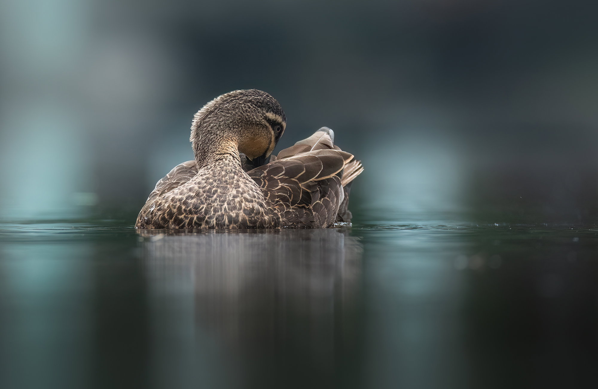
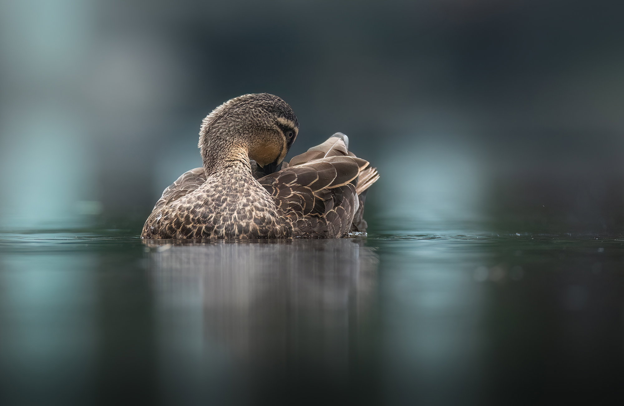
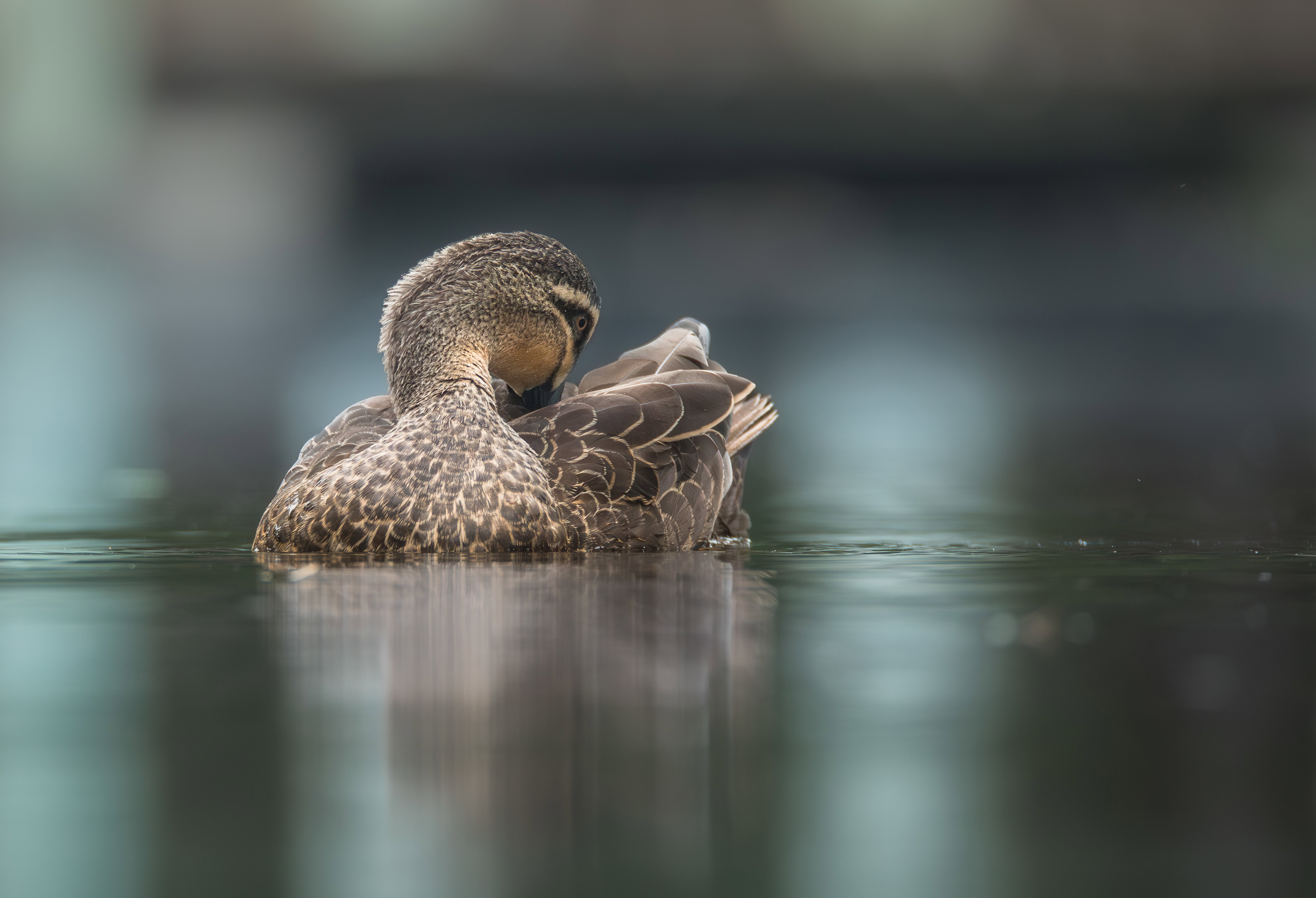
This is the latest rework on the duck image. @Diane_Miller has the best eagle eyes. The image was taken back into Camera Raw from PS and a Linear Gradient added to the bottom. Another smaller Linear Gradient (subtle I hope) was again added to the bottom to take care of the brighter reflections falling off the page. I now prefer to use Camera Raw’s Linear Gradients over PS. They seem much simpler.
The photographer is looking for generalized feedback about the aesthetic and technical qualities of their image.
Description
I don’t usually like shooting around suburban, man made “lakes”, but every -so-often, I check them out. It truly is amazing to see the variety of birds that live in these locations. Forced to live close with loud people, dogs and roaming cats.
I have chosen to leave in the unnatural background of a little painted footbridge.
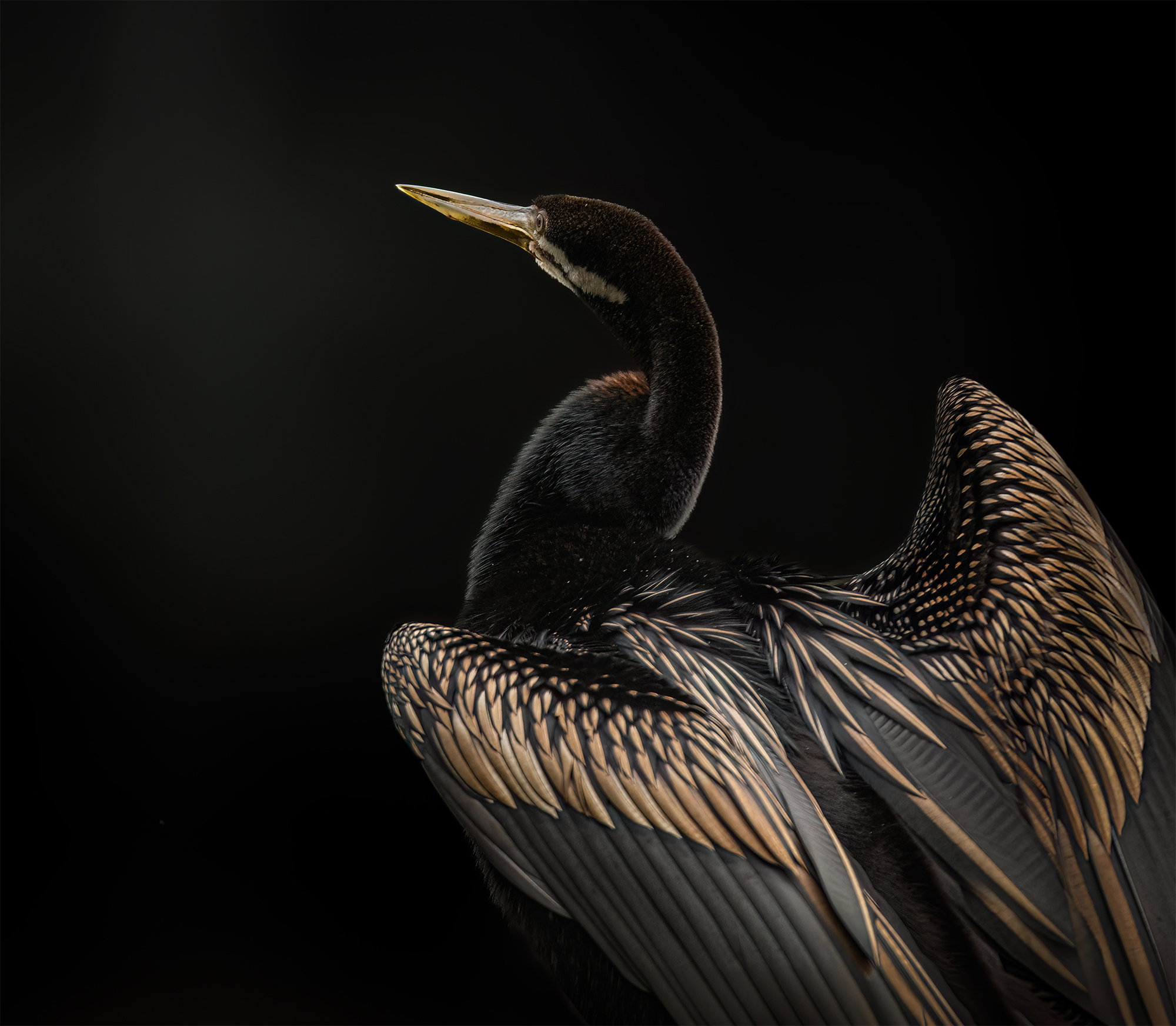
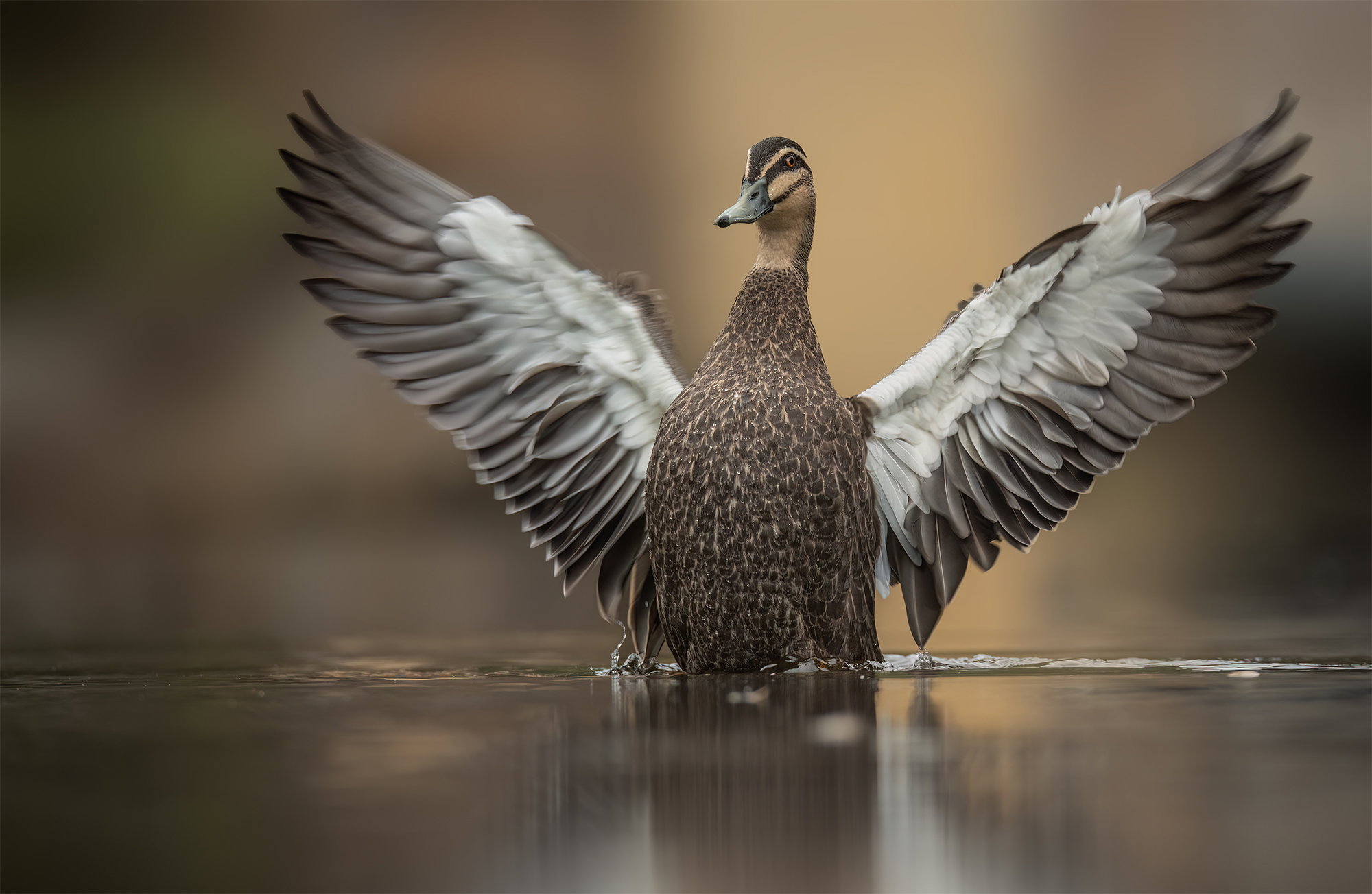
First image is an Australasian Darter and the second two are Black Pacific Ducks
Specific Feedback
Any and all comments are greatly appreciated.
Interested in opions on the man-made element.
Technical Details
150-600 1/1000 f6.3 ISO4000
Taken from below a small weir to get a better perspective.
These are all beautiful images, Glenys. The detail and the light on the darter is fantastic and the dark background works well The duck images show excellent detail with a nice low level view and a pleasing background. The man-made element seems sufficiently blurred to obscure that it is man-made.
Beautiful images all, Glennie. For me, the Darter is the most appealing, but the duck images are also excellent. They remind me on a photographer from the Netherlands that posted on this site for years who’s signature look was always very low with a very shallow depth of field just encompassing the subject.
I’ve also seen a design for a small backyard setup to get that look from a comfortable position.
Super!! All lovely and technically excellent – I can only echo the comments above! The bridge works for me as it is very abstract. I think an interesting touch for that image might be a gradient burn from the bottom to somewhat balance the dark area from the bridge and break up the bright reflections pulling my roaming eye to the bottom of the frame.
I don’t think you went too far, Glennie. It just went from a fine image to fine art.. move this to the top and label it a repost so everyone gets to see it. I’d love to know exactly how you did this.
Glennie, all three look great. I do especially like #1 and #3. #1 for the contrast and how the bird stands out against the dark background. #3 has those lovely muted blues and greens, they fit well with the restfulness of the bird’s pose.
It works for me – a treat, as you say down there! You could go even farther if you’re inclined, to darken just those three light shafts with a gradient near the bottom edge. Artist’s choice.
Just beautiful, Glenys love the first one for the Feather contrast and incredible light and a peak at the eye. What a great background to make it pop as well.
The rework is outstanding on the third image which may now be my favorite because of the rework. Terrific job handling the background on that one. The colors are incredible in the water. Thanks for sharing these.
 The duck images show excellent detail with a nice low level view and a pleasing background. The man-made element seems sufficiently blurred to obscure that it is man-made.