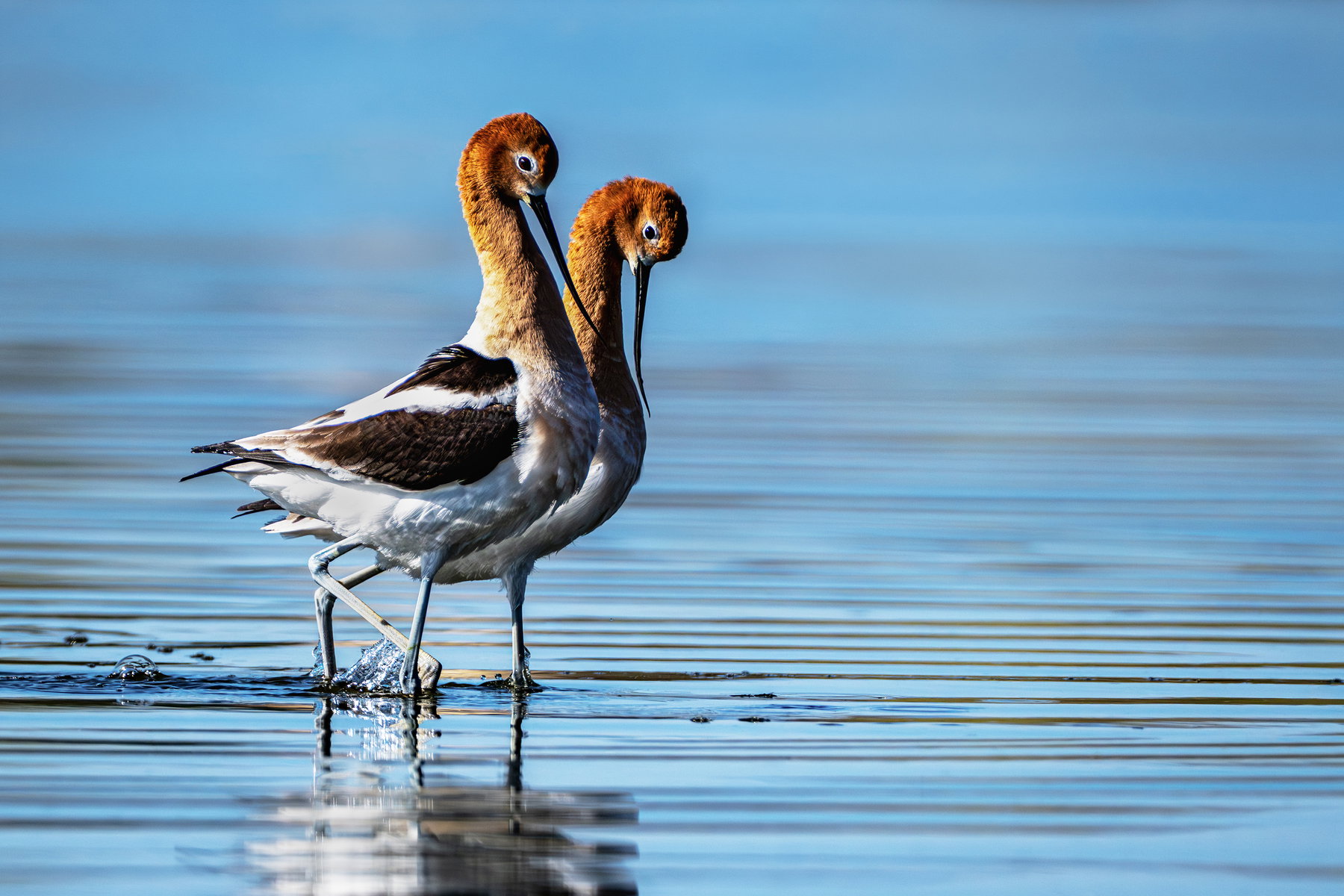
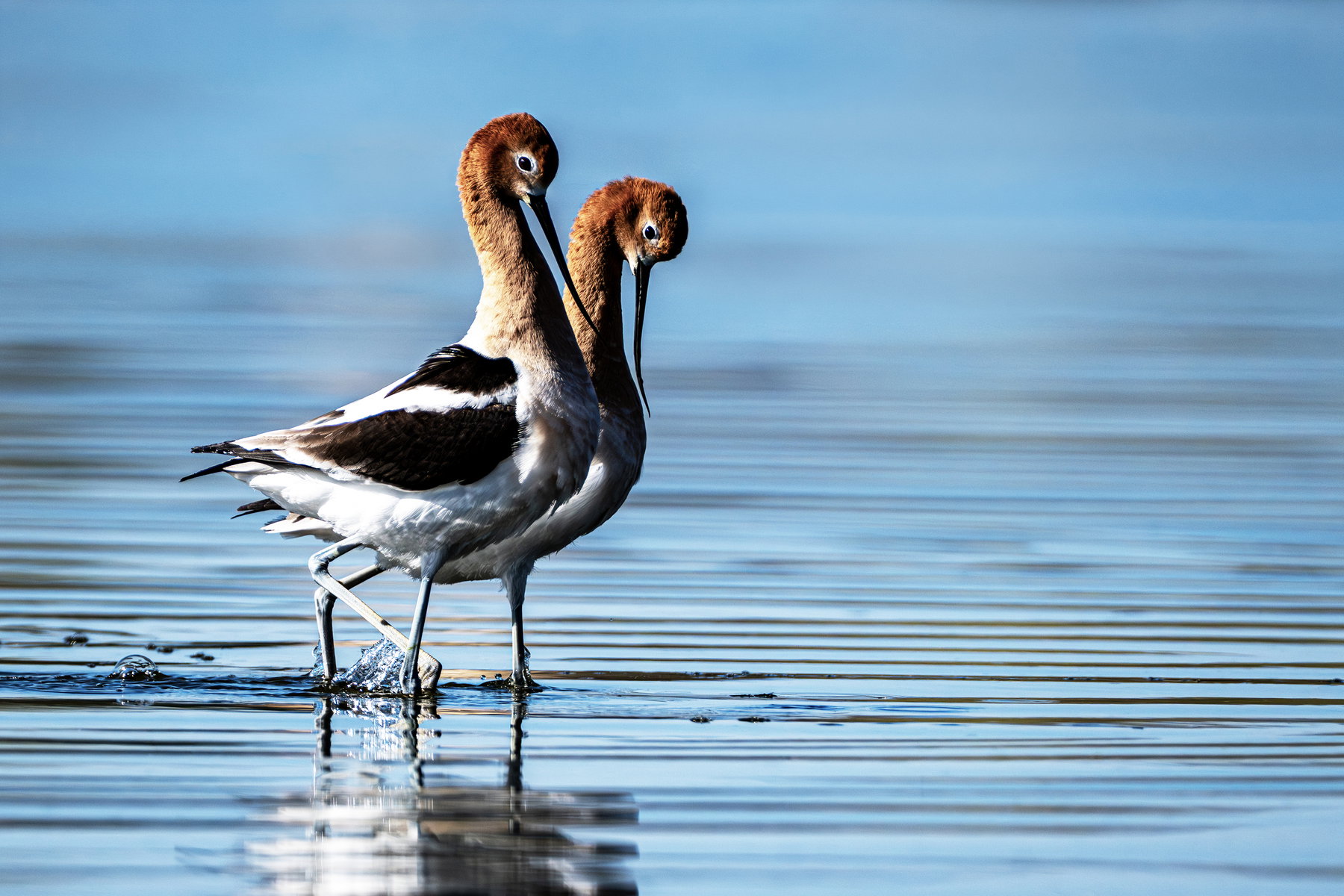
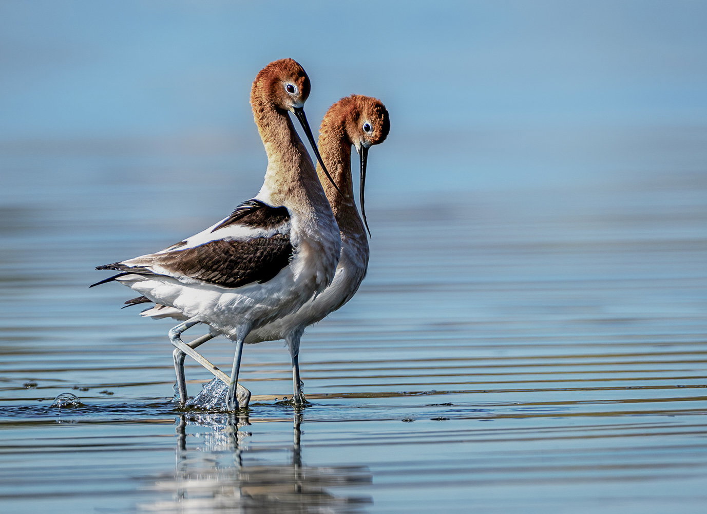
What changed: Lowered the contrast, Texture and Clarity in the BG. For the birds the blacks, Highlights and whites were brought down. I then burned the white in the reflection and the feathers on the back a bit more. There was still lots of room to the right in the histogram, so I used the curves adjustment there and then dodged on the feathers and darker spots in the BG.
Added after receiving feedback from the community.
Holly, welcome to NPN. This is a lovely look at this pair of Avocets. I’m thinking that their pose is part of their pairing ritual, with the arched necks and down turned beaks. The ripples in the water and the fading to blue are good additions. Some of the whites are a bit bright, especially in that moving leg with the driping water, the feathers above it and their reflection. Getting the two side-by-side and both nicely sharp is good.
I like the pairing of these two Avosets. From what I know, this is probably a mating ritual.
But I also agree with Mark that this image is a little blown out in the whites of the legs and some of the plumage. Fortunately, this is an easy fix. Keep posting.
This is such a delightful image. The avocets do appear to be quite bonded. You have managed a nice low angle, with great interaction and a lovely composition. However, I am conflicted by the ripples.
I am not sure what processing you do, Holly, so I’ll jump right in. Your blacks are a bit blocky. If you are using ACR or Lightroom, go to “Light” and choose Shadows. Straight away you can see more detail in the darker parts of bird. There are a few blown whites that will be troublesome. I have also decreased the Highlights and it has made some improvement. I have softened the background just a little by way of selecting the birds, Inverse, reduce Contrast. You can take that further by reducing Texture and Clarity just a tad.
This is a fine image, and well worth the effort to play!
Hi Holly, what a nice catch of these two hanging out together. Terrific moment. Good observations and advice given above. I’ll just add that my technique in the field for exposure is to use highlight alerts (“blinkies”) to signal when I am overexposing whites. I’ll then adjust my settings so the image is dark enough so the blinkies are just barely not showing at all. This will keep the whites from being blown out and you can lighten the dark areas in post processing. I think Nikon has a different term than “highlight alerts” but the concept is the same.
Welcome to NPN Holly. A very nice comp and avocets can be a challenge to get the right exposure. As others have mentioned, the whites are over-exposed and shadows are quite dark as well. Make sure that your Z8 will have the dyamic histogram in your viewfinder. You can easily tell how strong the highlights and shadows are over or underexposed. For this case, expose the image so that the brighter areas have details present. Other parts of the image of course, will be under-exposed slightly. Then, do basic corrections in Lightroom to bring up the shadows and midtones. In photoshop, I find that using adjustment layers for Shadows & Highlights will provide a further tool for tweaking highlight brightness and shadow darkness. Because overall contrast will be reduced, then use either a curves adjustment or the Brightness & Contrast tool to put some pop back into the image. I do like what Glenys did to the BG and you can also play around with slightly lowering the amount of cyan in the BG too. This is a wonderful comp and excellent behavior shot and it will be nice to see what you get after further edits to this photo…Jim
Thank you @Mark_Seaver, @David_Schoen@Allen_Sparks@Glenys_Passier@Jim_Zablotny@Mark_Seaver for all of you suggestion and tutelage. I haven’t known how to look for the details such as blacks that are too black and contrast balance. Thank you for helping me to not only see that, but more importantly how to kook for it. I did some revising and think it’s an improvement. Any other suggestions? Since I used the curves adjustment, is that too much? Should I let there be space? Is there a good rule of thumb for that IYO? Thank you so much!
A gorgeous subject from a lovely low angle! Good advice above on handling the sunny day contrast. Another option, when raw adjustments aren’t enough, is to use a linear profile. Proper processing takes a little practice but it lets you recover more highlight detail than using any of the “canned” profiles, and darks detail is more easily recoverable these days with the new noise reduction algorithms.
Thank you so much, Diane. My struggle has been to lower white highlights without making then so grey. I will definitely look into and play with this Linear Profile. You are so kind to take the time to suggest it:o)
Then the linear profile will be the answer! Although the adjustments needed feel clumsy at first, you can get to the same image as with the canned profiles, but with whites not blown out – or not as blown out, depending on the capture.