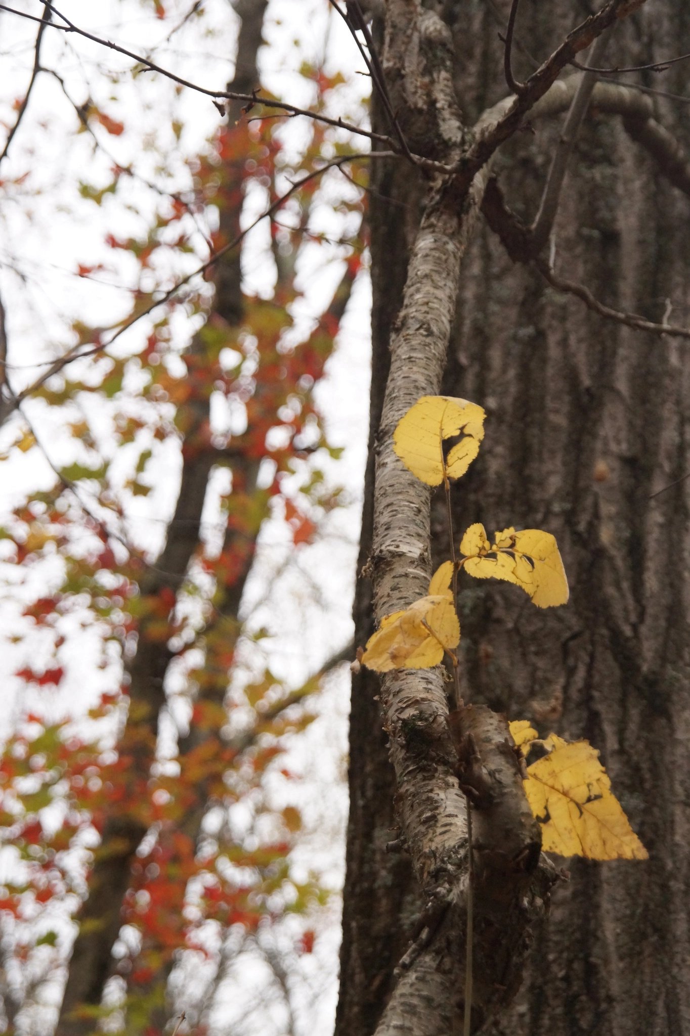
Another compositional question: I think that dividing this photo in half with the tree trunk was a right choice. Often, this can lead to static images; however, in this case, because of the difference in “weight” between the left and right sides, I felt that it worked. Would love to hear other opinions.
What technical feedback would you like if any?
All
What artistic feedback would you like if any?
All
You may only download this image to demonstrate post-processing techniques.
Very interesting and thank you for mentioning the “weight” of the two halves. I think it’s clear from not only your 50/50 comp, but also from your title that your goal was to contrast the two seemingly separate fall color scenes, within a scene. On the one hand you have the finer and closer details of the yellow leaves and their attached tree - vs. the green/red leaves of the bg tree that are clearly out of focus (on purpose of course?) I can see and get the juxtaposition you’re going for.
Back to the weight thing. At least for me, “weight” in an image, a composition, can be, much more than just space. It can also be colors, contrasts, and brightness. So as that relates to your image, at least for me, the brightness of the left “weighs” more than the right. Can’t say that’s of any significance… but the left side to me has more weight and so dominates and perhaps takes away from the yellow leaves on the right. Am I making sense?
So I think I understand what you were trying to accomplish. I’m just not sure how much it’s working for me as the viewer. I think it might help by cropping; I don’t think the vertical space is adding anything. Maybe like this? If anything I think it simplifies the image and perhaps even enhances your objective?
I felt that the mismatch between the two halves was a good thing, rather than a case of the left overpowering the right hand side – more dynamic than static, because the right hand side was more “solid”. I’ll take another look at it based on your comments and let them sink in, thank you!
Hi Gaurav - I love fall and all its colors. Your 2 halfs contrast in light/dark, focus/blurr, many/few leaves. For me I would prefer to see more of the yellow leaves on the tree trunk but that would have to be decided in the field. The brightness on the other half leads me away from the detail on the right. However, I think Lon’s edit better captures the contrast you were looking for.
The fall colors in this image are great. I would also agree with the previous comments that the brightness on the lef tside of the image along with the more colorful leaves tend to have my eye want to stay more left than right. I think Lon’s crop helps center the focus on the in focus leaves but the brightness on the left still throws this one off balance for me.