Hi Mike,
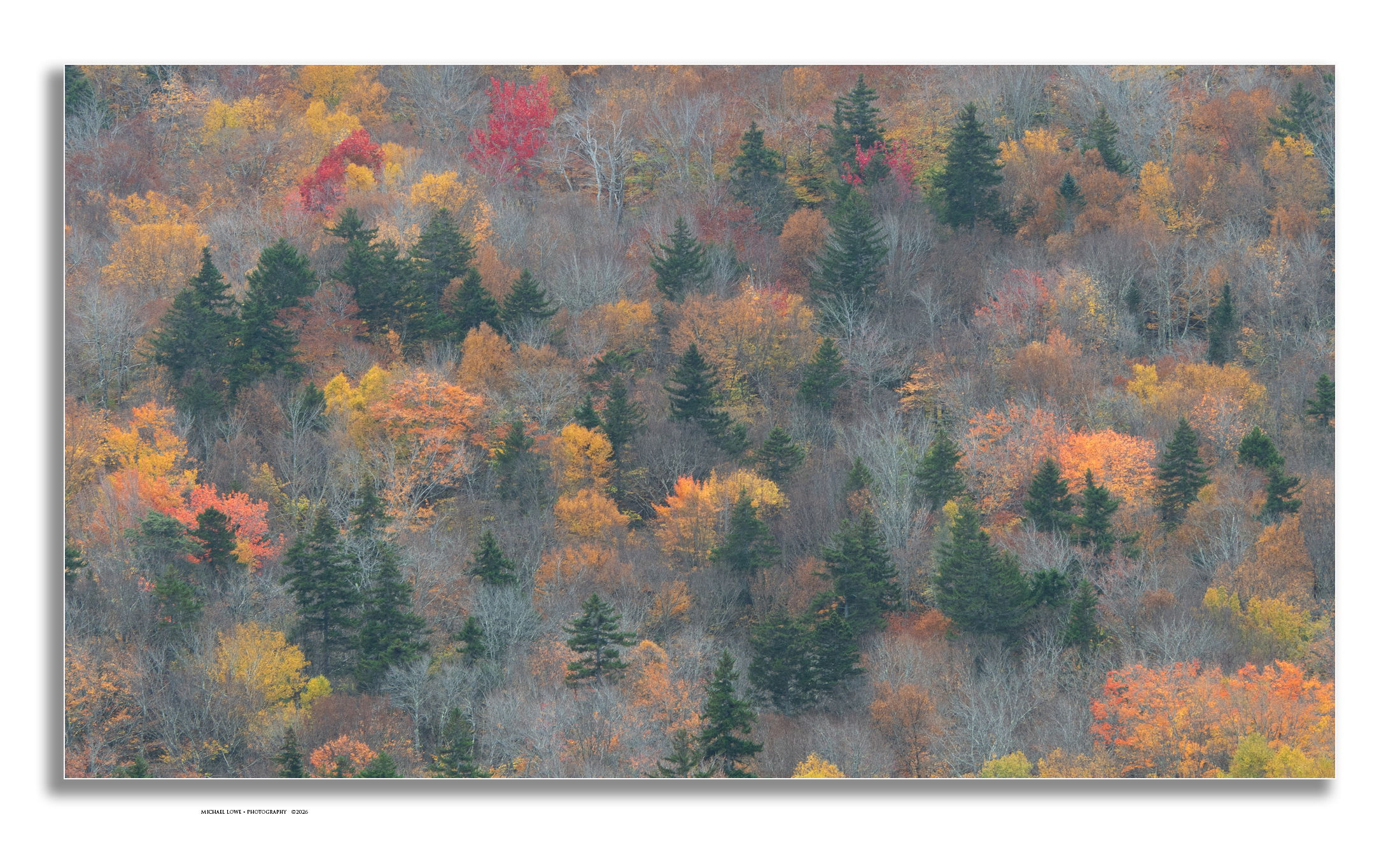
Where have you been hiding this lovely autumn image? You filled the frame beautifully with a wonderful mix of autumn color, leafless trees and evergreens. The only thing I might suggest would be to remove that bit of yellow tree just right of middle along the bottom edge. You have me wondering how I managed to miss this scene. Very nicely done.
Oh, very nice sir! That’s a lovely tapestry, and I find it interesting how much the evergreens and bare trees add. I think the variation makes it more interesting than if it was wall to wall fall foliage. In fact, that bottom right corner grabs the eye a little since it is such a bold splash compared to most of the image.
This may have a slight green tint? It might be worth playing adding just a dash of magenta.
Michael, I’ll go with the cliché of very Monet or Painterly look here. Or, just outstanding ART. Only thought for change is a bit more contrast, however, that might fall prey to lost feel of the two looks I mentioned. Works as presented IMVHO very nicely…
Beautiful shot Michael! Very Impressionistic to my eye. I like the kind of hazy or foggy look to the image and the subtler colors than you see in a lot of fall color images. I can’t see anything I would change.
This is just gorgeous, Michael. I agree with John that the evergreens add greatly, and also the leafless trees, which I think contribute to that sense of a green tint that John mentioned. I’m not sure the green tint is negative, but it’s worth playing with if you are looking for ways to keep enjoying working with the image (sometimes I keep playing when I shouldn’t just because I like being in it again). In the thumbnail view, the red tree at the top feels close to the edge, but the full-size image eliminates that edge concern.