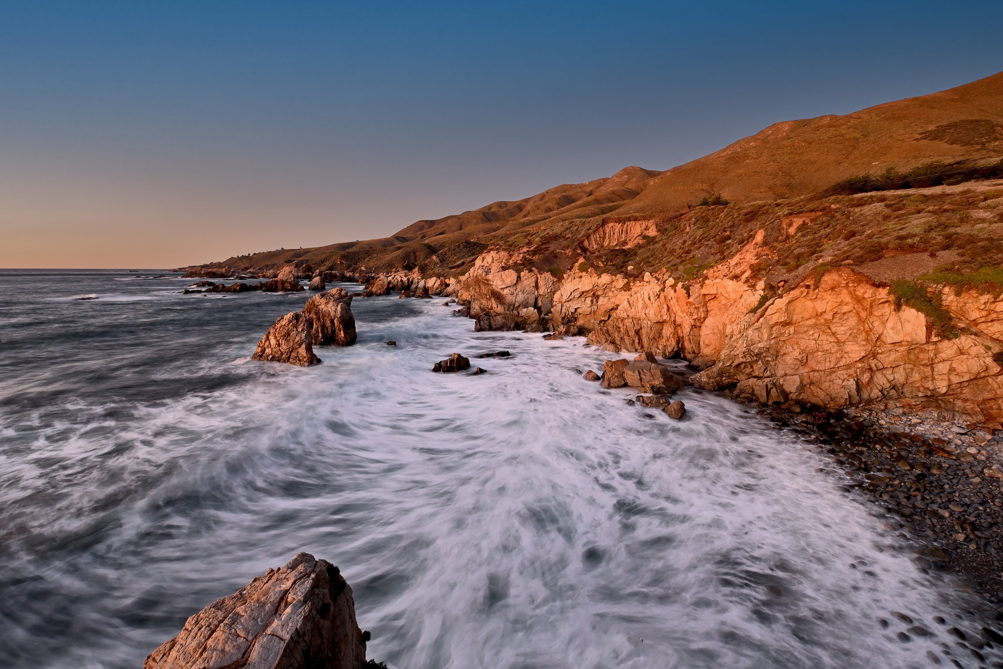
The photographer is looking for thoughtful feedback on the image as a whole, especially around the areas noted below.
Feedback Focus: Artistic / Expressive
About This Image
This was taken just before the sun disappeared in the Big Sur area. It was pretty dark outside, but at 2s I had plenty of light. You might not know exactly what you’ll get with long exposure, but this is about my vision. I have seen a lot of Big Sur shots, but no long exposures. So at least this is a fairly rare take.
Feedback Requested
I have done nothing with this shot except take out power poles. I wanted to get input on saturation, color and contrast mostly. The lighting created that orange throughout the landscape, but then again, a setting sun does that and this shot keeps that mood. Do I keep that? Or do I try to mess with color and contrast and saturation. And do I darken this a little to give it that look of just before the sun disappears? I look forward to your thoughts.
I quite like this. There is some beautiful colour contrast between the warm orange on the land and the cool blue in the sky and the white in the water adds some nice interest to the image. Personally, I wouldn’t mess with the color, nor would I darken this any. On the contrary, I might even be inclined to lighten it a smidge but that’s just me and I like luminous images.
I’m with others, Steve. It looks great as is. Maybe a smidge of texture of clarity to get that micro constrast, but I love the colors and the overall luminosity. It looks like sunset to me, and I love the sky. When I can see all the colors from blue through green to orange in the sky, I feel like I hit the jackpot, and you captured that here beautifully.
ML
Just goes to show that you don’t need a dramatic sky for a fine image, Steve. I like the feel of the image with the relatively mild surf, the quiescent late summer golden hills and the clear sky. the angle to get the nice curve of the shore works very well.
Beautiful shot! I love the longer exposure and what it does to the water in contrast to the ruggedness of the rocks. Likewise, the contrasting rich colors of the blue sky and red rocks is terrific. Contrasting but working in harmony! Honestly, you could leave it as is…perfectly sunset!–Holly
Thank you for the input Marylynne. And interesting what you mention the sky. I was a bit disappointed it was such a clear sky, but it kind of adds to the other-world feeling that I get from it.
Steve - it’s a lovely image and i like the movement in the water. i agree with much of the above re the temperature and saturation etc. The one thing I’d add is that (and I’m doing this on my laptop so who knows about the correct brightness setting), is that when I pump up the brightness to see the detail in the water, the bright rocks appear too bright. When i drop the screen brightness, the water is too dark for good detail. You might want to balance those two tones so they are both well represented at one screen brightness level. All this is naturally fwiw!
But it’s a lovely image that captures the feel of the crashing surf. Very nice!
The saturation, color and contrast all look just fine for my own personal tastes. The orange in the scene also looks perfect to me as well; just as I would expect at that time of day with the setting sun. I also think the long exposure works quite well here and has created some wonderful details and textures in the pounding surf. I have no suggestions; beautifully done.