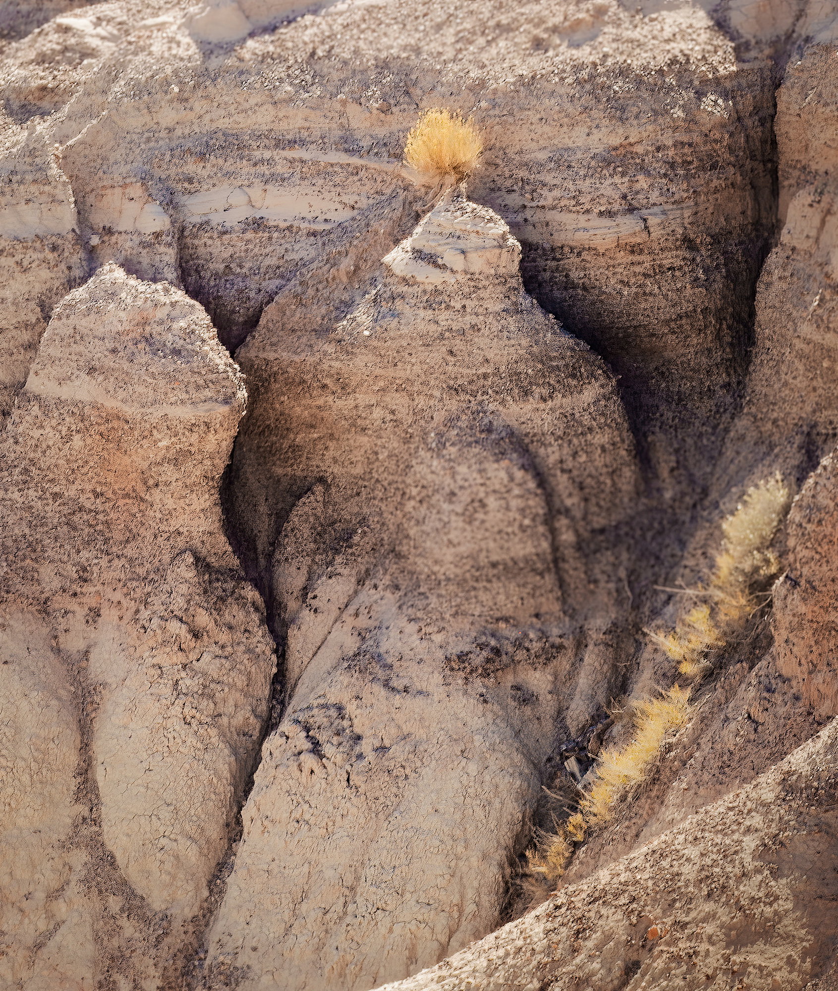
I really like the composition here. To me, this is a wonderful example of finding a small, intimate composition within a much larger landscape. The placement of the lone bush is excellent, and I especially like the visual relationship between it and the golden grasses running up from the lower right. Together with the darker erosion lines, they lead my eye very naturally through what is actually a rather complex scene.
The one thing that distracts me slightly is the distribution of sharpness. The large central ridge appears noticeably softer to me than some of the surrounding areas, and I also notice some softness in the vegetation toward the upper right. I’m curious whether this was intentional, a consequence of the chosen focus/depth of field, or perhaps movement.
I might also experiment with reducing the highlights on the bush just a little. It works beautifully as the visual anchor of the image, but to my eye it is perhaps a touch bright compared with the wonderfully subtle tones throughout the rest of the scene.
Overall, though, I really like this image — especially the eye for finding such a strong composition within all that geological complexity.
I am reading a book on minimalistic photography right now and this image could feature as a strong example. The former comment describes very well how the elements of the composition match and reinforce each other. Resulting in a really nice catch.
I would like to see what was above the tree though, because I get a feeling of an interrupted line at the top edge of the picture. But this does not take anything away from the marvel of the scene.
Hurst and Xavier, Your comments reflect my vision well. Thanks. I intentionally blurred the top of the image thinking that it would keep viewers eyes focused on the main part of the image. I am glad you noticed this. I will have to re-evaluate the blur. Thanks
Hi Larry,
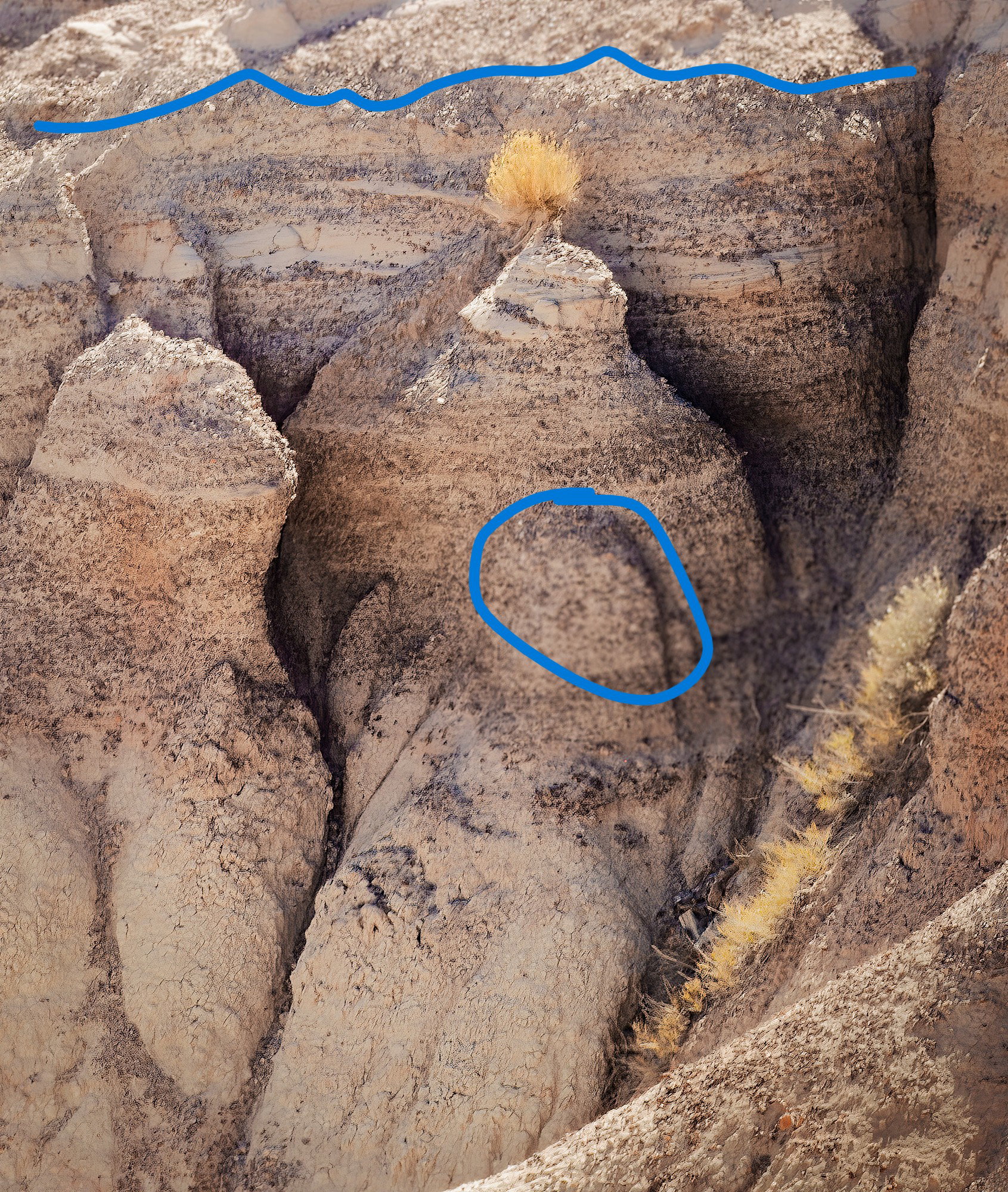
I noticed the blur too. Some of it is along the top, and the bush itself seems like maybe it was moving in the wind. What threw me though was the area I circled below. It should be in focus because what is in front and behind it are in focus. So that made me wonder if there was a lens problem or maybe some other treatment that was messing with clarity. For what it’s worth, if it were mine, I might be tempted to crop out the diagonal line of grass as well. So, perhaps a slightly tighter crop with a 4x6 vertical aspect ratio would give us that sene of a candle in an alcove.
Here’s a markup of what felt oddly blurry. I couldn’t get it detailed enough using the markup tool to identify those areas (I use a 14" screen !)
This is a neat find and the yellow bush perched on top of that rock formation does remind one of a candle. You handled the light very well and I like the textures and details in the rocks although there are a couple of areas that are very blurry. I know you explained the one at the top, but the other one that @Marylynne_Diggs noted is perplexing. I think if you can rectify those two areas it would elevate this lovely scene another notch. Looking forward to your rework.
First of all, I’m really enjoying the composition and subject matter; the way you’ve placed/arranged with the lone bush on top of the formation just works beautifully. This tells a great nature story as well.
Don’t mean to pile on, but I was wondering the same thing as MaryLynne. The formation in the center of the image and towards part of the diagonal grasses seems unaturally out of focus. Clearly now, there was an attempt to blur some areas to focus attention - which is working fairly well for the top edge. In fact, I don’t know the exact term, but this scene the way it’s presented makes me think of the technique for creating “miniature photography.” (Most city scenes from an elevated angle with much of the fore and backgrouns out of focus, leaving sujects in the middle to appear as miniatures. Anyway, no biggie if I’m not relating the intent..)
I know part of my reaction is the large format mentality I still have, where all focus is related to “planes of focus”. What appears here aren’t planes of soft focus, but seemingly chosen areas - not all of which fall in the same plane. So I guess I’m just being techical and nitpicky.
I think if depth of field and selective focus were being considered, that the triangular area in the foreground, might be out of focus had you focused on the bush wide open like f/5.6 or something…
I’d say you should definitely explore and experiment. The overall image is worth it!