Canyon Life

Image Description

Better title suggestions welcome… I’ve been sitting on this one for a while and is one of those images where I told myself I would put out for critique, even though it’s probably one of those image that would work best in a series, not necessarily standing out enough on its own.
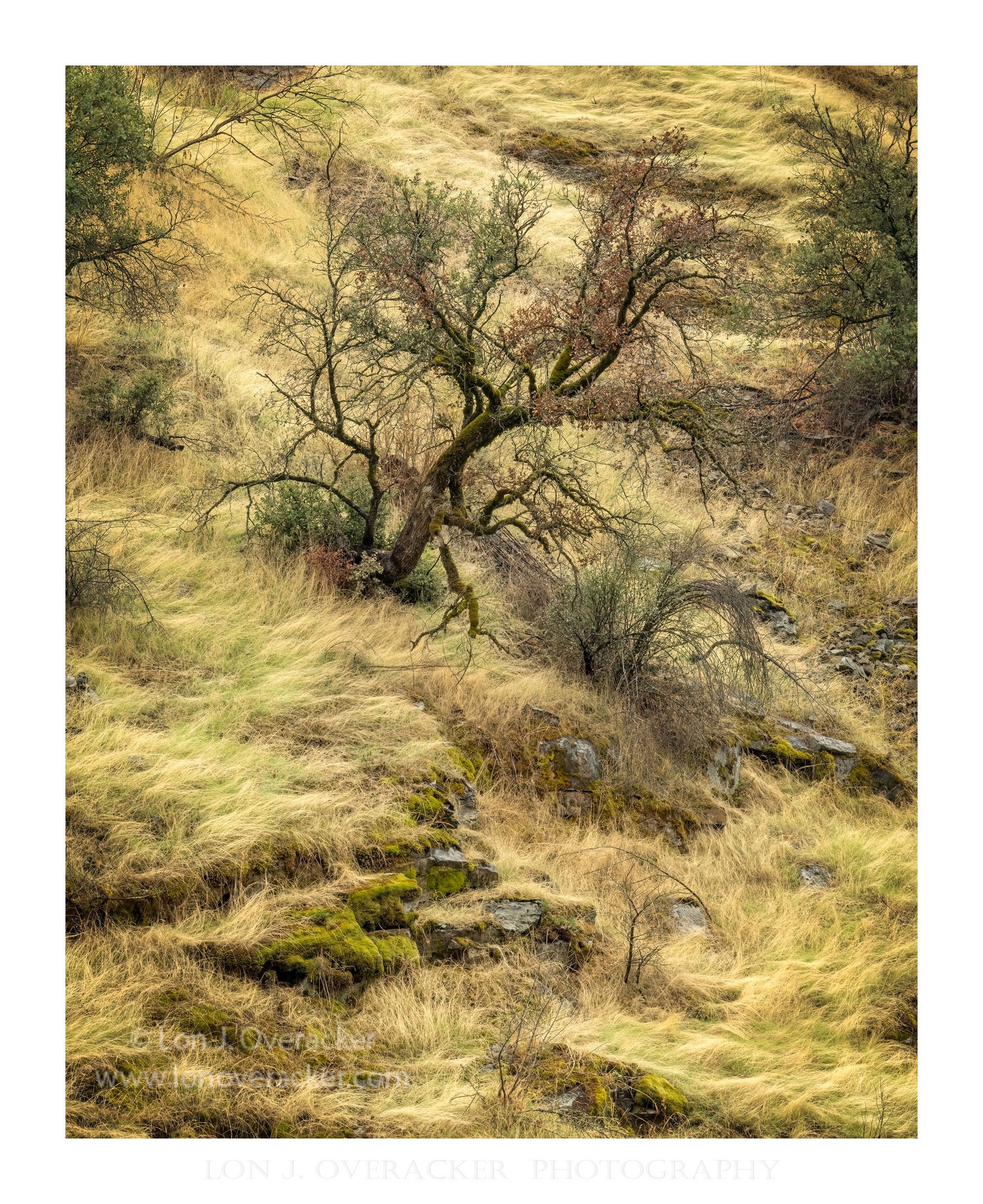
Same area of the Merced river canyon where I’ve posted recent images from.
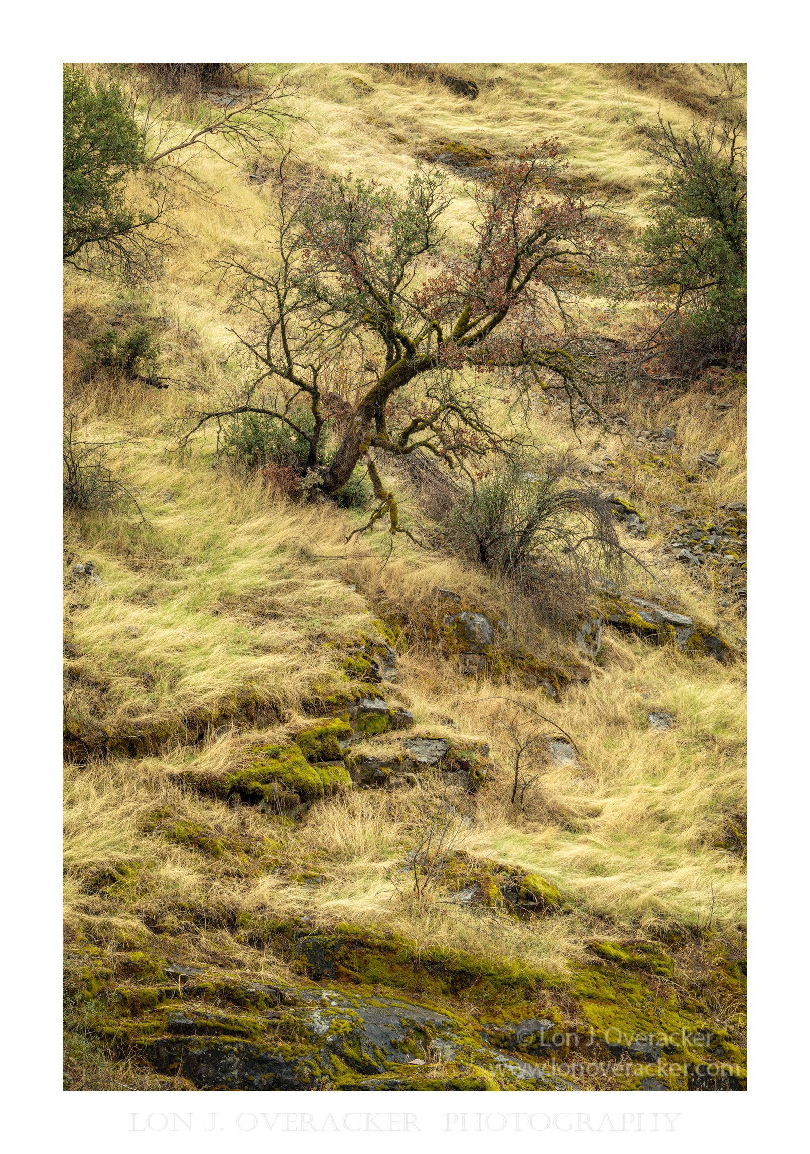

uncropped processed


Merced River canyon environment

Type of Critique Requested

  • Aesthetic: Feedback on the overall visual appeal of the image, including its color, lighting, cropping, and composition.

  • Conceptual: Feedback on the message and story conveyed by the image.

  • Emotional: Feedback on the emotional impact and artistic value of the image.

  • Technical: Feedback on the technical aspects of the image, such as exposure, color, focus and reproduction of colors and details, post-processing, and print quality.

Specific Feedback and Self-Critique

I’m posting because I think this is a good example where I ask myself the question, “Why did I capture this?” Or, does this capture what I was experiencing at the moment?

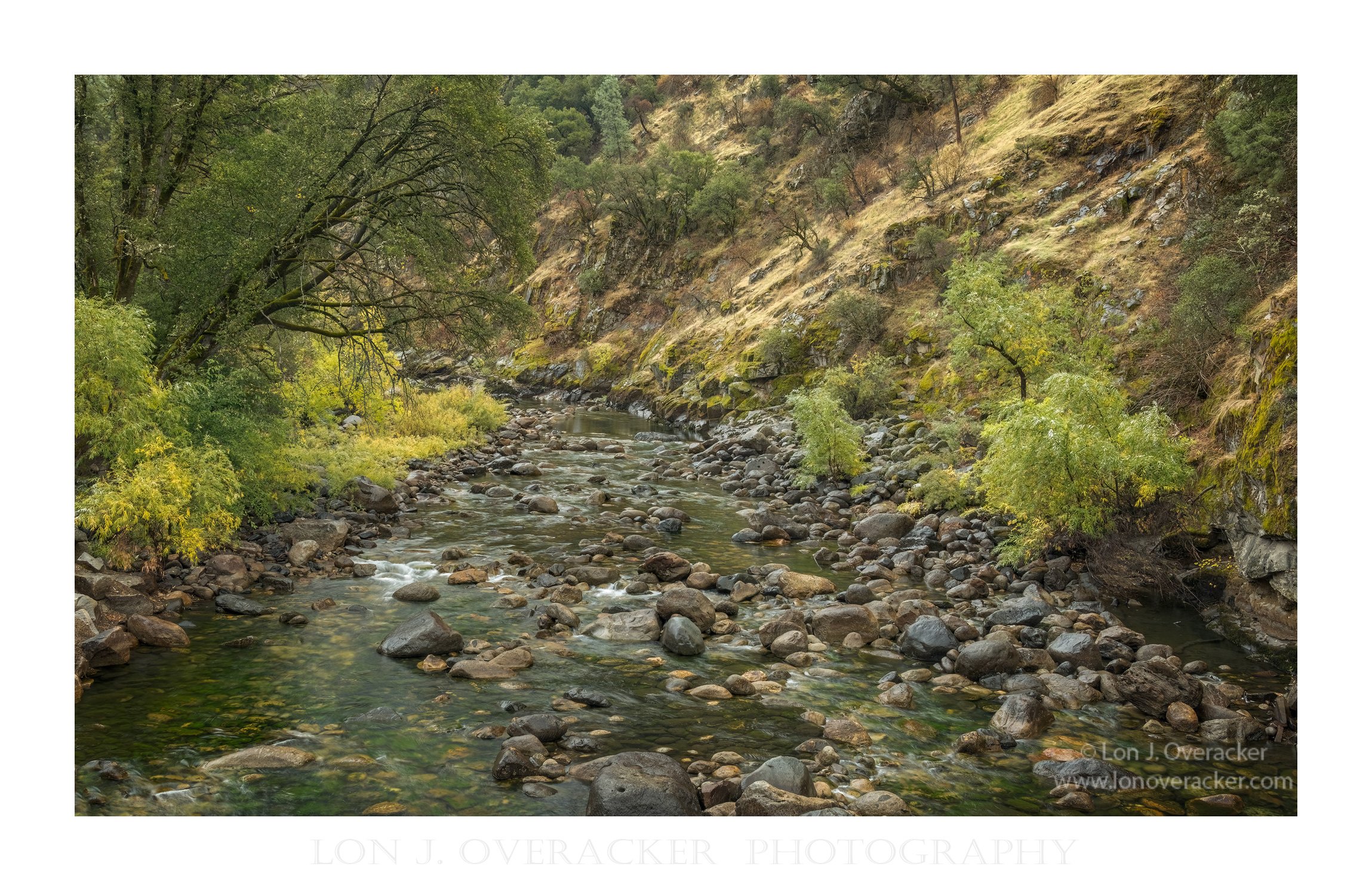
I’ve always been attracted to the walls of the Merced River canyon. But am having difficulty capturing what I experience. I think now after reading the recent NPN article “Peripheral Landscapes” by @Murray Livingston, I think I may have made a connection - or at least I was able to see a new way of thinking about images and connecting the capture to the moment. And so with that, I’m going to include a wider image showing more of the environment I’m exploring. You can see the oak tree in the background right of center.

Anyway, I’m now asking the question or exploring the concept of not what is necessarily contained within the frame of the image - but what is implied or told about what is not seen in the image. Is this concept to far out there? I’m no thinking about this: We spend all our time eliminating edge distractions, and making sure eveything within the frame is balanced, T’s crossed, I’s dotted… But as the photographer, we’re all standing there seeing and experiencing everything outside of the frame… yet it’s only what we capture inside the frame that we present.

All comments, suggestions welcome. I’ve included both the uncropped version and the environment image; and wondering if that was necessary. Spent too much time tweaking colors, cropping decisions (some minor cloning along the edges, etc.) So also curious to know if you prefer the crop of the full frame version. Lot’s of messy and little distractions in both versions. For starters, that oak ain’t the best lookin’ tree you’ll ever find.

ok, enough for now. Would love your feedback on any of the above comments. Thank you!

Technical Details

Nikon D800E, 28-300mm @116mm f/16 1/4s. 2 image focus blend - although honestly at the distance I was shooting it was completely unnecessary to do a focus stack. oh well.

1 Like

Lon, I like the image quite a bit as you’ve cropped it! I like how the tree is leaning and it’s arching shape is mimicked by the small shrub to its right. Also what stands out to me is the wispy yellow grass throughout the scene which sets the image off rather nicely. In contrast, in the uncropped version, my eye follows the rocky surface downward toward the bottom, drawing my attention away from the tree and the wispy grass. I prefer the cropped version myself. Regarding the peripheral elements, I like how you’ve balanced the other nearby trees extending out of frame. I can see why you’re intrigued by the steep canyon slopes. Nice image!

This is a very nice image, Lon. I love the mix of soft greens and yellows. I like the uncropped image the best. I really like how the line of stones make an S curve up to the tree. I think they make the tree stand out so much better. The lightening is so even, I wonder what a small spotlight in the middle from the top of the stairs to the top of the tree would look like with a very light vignette. I often do this to bring a little light to the center of the photograph, but I make the light and vignette very subtle. I’m learning for myself that messy doesn’t necessarily have to be a bad think. It’s part of nature and if cleaned up to be perfect then it really isn’t representing the nature that we talk about loving to be out in. I like this image and think it’s a keeper. I also like your stream image very much.

Lon,

I knew this was your photo the moment my eyes fell upon it, and then I looked for your icon to verify it.

As always, you have a way of capturing an intangible quality of your subjects. It is hard to put into words, but the wispiness of the grass (I mean really, I can see almost see every strand of grass) gives an incredible softness to the overall image to counter the rough scraggly nature of the oak. I also love the subtle color popping through the grass and the moss on the rocks, and then the complimentary colors of the reddish brown and sage green of the leaves on the oak. The “flow” of the grass carries your eye wonderfully through the entire image. Finally, I think your original 4x5 crop is better than the full frame, as I think the rocks detract from the overall feel.

Your work Lon is always inspirational, the kind of photographs I hope to make when I grow up :wink:

Hi Lon,

Those were my exact thoughts when I saw the thumbnail of this post in the feed. :grinning:

In my opinion, both crops are beautiful images. But if I had to choose my favorite, it would be the uncropped version.
I agree with @Donna_Callais and love the shapes of those mossy rocks at the bottom that lead the eye to the tree.

And thank you for adding the picture of the canyon environment, which by the way I also really like.

This is really beautiful and evocative. I very much like the messiness and the fact that you capture how well the oak blends into the surrounding (including not over cleaning the edges). As others have noted, the colours are really nice and subtle and there are some leading lines to help us explore the details. My vote also goes for the crop as it creates a nice balance between focus on the tree and the expansiveness beyond. I get a real sense of a living place when I look at this - that’s may be not quite the right words, but the picture has great energy. I think it stands well on it own but I’d like to see the series :). Thanks for posting and sharing your thoughts which gives me some ideas to keep in mind as well for my next excursion.

This is lovely and so evocative of our northern California foothills. I truly admire your compositional choices, Lon. The concept of the peripheral is definitely at play here. I see it in the way you included just part of two oaks at the top and the way the angled lines of the rocky outcrops and those cobbles in the drainage on the right come into the frame. Quite excellent.

And that oak may not be the most magnificent specimen, but it has tons of character.

Lon, to me a nice ,wild image . And I think that is because of the composition . Wild !

Ben

These are excellent images, Lon. Of the first two, the cropped and uncropped, I much prefer the cropped for the the reasons implied in your statement, namely “less is more”. What isn’t seen, is left to my mind to imagine and I think that makes for a more active, dialogical relationship between the photographer and the reader. In other words, I feel more like an active participant when I view the cropped version. (There is also “the thing” I have with 2:3 aspect ratios in portrait view for landscapes. Remind me, who was it who said they preferred 4:5 because they looked “more expensive”?). The second image of the creek is truly lovely. And here, I agree with you. Just from looking at the two images I can’t help but think what wonderful series you have in the making - not just the subject and the composition but the way you are handling the colour tones and soft, diffuse light in these images. Very nice work, Lon - beautifully seen and executed.

Well, the folks above stole my thunder (beautiful, no surprise that it’s yours, etc.). It really is an enjoyable image and I think the crop is the better version. Interestingly, especially in relation to my recent reply to you in my image, I think the crop moves the image a little away from what is implied out of the image even though I think it is the best version of “this” photograph. I agree about the series; that may be the strongest way to capture the true spirit of the area.

LOL, I got caught up in our discussion in the other thread and how it relates to your crop here, and forgot I did have one processing thought. The two border trees at the top are dark enough with the vignette effect that they stand out strongly and try to grab my eyes a little from that wonderful central tree. (To be fair, my eyes are a little like a child in a toy aisle.) If they are slightly less dark they don’t seem to do that as much.

Thank you all for the wonderful comments and suggestions! Much appreciated @Steve_Layman , @Donna_Callais , @Youssef_Ismail , @Jens_Ober , @CharlesV , @Bonnie_Lampley , @ben, @Kerry_Gordon and @John_Williams !

Looks like a mix between cropped and uncropped, leaning towards cropped. I think I like the tighter crop better which I think allows the grasses to show better, I think.

And John, great call on lightening to two trees on either edge. I think your edit looks great!

Great idea on the series folks! Get’s me thinking. Could be a “project”, but more appropriate as a “collection”. A Project is something you plan on doing in the future… a Collection, a gathering of themed images, already created. But certainly give me an idea of collection of images of the Merced River canyon. thank you all!

I’m leaning towards the cropped version, Lon. Well done.