The photographer is looking for generalized feedback about the aesthetic and technical qualities of their image.
Description
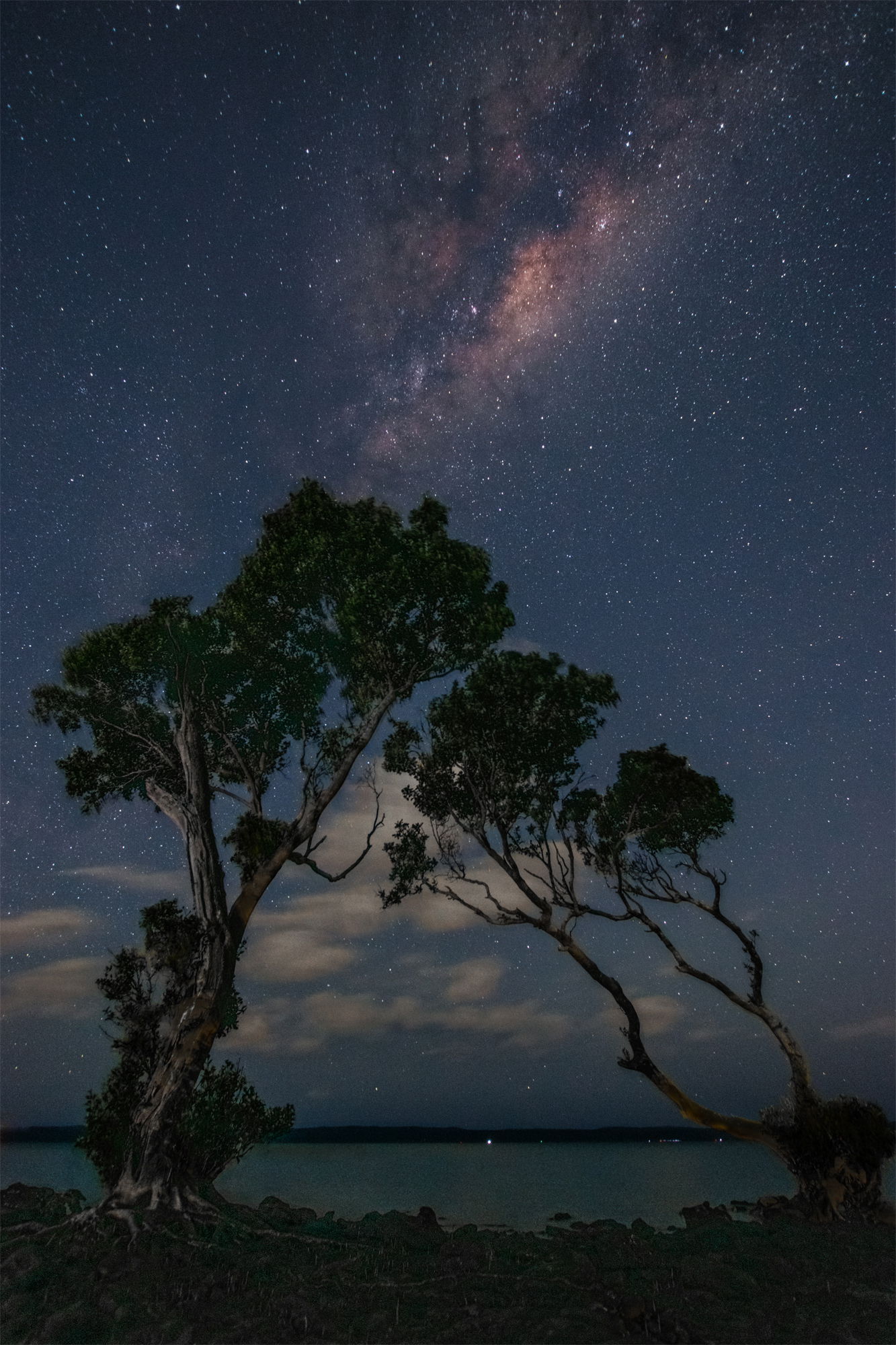
@Diane_Miller@Tom_Nevesely@Larry_Greenbaum I finally managed to re visit the island on a moonless and clear night. I tried to implement the suggestions that required a new photograph with slightly more separation between the trees. The photo is also different because of the sunset height of the milky way and the need to go to a 10mm lens portrait orientation to capture a similar image. I also used a LED daylight lamp to illuminate the trees from the far LHS to bring out the bark and leaves.
Original post …From Coochiemudlo Island looking toward North Stradbroke Island, near Brisbane. I have been waiting for a moonless and still night for some time. There was quite a lot of current at the time as the tide was about half way in, hence the sea is not specular. There is light pollution from the city as the nearest suburb is only about 7Km away.
I originally wanted to photograph some trees that had fallen into the water, however I was unhappy with the composition, so I moved to a pair of nearby mangroves. I tried to frame the trees and milky way to become a group of 3, but only later realised that the larger tree was effectively hugging the smaller, like people sitting on a beach and watching the stars.
5 photographs taken about 20 secs apart, aligned and merged to reduce noise in the sky, then a second time for the ground (by hand in PSE).
Specific Feedback
I would like a standard critique as I am unable to see how I could improve this photo. I think my brain is clouded by the pleasant evening under the stars.
A wonderful composition with the very interesting trees! The galactic center of the Milky Way is nicely placed. Overall, a nice job on a difficult subject.
A couple of suggestions, although I don’t know your limitations with PSE. The horizon in the right third begins to slope up. In PS that can be corrected with the Warp Tool. Sometimes the Lens Correction filter in raw conversion will correct for this sort of thing, but I have found the corrections to be limited, and they don’t cover all lenses. The rest of the horizon looks level so it might be easier with your software to make it less obvious with a barrel-pincushion distortion then rotate very slightly CW.
There is some pleasing subtle light on the smaller tree – it would be interesting to shoot this scene again with more light on the larger tree, or maybe a bit more shadow detail could be brought out in this one.
If possible, backing off a bit more with a vertical framing could also be interesting, to include a bit more of the MW. You have a much better view of the galactic center down there that we have at northern latitudes!
If you are not familiar with his work, you will love the nightscape work of Wayne Suggs:
While I generally like this image and I love the silhouette of the very photogenic trees I can’t help but feel that the image is a bit left heavy and could benefit from a bit more balance. Maybe by bringing out the milky way on the right a bit more you could counteract the visual weight of the dark trees on the left.
Diane, The islands provide a near and far shoreline, the center being nearest. This is why I did not flatten the horizon with the photo pincushion filter. Today, I was in this area on a ferry and re observed the islands in daylight with only one eye open. This changed the whole perspective of the horizon / shore line. I will fix this problem. I will play with the light on the tree, but it may have to wait three weeks till the moon is below the horizon and the Milky Way just above. I will have a look at Wayne Suggs in the interim. Thanks for your thoughts.
Tom, thanks for your ideas. When I venture back in three weeks, I will try your suggestions. Part of the composition I envisaged was using the Milky Way to balance the trees, but as you suggest, not quite right yet.
Rob, Welcome to NPN. Great to see an Australian nightcap. My wife and I visited Australia for a month in 2019. Terrific image. You captured the Milky Way beautifully. I tinkered a bit and added a slight amount of brightness to the trees with a darks 3 mask in PS with the TK9 plugin. I also added the slightest vignette.
Thanks for this wonderful image.
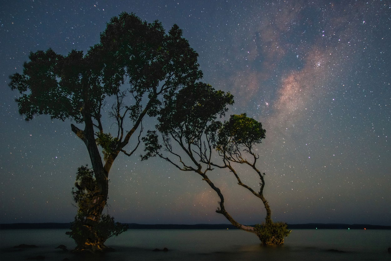
Larry, Thanks for your suggestions. I have modified my photo to recognise all the previous comments . Although I have not gone as far as some ideas, I think my photo is now far superior to the original submission. I do intend to re visit this location with a calibrated artificial light to allow better colour in the trees and also to improve the separation between the trees. Mother Nature will have to smile upon me to make this trip possible.
I have put the new file at the top. Thanks for the hint.
So do I! You can edit your original post and put it above the original for easy comparison. Or if someone posts a revision but they still like the original better, they can put it below the original. The top one becomes the “official” version.
I think you did a great job with this Rob! The image is nicely balanced and I like how the trees fit together like two pieces of a jigsaw puzzle and I like how they “interact” with the sky. The gentle light from your light painting really adds a lot to the image and is something I probably wouldn’t have thought to do if I was shooting something like this so good on you for thinking of that!
I have two questions for you though: One, how do you feel about the lights on the far shore? Are they an important part of the image to you? I ask because as an viewer/outsider they don’t mean anything to me and I would think about cloning them out. Of course they may be important to you or to someone familiar with the are in which case I think it would be better to leave them in.
My second question is whether you cropped this image of if this is the full frame? I think it wouldn’t hurt to have a tiny amount of space to the right of the right hand tree if that’s at all possible. Not so much as to lose the balance but just a small amount so that it’s not touching the edge.
A wonderful rendition! It is quite worthy of its own new post. I love the light painting and the interaction of the trees. The clouds would normally be something less than desirable but they work here, fitting in with the shapes of the trees. The sky color is very nice as is the color you found in the galactic center.
I could wonder about making the water just a little darker, but maybe not. It is a nice extension of the sky. I wonder if you could stitch together two or three frames to give a wider frame, but maybe with the distortion of a wide-angle lens that wouldn’t work well. But I don’t see anything here I would call distortion.
Looking forward to more of your nocturnal explorations!
@Tom_Nevesely@Diane_Miller .
Tom, The lights on the far shore. That is the way it is, maybe I am being silly, but everything that was in the frame is still there. I have certainly de emphasized some and emphasized others, but a local would recognise this place. The photo is about 90% of the complete frame. Layering the sky to reduce noise produces small noise bands at the edges due to earth rotation. That area is cropped. I have not tried stitching a panorama with noise reduction layering, however, to the right is a massive area of light pollution from the Gold Coast and very little interest to the left. Such experiments at this location must wait till next winter as the Milky Way is now too high. Diane, The clouds were a huge problem as they glowed yellow due to light pollution, in spite of the starscape pollution filter. I colour corrected them and made them darker. I had to wait a bit till they were in the trees and would have liked a bit more on the RHS. Re the water. I did think it was too bright, but was I a bit tired and not sure if that was imaginitus. I did hope for a comment in this area, thank you.