The photographer has shared comprehensive information about their intent and creative vision for this image. Please examine the details and offer feedback on how they can most effectively realize their vision.
Self Critique
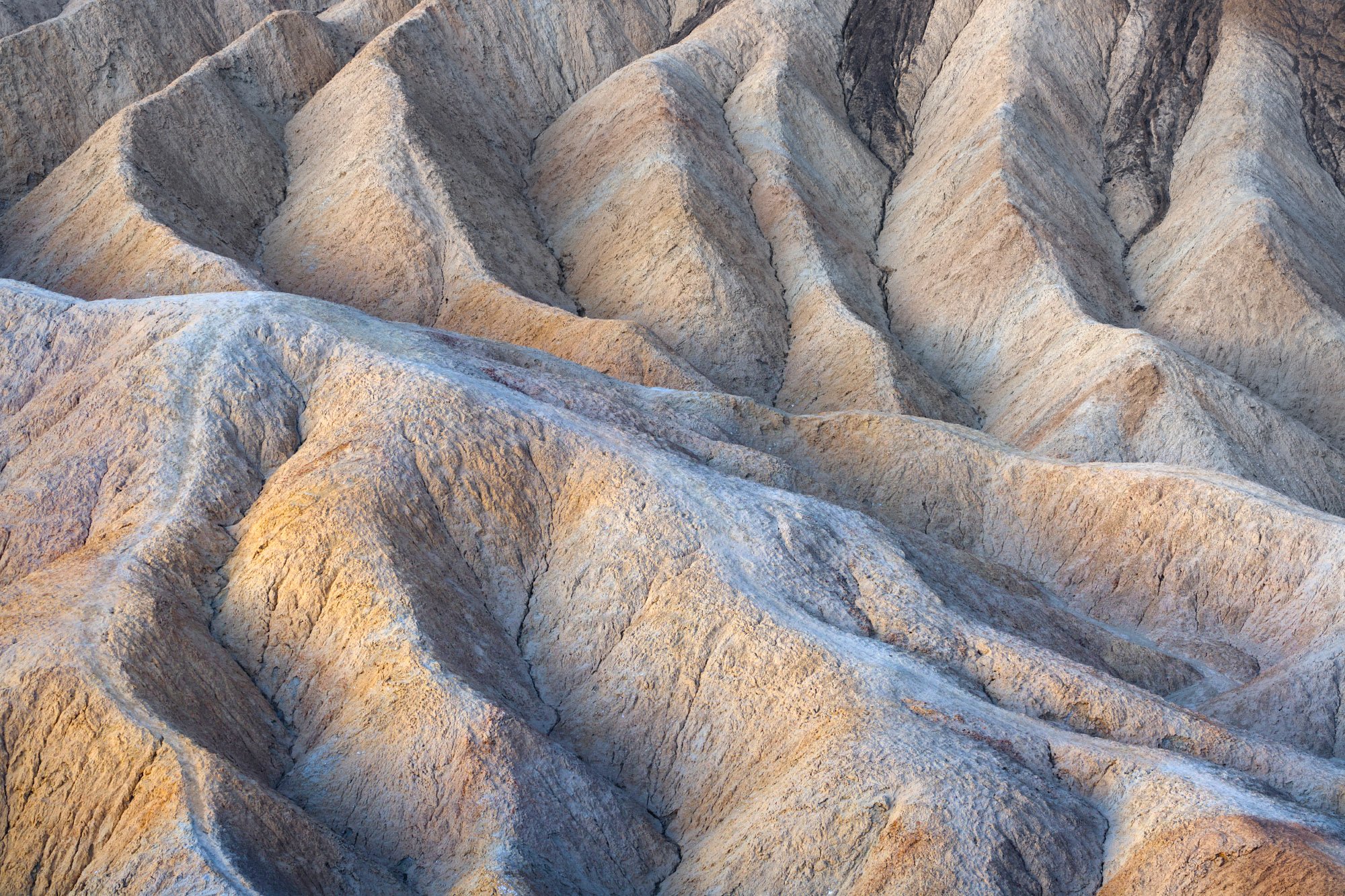
My first image was all about the colors, this one is all about the patterns…and a little bit of color! I couldn’t help but be drawn to the warm to cool contrast and left to right pattern. I felt the distinct pattern int he background was interesting on it’s own, but the flow of the mid and foreground provided another element in terms of shape without really detracting from the pattern above. I really enjoyed shooting the badlands and have more images similar to this one to process!
Creative direction
This image was made early in the morning so I’m trying to avoid cooking too much contrast into it. I worked some warmth into the left facing sides of the badlands and cooled the shadows a bit, enhancing what was naturally present.
I don’t know how you communicate the scale of time, but my whole time in Death Valley I kept coming back to the idea that this is a wild place, and the scale of time just feels different here.
Specific Feedback
Aesthetic, Conceptual, and Technical.
Technical Details
f16, ISO 400, 30 sec.
Description
This image is actually the first exposure I made in DV. It’s like I was immediately drawn to these textures and patterns. I spent far more time with these than I did with the wider views.
Zabriskie Point, I assume. A target-rich environment!! You found a nice composition, but for me the darker areas at the top pull my eye out of the frame. I wonder what you would think about having more contrast (or saturation) at the bottom and less at the top? You might even consider a crop from the top, which would emphasize the movement in the bottom part.
Hey @Diane_Miller thank you for that feedback. Are you refering to the dark “veins” for lack of a better term in the top right corner, or generally the darkness at the top of the frame? Just trying to make sure I understand clearly what is drawing your eye. The idea of adding some contrast to the bottom 1/2 is interesting. I will mull that over a bit.
The composition is interesting in that lines from the center middle line flow outwards to each side. I think I recognize these folds as the ones below the brown crown. Maybe not. I experimented a small from from the top to remove some of those notches in the upper left near the frame. It’s no big deal though.
Well now you know how special Death Valley is! Great job for your first image made there. Zabriskie Point is wonderful for a study of patterns and textures. I agree with Diane’s assessment of the darker veins being a tad distracting, so a crop would work, but I like that you lightened them in your edited image - the balance feels much better now. I love the lower contrast of the scene, and the warm to cool transition.
@Igor_Doncov You would be correct! Happy to hear you find the composition interesting. I just found these badlands all over the park to be a point of interest for me. I too thought about that notch, maybe something to clone a bit, not sure.
@brenda_tharp So cool to see you here! Love your work! I appreciate your feedback and I think it is the right direction. I may add a touch of the contrast back but I think this is the right path forward. DV is a special place for sure. I hope to come back some day!
I know exactly where this was shot and you did well to not include the darker streaked hill above which nearly everyone shoots because it’s so obvious. Kudos to seeing the lines, the texture and the flow that this particular area is known for and coming away with your own unique image. This is well done. I can see dodging the black streaks to some extent but not to the point where they look washed out. The colors look great as does the soft light you had to work with. This is a great National Park to bring a long zoom lens to because of all of the lines, colors and textures you have to work with. I hope you get to go back soon. You can literally get lost for an eternity in this place. Terrific post!
I think that this looks great and the only thing I would say is the same thing that Igor mentioned and that is that my eyes kind of get trapped in the little triangle in the top left corner.
Overall though, this is definitely a very beautiful image!
Very nice image. I would just recommend brightening and warming up that little sliver in the top left corner so it doesn’t pull the eye as much. Try and make it blend in with the layer directly in front of it. Otherwise you could warp it out or clone it, but I always try the least destructive thing (adjusting tones) first.
I also would recommend darkening the left side some. The lines seem to be moving from left to right, but the light right now isn’t helping add to the overall flow of the scene. If the left side were darker the eye would move in the direction of the lines more.