The photographer is looking for generalized feedback about the aesthetic and technical qualities of their image.
Description
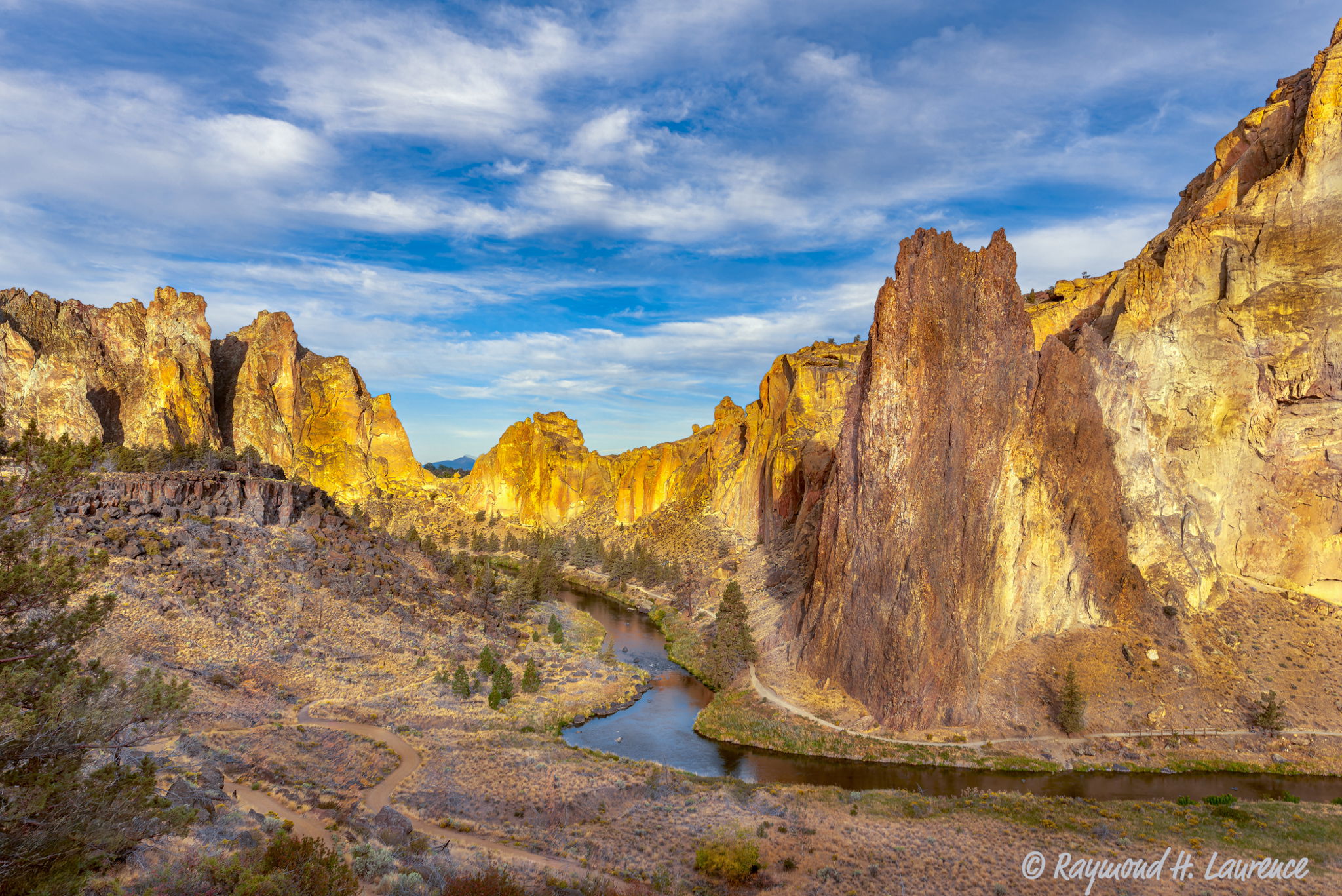
I tried several times to capture Smith Rock but always found clear skies that added nothing to the scene. One September morning the clouds were spectacular, albeit not a golden hour capture. however the sun was just starting to light the canyon and the glow was beautiful.
Specific Feedback
I appreciate any insights and suggestions that you believe will improve the emotional impact on the viewer.
Technical Details
Nikon D800 with a Nikkor 24-70 mm f/2.8 lens @ 24mm
ISO 100
1/40 sec @ f/14 (Tripod)
Critique Template
Use of the template is optional, but it can help spark ideas.
Hi Ray, I really love the golden light in this image but I’m curious what’s the story with the 2 images? Are they different versions of the same scene? Or is the second image the original unedited version?
Back to my critique… While I really love the golden tones in the landscape I can’t help but wish for a sky that was a bit bluer (as opposed to the cyan leaning sky we see here). I think that the “cleaner” blue would harmonize better with warm colours in the landscape and create a bit more colour separation. The sky in the second image is much better in my opinion.
Hi Tom, thanks for taking the time to comment on my photo. First, I thought the first image was too warm when I uploaded it. I tried to substitute the second image, but could not determine how to do it. The site while phenomenal has some features that are not intuitive. I am sure there is a way to substitute, but I couldn’t figure out how to do it. Second, I agree with your comment about the sky. I will try to make the suggested improvement and upload it later today. Thanks again. Ray
Hey Ray, I agree with @Tom_Nevesely the sky throws me for a bit of a loop and makes it hard to focus on other parts. It looks like your second image is an improvement, you could possibly take it a bit further if you are interested. I took a crack a it below. Looking at it here I would probably desaturate the blues a bit too. Other than the colors, you’ve got a really good image on your hands here. What a beautiful place.
When I was younger and heavily into rock climbing my buddy and I spent a week at Smith Rock, climbing every route we could get our (bloody) hands on. This is a wonderful representation of that beautiful landscape. The composition is spot on, with the river leading my eye through the frame. The tree intruding on the left would normally bother me but it doesn’t here, I think because it somewhat blends in with the background. From a processing perspective, I think something in between the two images would be more pleasing to my eye. I’d probably keep the sky from the second one, and warm up the just the landscape a touch without taking it as far as in the first.