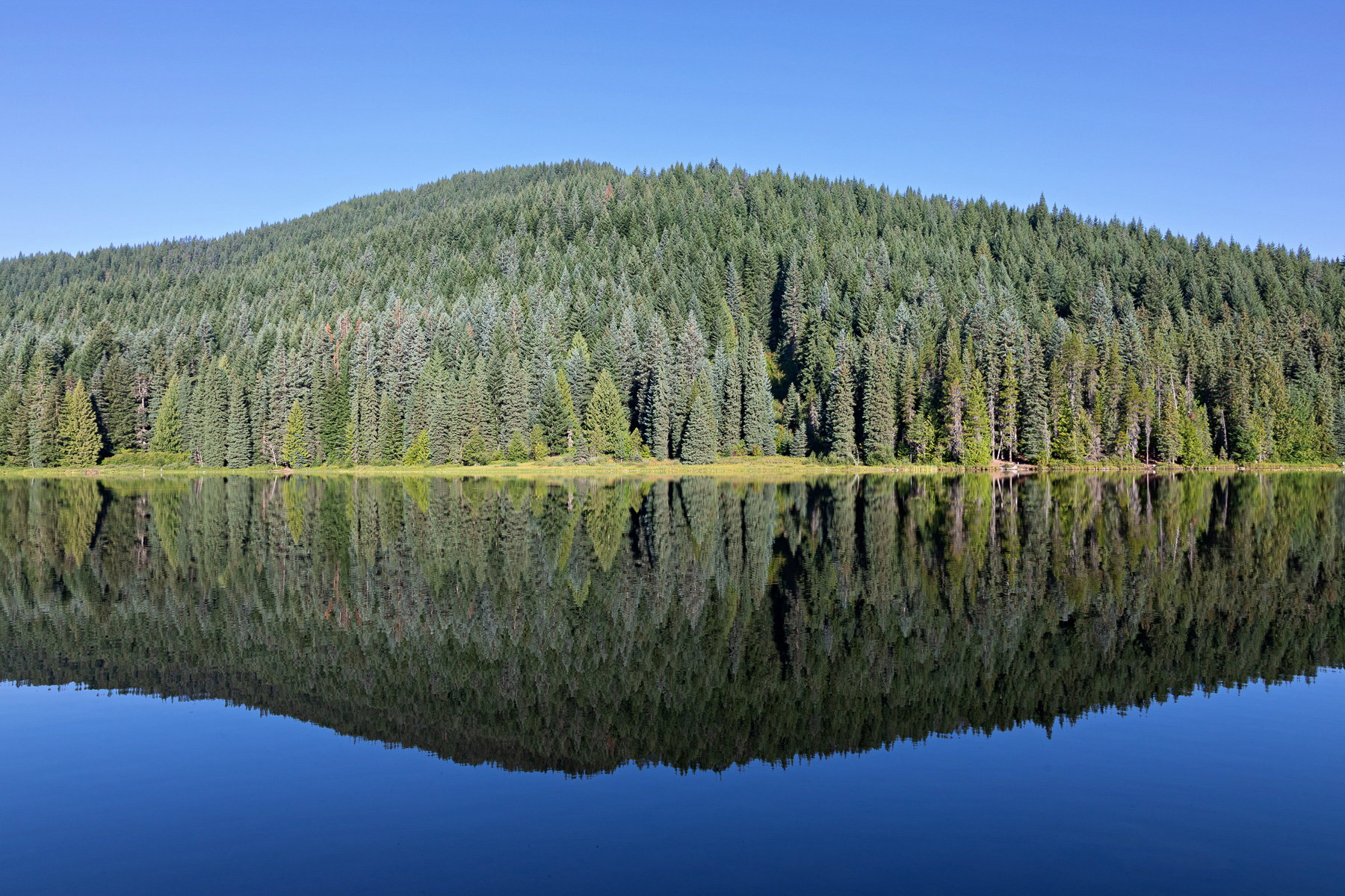
Revised Version
Revision 1 (latest)
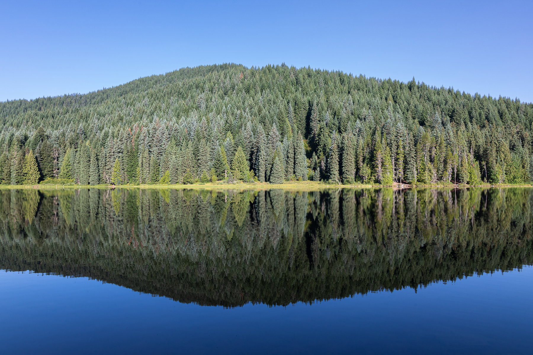
What changed: I darkened and increased contrast on the left side of the hill, straightened another .10, and pulled back on the purple in the sky by -1.
Added after receiving feedback from the community.
Original Version
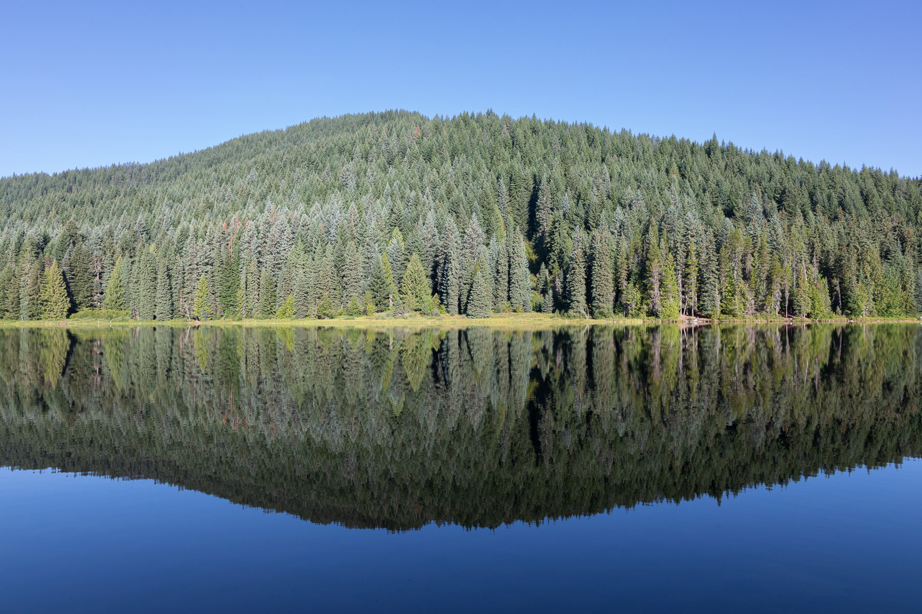
The photographer is looking for thoughtful feedback on the image as a whole, especially around the areas noted below.
About This Image
The morning I left Trillium Lake, we had the calmest conditions of my stay. The sky was nothing special (a blue-bird day on tap for sure), but the reflections of the trees across from my campsite were super sharp, and I liked the way Eureka Peak (the name of this humble hill on the west side of the lake) created such perfect symmetry left to right and top to bottom of the reflection.
I wanted to make this as abstract as I could without losing the scale. I have a much smaller view of a narrow cluster of trees, but this one feels special. I’m not sure about the sky though.
Feedback Requested
I’m always open to any and all feedback, including a yawn or a silent “pass.” In particular though, I’m wondering about the following:
- Should I adjust the color temperature and/or luminosity of the sky? It was morning, after sunrise, a little haze or smoke perhaps, but otherwise featureless. I think the color is a little on the periwinkle side and I’m not quite sure how to adjust that (hue slider in blue toward aqua and purple toward blue?)
- Do I need more contrast or some burning of the trees? I over-exposed this a bit (I’ve been playing with exposing to the right, as they say, since my 5DIV seems incapable to totally blowing highlights unless I try).
- Should I dodge the shadows in the middle of the trees where there appears to be an old slide or burn scar?
- Anything else? Distractions? Slight rotation? Level is close, but lake shores are tricky.
Thanks as always for the generosity of even a smidgeon of your time and attention. Truly appreciate it.
ML
Technical Details
Canon 5DIV with 24-105mm at 24mm
ISO 160, f/11, 1/50s
Exposure reduced, lens corrections applied, export sharpen, etc.