Fall Arrangement

Critique Style: Standard

The photographer is looking for thoughtful feedback on the image as a whole, especially around the areas noted below.

Feedback Focus: Artistic / Expressive

About This Image

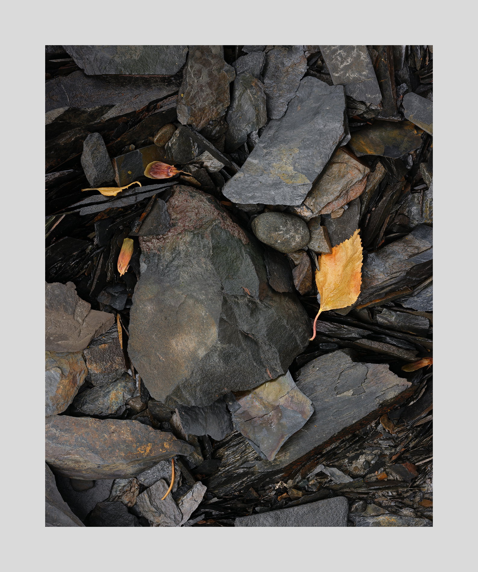
This is still another composition in the same vein as before. I relied less on tonal range here so it is more subdued. The colors are less varied as well. Even though the title includes the word ‘arrangement’ nothing in fact was arranged. Nature arranged it all. In fact, nothing has been cloned out in processing either.

Feedback Requested

I don’t know what to ask. The leaf is pretty strong but it feels appropriately so. Should it be darkened? The overall image is pretty dark. Should it be lighter? I suppose the big rock could be dodged a hair and the angular one above it could be burned in.

I suppose I could work on these ideas. And perhaps I should. Why am I not motivated to do so? I wonder if others feel the same way. The excitement drops after the shoot. Unless there are dramatic changes to the image the work seems tedious.

Technical Details

Camera: FUJIFILM GFX 50R
Focal length: 120mm
Shutter speed: 1.5s
Aperture: f/16
ISO: 160

metadata says f/16. That means I lost some sharpness.

I like this image just as it is because it is a bit subdued and not overly bright and saturated. This gives the image a cooler fall feeling which is more than fitting with the dominant cool/dark rocks. The leaves to my eye are true to their state of decay vs bright and saturated while still on a tree. The composition works really well with the haphazard leaf and rock interaction with no “by the book” rule of thirds needed to make this image pleasing. The old photographer me would have add saturation and brightness to the image but the new me likes it just as it is. Well seen and done @Igor_Doncov !

1 Like

Igor, I do like this as presented, but I can also see lots of room to tinker… I like how there are tons of details to see as I look throughout the frame. The “main” rocks angle nicely across the frame. My first thought is that slight burning-in of the bright leaf would let it fit better into the view. It would also be interesting to compare some dodging of both the main rocks to better match luminosity with the bright leaf with this version, although that could detract from the quiet, pensive mood of this view. The “loss of sharpness” at smaller aperatures is mostly a myth…while it can be measured with sophisticated scientific instruments, it doesn’t show in normal sized prints or on screen until you looking at 100% or larger. In a print the ink spreads slightly as it soaks in, reducing the resolution of the image.

Igor, you have once again turned what I would have called ‘ordinary’ when I walked by it into ‘extraordinary’ now that I see the image! This is a very nice image. I always try to determine what makes an image attractive and often I can’t articulate it very well. I think in this image in part it is the nice blue-grey colors of the rock contrasted with the nice yellow and oranges of the leaves. I can’t really see what makes the image appear to be well balanced, but it certainly doesn’t seem unbalanced. Finally, I started to think the little yellow curved piece at the bottom of the image should be removed, however, after thinking about it, I think it adds interest and should stay. Well done!

I like the subdued nature of the rocks in this image, Igor. It lets me concentrate on the textures and reduces the dependence on a “star” or two dominating the image. Yes you have one larger central rock, but it fits in beautifully with the rest. I suppose you could play with it, but I really see no point in doing so. All it would do is change the image a bit and there’s no reason to think it would be for the better.

Hi @Igor_Doncov
This to me is a symphony in yellow and blue-grey

The biggest leaf is balance by the 3 objects on the left, with an exclamation of yellow stem at the very bottom

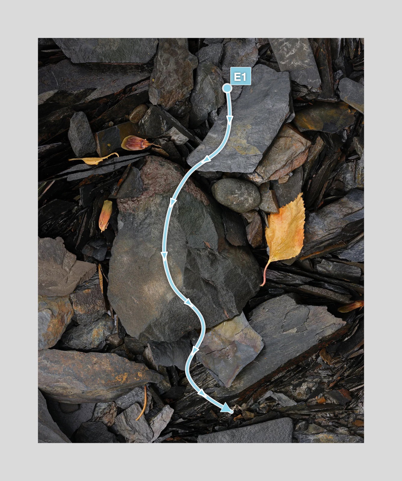
The rest guides ones eye down from the top
the different stones just add nice forms and textures

A beautiful abstract - works as a waterfall with nice interest to left and right.

Tweeks may alter the detail but the form and flow really works for me

No suggested changes
Huw

Visual Notes

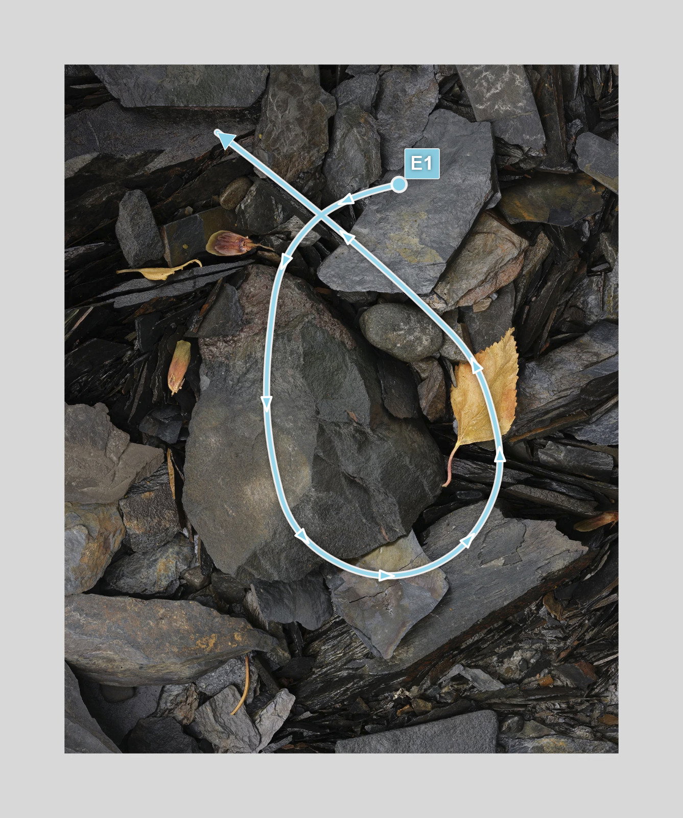
[E1] eye flow

Visual Notes

Hi Igor,
I like this a lot. For a variety of reasons, it doesn’t quite engage me as much as the one you shared before this. I think it’s the less defined shape of the biggest rock in the scene, and maybe the leaf having landed instead of being captured between two rocks. The surrounding rocks are not as distinctive (the other image had rocks that looked like shale lined up on its edges or something).

All of that said, it is a nice, quiet image.

Your quote was in some ways more engaging for me than the image. It’s something I feel frequently. Sometimes the processing is creative and I enjoy it, and sometimes I feel like I’m “beating a dead horse” (a metaphor, by the way, that my students had never heard and took literally, no doubt assuming I was having a psychotic break in class when we had discussed a story to death and needed to move on).

In this case, I doubt it’s the image itself that’s leaving you unmotivated. I guess it could be the fact that it’s the second of two that have similarities? Are they too similar? Is this your second favorite and therefore, not as motivating? Do you need a larger purpose for these: a project? a triptych? a calendar for friends or family?

Do you have an online gallery? I have one that I try to update a couple of times a year with a series that I’m working on. Once I have enough images, then I have quotes and titles to think about, which makes that phase interesting and creative for me.

Another possibility: Sometimes when I feel unmotivated to process or improve an image, it’s because the alternative – heading out to shoot more, going for a walk in the autumn glow, watching a football game – just sounds more attractive on a given day. More variety in life, including less time thinking about photography, can offer a creative boost. It’s like solitude: we don’t really crave it when we spend a lot of time alone. Desiring it requires its opposite.

Sometimes for me the lack of motivation is a little darker: Why do I spend so much time doing this? What is my real goal here–not just with the image but with photography? Do I need an additional hobby? I go through phases of this version. Maybe I should take singing lessons, get off the dang computer, do more yoga, go dancing at a club. Sometimes a break of a few weeks and a new location is all I need. Portland Japanese Garden should be lighting up soon, so I’m kind of coasting a bit until then.

And yes, for me, often, the real joy is in the hunt, the seeing, the capturing, and later, deciding which ones are best. The processing is rarely the most enjoyable phase–often something I do when it’s raining cats and dogs or stinking hot outside. In other words, when being inside on the computer is the best use of time.

Anyway, I just thought I would add to your conversation about motivation, processing, the creative life. It’s not always a flow state. Sometimes we’re outta gas; sometimes we have the front end up on blocks. Sometimes we just need to walk to our destination or consume art instead of creating it. Look at the work of a favorite artist. See if it jump starts anything.

ML

[E1] My eye goes from the angular rock down through the larger one to the leaf and then back up to the left corner
Thank you for your thoughtful thoughts. Can thoughts not be thoughtful?

Being out of gas came closer than you could have guessed. I caught a bug and spent several days mostly in bed. I was just coming out when I posted that. It’s funny. When I came back from Alaska I was all jacked to process. I had gotten into a good seeing groove up there. Then the long flight home and chores and obligations. And before you know it much had evaporated. The problem with not being motivated is the good things don’t look good. Judgment is off.

But there are other things working as well. All these readings on Japanese aesthetics and works of Michael Kenna have made me want to go in a different direction. Which is great. But I keep going back to compositions I feel comfortable with because they are easier. Well, enough bellyaching!

Oh. And I forgot to mention. My laptop was stolen in Anchorage. I’m sure that has something to do with it. All Alaska images posted were shot in the last 3 days of the trip. I could only shoot as much as the memory card allowed. There, now you know everything.

1 Like

Visual Notes

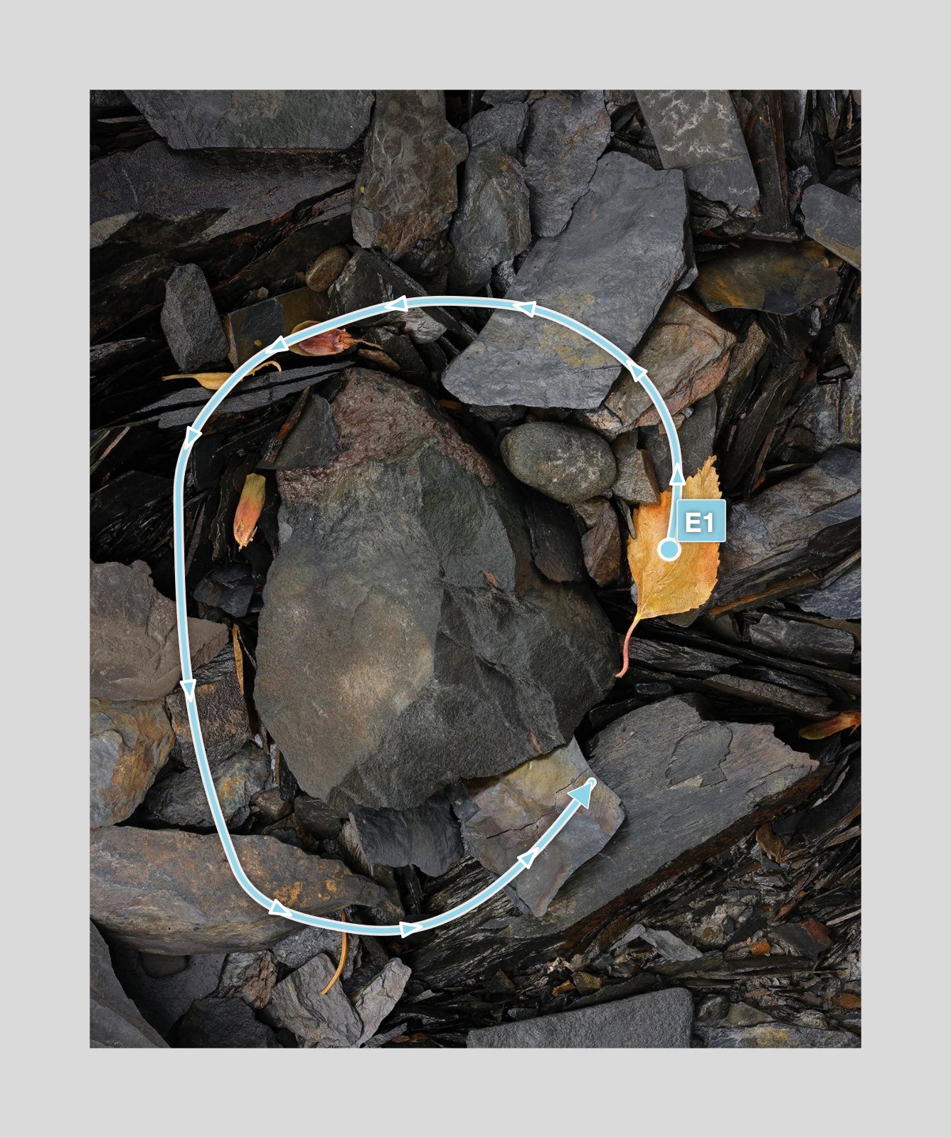
Even though this and the previous image are about the same subject I see and appreciate them in different ways. The previous one was about form and the rest was background. This one is about arrangement. For me the eye starts out at the leaf and proceeds around the circle, eventually stopping at the pointy rock where the arrow ends and even continues to the larger shape to its right. Then it jumps to the bottom right triangle with all it jaggedness and I observe how different it is from the rest. My conclusion is that the central rock isn’t that important (unlike ‘Africa’). It’s the shapes around its border that are of interest. The rock itself just holds them together and guides you. It provides structure.

[E1] Read above

I agree with this, although my eye went in the direction of something floral. The rocks at the bottom left form a vague receptacle/sepals, the larger rock an ovary, leading up to a stigma and anthers above and to the right of the large rock. Maybe that’s a stretch too far, but once my mind landed there it just felt a bit right.

I really like that the leaves are there. They keep a bit of realism in the scene, and add just a bit of spice to the dish.

I used to fight the ebbs and flows, and now I embrace them. I find my photography, both shooting and processing, is better when I let the little waves pass by while waiting for the bigger ones.

I like this… Quite a lot actually. I think the composition is well thought out (as is typical with your images) and balanced. The leaf, though bright and colourful, doesn’t detract or pull all the viewer’s attention onto itself and feels harmonious, at least to my eyes.

Igor, there is an appealing tension to your composition for me. I also enjoy the - muted - color palette a lot.

Igor, I like this one better than the previous version, which I already liked.
All things considered, though, I think the little branch tip in the lower left corner is unnecessary.

I thought the previous one was substantially better so I was surprised.

Hi Igor— I like the deep tones you’ve captured and how the primary leaf subject is pushed to what your eye focuses on. I appreciate the color depth and true-life feeling that is highlighted. If I were to wonder about anything with this shot it is the smaller leaves to the left of frame… do they detract from the primary leaf or do they lead your eye to the hero? So if I were to do any experimenting I would try toning down the smaller leaves to see if that added or subtracted from the overall image. But that’s really nitpicking as I love this shot!

I specifically looked for compositions that had more than a single leaf. Perhaps I was wrong. I just felt that a composition of all rock with a single leaf was ultimately uninteresting and predictable. However, once I made that constraint I was surprised how much more difficult it was to find good compositions. I think that multiple leaves require an arrangement between them that doesn’t exist in the other case. Here the large leaf on one side is balanced by 3 small ones on the opposite side. I don’t actually think this out. I just sort of sense when things feel right.

By the way as I get older I find this sort of looking and experimentation pretty tiring. I just don’t have the stamina to work as long as before. This limits my productivity and the quality of the work.