The photographer is looking for thoughtful feedback on the image as a whole, especially around the areas noted below.
About This Image
As many of you know, several NPNers had a meet up for Fall Colors in Yosemite National Park the first week of November. It was an amazingly fun trip scrambling around with people of like mind for 3 or 4 days. I was on the first Yosemite trip back in May so I knew about half the people already but meeting Bill, Marylynne, Bonnie and her husband Guy, and Youssef was incredible. Everyone jelled, everyone was fun to be around, and stories were told. It was a quick trip but one I’ll never forget, mostly for the people but the photography wasn’t bad either. This is my first post from that trip.
Almost every shot from this trip was more of an intimate scene rather than the traditional epic Yosemite Grand scenes we all know and love. I had Fall colors on the mind so intimate became my theme for the brief time we had in the park.
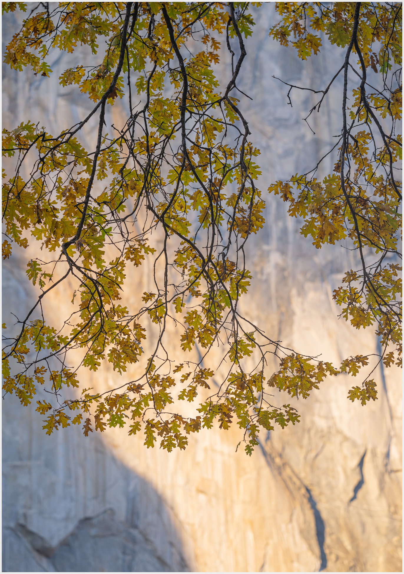
This image is made of a black oak whose branches and leaves were hanging in front of El Capitan. There was a brief moment where El Cap partially lit up providing a beautiful backdrop to the oaks leaves.
Feedback Requested
I have many images in different compositions of this scene and I’m wondering if the light is a distraction or not. I personally like the cool blue and warm colors together on the rock face but I can also see the light as a distraction of sorts.
Is the light on the wall too bright? It’s not blown out but it’s processed right to the edge.
Technical Details
Camera: z9
Lens: 100-400mm. Hand Held. 9my other camera was on the tripod. 
Focal length: 180mm
Shutter speed: 1/160th
Aperture: f/5.6
ISO: 160
Flash: none