The photographer is looking for thoughtful feedback on the image as a whole, especially around the areas noted below.
Feedback Focus: Artistic + Technical
About This Image
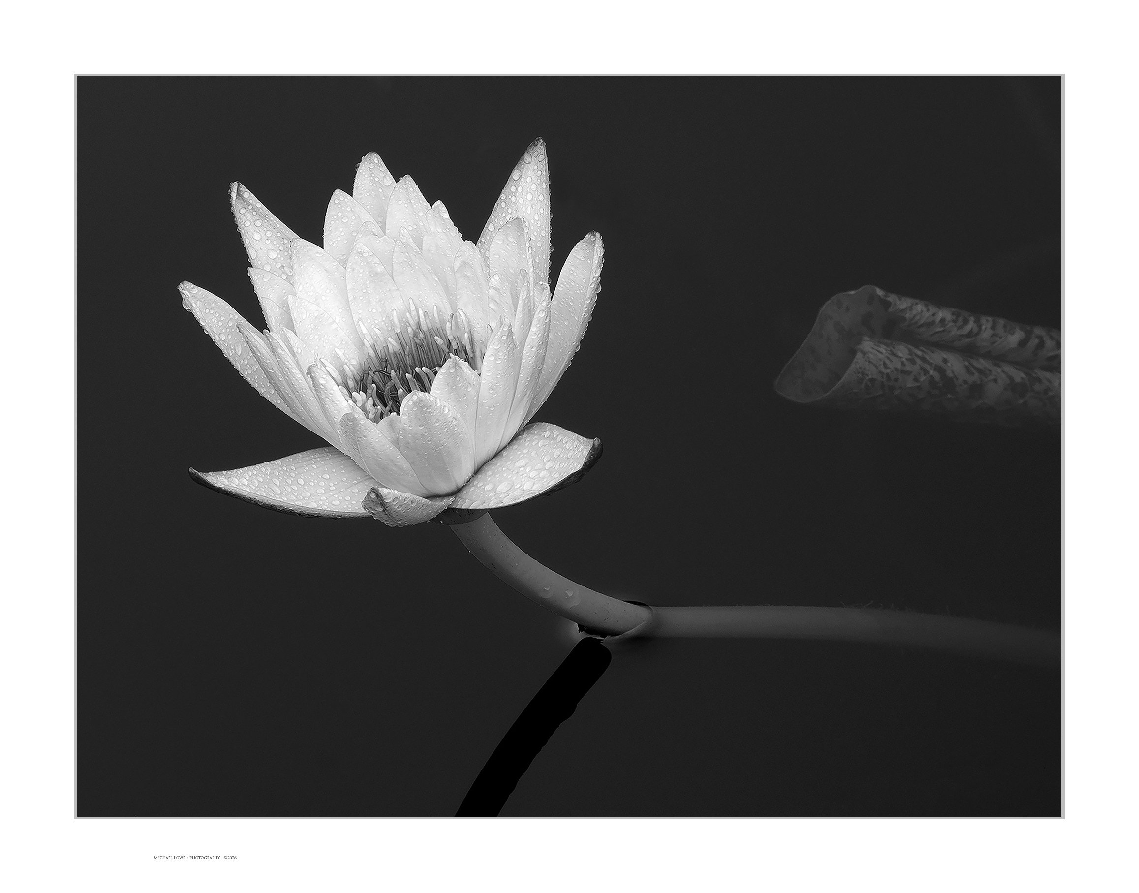
After viewing @Diane_Miller 's wonderful B&W water lily, I decided to try my hand at it. No special PS skills. Basic contrast and tonal adjustments. Taken at Longwood Gardens, PA.
I have to say that I never would have thought to convert a colorful waterlily into a B&W image, but I have to say that this works really well IMO. I will have to go back and check out the post from @Diane_Miller. This has a nice range of tones and I am loving those water drops on the petals, especially when you view the larger version. I also am enjoying the water tension around the root where it breaks the surface of the water. I also think the unfurling pad in the BG works as well. No suggestions from me as this is beautifully done.
Mike, a worthy successor to Diane’s shot. I too love that point where it breaks the water surface. Maybe, if you cropped a little off the bottom, this surface feature would increase in prominence and the two black strips (top and bottom) would be more balanced. The length of the stalk shadow also pulls my eye down a bit - but these are just personal taste reasons for that crop. Everything else is great!
WOW!! I love the wonderful detail you pulled out, and B/W lets nature’s design (and your seeing of it) be the subject. The whites are just right for my taste and the detail in the stamens and the water droplets is so lovely. The surface tension and the unfurling leaf reaching for the flower are such nice touches to place the flower in a lovely setting, and the dark water is the perfect BG. Stunning!!!
I like the crispness of the subject and how the flower glows from the darkness of the surroundings. The water droplets on the flower provide additional interest to the scene. Awesome shot with perfect processing…Jim
Gorgeous, Mike. I’m fascinated by how much more interesting these water lilies are in black and white. Yes, their colors are delicate and lovely, but when we strip then down to shades of white, the contrast with black water becomes more poetic, less “objective.”
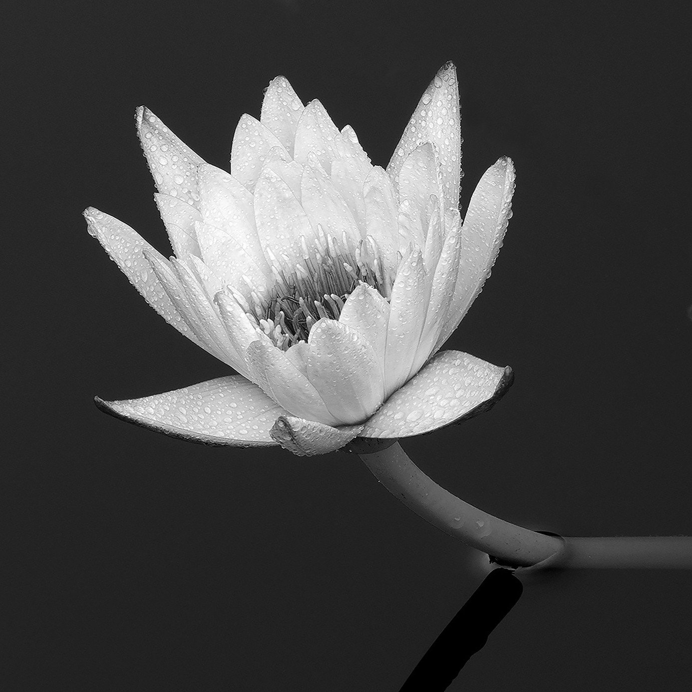
I also love that surface tension others mentioned. The leaf entering from the right is a bit of a distraction. To me, it doesn’t add to the image. It would not be hard to remove if that is in your practice. If not, I found a crop that simplifies a little (less stem shadow and no curled leaf). It’s square, and I know that’s not everyone’s taste, but it gives you a place to start if you want to play with a portrait crop or a tighter 4x5.
Mike: Oh this is fine! I like your comp and all of the fine details from the water tension to the drops to the inclusion of the petal. Nicely seen and superbly presented. >=))>
This is a gorgeous image of the water lily, Mike. For my taste, every detail is perfect including the curled leaf on the right. I like the range of tonality in this one as well. Excellent work.
What a great image, I like it a lot. The b&w rendering works very well, and I like the minimalistic presentation. The leaf to the right balance the lily in a good way. Not much to improve here, but maybe you could try to increase the distance from the top of the lily to the upper border to make it the same distance you have to the left border.
Kris_Smith
(Kristen M Smith)
selected this as an Editor's Pick
10
A bold arrangement with luscious processing and detail makes for an outstanding addition to the category.