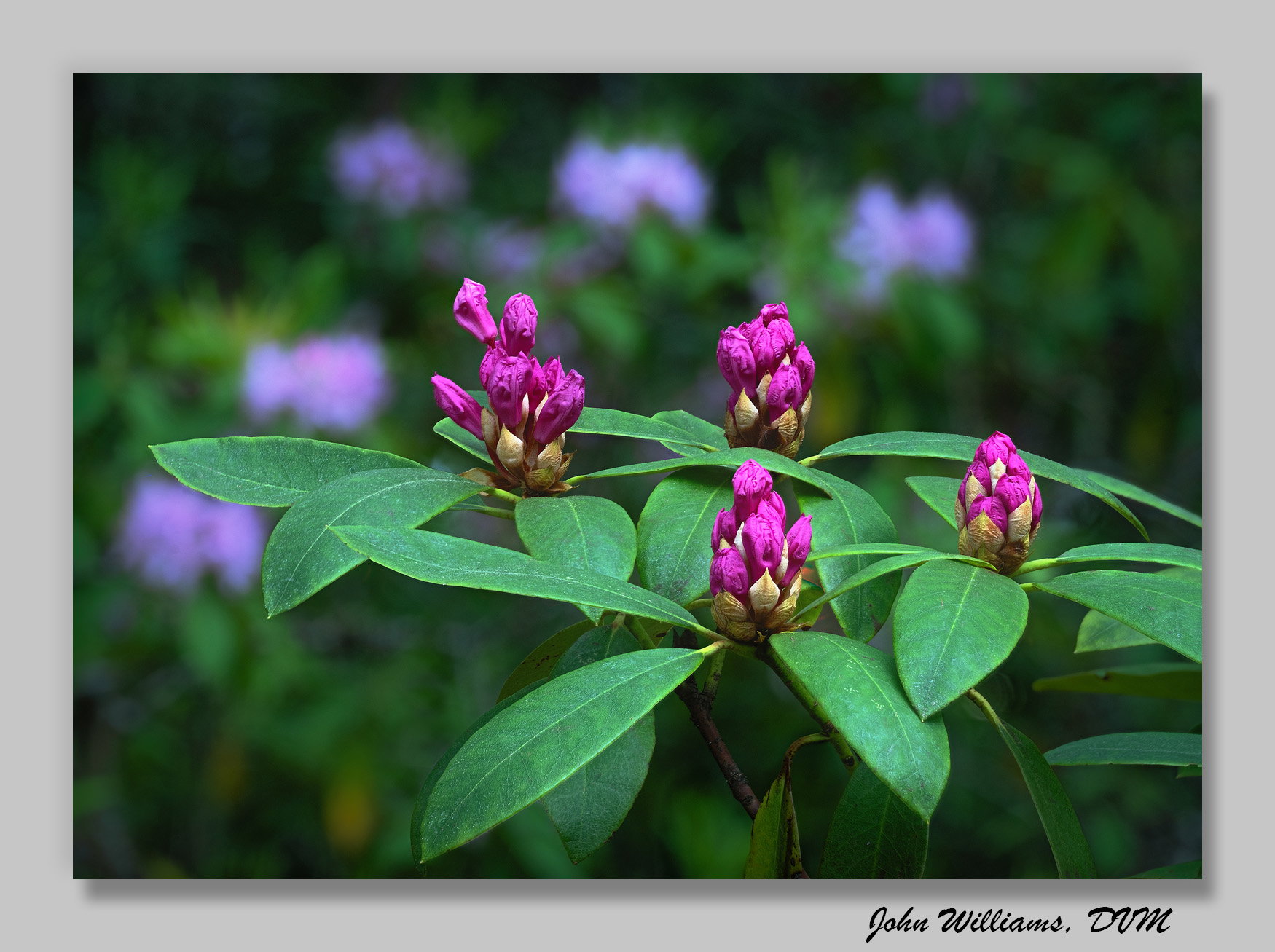
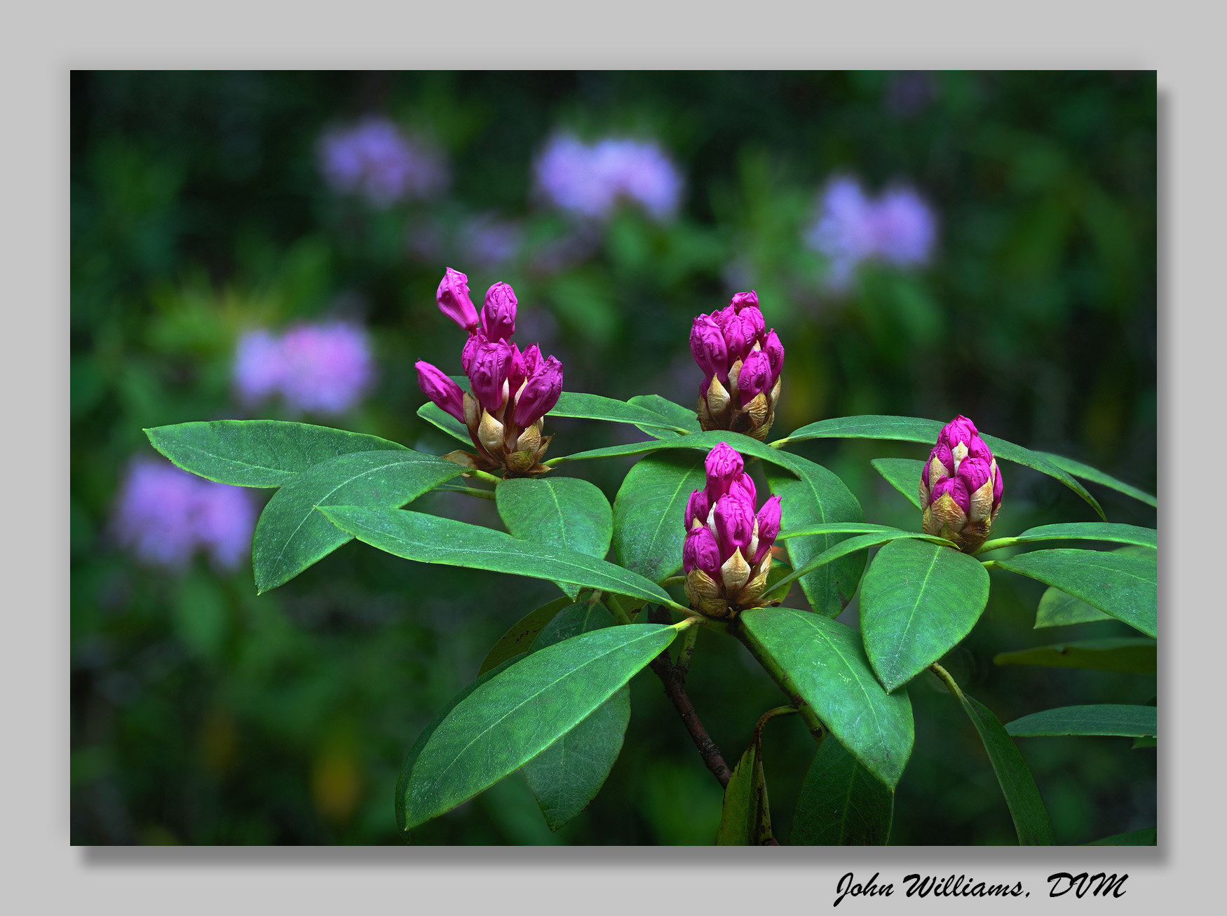
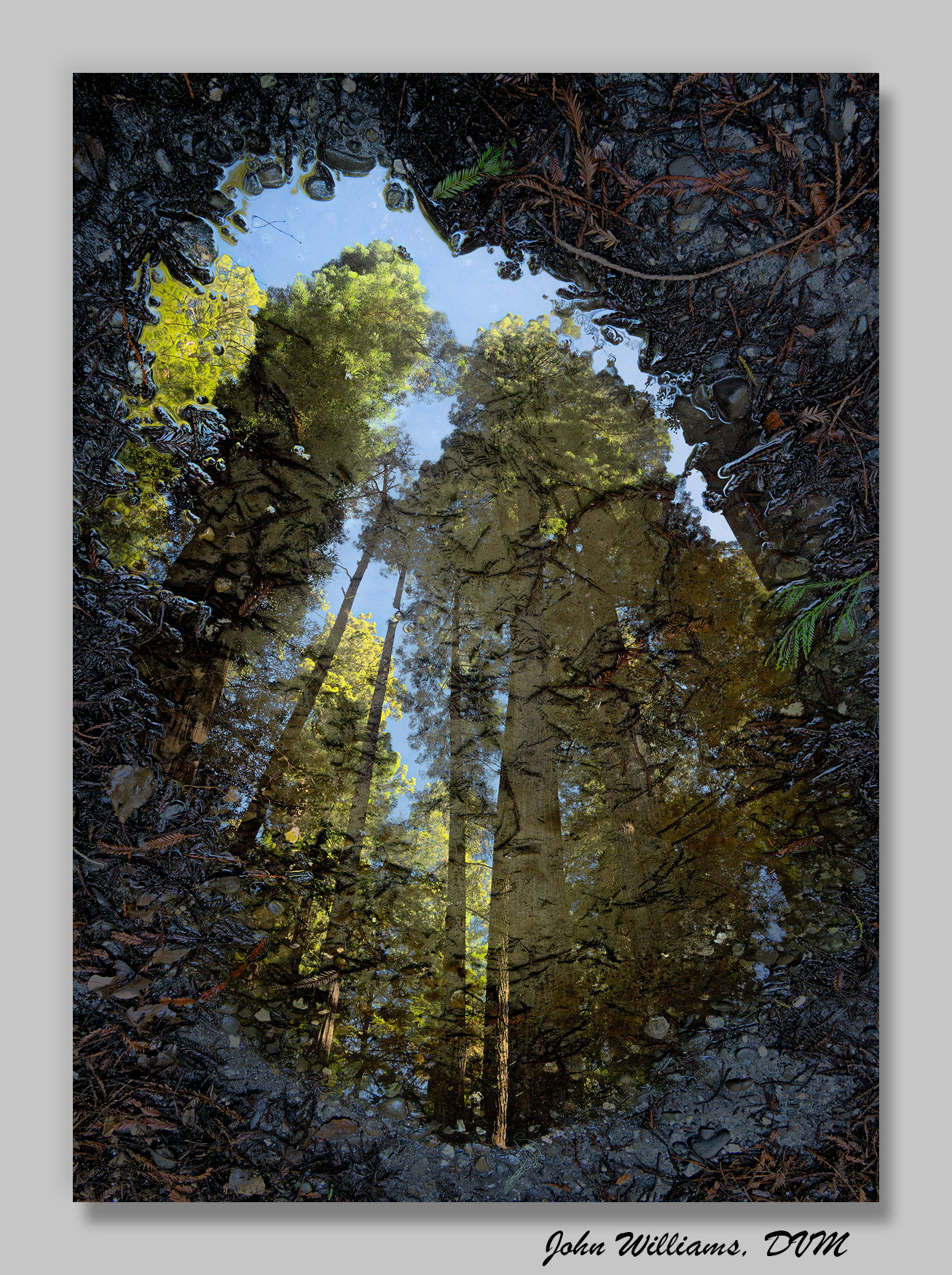
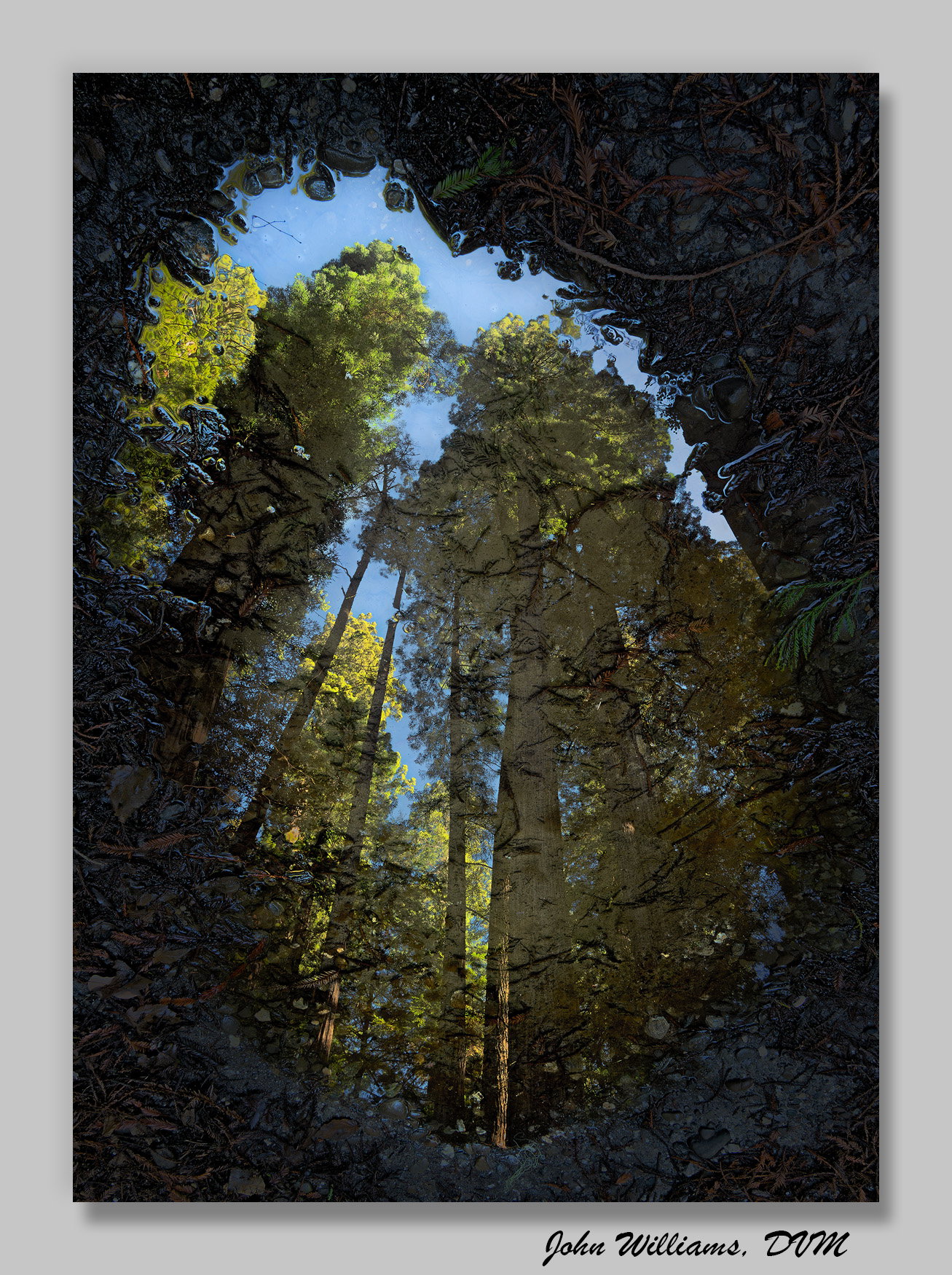
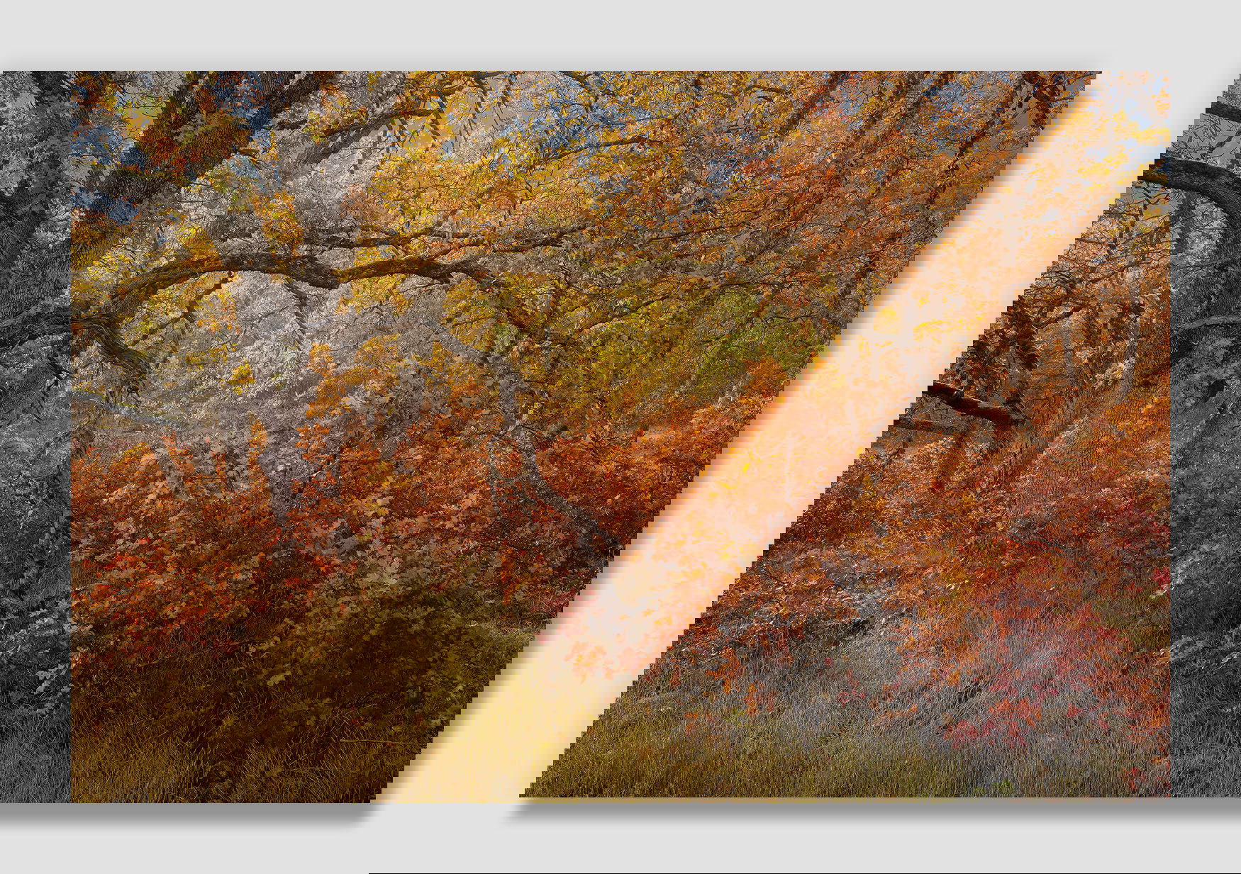
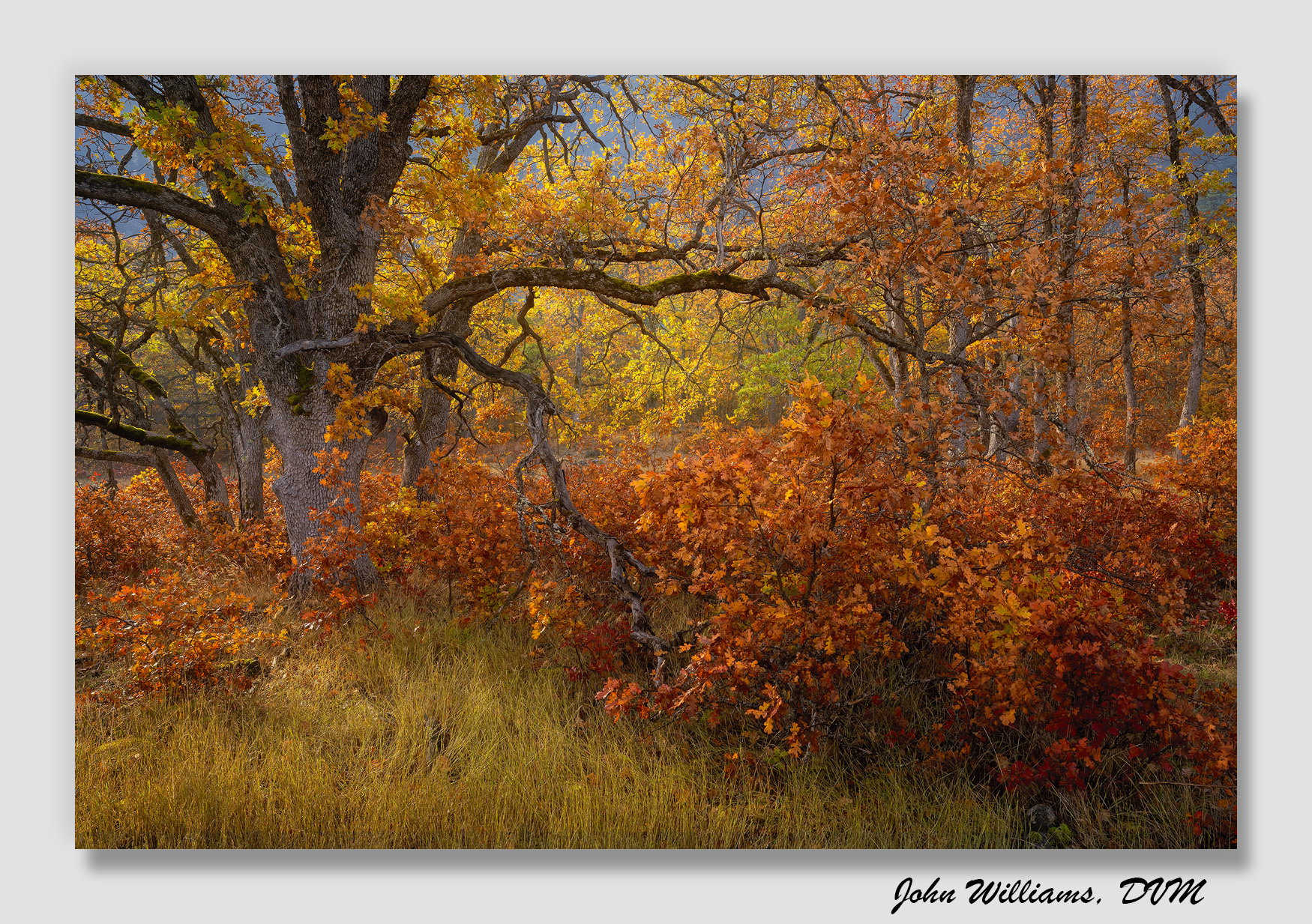
We recently purchased a new computer, and I’ve been slogging through and better organizing my image catalog as a part of that. I’m using the same old monitor and ColorMunki calibrator, but I had to switch to the Calibrate Profiler software since the original software doesn’t work with Windows 11.
Frustratingly, to my eye my images seem a bit different in the (mostly) mid-tone luminosity than what I remember. I’ll post three images below that I’ve posted before, the first image a lighter version and the second darker. If you have a preference between the two, can you tell me which you prefer?
John, the brighter image for all three gets my vote. They appear to be more luminous and darker tones less dense.
I hope this helps!
I am dreading having to buy a new machine with Win 11. My current Puget Systems workstation dates from 2011 (still quiet and working perfectly), so it can’t be upgraded to Win 11.
I will buy from them again but when I do, I’ll retain my current Primary SSD and set up dual boot on the new machine until I can make sure everything works with Win 11.
(Rant)I remember when Microsoft said, " Windows 10 will be the last Windows OS!", but nooo, they had to create Win 11 with that ‘Trusted Platform’ security BS! To add a bit, Adobe no longer supports my version PSCC and my machine is not compatible with the latest version. Arrgghh! (/end rant)
John, you have my sympathy with having to upgrade and the attendent issues with software compatability. I’ll vote for V1 for both 1 and 2. In 1 the extra brightness translated into being more inviting. In #2 the details in the surroundings add a ton of interest. I prefer the darker version of #3 with it’s slightly more saturated colors although I will also say that the lighter version has a nice “glow”. In my own processing, I do a lot with mid-tone luminosity and it makes a huge difference in viewing with changes that look subtle in the overall image.
Agree with both so far that the first version for images 1 & 2 work best.
The 1st, the leaves of the plant just seem better separated from the bg, AND the 2nd one just seems like it’s a 1/3 stop under exposed.
In the 2nd image, the surrounding area beyond the reflection as much more detail and overall has a much better appeal. Again, the 2nd version seems under exposed.
I’m with Mark on the 3rd image in that the darker luminosity seems to have created better overall contrast and color saturation. But also agree both of #3 work well and wouldn’t have noticed anything if they were stand alone.
I guess this begs the question, which of the 2 versions are you editing to make look better to your eye?
Did you port over the monitor profile from the old machine to new? Or did you recalibrate with the new system and old monitor?
I swear, the 3rd image sure looks like it could have been taken in Yosemite Valley!!! Maybe a pre-cursor to our trip! Let’s hope so!
The first, brighter, images were the original edits. The second version, that is darker, is using the new screen/calibration.
It’s the same monitor with a new computer, and the same physical calibrator with new software. To my eye, the shadows are more open and the highlights more muddy with the new setup. It’s typically subtle, which is good, but at times can be more significant. (The second image is an example of a bigger change with the new set up.)
It’s frustrating. I don’t care which is “correct,” I just wish I knew which was!
For now, what I’m doing is to calibrate to 100 for luminosity (instead of 120). We’ll see how that goes.